It was important to find the perfect material to mirror the overall feel and theme of the event. Without...
Inspiration
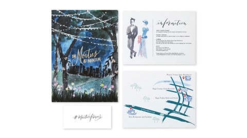
Imagine a wedding banquet hosted by Lady Rose from Downton Abbey where she has chosen Shakespeare’s ‘Midsummer Night’s Dream’...
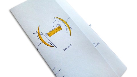
The chapbook’s short cover literally begs you to take a look inside. – Thomas Ingalls My delight …...
The design team at The Workhouse has revealed its obsession with typography in Wayward Arts Magazine (Issue 18) from...
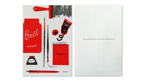
The everyday tools that surround me are lovely objects and daily reminders to me of how fun my...
This colorful and energetic mailer promoted an annual two-day fundraising event that garnered $12.3 million to benefit...
It’s very hard to make a piece of printed work that really matters for the reader, but I...
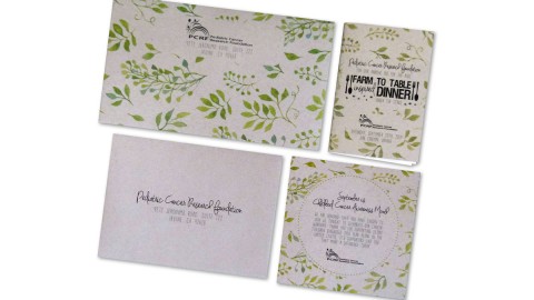
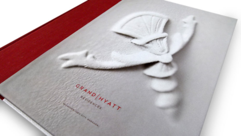
The design was directly inspired by the topic of biomimicry or “design inspired by nature. Just as nature can...
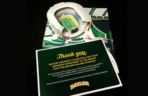
“Our approach was to display, with elegance and clarity, each of the features in a lavishly over-sized format.” In...
The biggest challenge with this project was to successfully communicate information about the featured events for each program and...
The idea came also from the fact that Anne loves these photo booths; she takes photos of herself...
We learned patience! Truly this project had so many stakeholders, thus many, many opinions. Additionally, there were so...
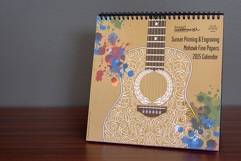
On our fourth annual calendar, we found music legends to be an easy choice. The hard part was narrowing...
We do not look for the fitting medium in the beginning of the production process, but we...
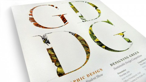
The magazine works as a platform for deepen the creativity and technical knowledge students in the graphic arts...
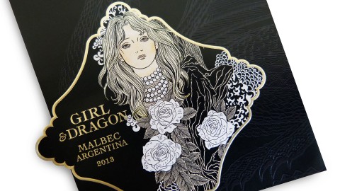
Cult Partners takes us on a “Game of Thrones” like adventure in Gothic-luxe style with this wistful wine label....
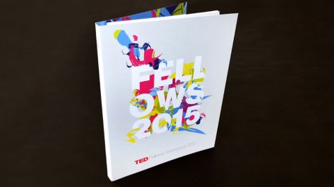
The TED Fellows Program is a global network of “visionaries in their fields who collaborate across disciplines and make...
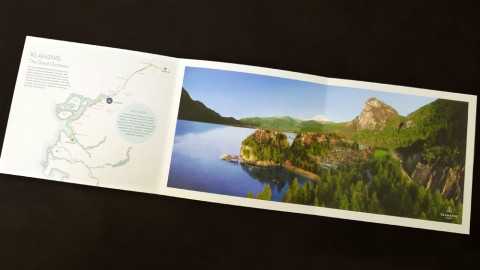
The creative team at EKISTICS shows off their talent for design in this perfectly balanced brochure for Klahanie...
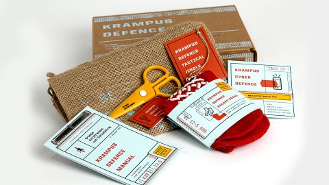
We learned to have fun with the theme and run with it. Plus, hand-assembly always goes good with...
We wanted to create something that people will use after the calendar year is over. Print was the best...
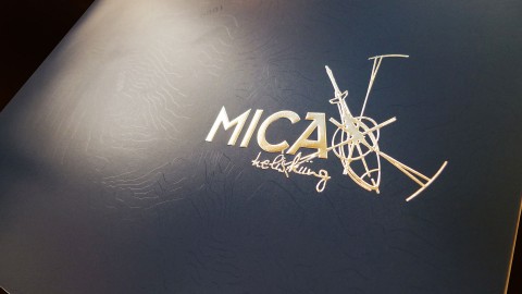
The in-house creative team at Mica Heli captured this breathtaking destination and adventurous skiing experience with such skill that...
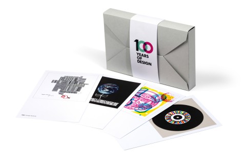
This commemorative collection is a beautiful example of the adage, “Hindsight is 20/20.” To celebrate AIGA’s 100th birthday, designers...
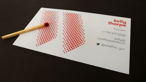
Cossette Communications Inc. created a red-hot business card for client Wildfire Experiential and Events. It’s so hot that if...
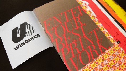
Well, I’m sure Carter Hales Design Lab wasn’t eligible to enter this piece into the 2014 Unisource Canada Design...
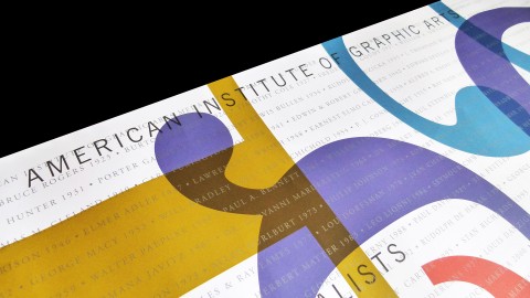
We learned to make sure the ink colors worked in harmony with each other. – Kit Hinrichs This commemorative...
The creation of title and custom lettershapes inspired by and reflecting the original construction elements of each ‘Lilium’...
One of the production highlights is the ticket wallet. It’s the printed product that holds the whole campaign...
The folds which create dimensionality. The larger format which creates an impact. The metallic gold spot color which...
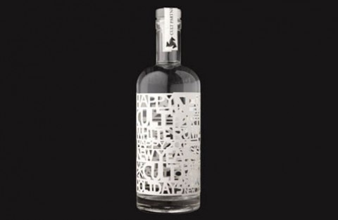
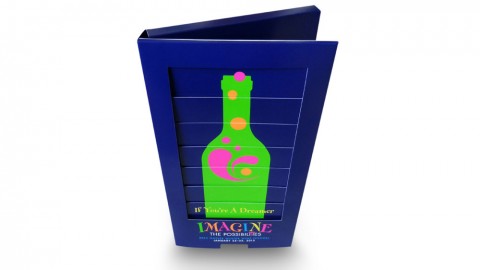
Cult Partners’ year-end promotion is sooo appropriate for their client base. But really, who wouldn’t love 90-proof white...
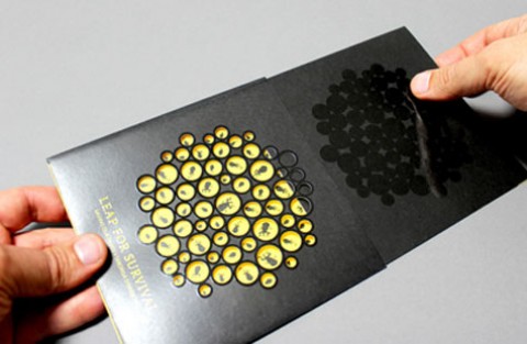
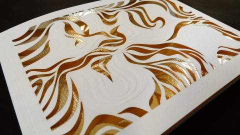
A series of holes were drilled into recycled black card, representing tiny frogs eggs. Each hole had...


Recent Posts
-
 Deep Dive – Creating Truly Swoon-Worthy Invitations
Renowned invitation designer Marc Friedland gave us a peek into his creative process…and his...
-
Weekly Quiz: In Digital Die Cutting, What Does the Actual Cutting?
You know what “Die Cutting” means and you know what “digital” means, but what...
-
‘Harry & Sally’ Brochure With Surprise Inside
How do you promote an NYC neighborhood as having a "small town feel"? You...
-
Weekly Quiz: Is it Male or Female Hemp Plants That are Used For Paper?
One sex brings us CBD extracts and recreational/medicinal cannabis, the other, paper. So which...
-
Metallica ‘Blackened’ American Whiskey Limited Edition Packaging
What's crazier than whiskey made by blasting Metallica tunes at it during the crafting...
