The dramatic curves and contrasts in Kris Sowersby’s beautiful Domaine Sans typeface inspired the ‘type as image’ approach to...
Inspiration
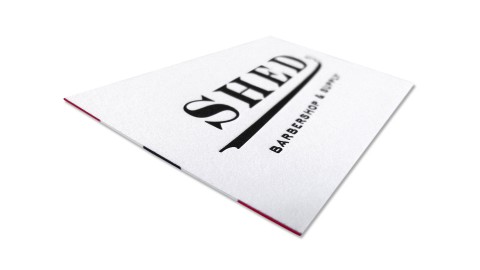
The striped edge painting really brings the piece together and couldn’t be more fitting for a barber. – Brandon...
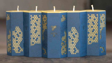
Beeswax production is an incredibly labor-intensive task, both by the bees and our neighbors at Worker B. –...
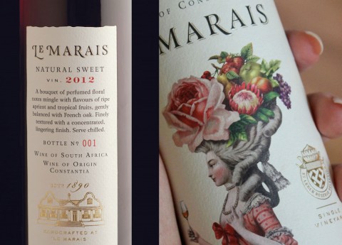
The beautiful illustration is really the hero of this piece. It gives visual clues to the dessert wine’s...
There are not too many things in life that define quality better than fine food (and of course...
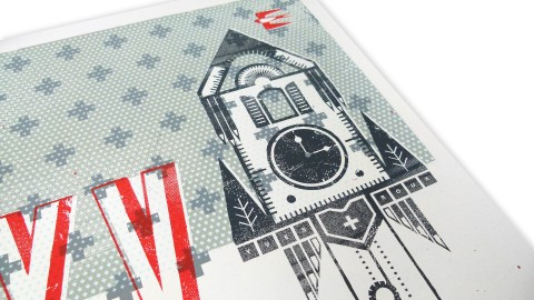
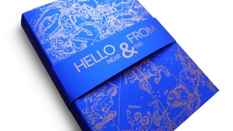
The design highlights of this piece? “Its Swissness. Annnd (hey “Portlandia” fans) we put a bird on it. –...
The ultimate lesson here was that additional steps might be tricky, but they are sometimes necessary to...
Despite the fact that many people actually prefer gift cards to shot-in-the-dark gifts chosen by others, they’re still somehow...
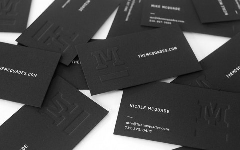
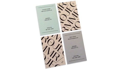
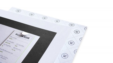
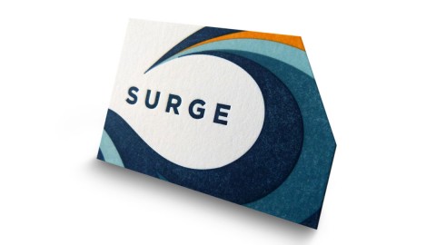
When designing our own business cards we wanted to make sure they were simple enough to stand the test...
Drawing on the brand aesthetics as well as the product’s attributes, I began to work around the concepts of...
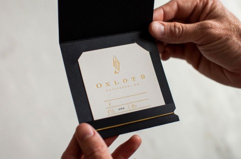
The cards “provided something tactile for the face-to-face meeting of two professionals for the first time that could be...
My favorite part about the piece is how the gold foil, warm gray ink, and blind impression work together...
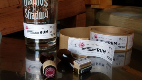
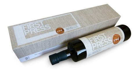
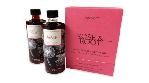
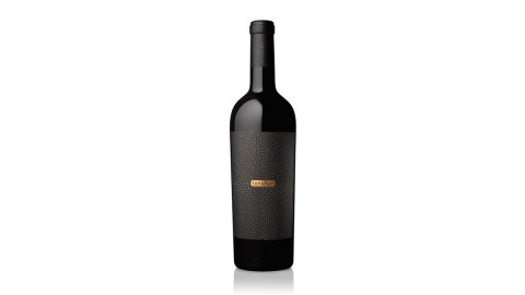
Few industries are as widely known for their creative packaging as the wine and spirits biz. And when you...
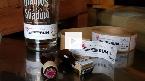
Few industries are as widely known for their creative packaging as the wine and spirits biz. And when you...
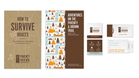
“Most of these print pieces were more than just marketing fluff pieces.” – Suzy Simmons, Co-Creative Director Getting braces...
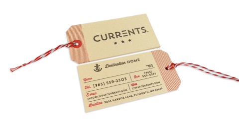
“A website is invaluable in the property management business, but the high quality of the design and the craft...
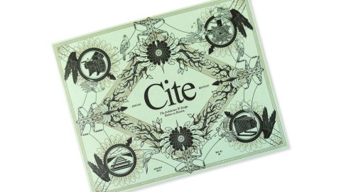
The issue is actually culled from online content on Cite’s blog, Offcite. The online readership drove the...
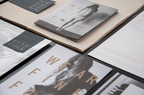
The sophisticated, beautiful look of this branding reminds everyone, ‘We ar Finefolk.’ – Ingred Sidie, Co-Creative Director “There...
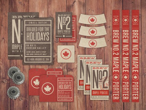
The unique additive of maple syrup inspired the design direction. – Craig Valentino The Brew No. 2 Maple...
Careful file prep and color management allowed us to get great results out of the uncoated paper stock. –...
“Attention to detail and unwavering watchfulness are required to end up with a stack of amazingly printed pieces...
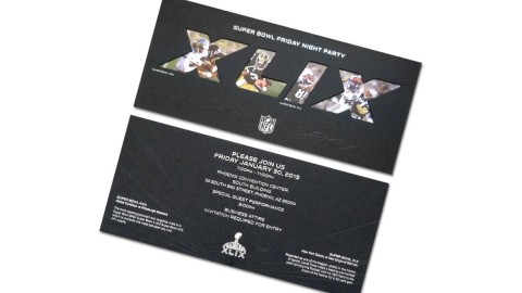
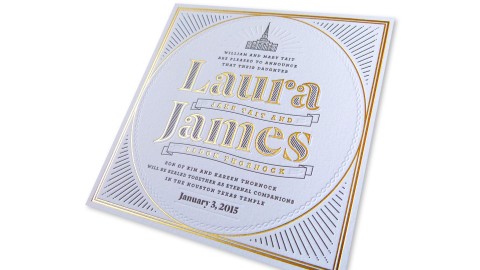
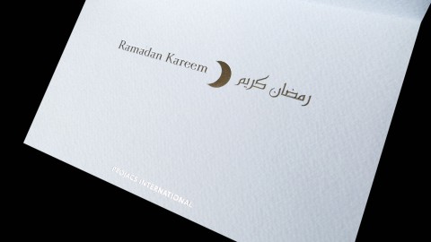
This super thick invitation fits perfectly inside the clear capacity envelope! Our team’s attention to the smallest detail...
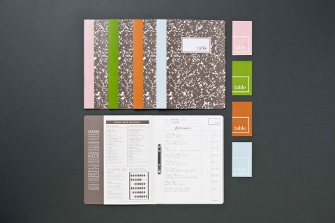
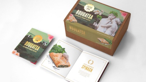
The notebook design was inspired by the restaurant owner’s approach to food and cooking and his experience working...
When you get right down to it, the urge to ban a creative work comes from a deep-seated fear...
Paper captured the grace and spirituality of each holiday (via foil-stamping, diecutting and embossing) while providing the company’s imprint...
We named the brand ZoZoi, meaning “live life” in Greek. The over-the-top design, kitschy gold foil, and Greek-lish...
It takes a certain talent to make the elaborate seem effortless, the complex seem simple. And so it is...
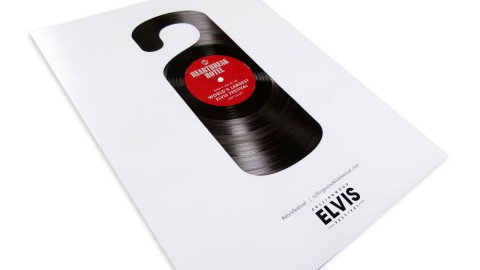
We’re feeling a hunk of burning love for these Elvis posters. Digitally printed for the Collingwood Elvis Festival, the...
We collected 23 different postcards from around the world. When all 23 come together, it creates an amazing...
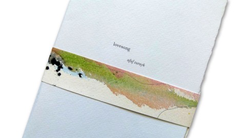
“The precious and secretive nature of love and loving, as described by the author in her poems, is reflected...


Recent Posts
-
 Deep Dive – Creating Truly Swoon-Worthy Invitations
Renowned invitation designer Marc Friedland gave us a peek into his creative process…and his...
-
Weekly Quiz: In Digital Die Cutting, What Does the Actual Cutting?
You know what “Die Cutting” means and you know what “digital” means, but what...
-
‘Harry & Sally’ Brochure With Surprise Inside
How do you promote an NYC neighborhood as having a "small town feel"? You...
-
Weekly Quiz: Is it Male or Female Hemp Plants That are Used For Paper?
One sex brings us CBD extracts and recreational/medicinal cannabis, the other, paper. So which...
-
Metallica ‘Blackened’ American Whiskey Limited Edition Packaging
What's crazier than whiskey made by blasting Metallica tunes at it during the crafting...
