“Most of these print pieces were more than just marketing fluff pieces.”
– Suzy Simmons, Co-Creative Director
Getting braces when you’re young makes a difficult time that much more so. But as this identity for Oregon’s Paventy & Brown Orthodontics demonstrates, the difference between an ordeal and an adventure occasionally comes down to branding.
Drawing on the state’s renowned outdoorsy nature, Test Monki crafted an entire brand experience that transforms getting braces from a pain in the posterior into a glamorous challenge to overcome.
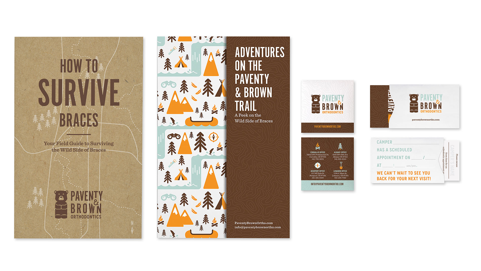
To begin, the designers came up with a Twin Peaks-esque logo and color scheme to unite every piece. “The bear looks like it was plucked off the top of a totem pole and is the ‘pillar’ for the brand,” Simmons explains. “The color choices were picked to invoke a warm and cuddly (yet masculine) feel.”
This look, along with a theme that evokes the famed “Oregon Trail,” was applied to absolutely everything, much of it expertly printed by Admore on Millcraft Delta Silk paper, including:
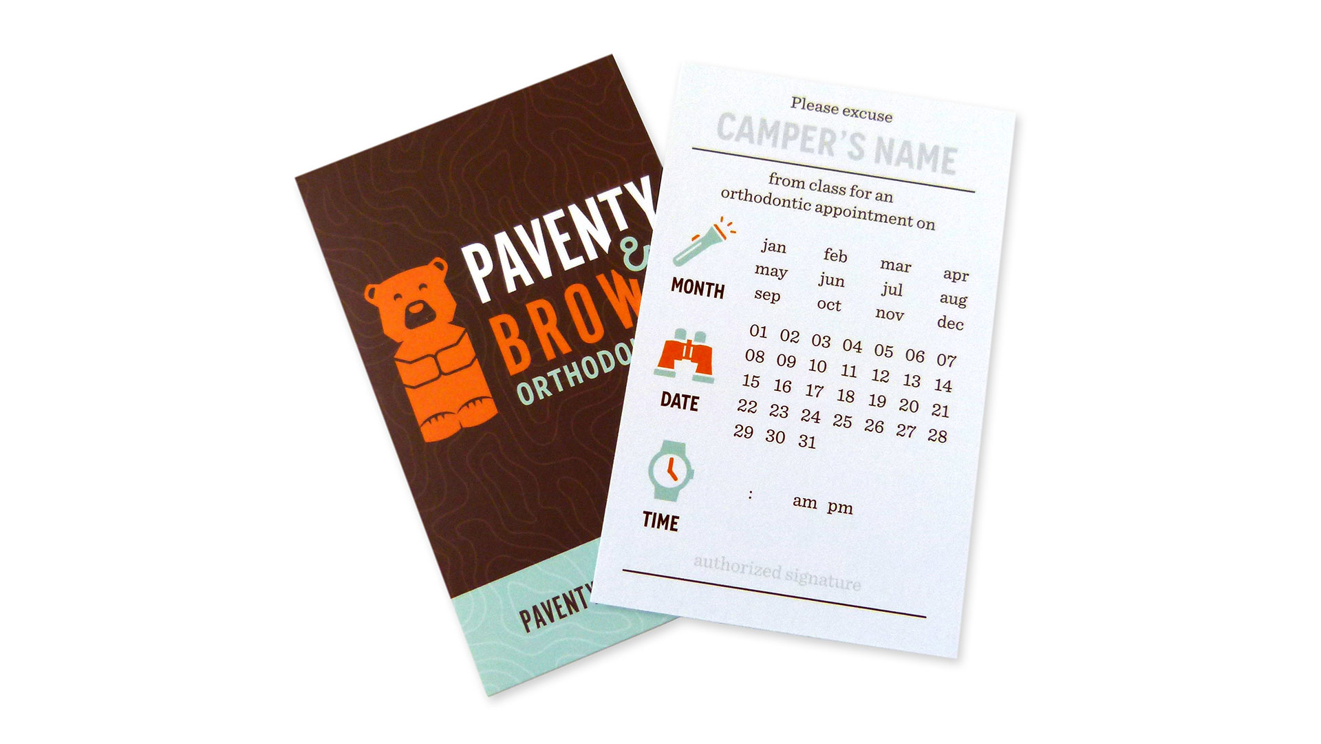
- Next appointment card reminder envelopes, which contain a “Please excuse my child” card that can be filled out and given to teachers
- Postcards that show the practices’ locations on the back in the form of a wilderness travel map
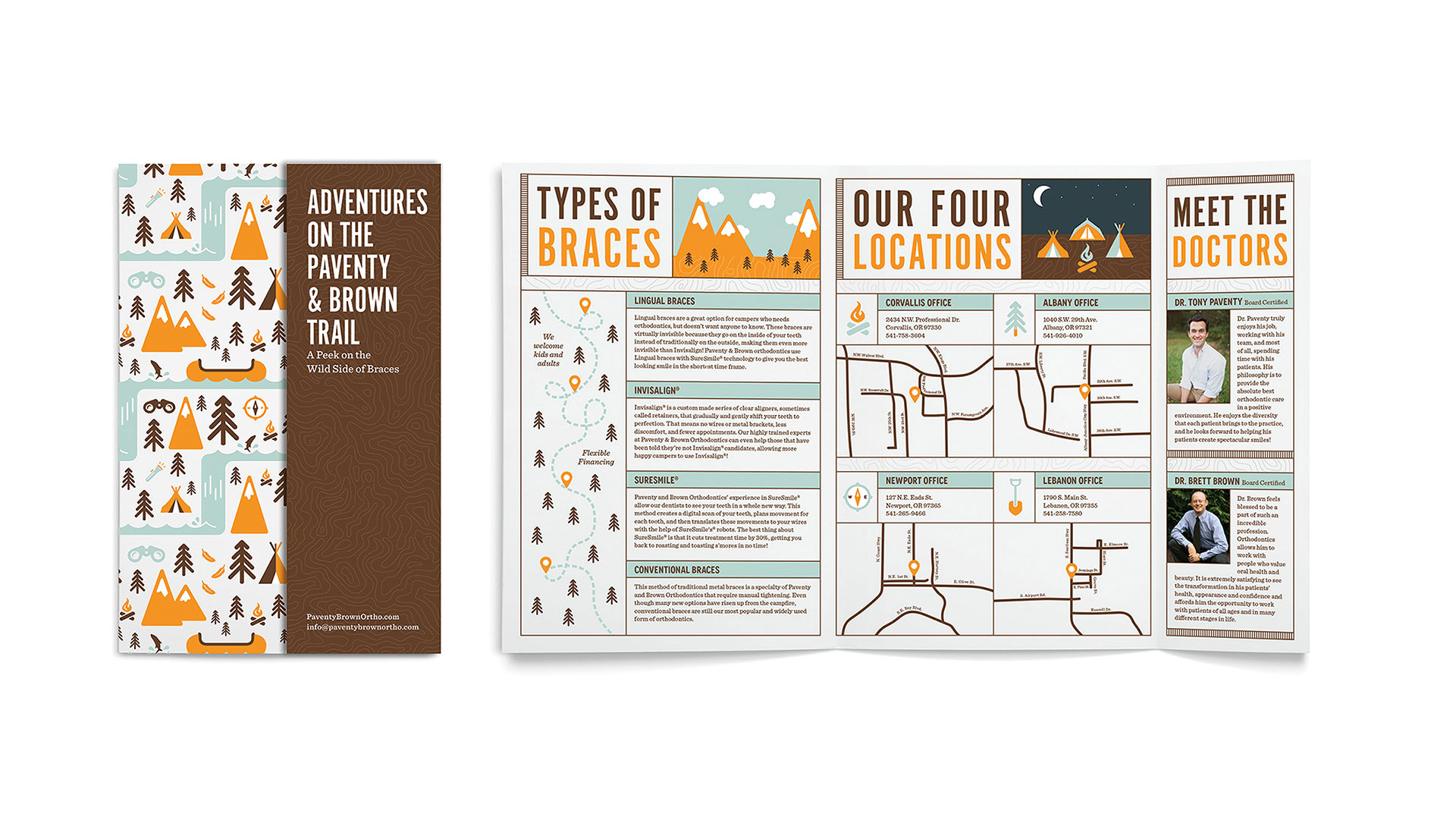
- A brochure aptly called “Adventures on the Paventy & Brown Trail,” featuring a short cover – a great and inexpensive way to add some extra oomph to a printed piece.
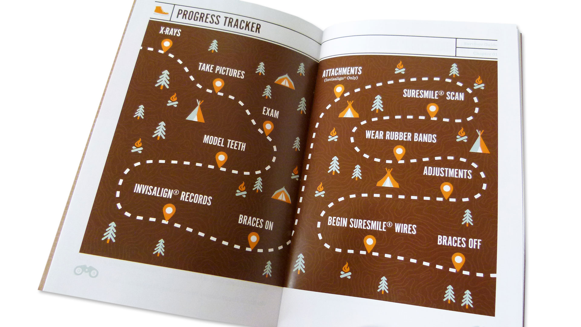
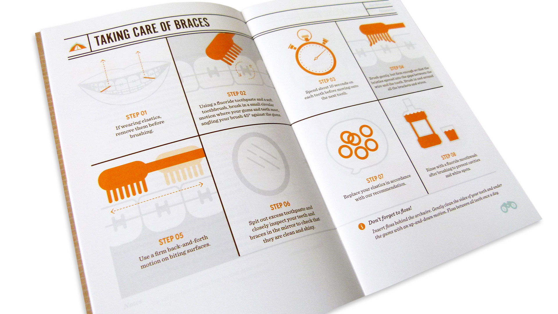
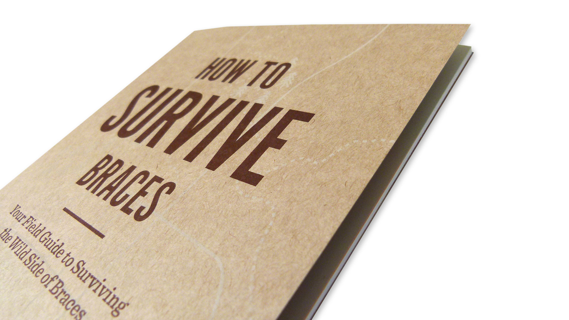
Perhaps most impressive is a 36-page guide called “How to Survive Braces,” the cover printed on Mohawk Loop Antique Vellum Jute 80 lb. Cover, which answers the most pressing questions, from which foods to avoid to how best to clean your new grillwork. (This survival theme comes full circle with the awarding of an “I Survived Braces” T-shirt at the end of the whole experience.)
All of which makes us wish there had been a Paventy & Brown around when we were kids. This whimsical approach just might have made the whole orthodontic ordeal BEARable.