[youtube=http://www.youtube.com/watch?v=lSdD1ORQA4g]
We do not look for the fitting medium in the beginning of the production process, but we create our forms organically with the content and our communication goal.
– Philipp N. Hertel, Co-Designer
The design team at Zeppelin University created a shining example of how to bring a concept to life. Their theme is a lofty one: Bridging the distance between people through education, bridging the gap between a student’s present and her future, and bridging the academic disciplines within the university.
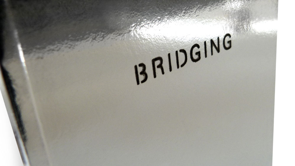
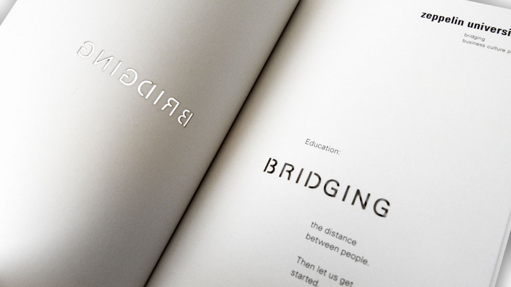
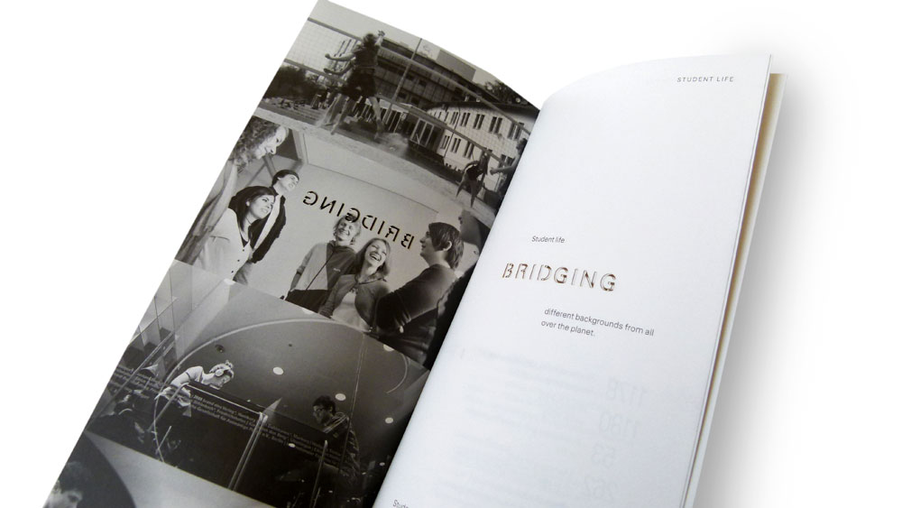
One amazing element creates a passageway through every page of the brochure: a laser diecut of the word “bridging.” Right-hand pages are right reading, and left-hand pages read backward of course, but even this serves to visually connect the span of the spreads.
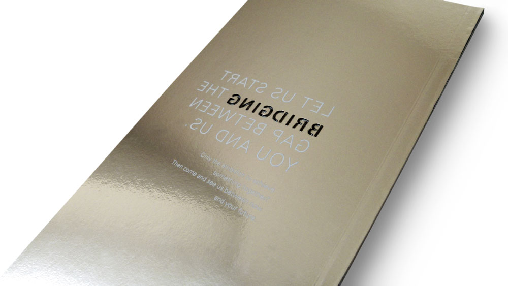
The halftones have a nostalgic quality printed on the creamy surface of the KardaPat 13 Klassica paper. Its silky, matte-coated finish not only feels wonderful as you thumb through the text pages, but also pairs perfectly with the mirrored exterior of the covers. (A heavier weight of the KardaPat Klassica is finished with PET silver foil.)
As in all well-designed pieces, these designers left nothing to chance: a transparent PET glossy foil was put over the silver foil to keep it from fingerprinting, the size of the brochure fits great in your hands and your pocket, and the subtle use of UV white ink on the back cover is a clever surprise.
Love this piece?
Like it and share with your friends below.

