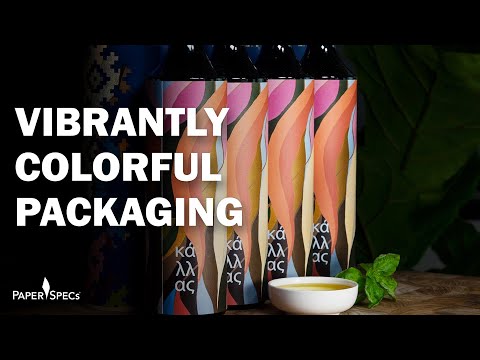
The Kállas family, which owns Vancouver’s Metropolitan Fine Printers (MET) [projects / website], often looks to their proud Greek heritage for inspiration when it comes to creating their annual client gifts. For years that’s taken the form of olive oil derived from Greek orchards that have been in their family for more than a century.
In the packaging for their most recent batch of “First Press” olive oil, they’ve combined handmade touches that emphasize this Old-World focus on quality and craftsmanship, with modern printing techniques.
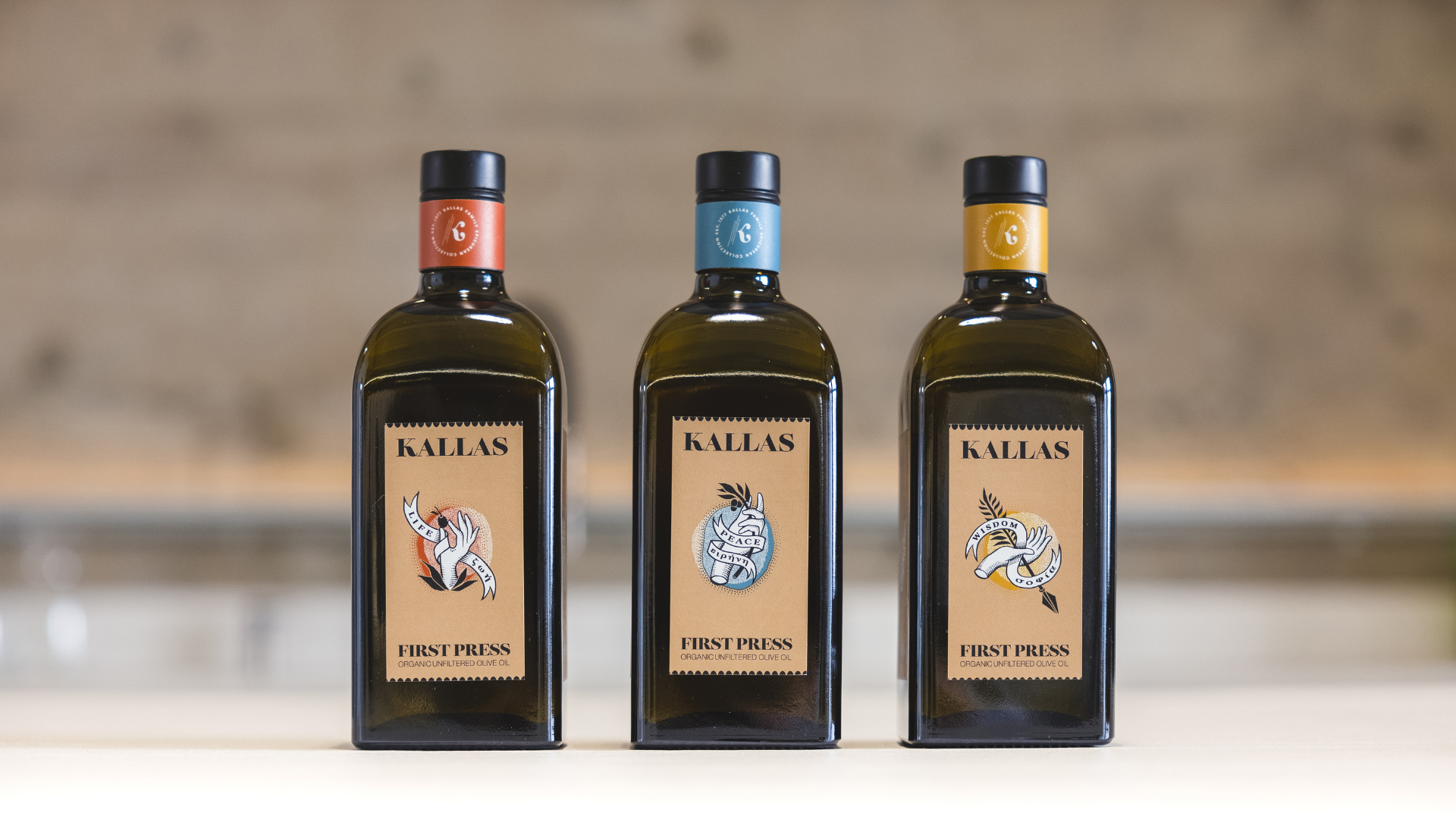
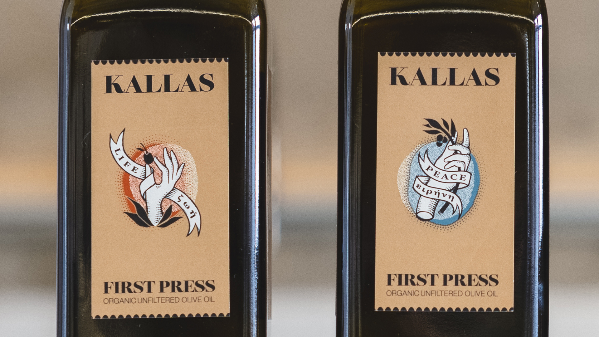
Working closely with artist Ben Didier to come up with illustrations that capture the importance of olive oil in Greek culture, Letterbox Design [projects / website] decided on 3 different label types, each focused on the concepts of “Peace,” “Life” and “Wisdom,” respectively.
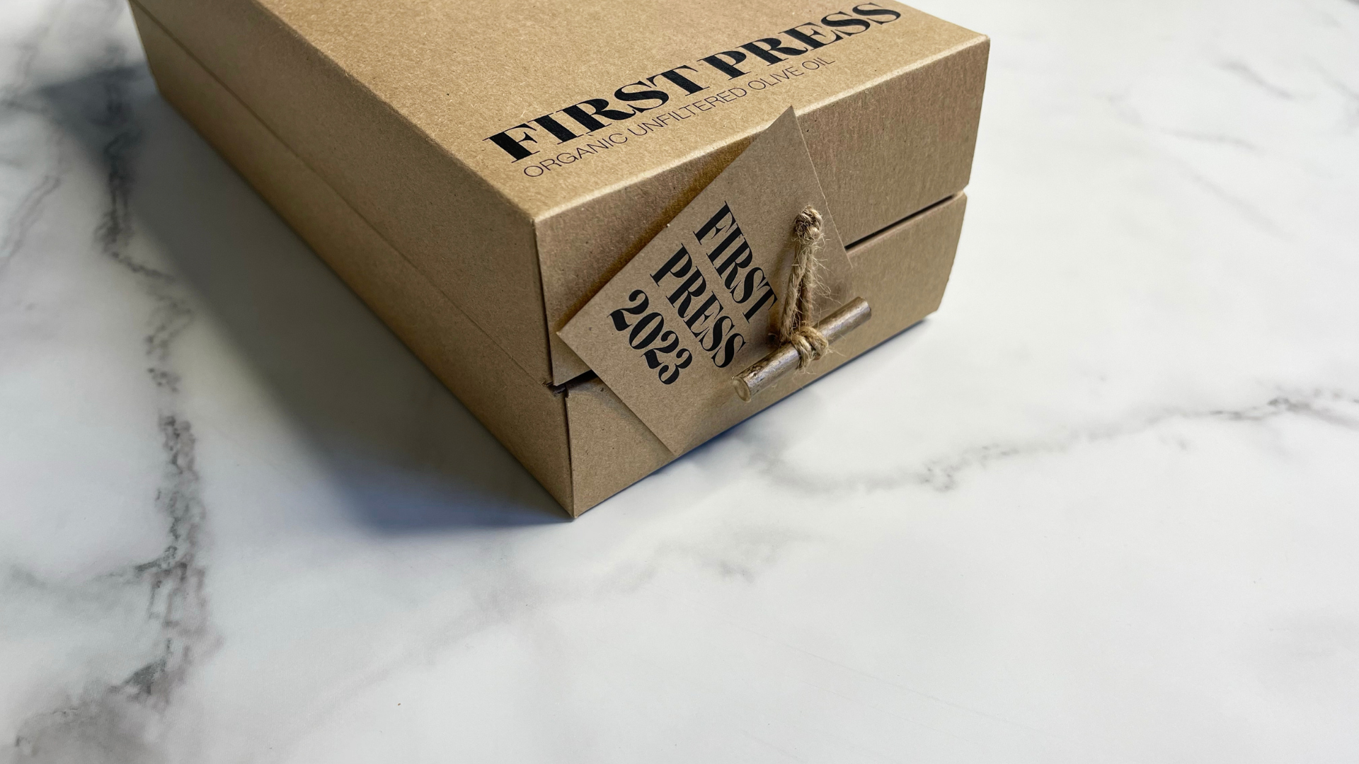
Each bottle arrived nestled inside a package made from 18 pt. chipboard, with one of the 3 illustrations offset printed CMYK + Opaque White Ink on the outer lid to match the bottle label inside. Holding the packaging shut is a twine closure neatly secured by a tab made from an olive-tree branch. This not only ties into the olive oil motif, but it also emphasizes the natural, sustainable materials used in the packaging. The hangtag that dangles from the twine closure was also offset printed and hand addressed to each recipient, reinforcing the personal feel of the gift.
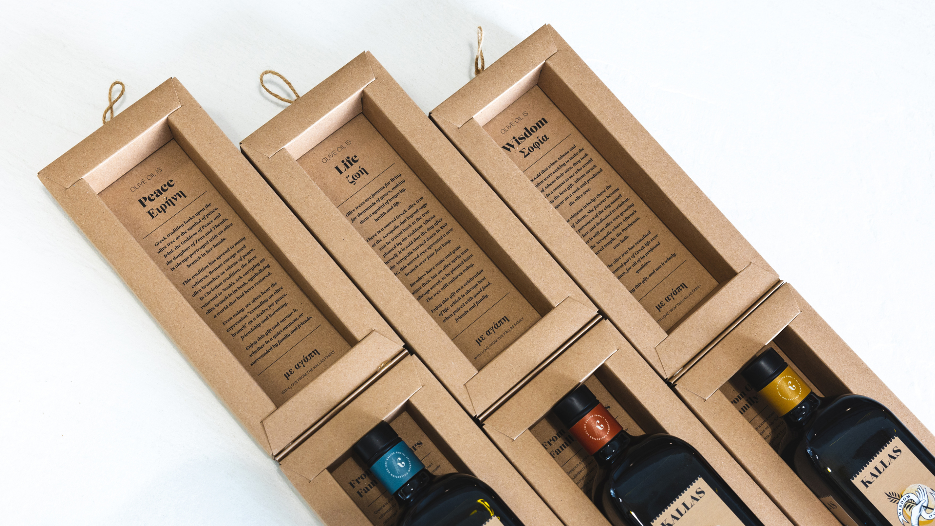
Lifting the lid presents an exciting unveiling experience. It reveals a history of olive oil offset printed on the inner lid as it relates to whichever “Peace,” “Life” or “Wisdom” concept appears on the outside of the package and the label inside. The olive oil bottle itself lays snuggly inside an inner grotto; removing it reveals a “from our family to yours” message offset printed inside the package.
My favorite part, because I like a clever twist, is the actual label, which is digitally printed CMYK on 60 lb. uncoated Spicers Pacesetter label paper.
What at first glance looks like perforated edges are actually tiny half-circles printed in a bottle-matching color along the top and bottom of the label. As this saves on the costs of die cutting a real perforation pattern, it’s a clever modern touch to say the least.
This pairing of centuries old Greek traditions with both digital printing and handwritten hangtags, all makes for a delicious blend of old and new.


