[youtube=http://www.youtube.com/watch?v=p2kzPWcfTd0]
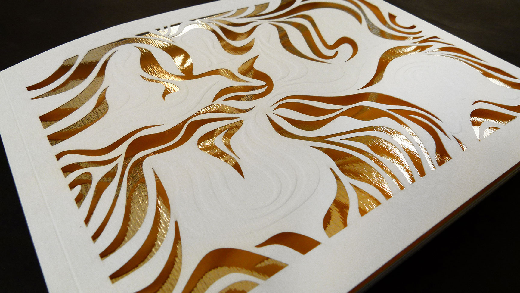
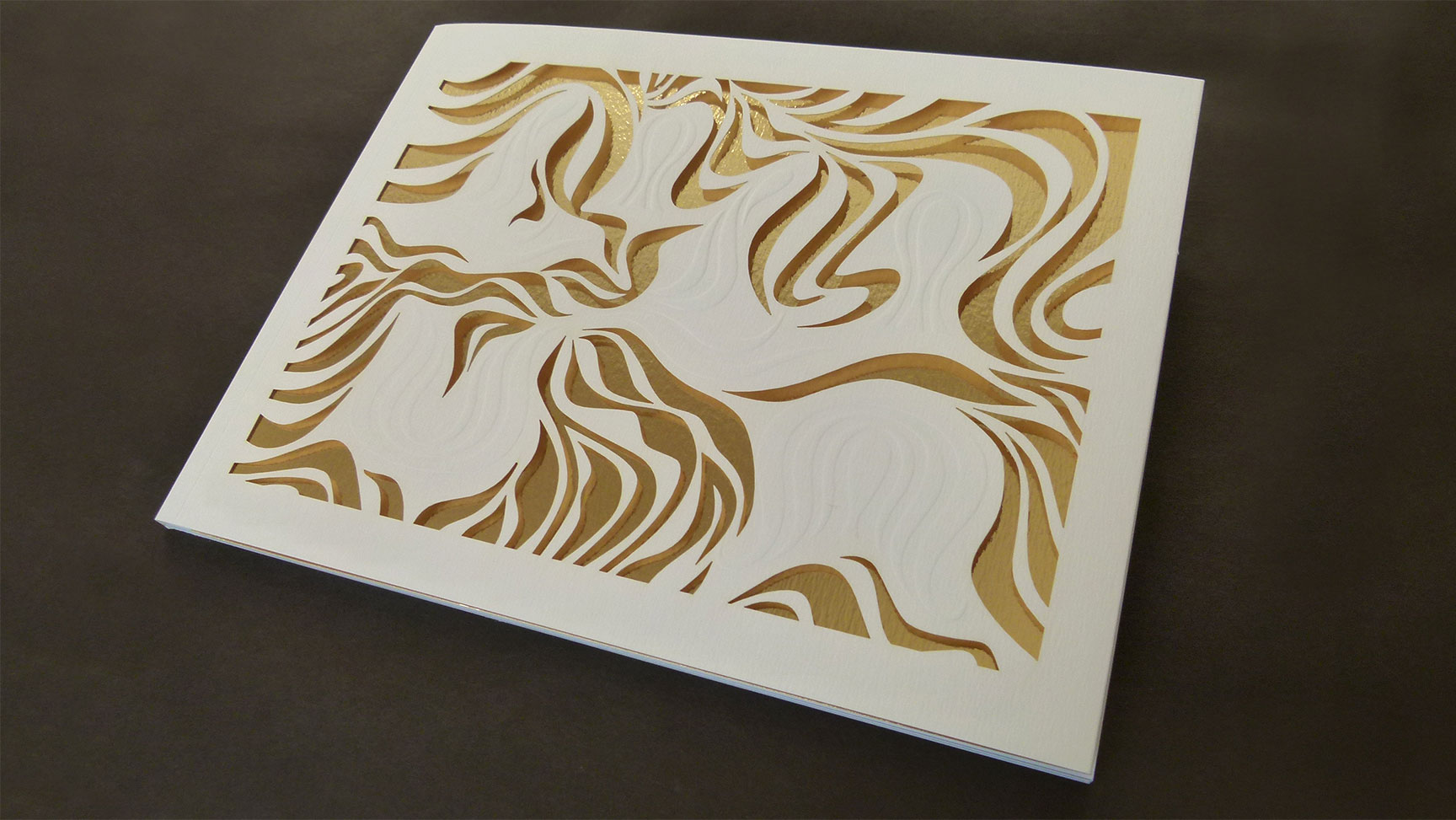
The creation of title and custom lettershapes inspired by and reflecting the original construction elements of each ‘Lilium’ piece. The introduction and usage of a combination of finishes such as embossing, lasercut and goldfoil in a specific sequence and manner to achieve a unique and memorable result.
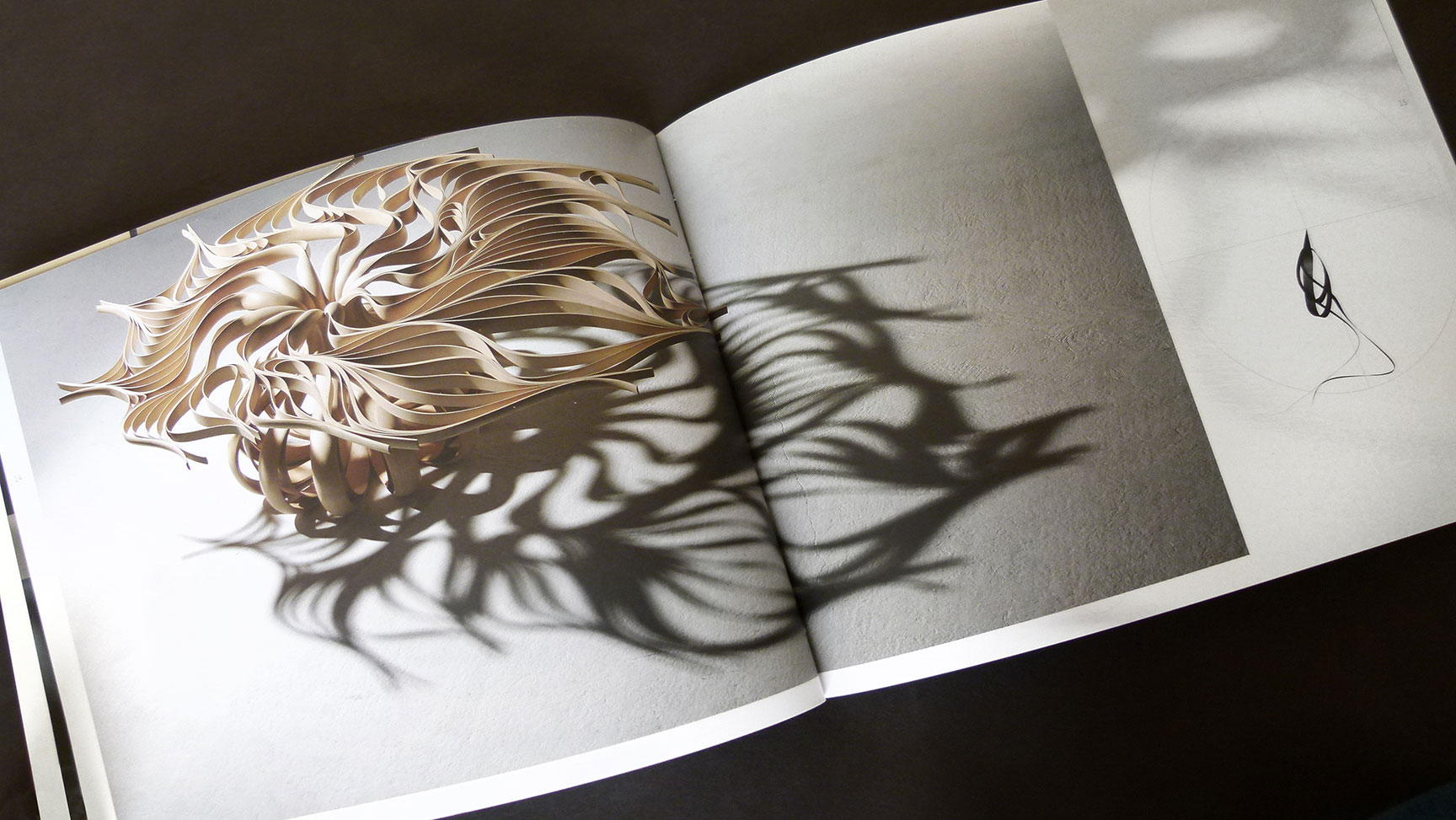
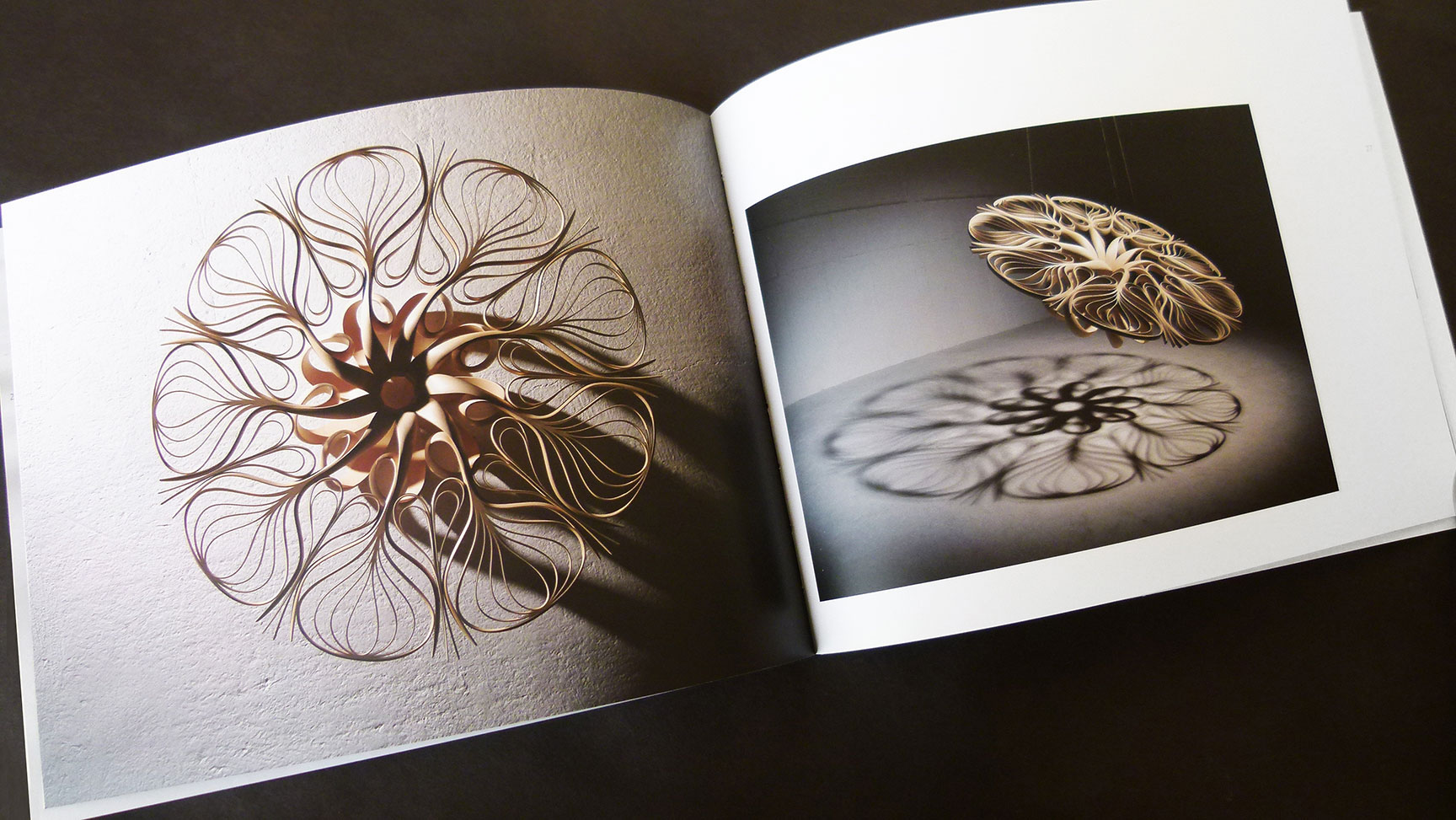
The usage of photography, format, composition and layout on double page spreads.
Underlying typographic grid structure using Fibonacci ratios to emulate construction methods and principles of the Lilium pieces.
– Christian Kunnert
Designing an exhibition catalogue is no easy task. It must convey a true understanding of the artist’s work while expressing its own visual form in a compelling but complementary way. The team at Kunnert & Tierney shows their mastery at every design level in this spectacular book for the Joseph Walsh show “Lilium.”
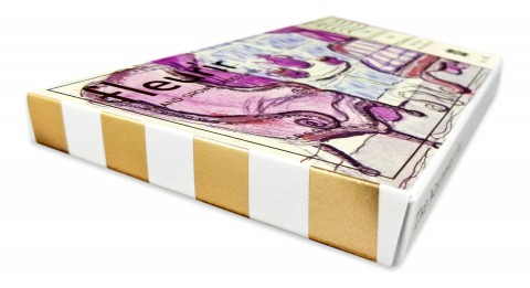
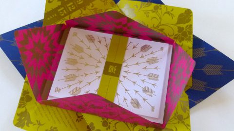
Embossed and lasercut organic shapes play against a gold foilstamped and fold-in front cover. While beautiful in its own right, the design and execution also echo the play of light and shadow central to the artist’s sculptures.
Paperlinx’s Velvet finish on the text pages is a good tactile contrast to the uncoated Rives Traditional Cover and allows the amazing photography to shine. The designer used Fibonacci ratios in the underlying typographic grid structure of the catalogue to emulate construction methods and principles of the Lilium pieces.
As a whole, the uniqueness, intricacy, accuracy and attention to detail that are characteristics of Joseph Walsh’s work are amply reflected in this stunning printed piece.
Love this piece?
Like it and share with your friends below.

