The magazine works as a platform for deepen[ing] the creativity and technical knowledge [of] students in the graphic arts field.
– Miguel Sanches
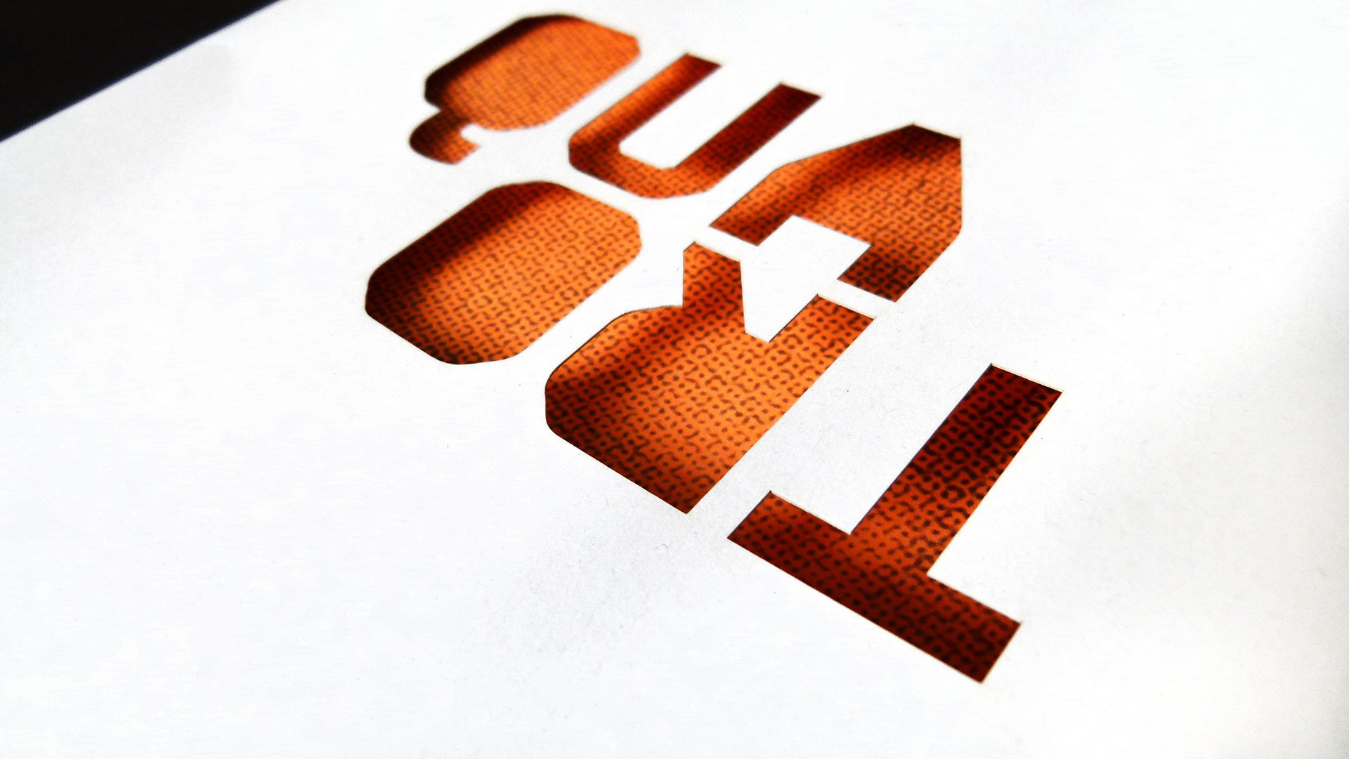
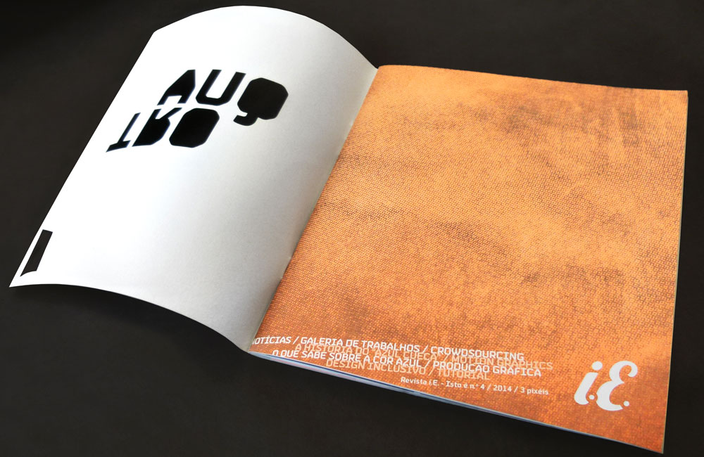
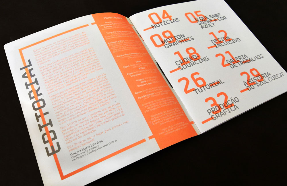
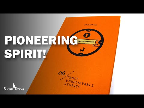
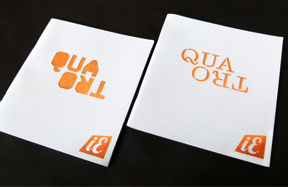
Let this be a lesson to you. It certainly was for the design and graphic art students at the Polytechnic Institute of Tomar. I’d say they passed with flying neon colors (Pantone 805U to be exact). The visual energy of the neon orange is nicely offset by with a restful blue.
And if I were to grade their paper (uncoated 100% recycled Portuguese Renovaprint), it would be A+ for its toothy texture and nice ink holdout on the photographs. The word quatro (fourth edition) is done as a diecut on the front cover. Breaking title in half and turning the second syllable into a mirror image turns a straightforward diecut treatment into an interesting shape.
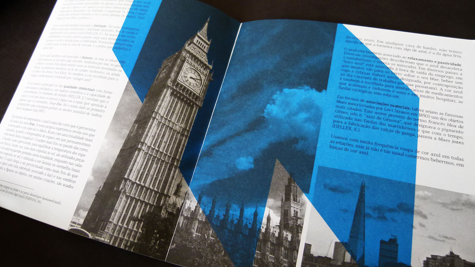
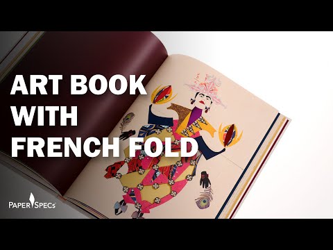
Text pages were organized via layering of text and color blocks. A mix of font choices and color overprinting gave the magazine a fun and upbeat retro feel.