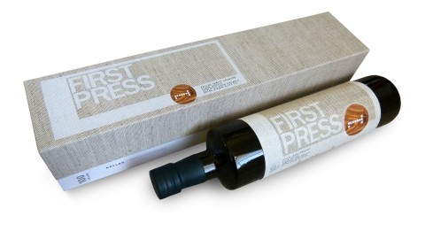
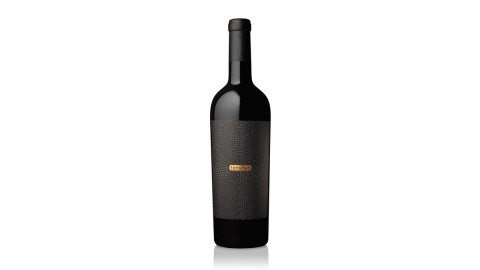
I never compromised. It was hard to find the exact bottles in a low quantity. It was even harder...
Paper Inspiration
One surefire way to get clients excited about print? Round them up, ply them with generous lashings of whiskey,...
Leaving a well-designed physical artifact behind more often than not still makes a bigger impression (maybe even more these...
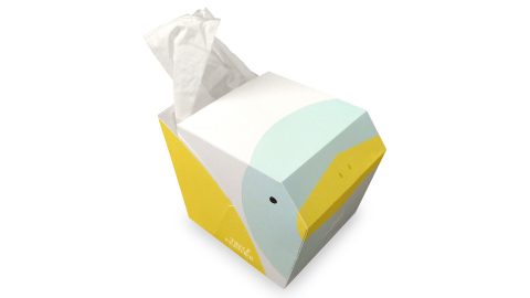
Snuffling our way through cold season, many of us are probably perfectly primed to appreciate Tiny Feather, a tissue...
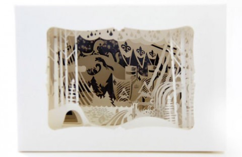
Once upon a time, a most amazing shadow box arrived at the doors to our kingdom. It came from...
I love that the lyrics are represented on each card (which was quite a feat given the size), and...
The design is complex and intricate, which can be hard to pull off, but when it works it’s bound...
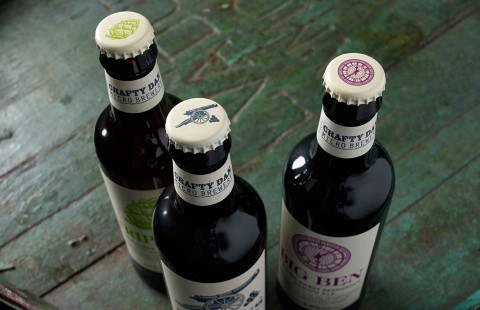
It’s nice to be taking the Americans on at their own game and reclaiming our brewing heritage. – Myles...
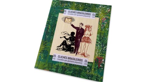
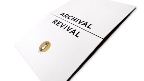
What better way to employ letterpress clichés than through their original medium? – Gustavo Piqueira, Designer Occasionally a book...
A beautiful printed piece was the logical choice; we wanted to produce something that people would hang on to,...
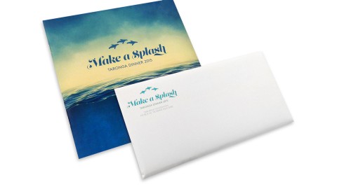
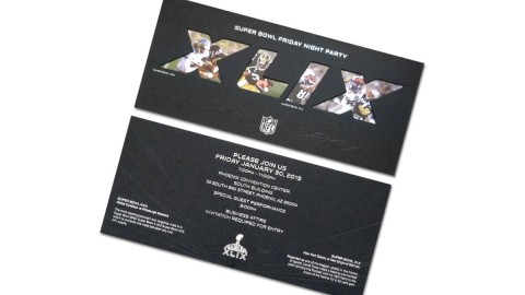
It’s rare to receive an invitation in the mail these days – our invites for Taronga Zoo have become...
We sought to find a visual language that could embody the unique traces of his art. – Gustavo Pique,...
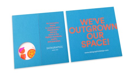
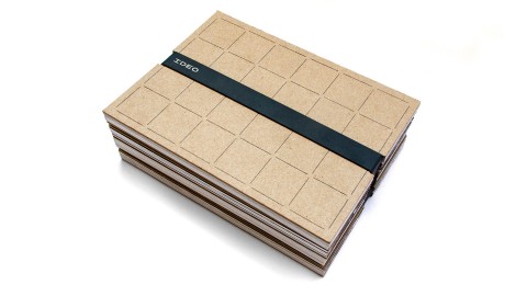
When the time arose for 82-year-old printing company DataGraphic to move to larger digs, they teamed with designers Claudia...
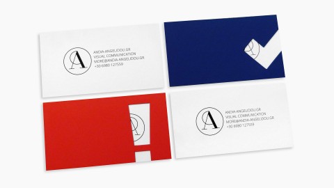
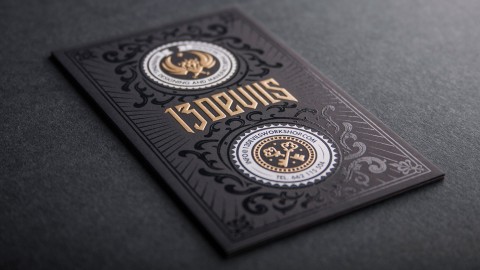
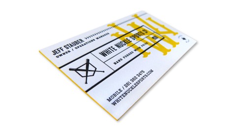
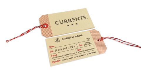
When a business card flirts with your fingertips long after you’ve stopped looking at it, you know you’re on...

The variety of the mailing set does not only present facts about the LoftCube, but also transports the guest’s...
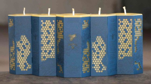
Beeswax production is an incredibly labor-intensive task, both by the bees and our neighbors at Worker B. – Todd...
There are not too many things in life that define quality better than fine food (and of course fine...
The ultimate lesson here was that additional steps might be tricky, but they are sometimes necessary to achieve the...
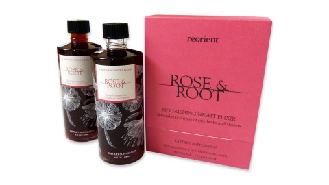
Drawing on the brand aesthetics as well as the product’s attributes, I began to work around the concepts of...
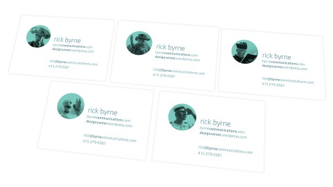
The cards “provided something tactile for the face-to-face meeting of two professionals for the first time that could be...
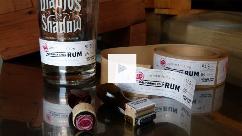
Cult Partners and Sutherland Distilling Co.’s discuss the achievement of the Diablo’s Shadow packaging in this video from our...
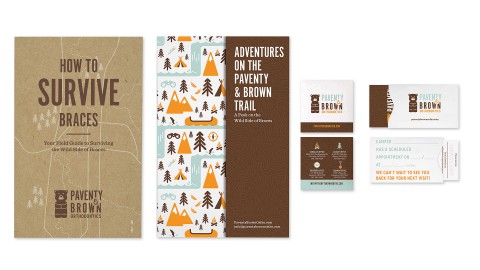
“Most of these print pieces were more than just marketing fluff pieces.” – Suzy Simmons, Co-Creative Director Getting braces...
“A website is invaluable in the property management business, but the high quality of the design and the craft...
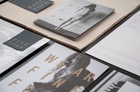
The sophisticated, beautiful look of this branding reminds everyone, ‘We ar Finefolk.’ – Ingred Sidie, Co-Creative Director “There...
Careful file prep and color management allowed us to get great results out of the uncoated paper stock. –...
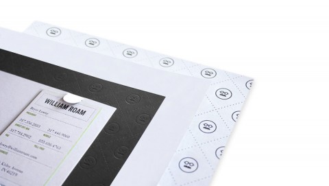
This super thick invitation fits perfectly inside the clear capacity envelope! Our team’s attention to the smallest detail is...
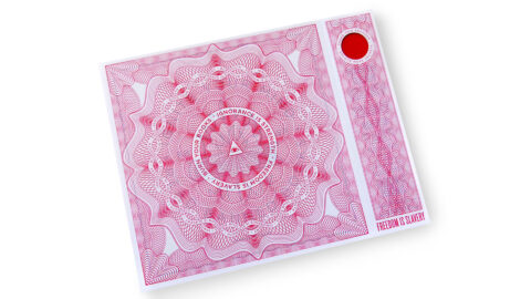
When you get right down to it, the urge to ban a creative work comes from a deep-seated fear...
It takes a certain talent to make the elaborate seem effortless, the complex seem simple. And so it is...
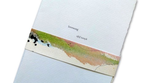
“The precious and secretive nature of love and loving, as described by the author in her poems, is reflected...


Recent Posts
-
 PaperSpecs [unboxed] – September 10, 2026
Special Guests: Jim & Rebecca Sutherland Kick off the fall with this one-of-a-kind ‘mini...
-
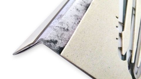
3 Ways to Afford Edge Finishing
Nothing makes a book, invitation or business card grab a recipient’s attention quite like...
-
What Gives an NFC Print Piece a ‘Longer Life’?
This technology can turn a printed item into a direct connection with your audience....
-
What Turns Metallic Ink Into a Highlight?
Two print pieces can use the same silver or gold ink and still feel...
-
‘The Flapper’ Interactive Direct Mailer
Enter to win 1 of 125 copies of ‘The Flapper’ Interactive Direct Mailer right...