I never compromised. It was hard to find the exact bottles in a low quantity. It was even harder to find someone to print directly on the glass to produce a no-label effect. But beyond that, I believe the story and the connection of the history of the four spirits makes this piece especially personal and functional.
– Anna Addison, Founder & Creative Director
It’s not often you come across a self-promotion piece that makes you contemplate the world, its people, and the role alcohol has played in helping the one cope with the other. But then it’s not often you encounter something quite like The Clear Line package from Dutch branding & packaging studio Mad Consort.
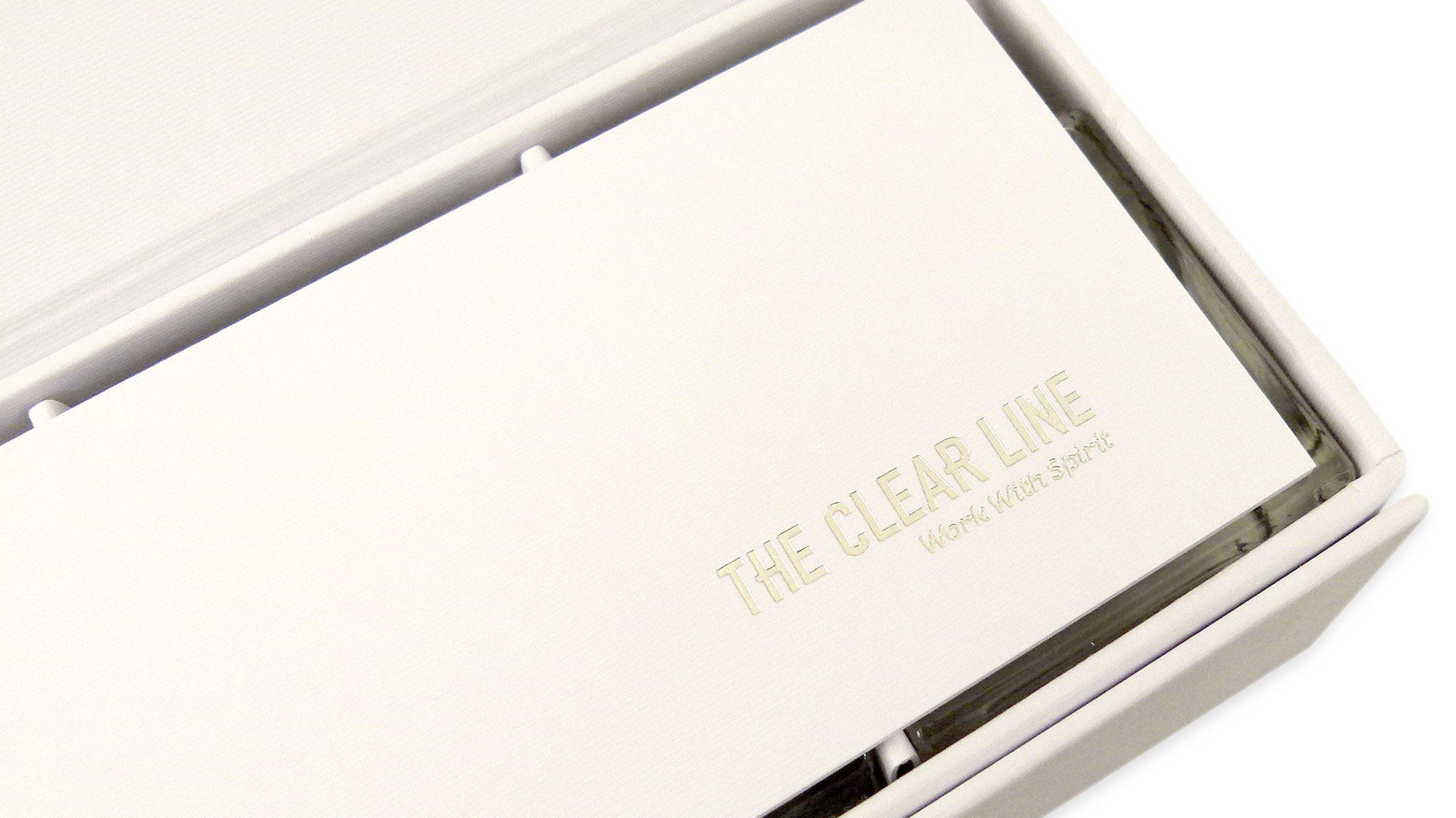
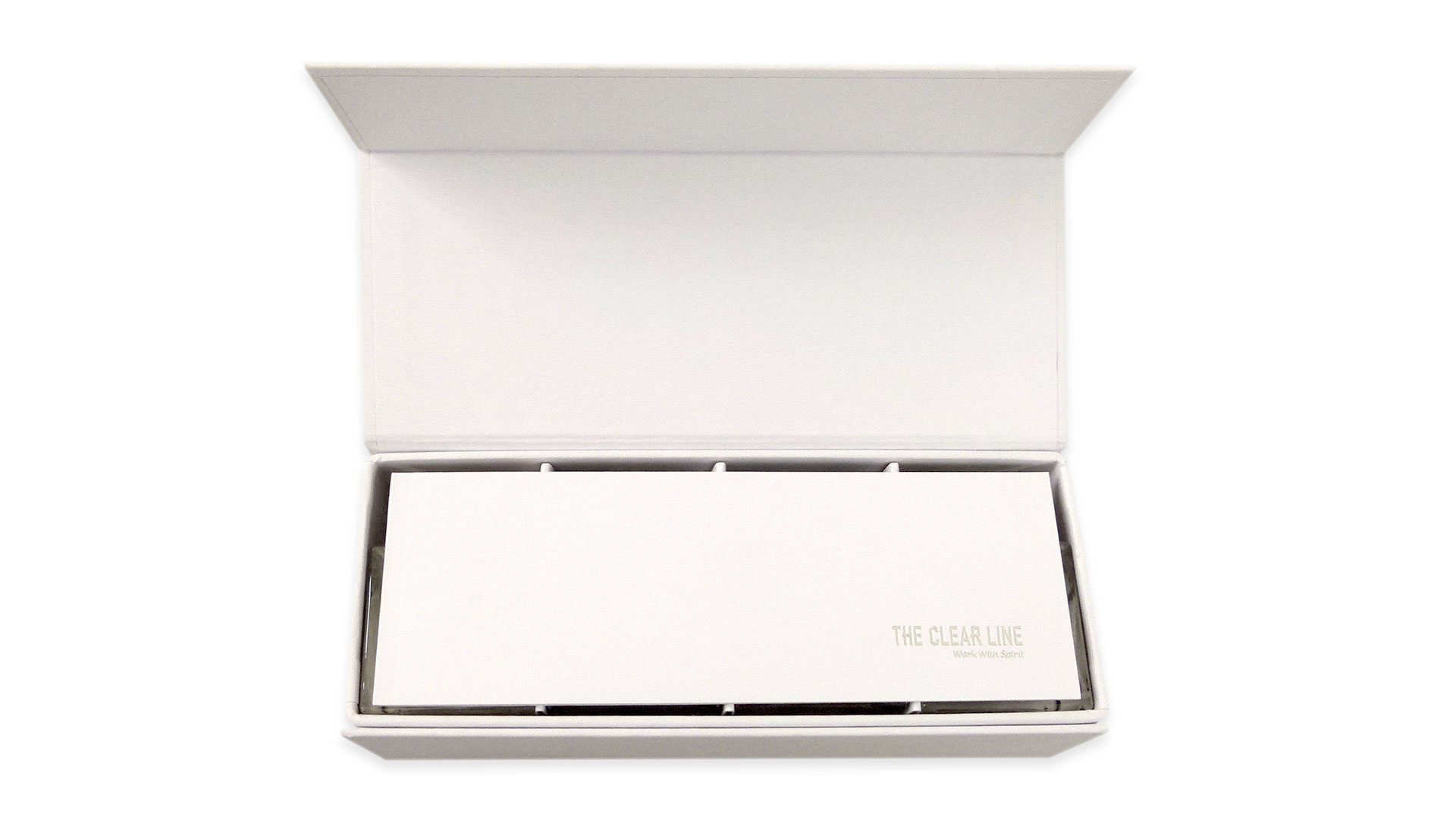
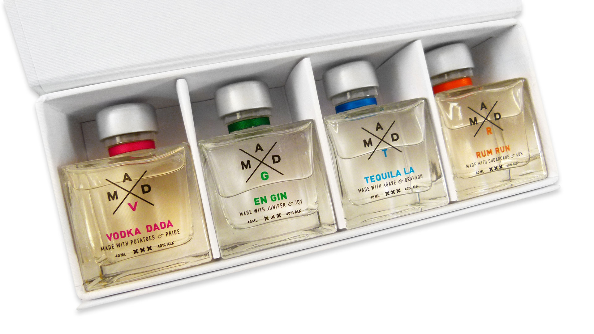
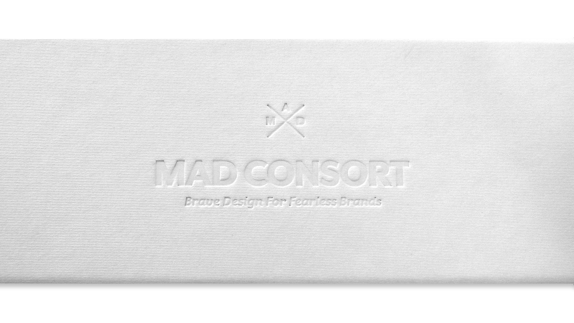
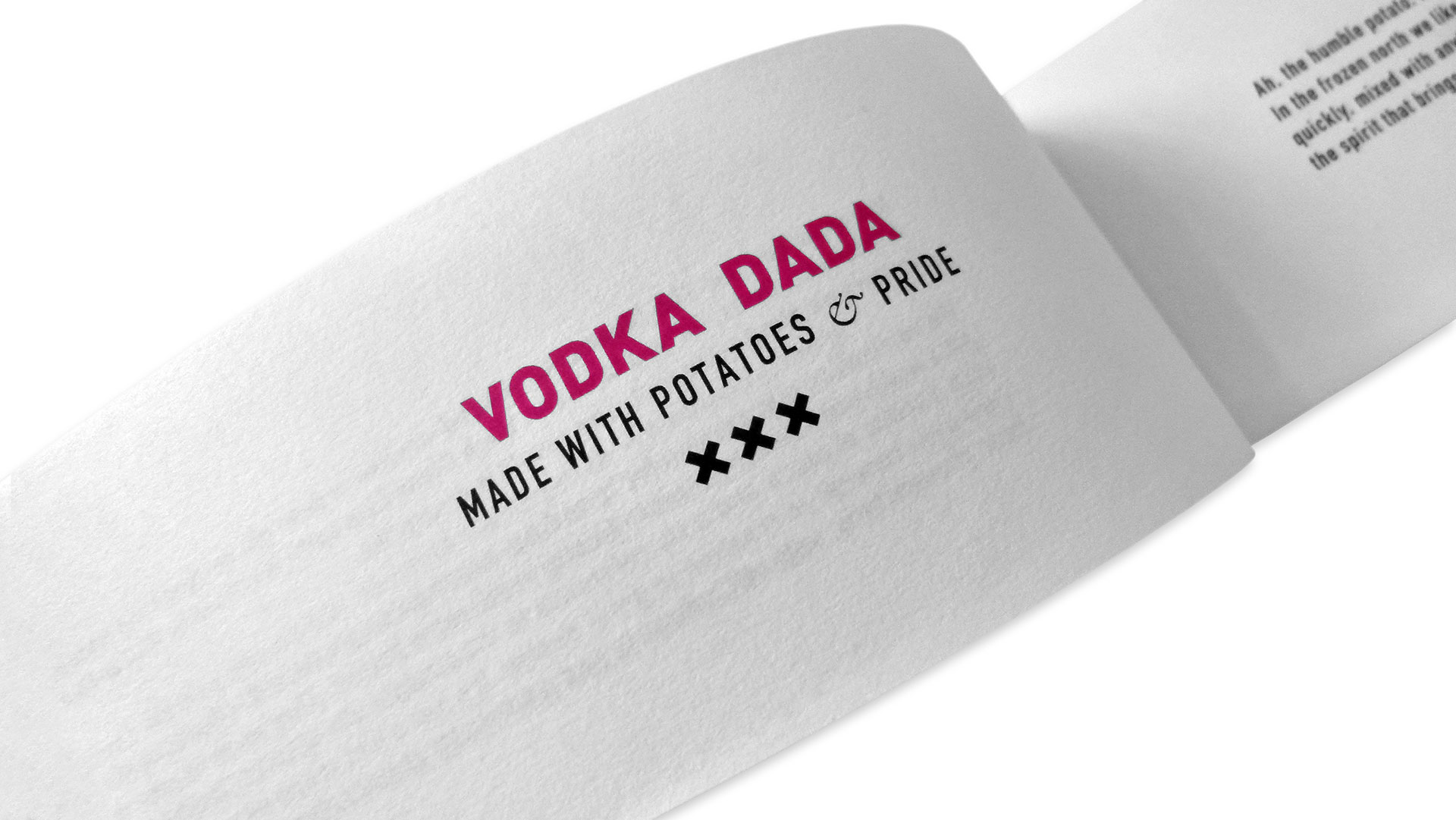
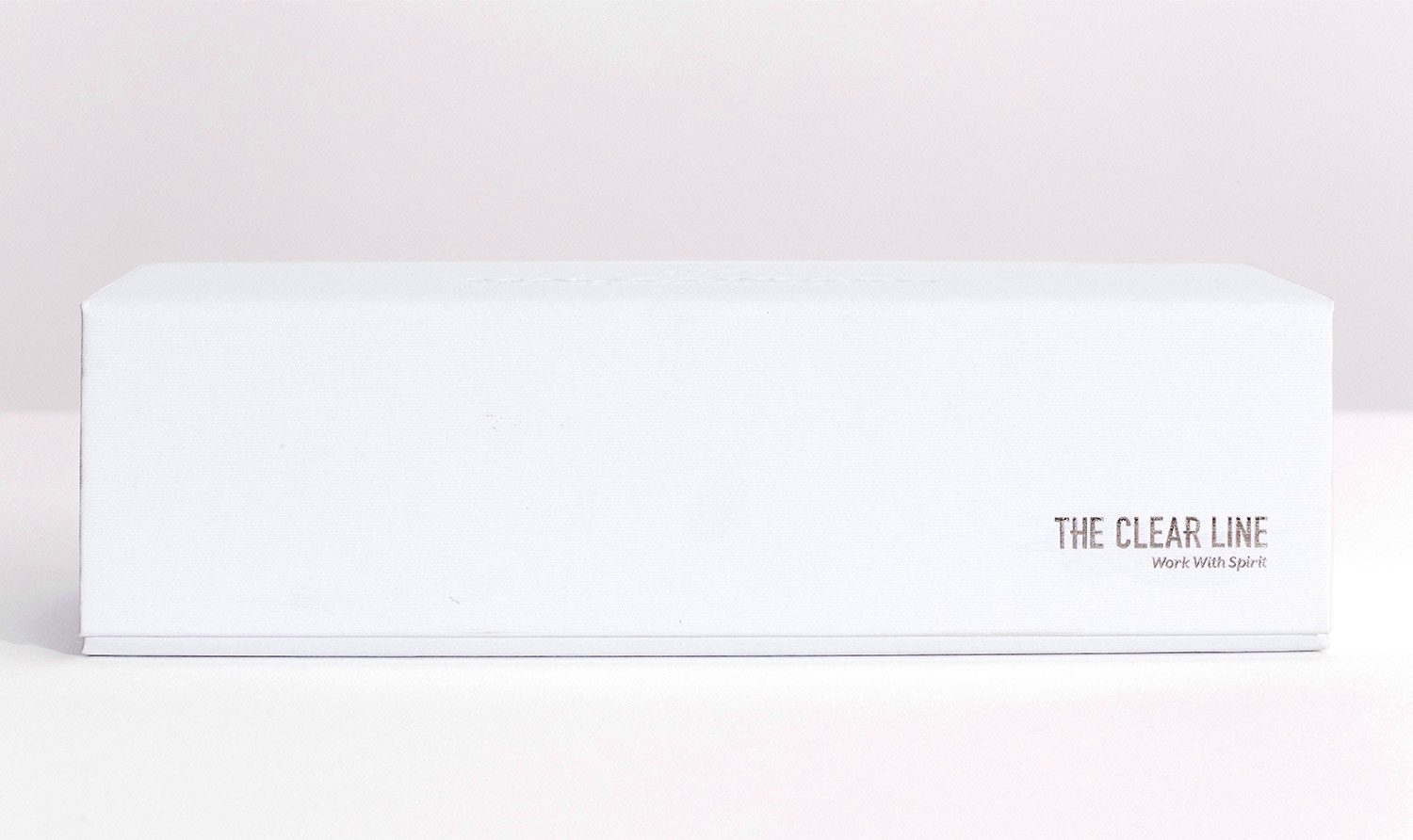
The package itself exudes luxury, the 175 gsm Colorplan White Frost tantalizing with every touch, the Mad Consort blind-embossed logo providing the icing on the tactile cake. When opened, the phrases “The Clear Line: Work with Spirit” stamped in silver foil on the outside are seen again on the cover of a 9-page booklet digitally printed, also on Colorplan White Frost. Of course like a child on Christmas morning, we can’t help but remove it straight away to peek at the treasures inside, and it is there that we glimpse the heart – philosophical as well as literal – of this wonderful promotion: four color-coded bottles of vodka, gin, tequila and rum.
“The Clear Line is a story about geo-alcoholic lines and the human spirit,” explains Mad Consort Founder Anna Addison. “In the Old World, or a world less than a century ago, the spirit geo lines were very clear. Vodka came from the Soviet Union, gin from the United Kingdom, tequila from Mexico, and rum from the Caribbean Islands. The people worked with what they had from simple potatoes to exotic succulents, in all types of harsh climates.
“Now, in the ‘The New World of Spirits’ the geo-spirit lines are constantly being pushed and tested with beautiful flavor discoveries, distillation purities, and unfiltered gems being bottled and celebrated in opposite parts of the world from their traditional origins. The message for us is simple: Collaboration and passion makes the difference between good and great work. So, let’s create something amazing together.” (And amazing it is, particularly as everything here – with the exception of the booklets – was made by hand.)
Perhaps this international view of collaboration should come as no surprise, conceived as it was by Addison, a Moscow native working in Amsterdam. And true to this spirit, materials and craftsmanship came from all over: “a box maker in north Amsterdam, glass from Italy, the bottle printer in North Holland,” says Addison. “And I found the perfectly matched 5 mm silk ribbons in Paris.”
Finally, “The Clear Line” is about all the lines we deal with as a society, she says. “In our daily lives we are surrounded by die lines, bottom lines and deadlines. We open or close the lines of communication.” And with this package, and the booklet that explains the history of the spirits inside, Mad Consort shows alcohol itself to be a substance that keeps the lines of communication open not only between cultures, but between our ancestors and ourselves. That, in the end, is what traditions are all about.

