One of the wonderful things about print design is its potential for showing us new ways to look at things we thought we already knew. This week, we discover a book that employs an old concept to make the art within interactive, examine a magazine that aims for a futuristic aesthetic but also reminds us of one from the past, and stand aghast as a raunchy mainstay from the ’80s tackles the presidential race. (Previous Cool Designs of the Week can be found here.)
‘Vento’ Book Design
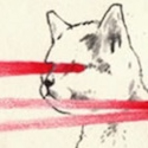
With our eyes constantly scanning the horizons for the “next big thing” in print design, we often forget just how nifty some of the older methods are. “Vento” by Virgilio Villoresi and Virginia Mori uses the time-honored tradition of moiré animation to bring a series of illustrations to life. While there seems to be maddeningly little information available about this book, at least in English, its trailer speaks volumes.
Mother Magazine Design
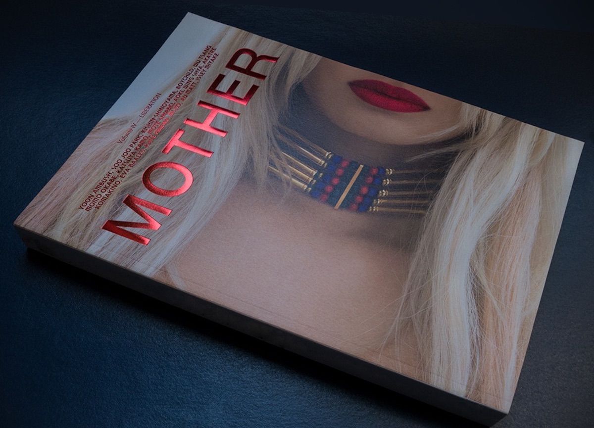
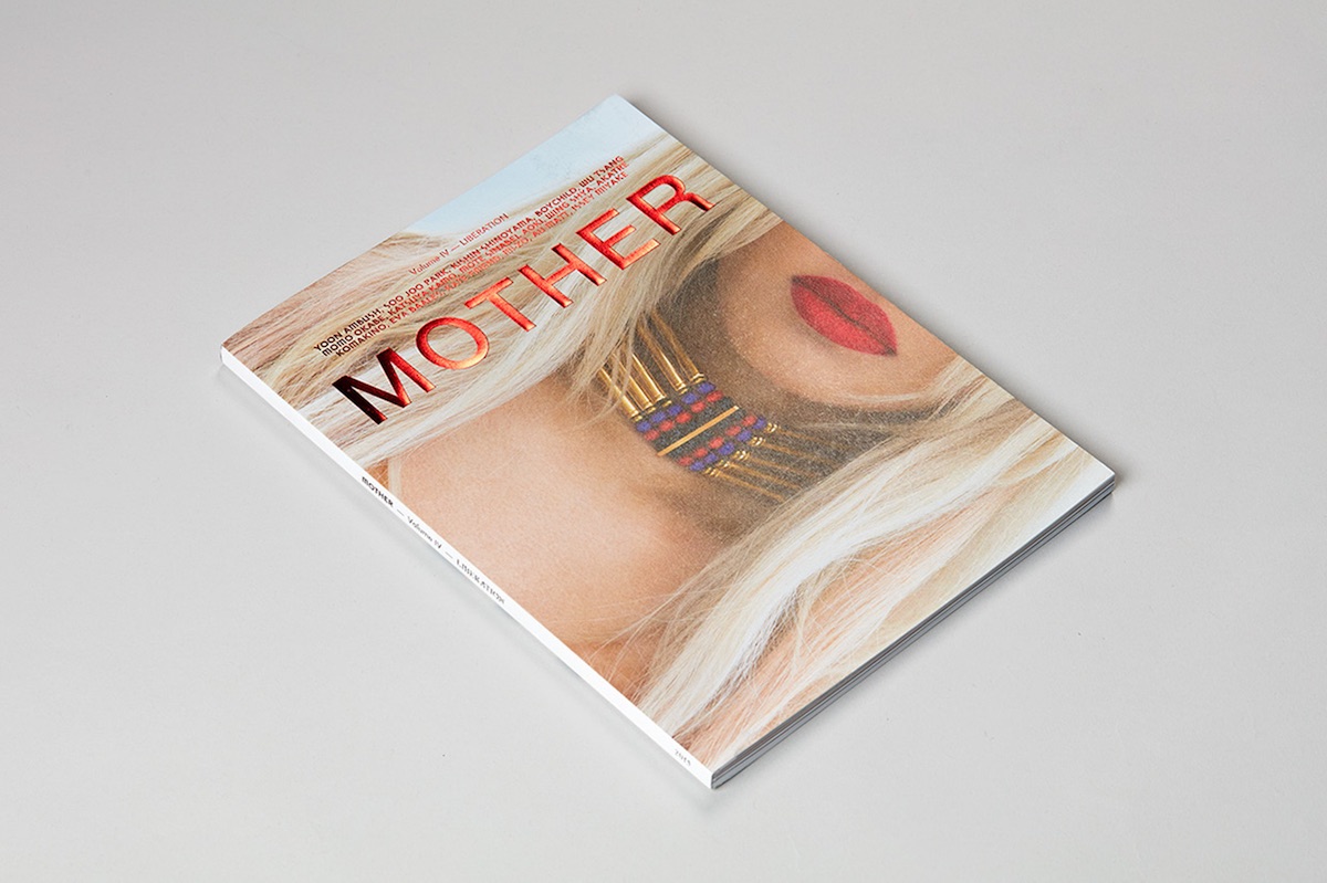
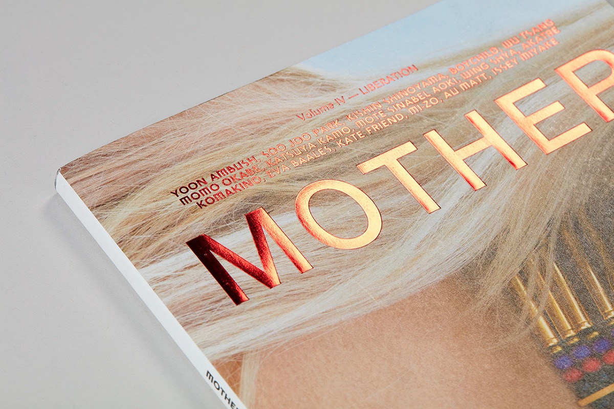
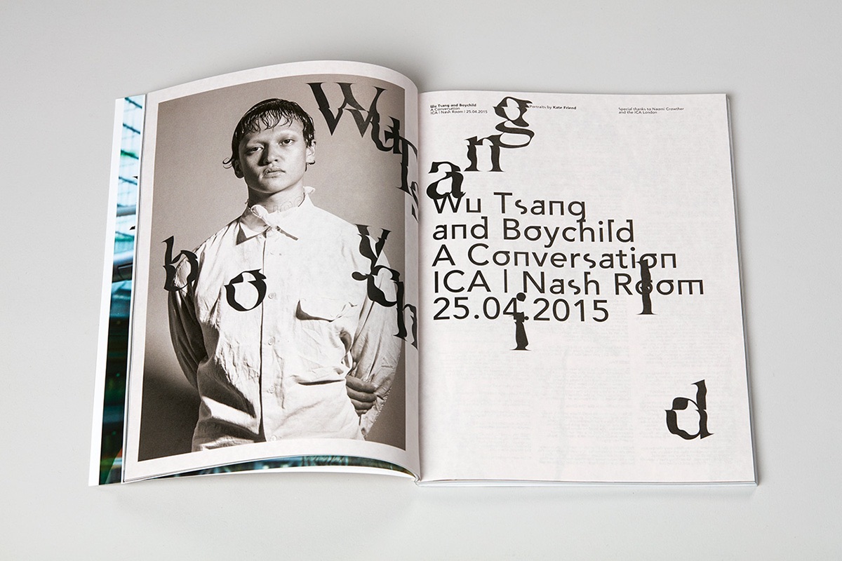
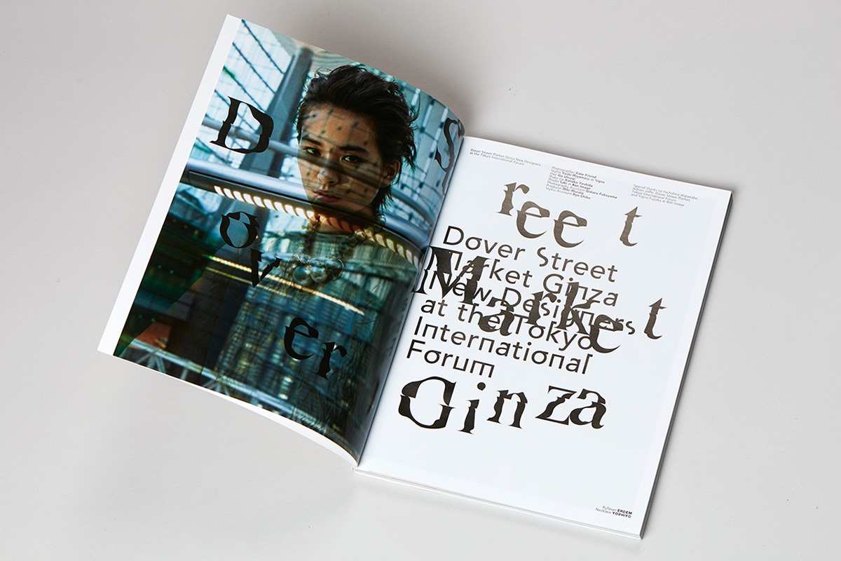
The fourth issue of Mother has been floating around for a while now, but honestly it’s taken us this long to get past that gorgeous cover. (Just look at the fine details of that foil stamping just above the title plate!) Envisioned by its creator – London photographer Kate Friend – as more of an art object than a magazine and inspired by Japanese aesthetics, it delivers on that ambition beautifully. One thing that really struck us is its use of typography, which instantly reminded us of David Carson’s wonderfully chaotic “who-the-hell-cares-if-you-can’t-read-it” work on Ray Gun. While in no way as raucous as that ’90s mag, Akatre Studio’s Mother magazine design follows through on that magazine-as-art-object idea by forcing you to consider the page itself first, and only then can you settle down to the process of actually reading it.
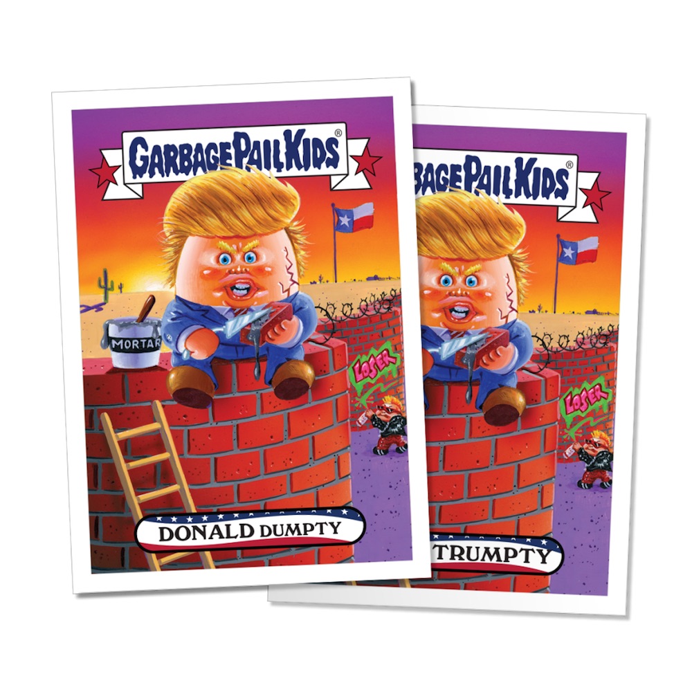
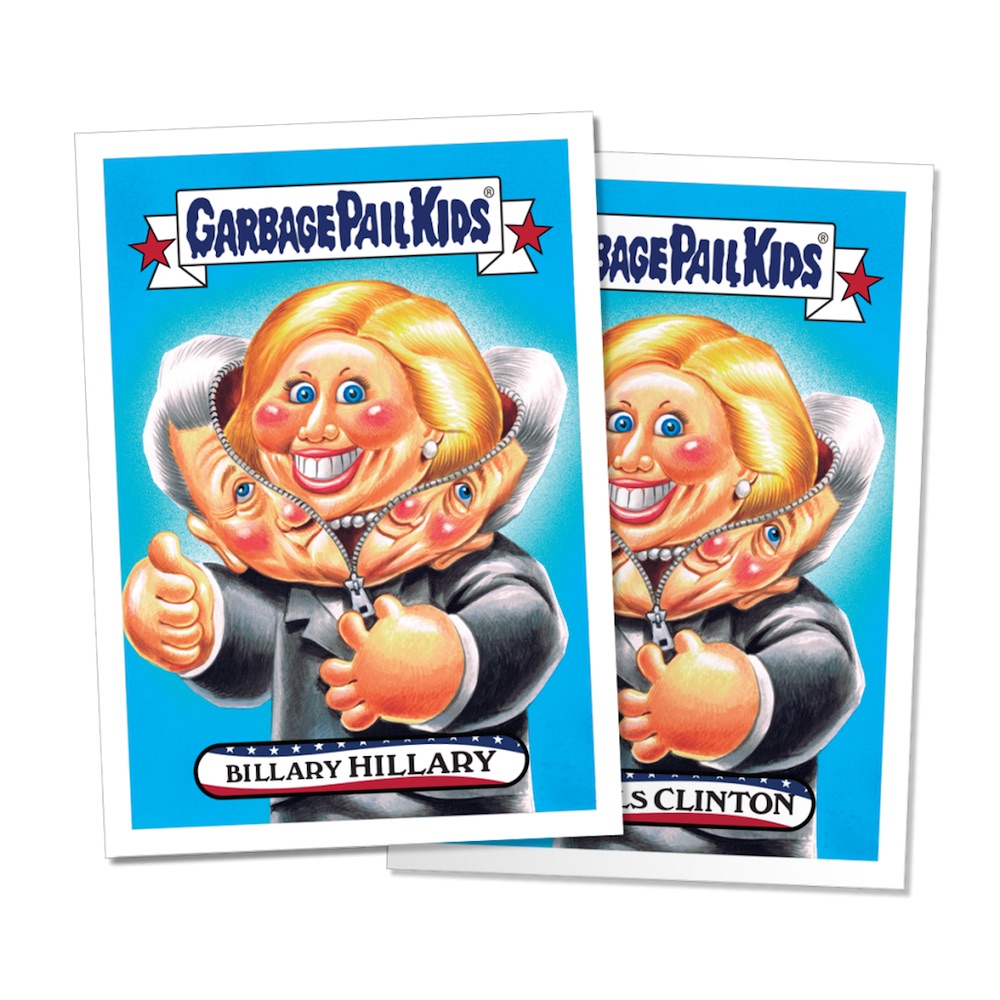
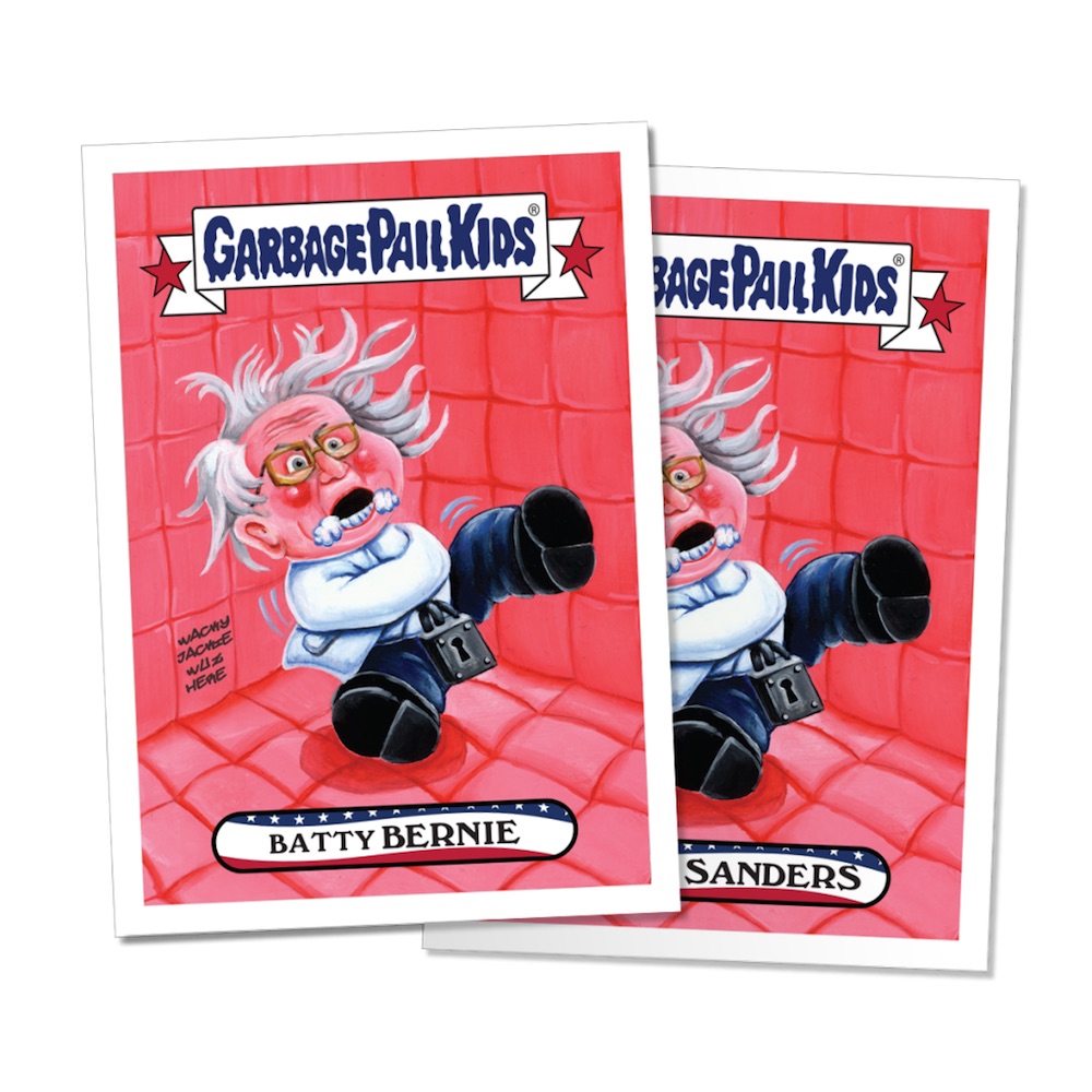
Garbage Pail Kids: Election Edition
Back in the ’80s, long before absolutely everything was served to you on a bed of fresh snark, young people could usually rely on two sources of biting satire: Mad magazine and trading cards like Garbage Pail Kids. Unabashedly gross and childish, these send-ups of the all-consuming Cabbage Patch Kid craze rejoiced in tasteless concepts in the “Potty Scotty” vein. The kids made an unexpected reappearance on Feb. 9th with the issuance of nine brand new cards, each dedicated to one of the current presidential front runners. On sale for $10 each or $50 for the complete set, the “New Hampshire Primary Edition” was only available for 24 hours. All nine can be seen here.