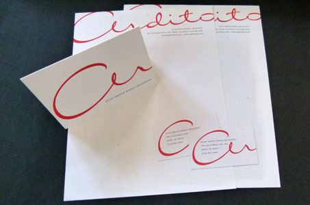
This identity package is an example of how to bring the client’s individuality into the design by using her signature as the star graphic element.
The signature was refined by a calligrapher’s artistic touch and serves to convey the friendly personality of the main player in this business. Sitting on any desk or in any pile of mail, this bold flowing script printed in red is immediately recognizable and unforgettably distinct.

The use of French Paper’s Speckletone was a great choice. It produces a double treat for the senses – visual texture for the eyes and soft smoothness for the touch – and again lends an air of approachability.
I loved how the signature is split into two parts on the business card and A10 envelope with the “Ar” on the front and the “dito” on the back – a practical and inventive solution to incorporating the signature into the space without diminishing the size that captivates our attention.
And bravo for the inclusion of the A10 envelope and note card in the identity system! So many clients don’t opt for this, but I really think it takes the package to the next level.
(I did miss the fact that the signature was not on either envelope, but I suspect this was a production issue and not wanting to compromise the look of the design to the requirements of envelope conversion.)