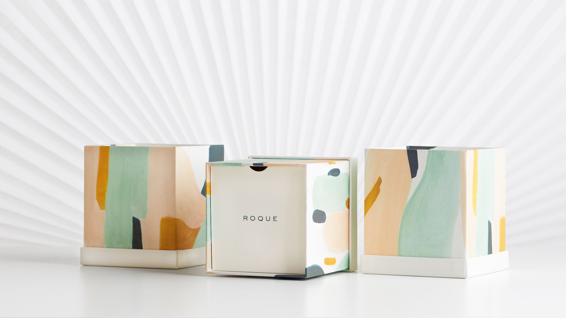
What would self-confidence look like if it were packaging? It might present the world with a plain but dignified face with only a sliver of color showing through – a little hint at the hidden depths within. Such is the packaging created by Arithmetic for Roque. It’s not only designed to house a line of jewelry that celebrates the inner strength of women everywhere, but it is also meant to serve as a keepsake box for years to come.
Taking its name from that of Pablo Picasso’s wife, Jacqueline (née Roque), who was both artist and muse, the Roque line required a container that, like the jewelry it contained, walked a similar tightrope between creativity and inspiration. In short, it had to be a piece of art itself.
A Burst of Color Waiting to be Revealed
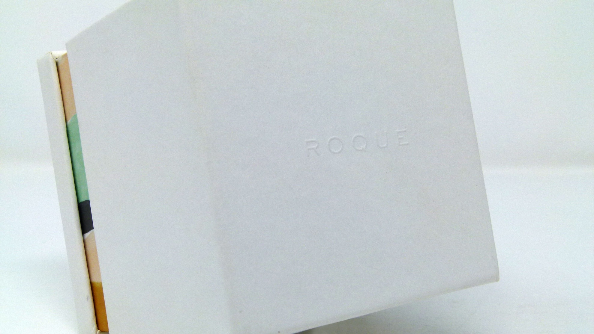
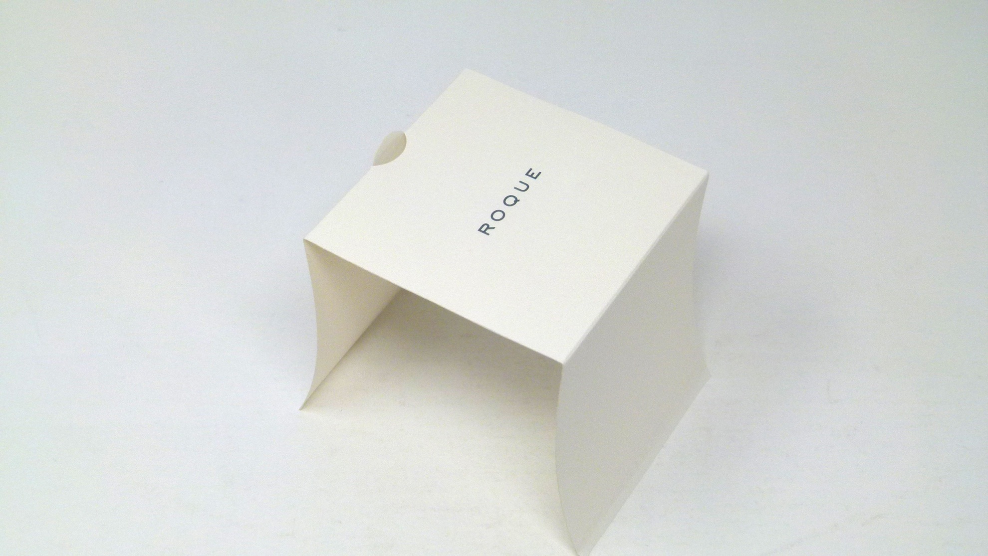
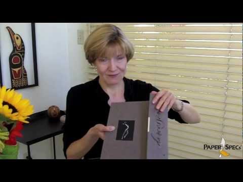
Closed, this piece is as unassuming as they come. A shoulder box custom-wrapped with White, uncoated Fedrigoni Old Mill Bianco, it offers only two hints that it might be concealing something extraordinary inside.
The first is the blind embossed “Roque” logo on the top of the lid.
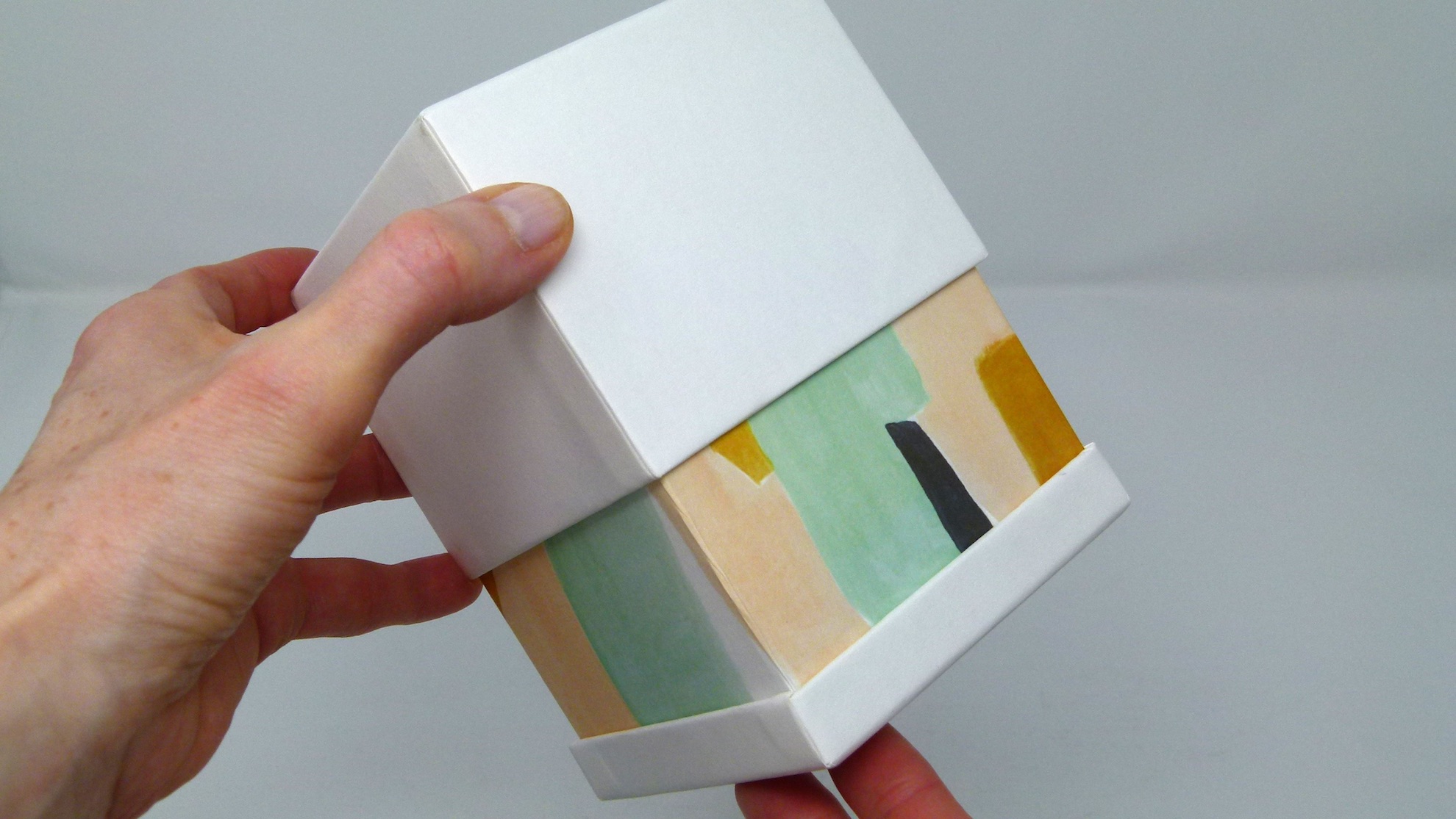
The second: a narrow band of pastel colors that runs all the way around the bottom of the box. The extreme minimalism of the exterior and that small horizon of color suggest a deeper meaning lies within. Sliding the lid upward reveals that this band is actually a watercolor design that covers the entire neck of the box beneath.
A Simple Dash of Elegance
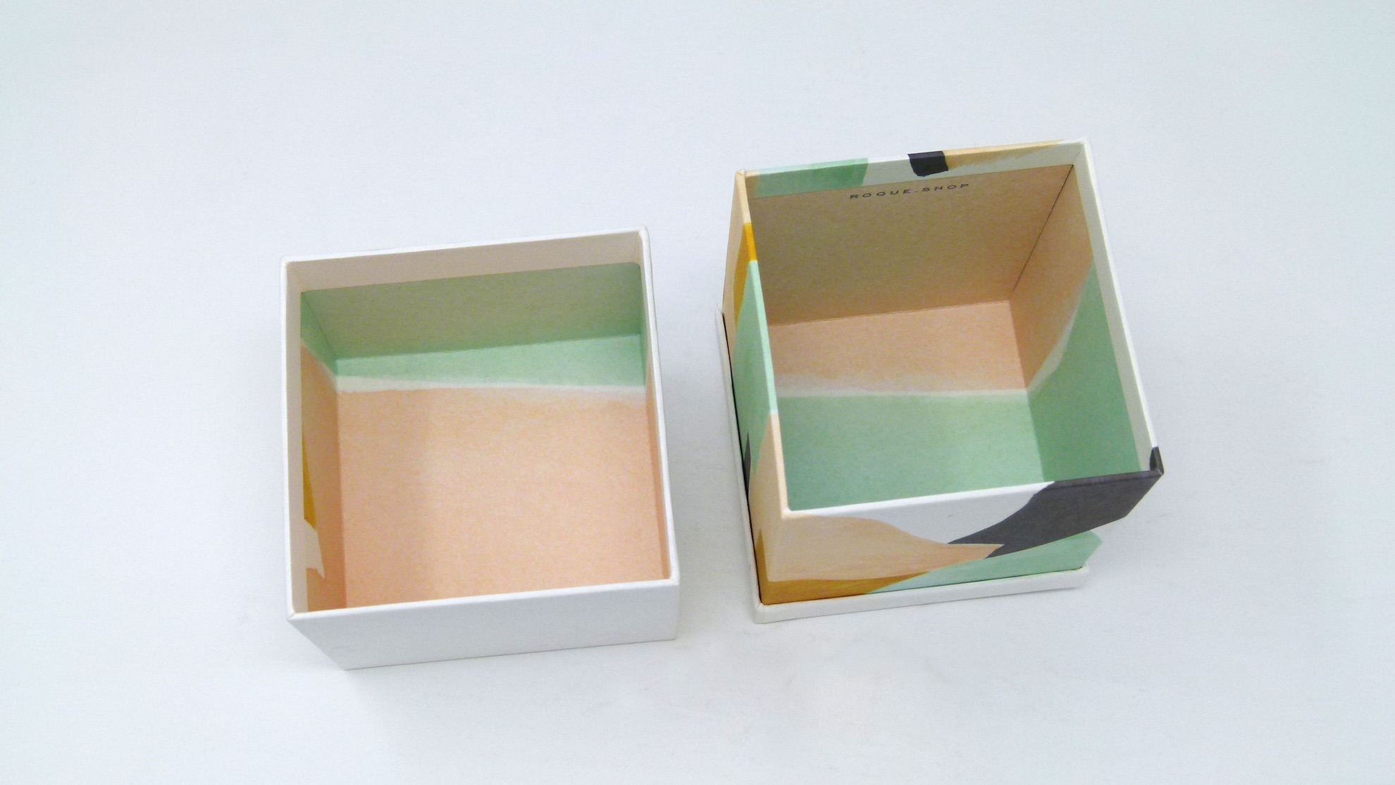
Once the lid is removed, I’m presented with the Roque brand name yet again, this time peeking up at me from a White card where it’s been embossed. The card was designed to slow down the unwrapping experience, giving the owner one last moment of anticipation before revealing the jewelry inside. A die-cut notch at the top allows the card to be pulled up and removed.
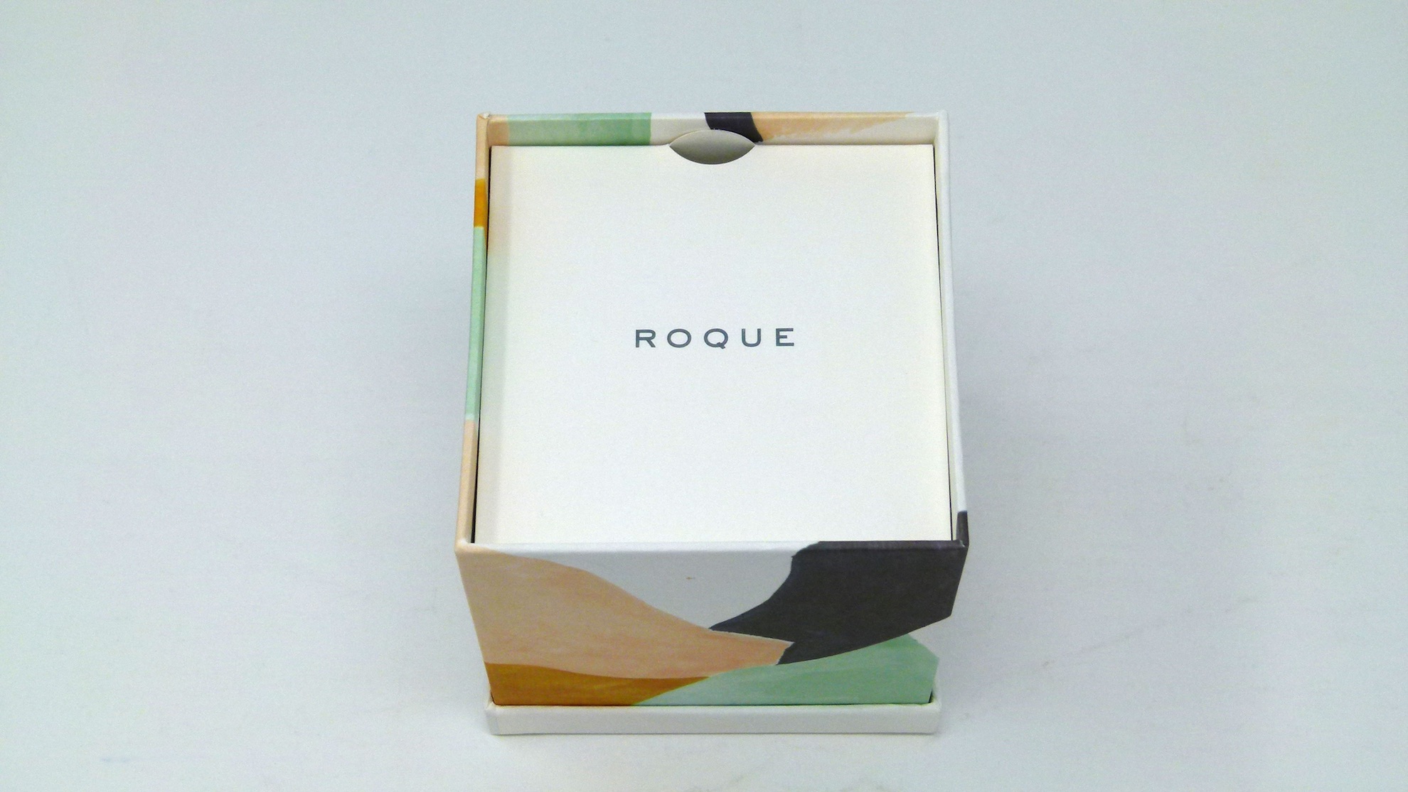
As anxious as I am to see what’s beneath, I don’t want to rush past this detail, which is a clever touch. Through the use of scoring, as well as the notch and the embossed logo, the designers have transformed a simple piece of paper into something quite sophisticated.
A Colorful Piece of Sustainability
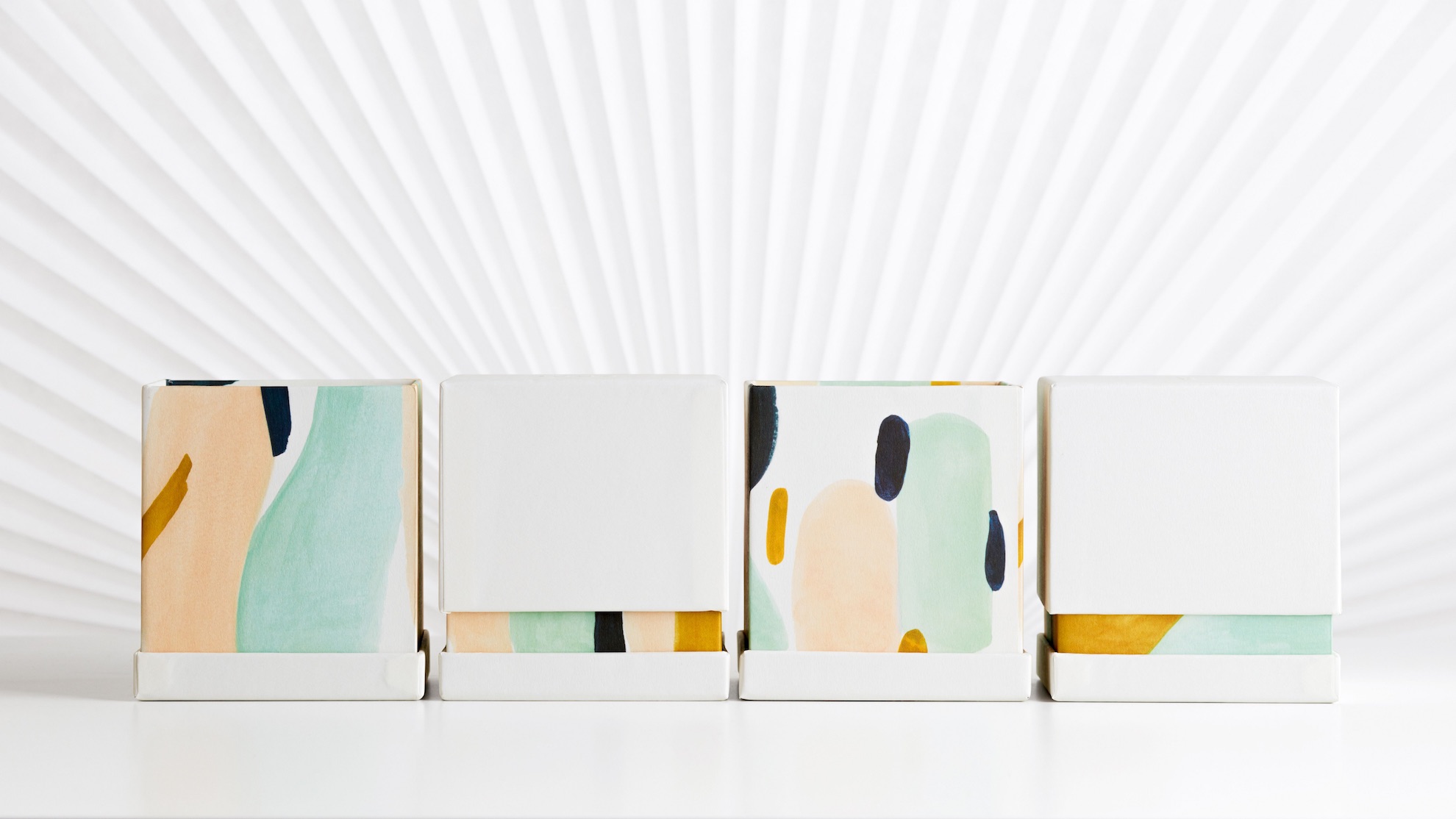
Inside the box I discover more watercolor patterns, a colorful backdrop for the jewelry nestled inside. This was actually derived from watercolors that were hand-painted by the designers, scanned, and offset printed for the liner. Each of the four paintings used were inspired by human and natural forms, including the coastal shapes of California, as well as the color-blocked interior and staircase designed by Le Corbusier & Pierre Jeanneret in the Weissenhofsiedlung in Stuttgart.
Not only did the designers want to make this packaging as much a piece of art as the jewelry inside, they also strove to ensure that it’s as environmentally friendly as possible. For starters they opted for FSC-certified Fedrigoni Old Mill Bianco and soy inks. This is unusual in the luxury jewelry arena, which tends to use unrecyclable components to protect the items inside.
And they also embraced the greatest eco-strategy of all – reusability. The Roque packaging was designed to be kept as a keepsake box long after the jewelry has been presented to the recipient.
The whole experience reminded the designers at Arithmetic that most paper-based manufacturing is still done completely by hand. It also made them, and me, better appreciate the human skill that goes into crafting the packaging that protects all handmade treasures.


cool. it would be nice to see what the jewelry looks like too!
I have been following your blogs for quite some time now and I am very impressed with the amount of information you post. Your blog is a great source of inspiration to me as an aspiring designer, which is why I decided to write this review.I’m in love with jewelry design, and when I discovered about sustainable packaging design i was amazed by the fact that there are so many designers out there who are working towards making their designs more eco-friendly. It really inspires me to keep on practicing my craft until it reaches perfection!
Thank you so much for writing and for the kind words, Randy! We’re so happy to hear that you found our packaging stories inspiring! 🙂