For more than a decade Chicago foodies had attended communal dining experiences as part of the Sunday Dinner Club, always searching for a new taste or texture to enjoy.
And design studio Kitemath has been an integral part of bringing these culinary experiences to life by producing equally hand-crafted menus, going out of their way to play with different paper textures, die cuts, foils and more.
The book they published perfectly captures the essence of these delectable print pieces, reflecting the sumptuous meals and menus.
A Tactile Cover Experience
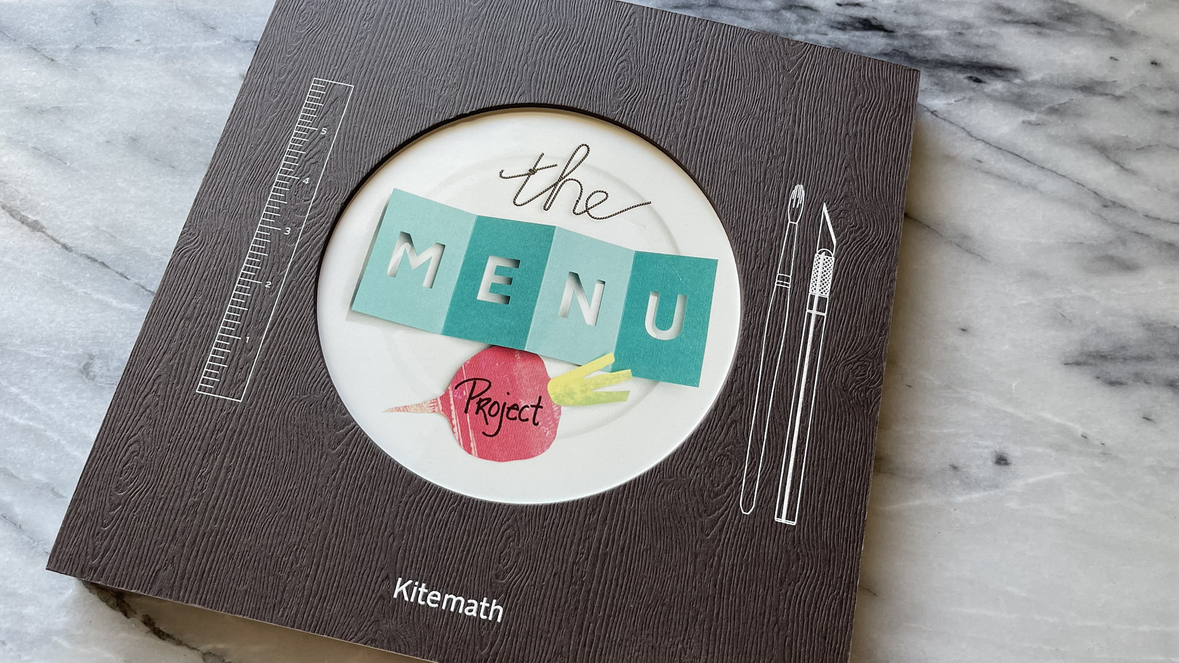
From the start, the chunky wood-grain cover catches your eye. Made from 111 lb. Gmund Savanna Bubinga Cover, duplex laminated to 160 lb. Strathmore Premium Mahogany Double Thick Cover, it promises a treat.
The tactile texture evokes thoughts of a large hardwood table, perfect for intimate meals at the Sunday Dinner Club.
O’Neil Printing digitally printed the design studio’s name in white UV ink. A ruler, paintbrush, and X-Acto knife flank a dinner plate, replacing traditional cutlery.
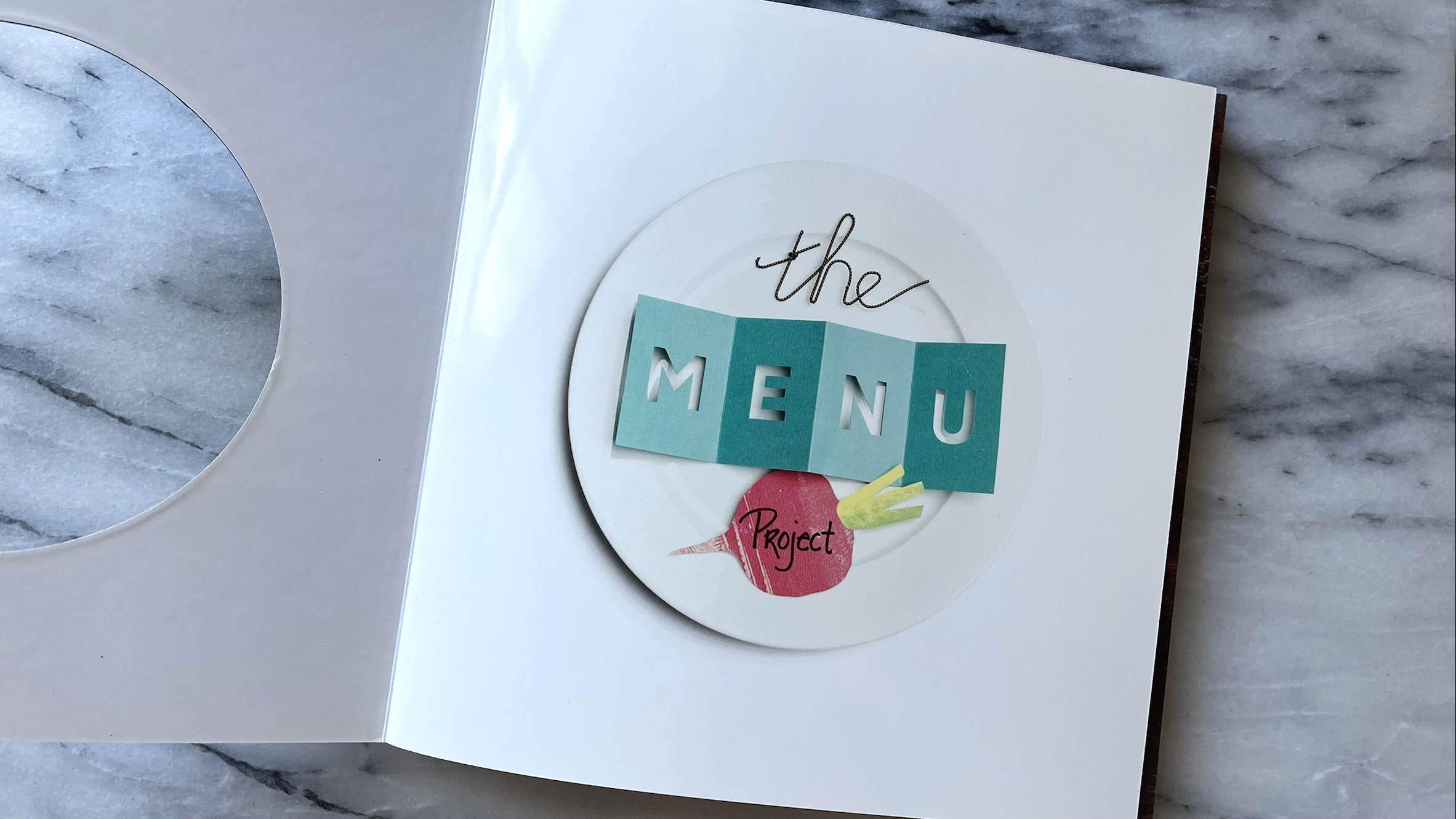
At the center, the “Menu Project” title, made of handmade pieces, adds intrigue. The title peeks through a die-cut window, revealing a full plate photograph printed on 9.5 pt. Chromolux 700 High White Cover for a beautiful shine.
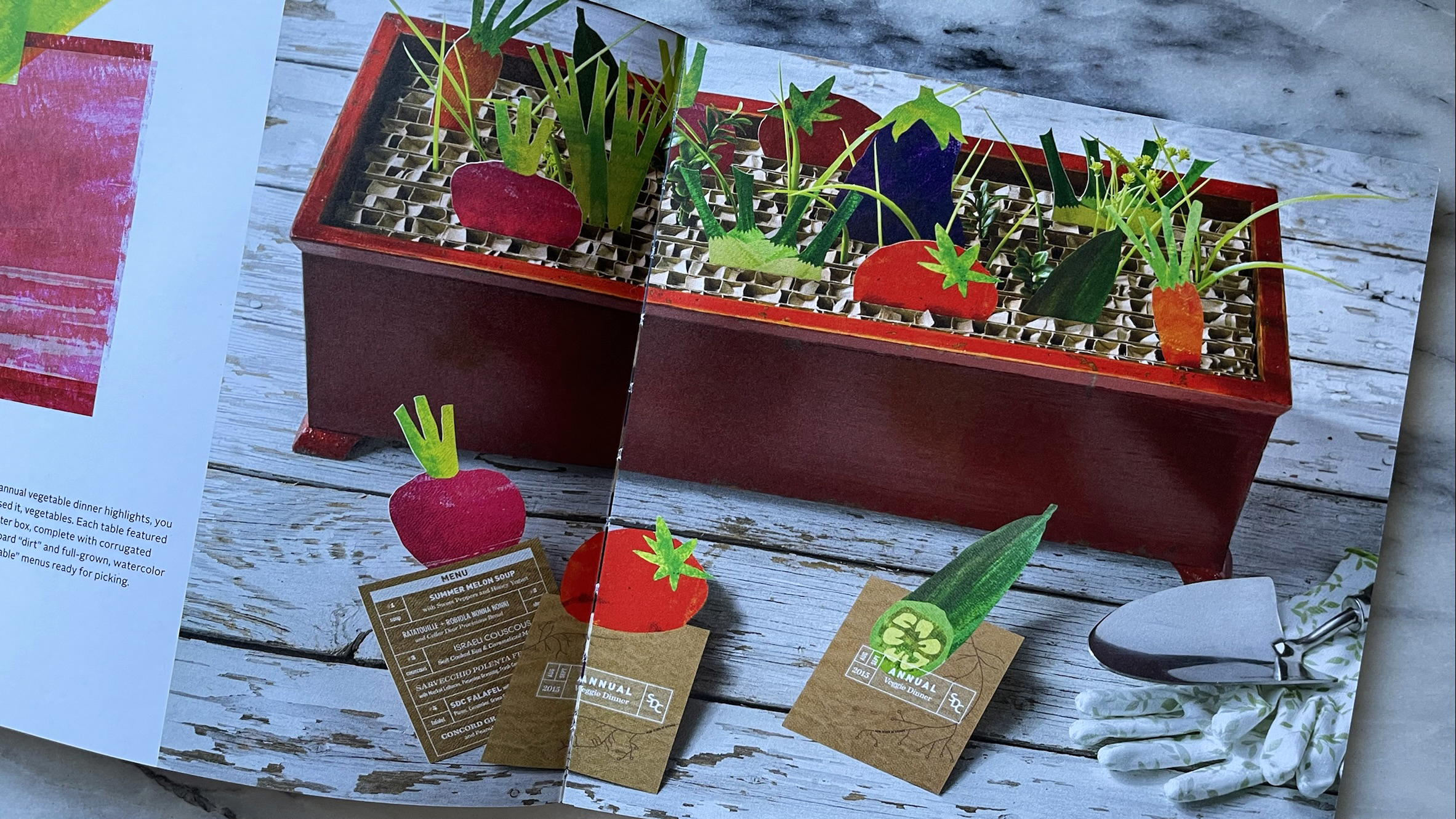
Inside, each handmade menu gets a deluxe treatment. Rich, moody images, digitally printed on uncoated 65 lb. Mohawk Options Smooth Cover, emphasize the artistry.
Many menus were photographed on wooden backgrounds, echoing the thick, wood-grain cover.
Dramatic and Inventive Touches
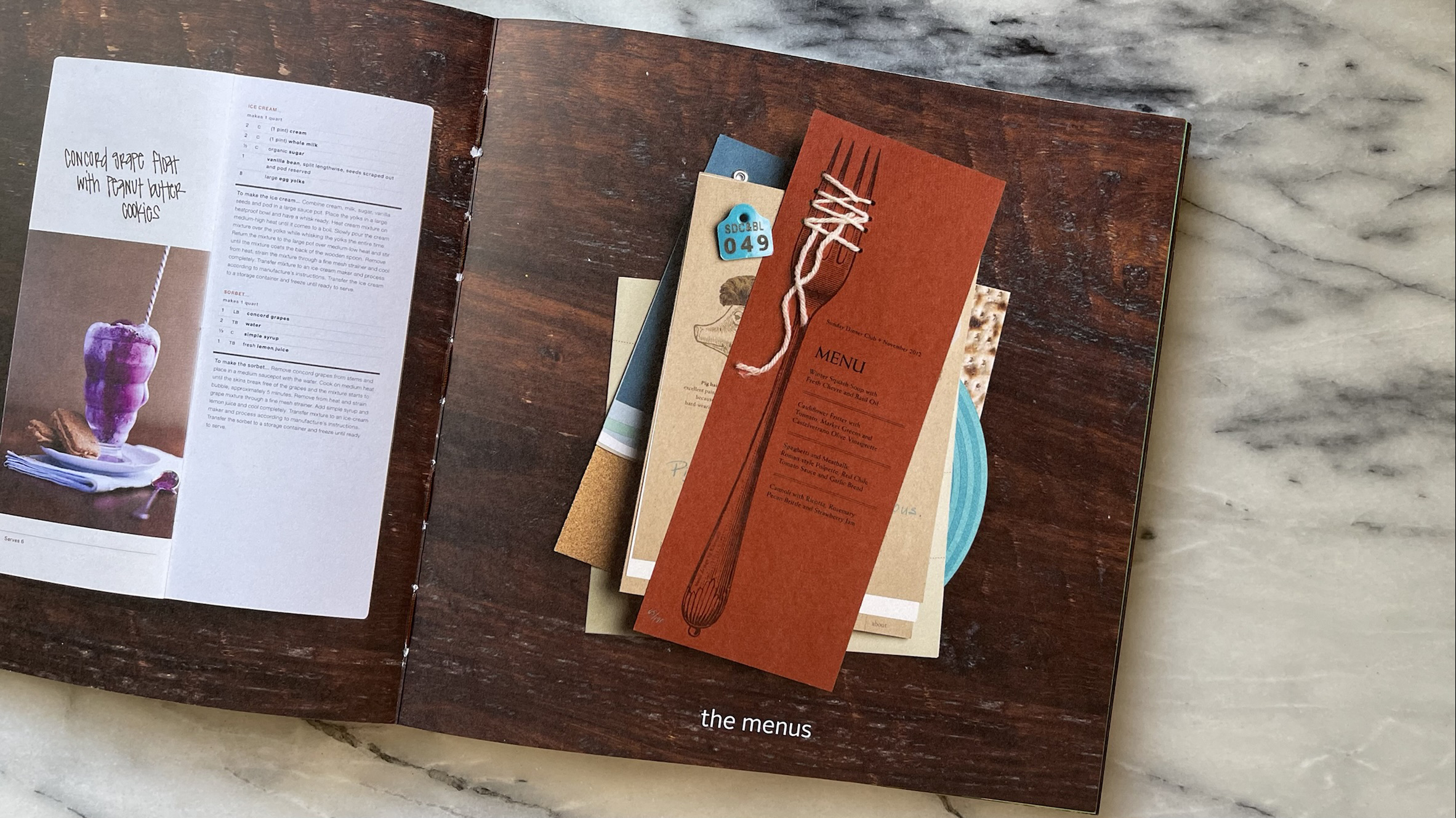
Vibrant and dramatic images shine throughout, thanks to careful styling. Menus were placed at angles or inventively styled, adding energy to the shots.
One standout detail is the dimensional enhancement. The designers recreated a technique from one menu by weaving string through holes along the tines of a printed fork.
A pop-up cube menu surprises readers with its interactive design. Duplex-laminated pages provide the necessary thickness to support the pop-up effect.
Other little sparks of creativity, such as a vertical Bronze foil stripe printed opposite an image of a glowing electric light, demonstrate a breathtaking marriage of fine art photography (courtesy of Kelly Allison and Tyler Mallory) and book design.
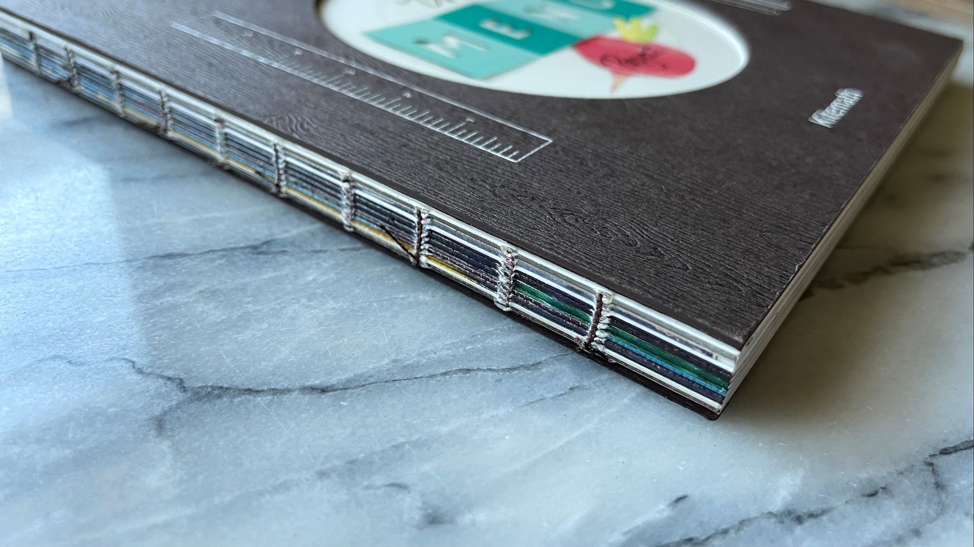
Adding to the handmade charm, the book uses a Smyth-sewn binding with an exposed spine, crafted by BindTech-Roswell. The Brown thread running through its signatures matches the wood-grain cover, underscoring the handmade craftsmanship of the book and its featured menus.
Note: “The Menu Project” book can be purchased here.


