In a way, every wine is a storybook. But suppose a vintner had casks of wine that became lost, secreted away somewhere in a dark cave, their story a forgotten chapter of that vineyard’s rich, glorious past? Fascinated by this idea, Scotto Cellars created “The Lost Chapters” wines. Seizing upon that tantalizing sense of romantic mystery, Makers & Allies captured it in their labeling for this line of zinfandels, petite sirahs and pinot noirs.
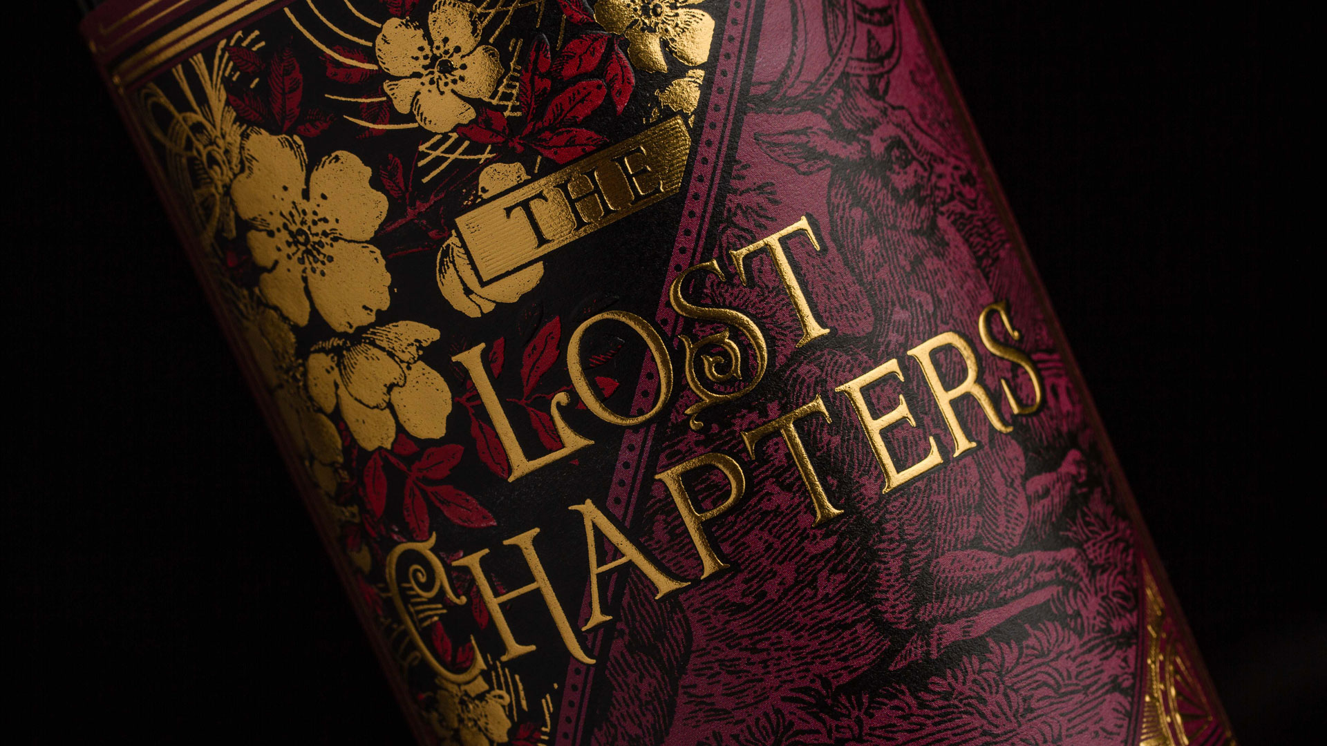
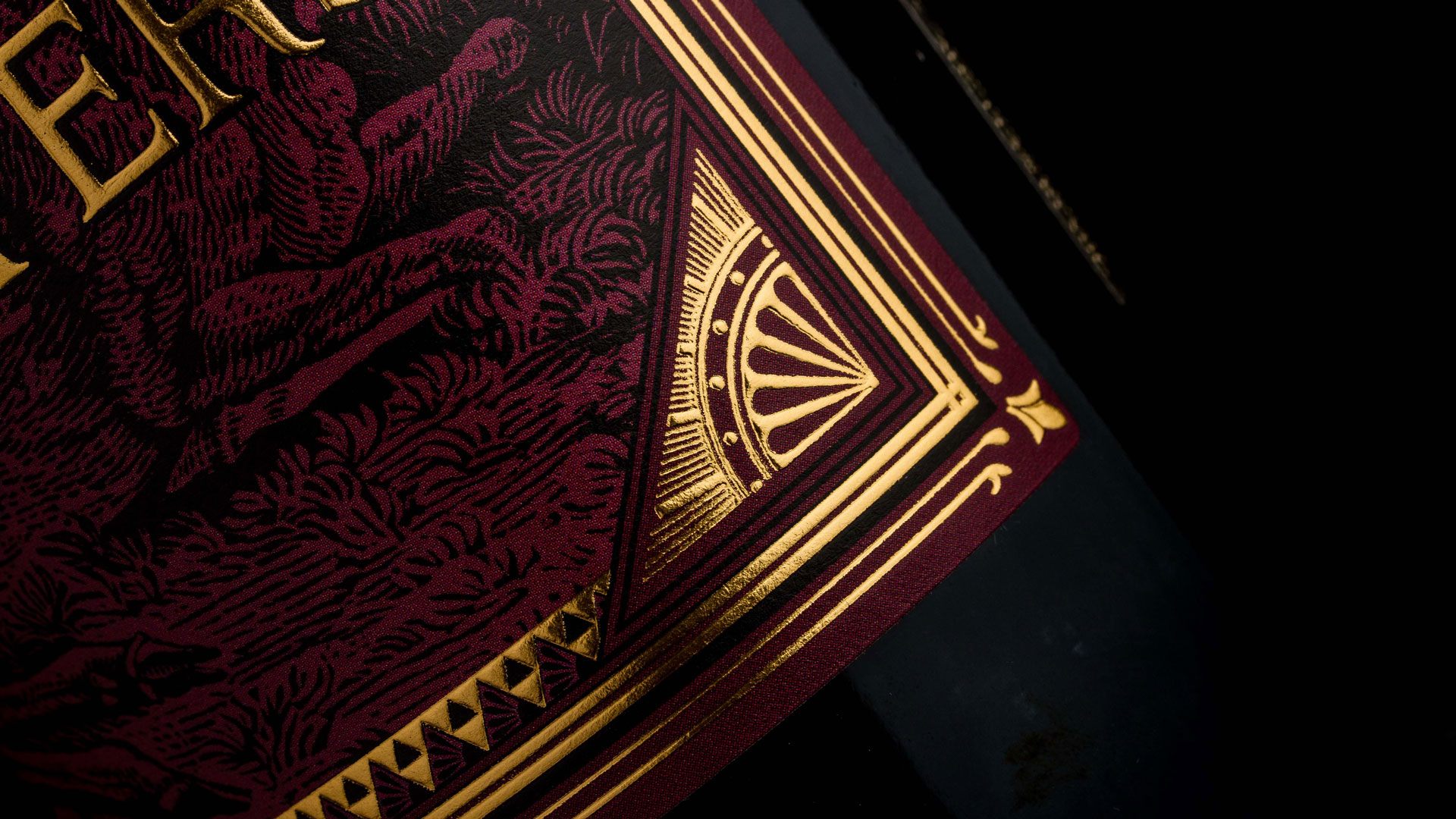
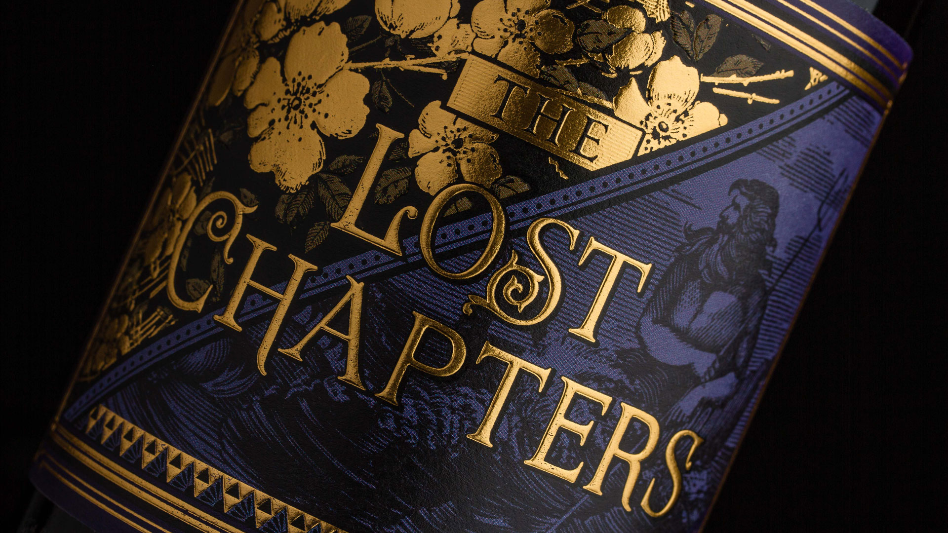
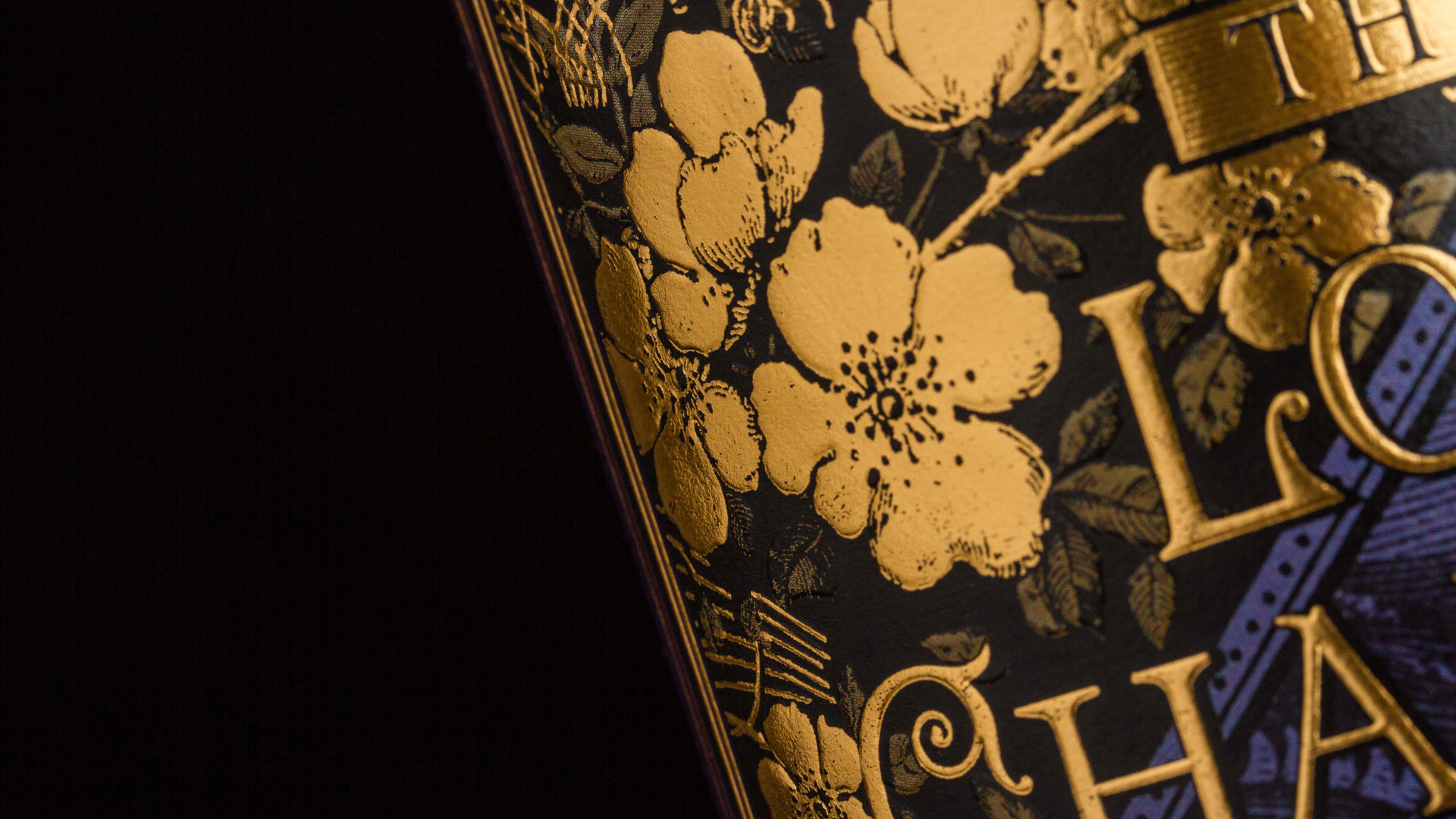
Each bottle in the “Lost Chapters” line looks like it would be perfectly at home in a mansion library, less like a bottle of wine than a prestige edition of a fantasy novel – the typography alone smacks of hobbits, elves and knights of the realm. The black line art, too, has a distinctly mythic appearance, evoking the look of 15th century European woodblock illustrations.
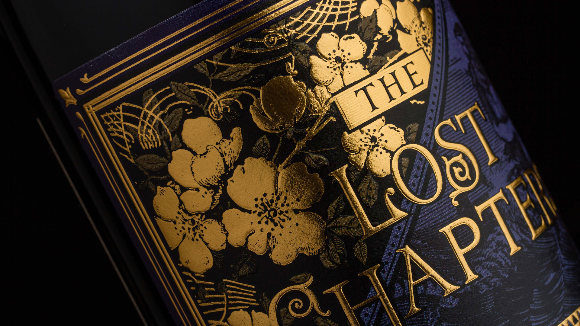
This is made all the richer by a flood of blue and/or red ink, depending on the label. Two separate embosses on the front of the label – a highly detailed sculptured emboss for the flowers in the upper left quadrant AND a domed emboss for the logo mark and border elements – make this already-sumptuous-looking label a sensual delight for the fingertips as well as the eyes. A generous layer of gold foil on the foliage and lettering complete the effect of a cherished volume plucked from a well-appointed bookshelf.
“The name ‘The Lost Chapters’ was inspired by the winemakers’ travels from vineyard to vineyard in search of small corners of forgotten vines, and the lost stories that each wine has to tell,” according to its designers. “As a result, for the branding and label design, we took inspiration from old stories and vintage book covers.”
What’s truly remarkable is that this vintage look was crafted using a decidedly 21st century technology: digital printing.
“The label was intended to be printed offset with 4 PMS colors called out for the front label, and three for the back,” explains Makers & Allies Senior Designer Rachael Pietsch. “However, due to small quantities, the labels ended up being printed in digital, so we used CMYK process to match our selected PMS spot colors.”
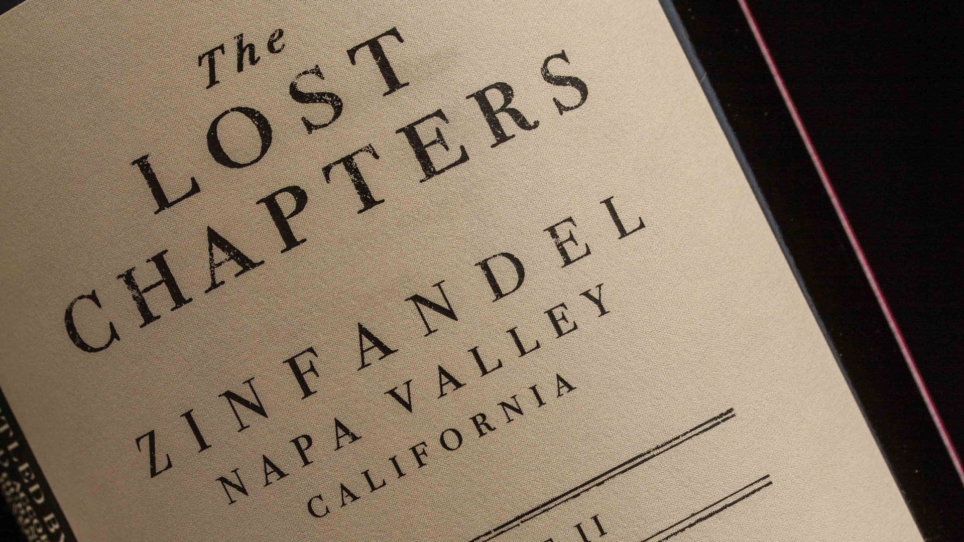
The rich color laid down by San Luis Obispo’s WS Packaging Group works beautifully on the Fasson Estate Label #8 vellum stock to reproduce a burgundy-and-cigar sense of luxury burned into our collective imaginations by countless Hollywood films.
Rachael reveals that the quality of “The Lost Chapters” labels is all down to “a lot of careful attention and time paid to color refinement, hitting the emboss as deeply as possible, and a ton of love…AND gold foil.”
Which, when you think about it, is how every design story should end.
Hot foil stamping brought a distinctive touch of elegance to this piece, but there are so many other ways to get the shimmer and shine of foil. Discover them, as well as the pros and cons of each, in our free Foil Cheat Sheet. Download yours now for a limited time!


How much does a bottle of lost chapter cab cost retail in Florida? It is a wonderful wine.
Good question, Geri. Does anyone out there know?