When beautiful design, top-notch production quality, and a life-changing message all come together, the result can powerfully demonstrate just how much design can help us make the world a better place, one person at a time.
When I first chanced upon this stunning “Procrastiworking” poster by iconic illustrator/letterer Jessica Hische hanging on the wall at beloved print shop Studio On Fire [projects / website], I was instantly mesmerized.
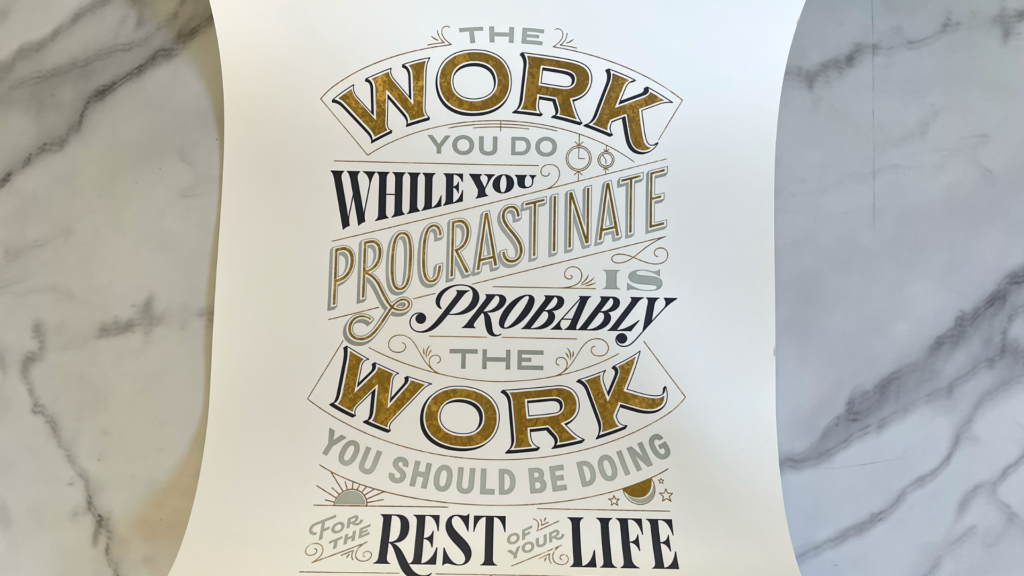
And profound though the message may be, what really impressed me was how large the artwork was for a letterpress print, and how the unusual foil used worked so well with the design to emphasize the timelessness of this advice.
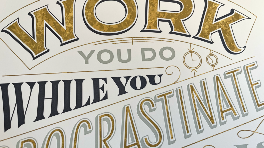
It all begins with the beautiful, heavy cover stock used: 110 lb. Crane’s Lettra Pearl White. Not only does the cotton sheet feel elegant, but it also provided much needed durability as it had to make several trips through the letterpress – one for each of the 2 colors.
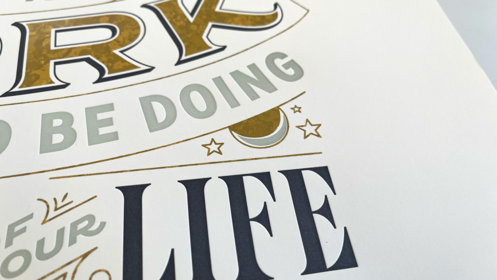
What about the Hot Foil Stamping, Sabine? I’m so glad you asked!
This then is the 3rd run through the letterpress. The Hot Foil Stamping features an antique, distressed look that’s built right into the Foil itself – something that most printers won’t have lying around the shop.
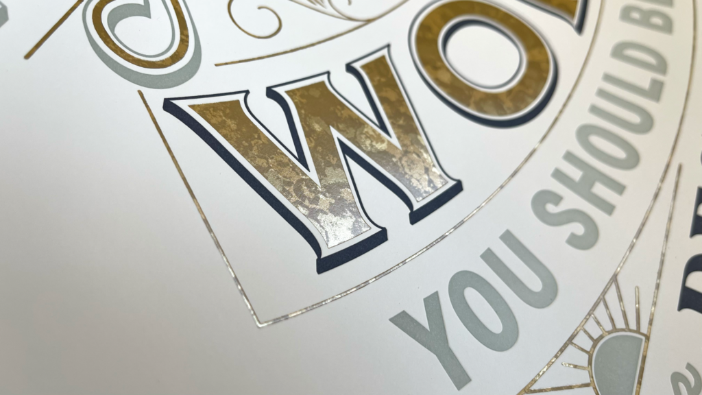
And while the broad letters in the word “Work” instantly grab my attention, the fine lines in the design accents, such as the filigree swirls and stars, are what keep me drinking in every glorious detail.
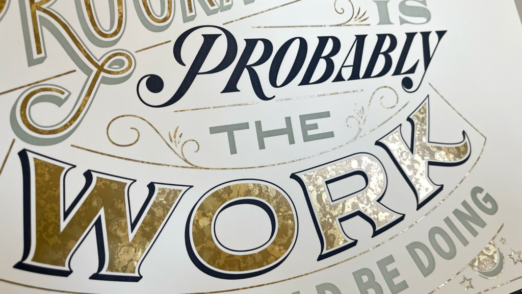
Indeed, it is this juxtaposition of heavy and slender lines that keeps my eye coming back for more. All are rendered in that same “old fashioned” mottled Foil. (Jessica’s signature is letterpress printed at the bottom alongside her Hot Foil Stamped logo.)
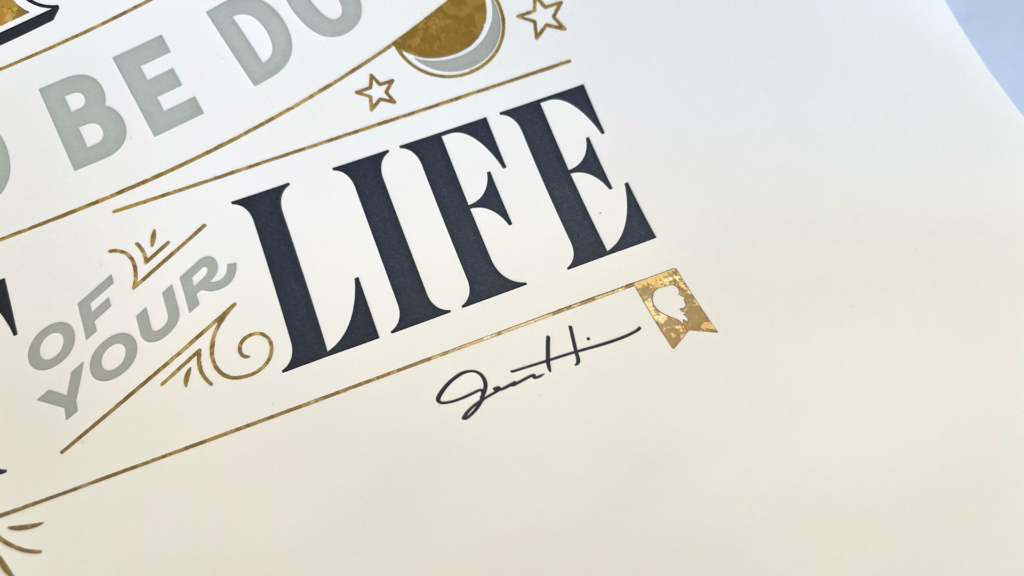
Owing to the pressure and heat involved, the Hot Foil Stamping is slightly debossed, too, adding an extra layer of tactile brilliance to the piece. This is in slight contrast to the deep impression left by the letterpress printing.
And because the whole piece was produced by our good friends at Studio On Fire, the registration is absolutely flawless.
The poster neatly sums up Studio On Fire’s precision and knack for pushing the boundaries of what printing and finishing can do, and Jessica’s ability to make words and ideas come alive on paper. The fact that she took this poster’s advice– abandoning her fine arts studies to pursue an immensely successful career in graphic design – is only the shimmering icing on this letterpress cake 😉
>>You can purchase a ‘Procrastiworking’ Print (with different Foil) here.


