“I was wondering if you could scan a QR code in a dark bar,” said Christopher Simmons, principal and creative director at MINE (San Francisco). “I actually crawled under my desk and tried it. It worked!”
Simmons, guest judge for PaperSpecs Gallery’s Take Note Award, put the Quarter One 2012 winning entry from Fizz Creative (Lakewood, Ohio) through its paces.
“Among the finalists, this was the most surprising piece. I didn’t expect anything from a coaster, and here I was interacting with it. I like the idea that you can be entertained, informed and engaged by a coaster instead of just mindlessly staring at it!”
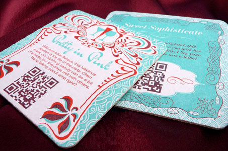
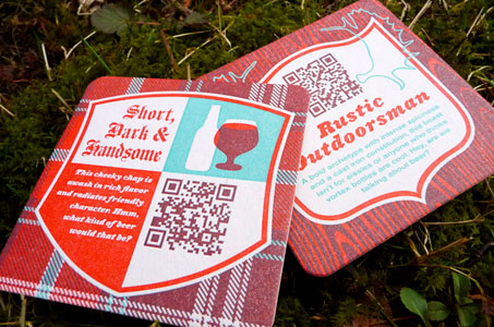
Jasen Melnick and Katie Major, the principals at Fizz Creative, created this outstanding set of four coasters as a self-promotion piece to introduce potential clients to their personalities, their design firm, and their love for beer and wine.
The Inspiration
We’ve all heard that inspiration can arise from anywhere. In this case, it seemed to come from everywhere – the designers’ personal interest in spirits, the fact that there is a large number of breweries and wineries in the northern Ohio area, and a healthy shot of unexpected synergy.
“We got involved with a networking community of programmers in Cleveland. One of them suggested just off the cuff, ‘Hey, we haven’t seen any QR codes on letterpress stuff yet. Wouldn’t that be cool?’” recalls Melnick.
“The funny thing was, we were actually in a bar and talking about coasters. We thought it would be a really good opportunity for bar owners to have something to engage their customers while they’re sitting there with their drinks,” adds Major.
Two weeks later, their printer made a similar suggestion noting that he hadn’t seen any letterpressed QR codes. Melnick and Major took the conversation as a sign, and the coaster project was born.
From Idea to Reality
“We had a great printer who really paid attention to details. Keith Berger at the Cranky Pressman worked to get colors perfectly even. This piece has a full bleed so it’s not like some coasters that have a big, white ring around the outside. He got the registration perfect, within less than a hundredth of an inch,” says Melnick.
The QR codes received a double hit of ink, which required precise registration to maintain the crispness of the image – essential to the readability of the code. The design called for two PMS colors that had areas of overlap. Since letterpress inks are transparent, the overlap created a third color for the palette – a smart way to stretch any budget.
Intelligent Design Behind the Technology
The duo set out to learn everything they could about two-dimensional barcode technology and quickly realized that its potential was sorely underutilized.
To their creative credit, each coaster in the promotional package had a unique code that sent users to different landing pages on the Fizz website. The copy on the coasters teased you with a different description that could have been a type of beer or wine. You scanned the code to get to the equally fun answers, food pairings and a peak at the personal sides of Melnick and Major.
“We thought it would be more interesting than just going to a static home page. You read one side of the coaster and try and guess if the copy is describing a beer or wine based on our personalities or what it might be. When you use the QR code, you’re able to interact with the website in a stimulating and attention-grabbing way,” explains Major.
This design pair succeeded because they used the technology in an exciting way for a specific, clear marketing purpose (not just because QR codes are the marketing gimmick of the moment).
“The goal is to get people to come back to the website and stay longer while they’re there – not just ‘Oh, here’s the home page. I saw this before – I’m done,’” adds Melnick.
“People want intelligent design. They crave it. Putting a QR code on a poster just for the sake of it doesn’t necessarily mean it’s going to be a good design. It’s important that the code has meaning behind it and adds something of value to the user,” says Major.
NOTE: See more inspiring designs in our weekly Paper Inspiration video series.