To tweak a famous phrase, “typography is born free but everywhere it is in chains.” From store signs that look like eye tests to websites that use a dozen fonts when 3 would do, type is at the mercy of anyone with a keyboard today. But as this colorful piece for the Type Directors Club so boldly demonstrates, the right type, when applied with thought and purpose, can change the way people look at the world.
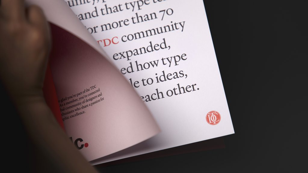
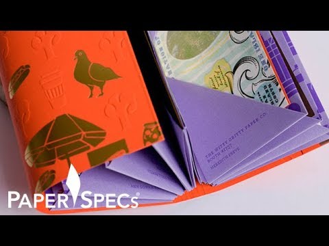
Created by Chicago’s Firebelly Design and digitally printed by JS McCarthy Printers, this welcome kit for new members of the TDC hammers home one of the organization’s core messages – “Type drives curiosity.” It does this through the use of a small number of typefaces printed on papers of all different shapes, sizes and colors, all bound together in a unique way.
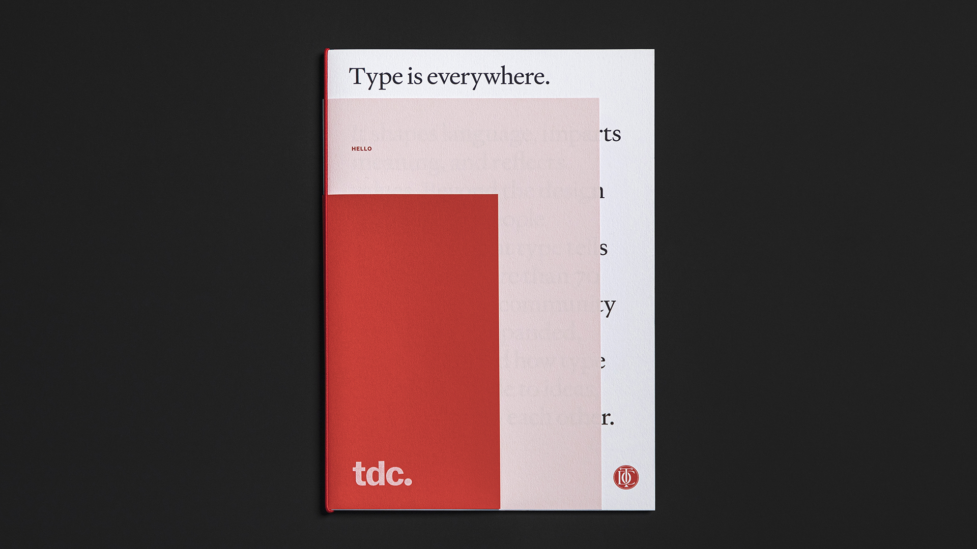
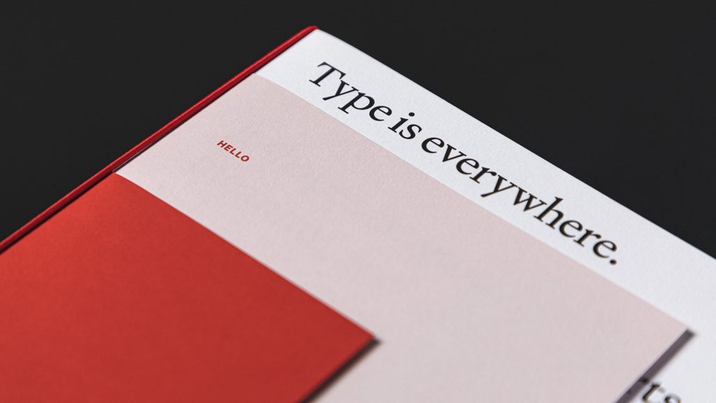
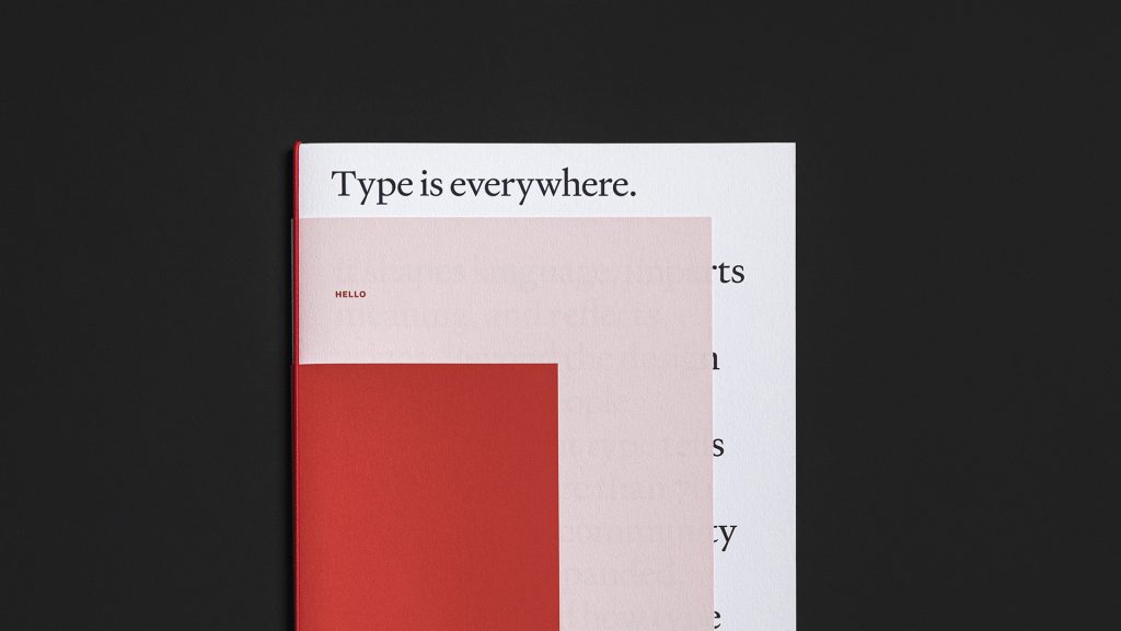
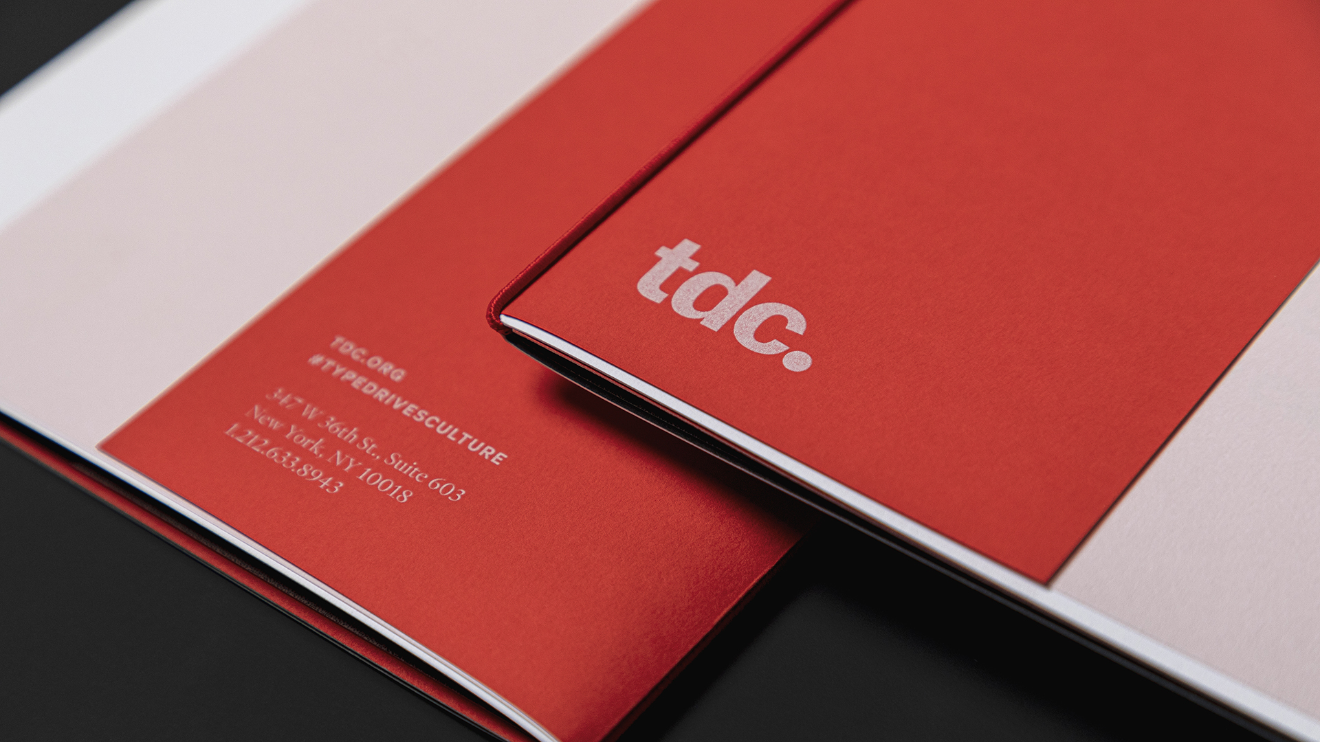
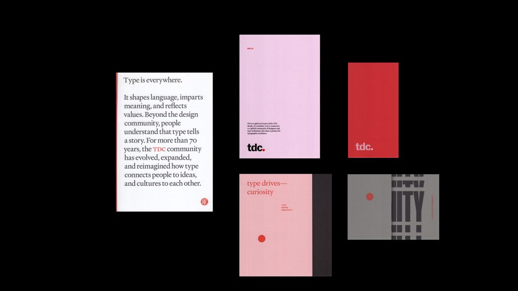
The cover grabs your attention right away as it actually consists of 3 different varieties of Mohawk’s Keaykolour line of harmonizing papers trimmed and stepped in size in such a way that all 3 are visible at once.
“Type is everywhere” exclaims the largest sheet – 111 lb. Cover Pure White – and goes on to prove this point by allowing just a hint of more text to peek out from behind an 80 lb. Text Pastel Pink sheet. That paper simply says “Hello” in Red in a much smaller typeface. The final paper, trimmed down smaller still, features the TDC logo on 80 lb. Text Chili Pepper Red. (A more classical version of the logo appears at the bottom of the White sheet in Red.) All papers have a smooth Vellum finish.
The inclusion of a Red elastic band not only serves to bind these nested sheets together, but also provides an appealing vertical Red border for the cover, which plays beautifully with the topmost Red sheet.
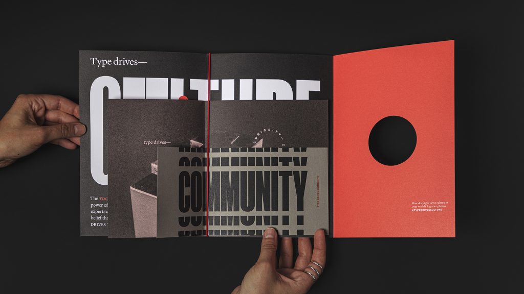
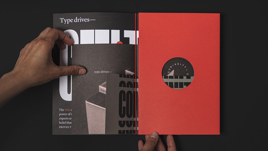
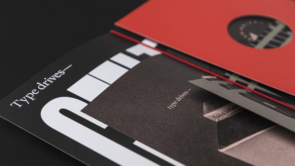
Opening the kit we find the thesis of the piece – “Type drives culture” – printed on the inside front cover of the White sheet by knocking out the words and flooding the rest of the paper with rich Black. A Red dot – part of the TDC logo – appears here and seemingly bounces over to the next page – another Pastel Pink sheet, this time trimmed to a different size from the one used on the cover.
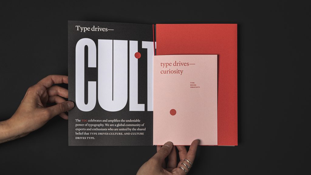
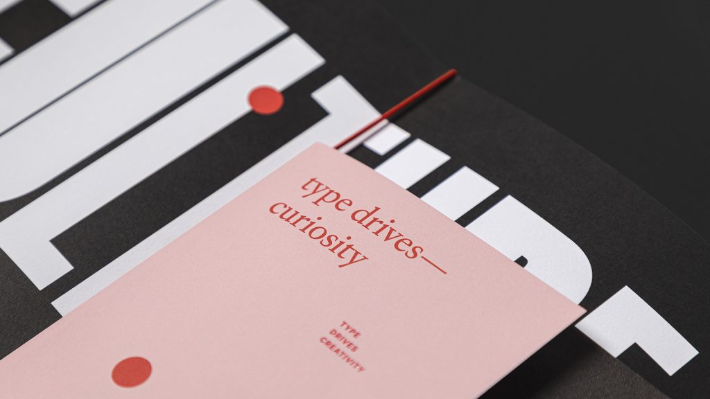
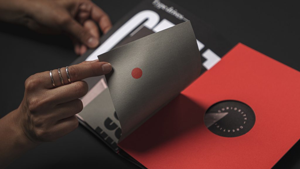
Turning this Pink sheet reveals more surprises still, including another Red dot, this time on 80 lb. Lichen Text. When opening this mini-brochure, it extolls the virtues of “curiosity” and “community” through type. But there is also a round die cut in a Chili Pepper Red background through which more pages can be glimpsed. And since the whole booklet is only held together by an elastic band, you can remove each piece for closer examination, or even put them up on your wall for inspiration.
However effective you think this piece is at celebrating the compelling nature of typography, there’s really no denying that it’s a fantastic celebration of how engaging and impactful print can be.
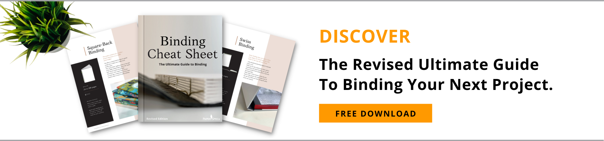
While a color-coordinated elastic band turned out to be the perfect binding for this piece, there are so many other options available for putting your next book, magazine, brochure or catalog together. Discover the 12 most popular, as well as crucial info about each, in our free Binding Cheat Sheet. Download yours right now!


