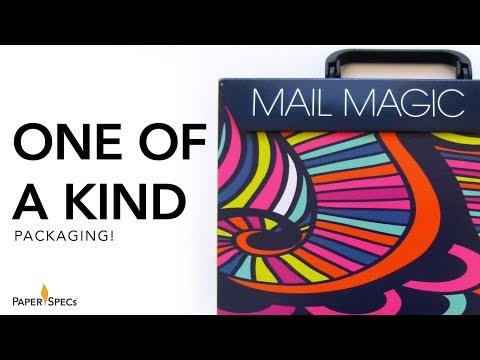
Print shops are a lot like designers: They’re often so busy actually getting their client’s work done, they have little time to devote to promoting themselves and the miracles they can perform with print.
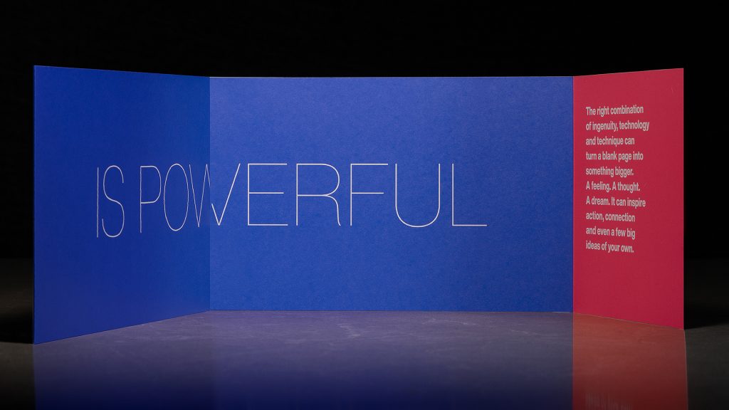
Realizing the importance of self-promotion, our friends at Metropolitan Fine Printers (MET) [projects / website] created this amazing direct mail piece that neatly expresses one simple philosophy: “Nothing is more powerful than paper, ink and an idea.” In this case, the idea is to take the recipient by the hand and lead them into a wonderland of inspiration.
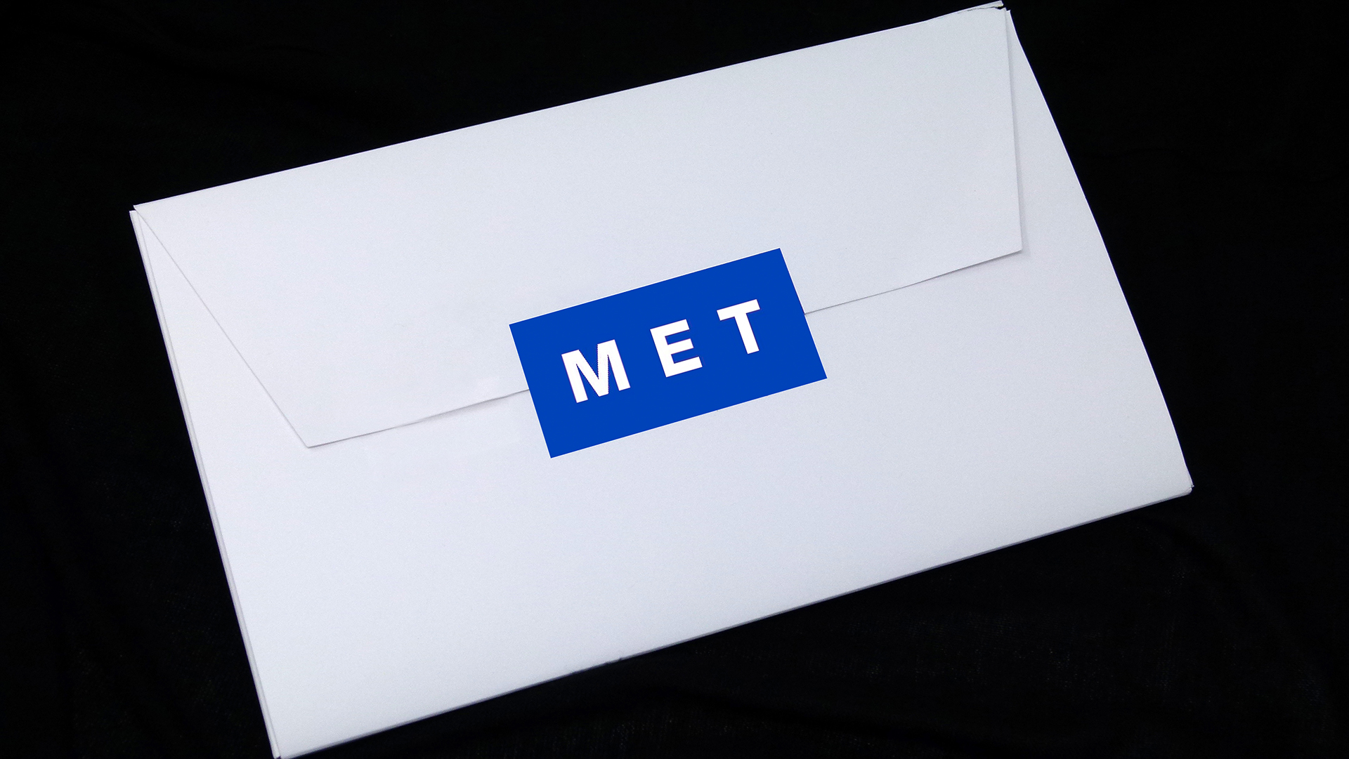
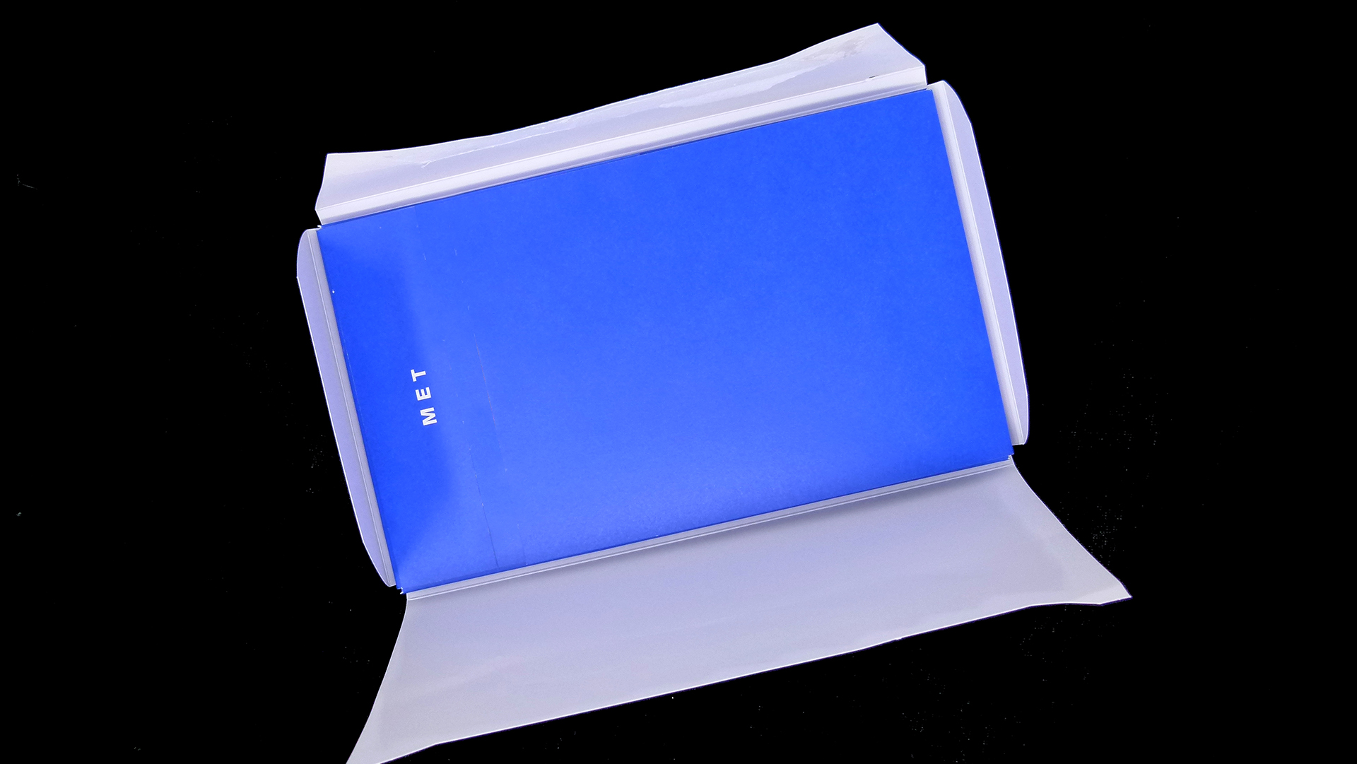
Designed by Will Creative the piece arrives, humbly enough, in a White envelope, a Blue MET logo printed across the flap. Opening the envelope reveals that it is in fact a cross fold, which holds…another envelope, this one Blue with a White logo. [PRO members: Grab this look with your exclusive PRO Guide to the Iron Cross Fold!]
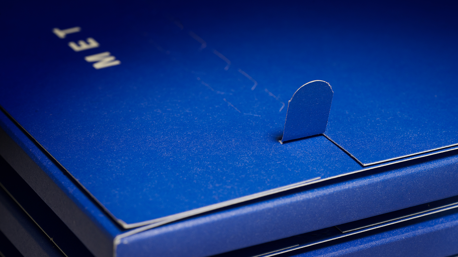
Tearing this one open using the handy zip-strip at the top – a great way to add that extra sense of anticipation – sets off a type of “inspiration chain reaction,” for this piece, too, folds out in unexpected ways!
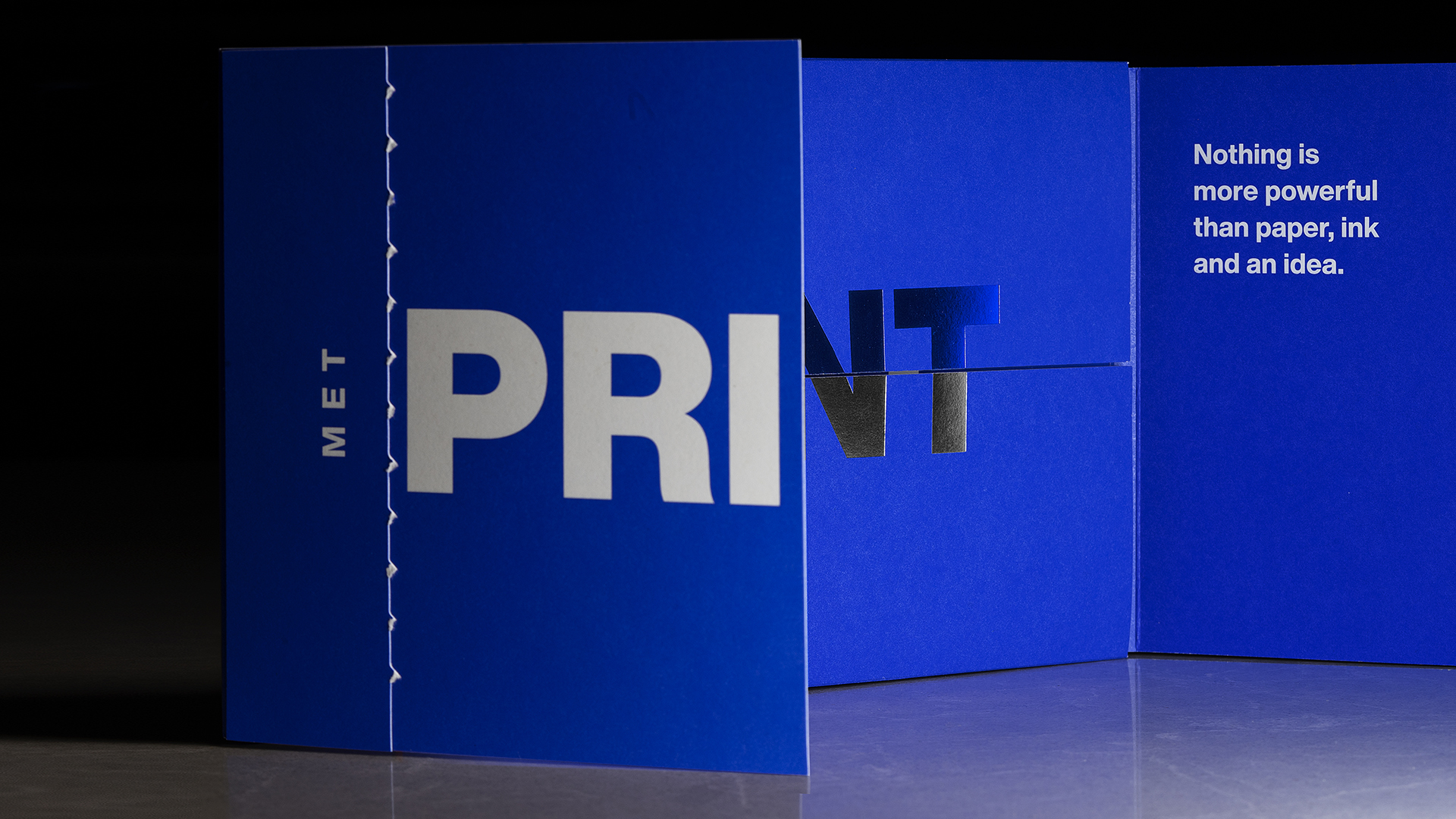
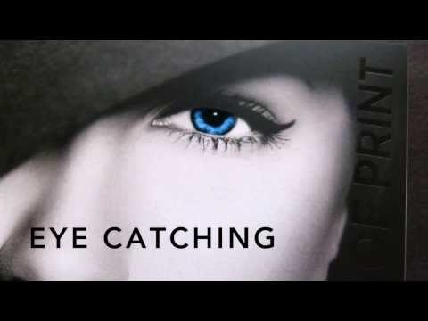
Lifting the top panel reveals the word “Print” in 3 different colors. First up emblazoned in White across the left panel; then in Blue and Silver foil. This “Print” opens vertically, bringing us at last to the “main event.” (It’s times like this that I’m glad that this is video!)
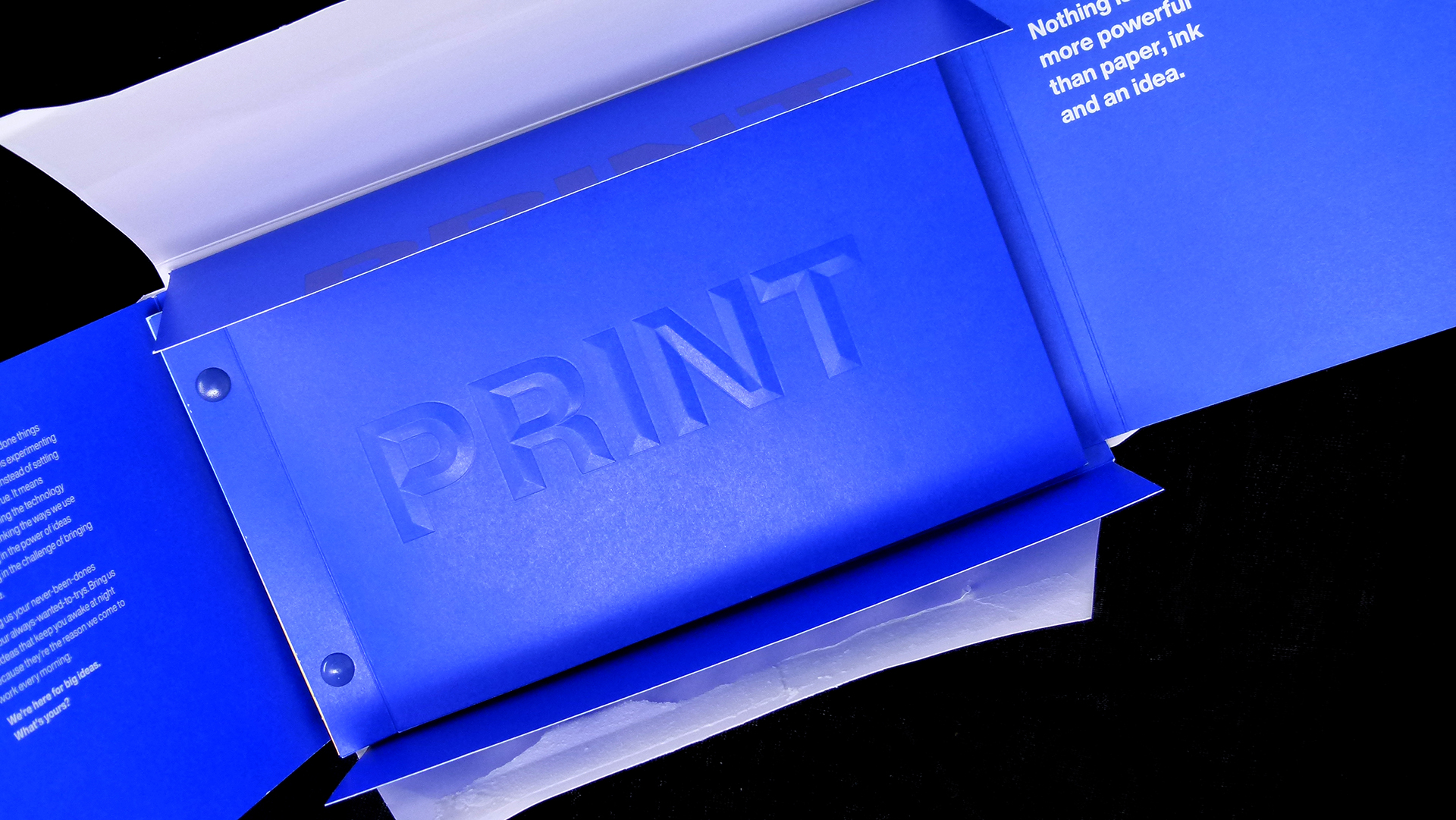
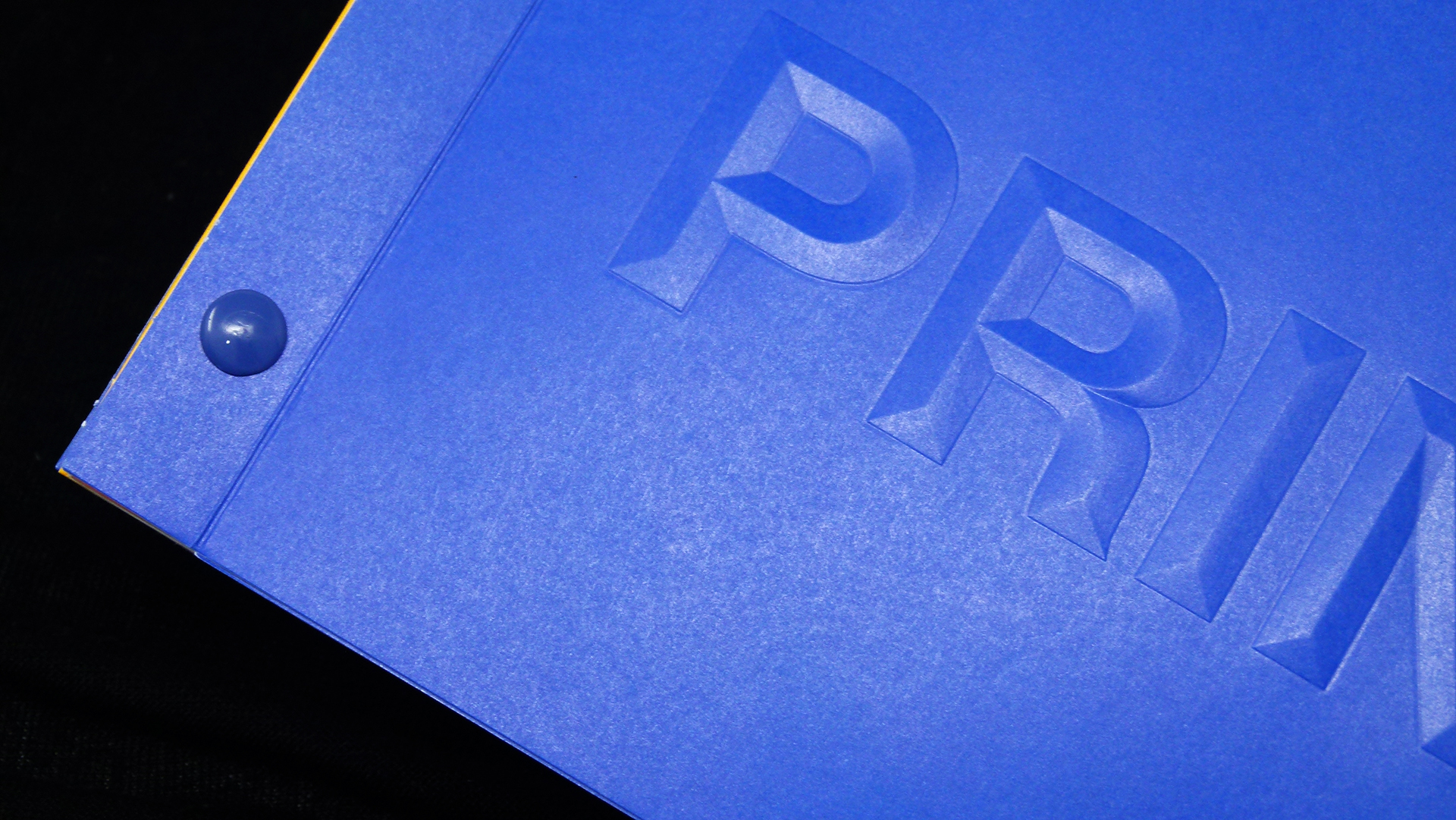
The booklet inside features a cover that perfectly matches the Blue of the envelope. Instantly I’m compelled to run my fingers over the front cover thanks to a gorgeous sculptured emboss of the word…that’s right – “Print” 🙂
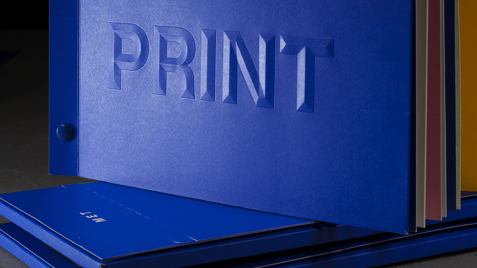
The cover is made from 100 lb. Mohawk Options Smooth Cover that’s been folded over to create a full cover on the left to hide the deboss on the back of the front cover, and a short cover on the right that shares the company’s philosophy and intention for this piece.
The Chicago screws that hold the booklet together – hand painted to match MET’s Blue brand color – provide a further treat for the eyes and fingertips. Another benefit to this screw binding style is the way it allows you to mix and match the papers used. [PRO Members: Get this look with your exclusive PRO Guide to Screw Binding]
This is something that was taken full advantage of here, with substrates ranging from the aforementioned 100 lb. Mohawk Options to 130 lb. Oji Paper Topkote and 35 pt. coaster board.
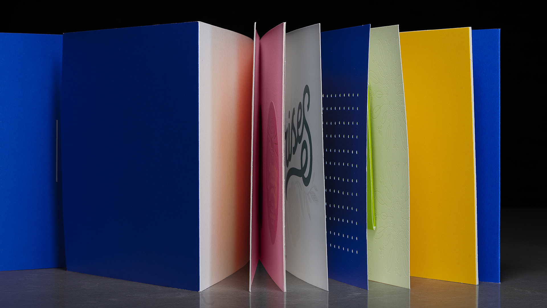
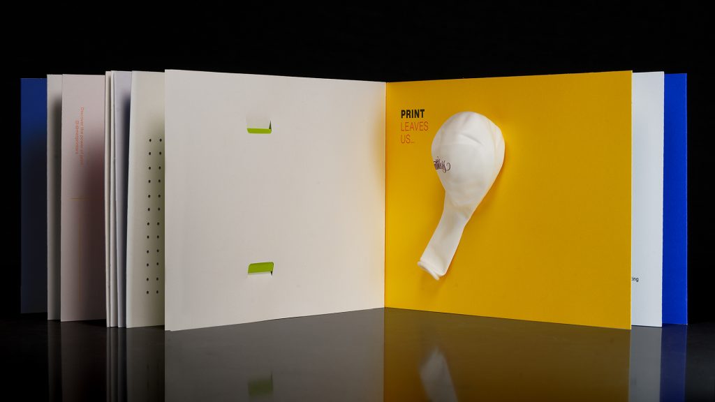
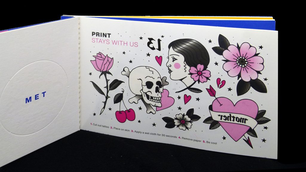
Among the interactive treats to be discovered inside:
- A duplex laminated postcard with registered deboss and perforation
- Temporary tattoos
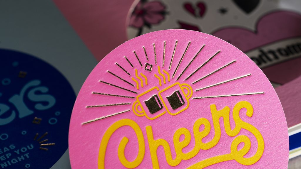
- Pop-out drinks coasters with Gold foil and registered deboss
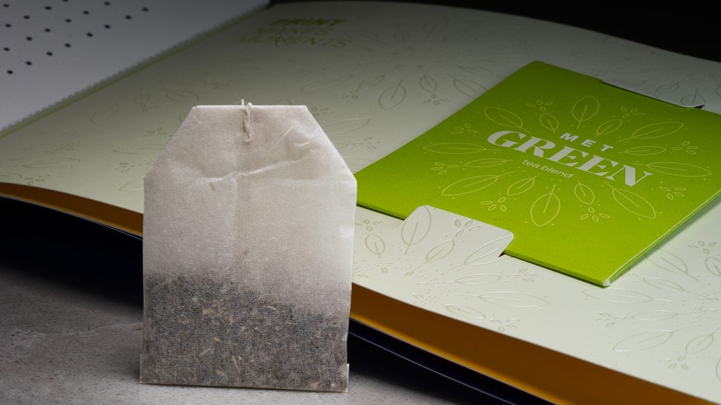
- A custom green tea bag that sits snug on a Clear foil pattern
- A balloon
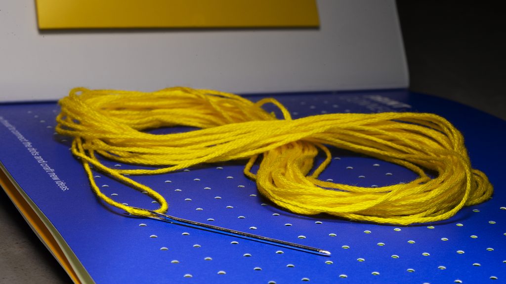
- A multi-holed “cross stitch card” complete with Yellow string and a needle!
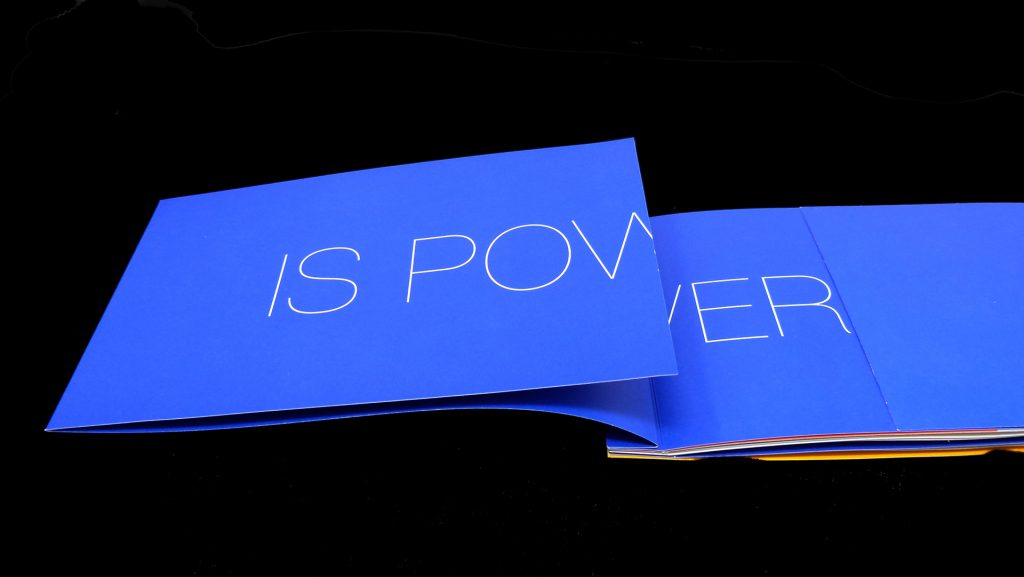
Each page shows off some of the printing and finishing techniques that this printer provides. And taken as a whole, it reminds us that – whether you print it, foil it or emboss it – “print” can still surprise like nothing else.


