Since the founding of America one of its mottos has been “E pluribus Unum”: “Out of many, one.” It’s a sentiment celebrated recently in a series of postcards created by our friends at Chen Design Associates (projects / website) in response to a heartbreaking rise in violent attacks here against Asian Americans and Pacific Islanders (AAPIs).
Members of this studio – representing first-, second- and third-generation Asian Americans among them – sought to express through these eye-catching letterpress pieces that they are both fully American and fully Asian, however different their personal backgrounds and experiences might be.
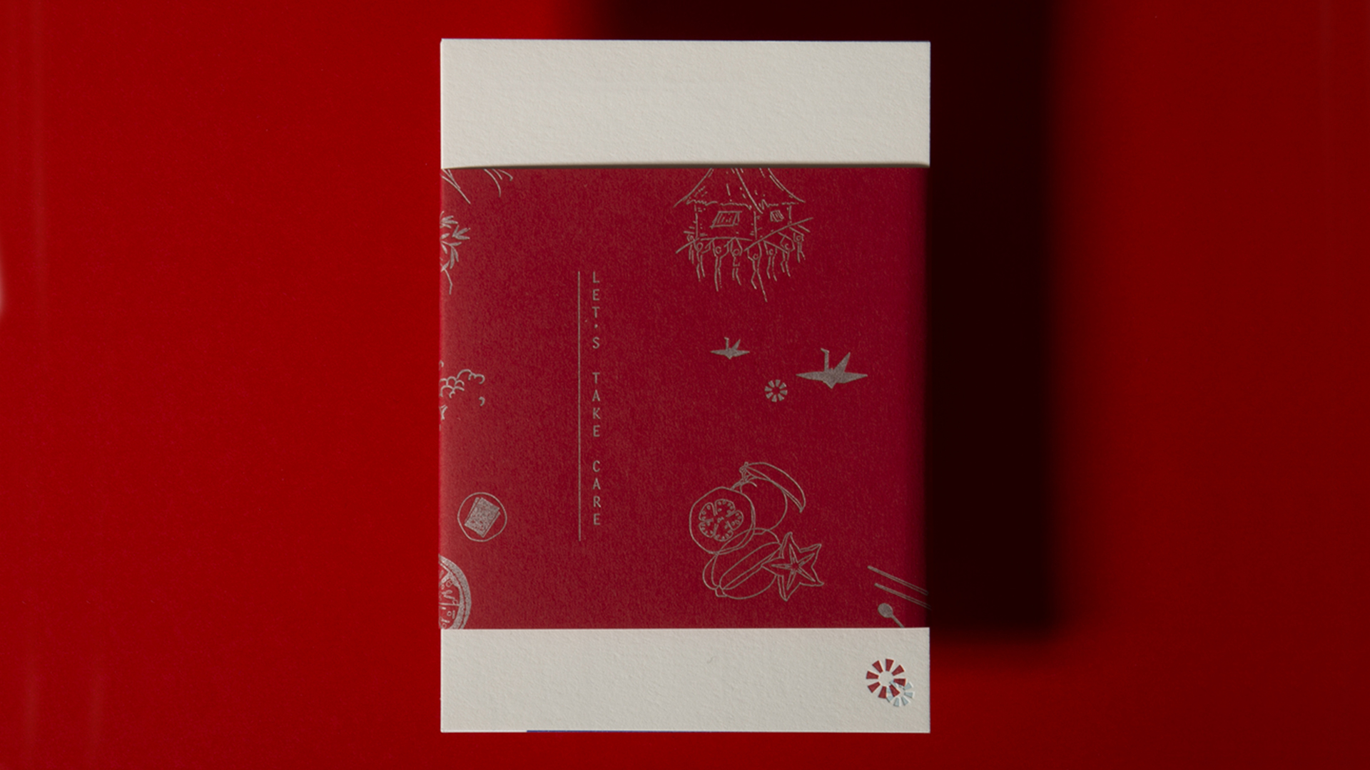
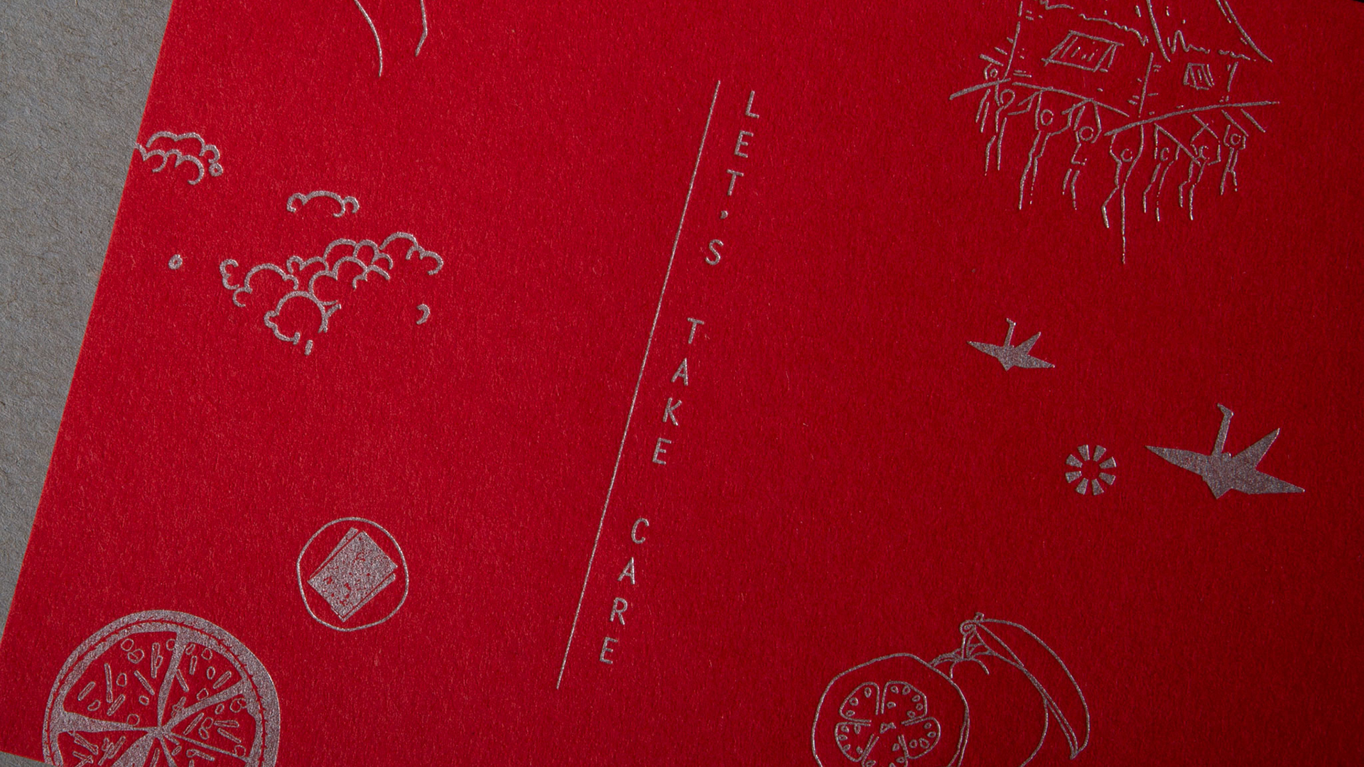
The postcard set is exquisitely packaged in a bellyband of uncoated Colorplan Vermillion, popping beautifully against the Pearl White of the top card. On the front of this packaging appears the title, “Let’s Take Care” letterpress printed vertically – a nod to the way many Asian languages are rendered – in Silver metallic ink. Various Asian-themed illustrations are also printed in Silver, giving us a taste of what lies beneath the sumptuous Red band.
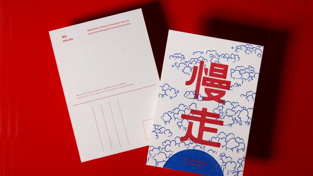
Removing it we discover that each postcard features a reassuring phrase in the native language spoken by one member of the design team, in the hopes of providing, in the words of founder Joshua Chen, “beauty, comfort and solidarity” during this trying time. These include the Tagalog for “Let’s take care of each other” and “Protect what is important” in Taiwanese.
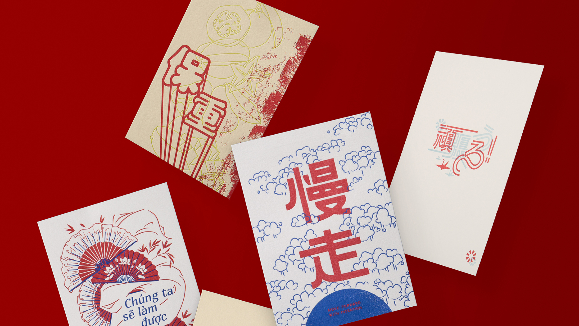
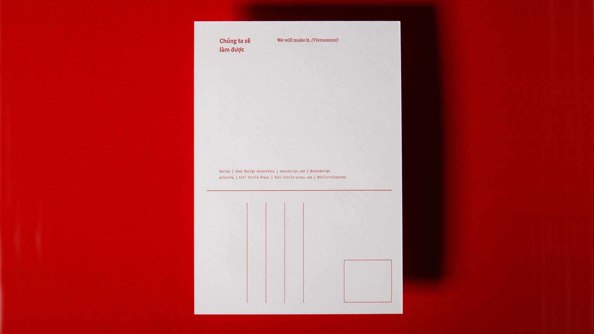
Letterpress printed on Crane’s Lettra Ecru White, Pearl White and Fluorescent White by our friends at Full Circle Press (projects / website), each of these six cards looks different from the rest, yet are united not just by their messages of encouragement, but also by a Red spot color they all share. (Three additional spot colors were used on the card fronts.) This expression of diversity also extends to the use of 3 different shades of paper.
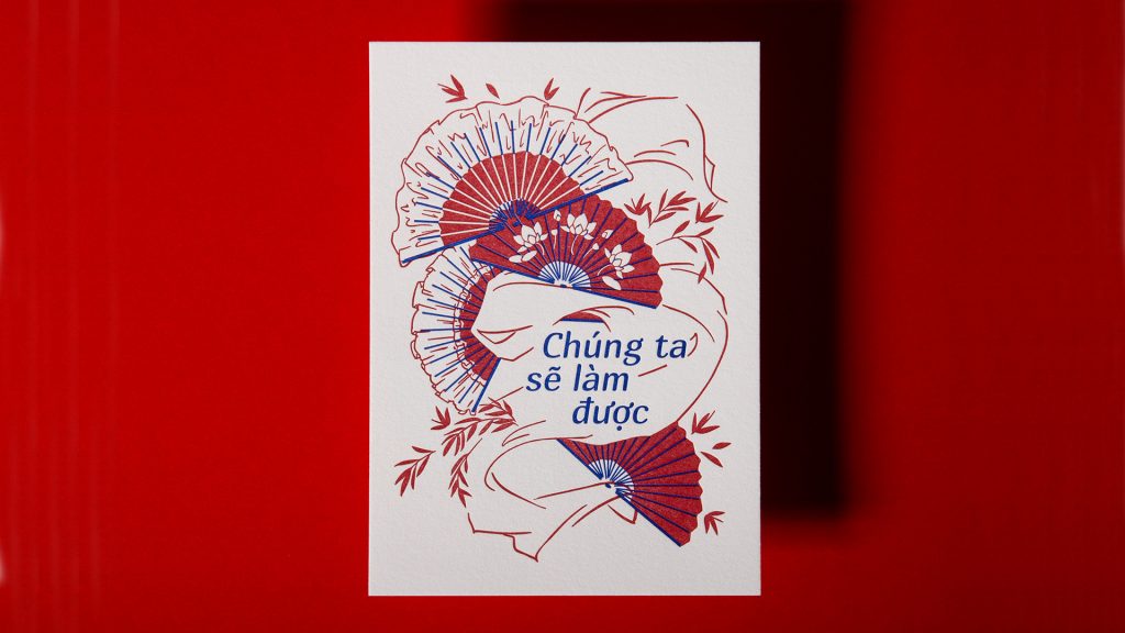
The design team also took great care in the choice of illustrations for each card, with images of tropical cut fruit and shared plates of food subtly reinforcing the idea that we are all part of a larger family in this country, and globally.
Though initially created to give non-Asian Americans better insight into that community, by the end of this project those at the studio also learned new things about each other and their family histories.
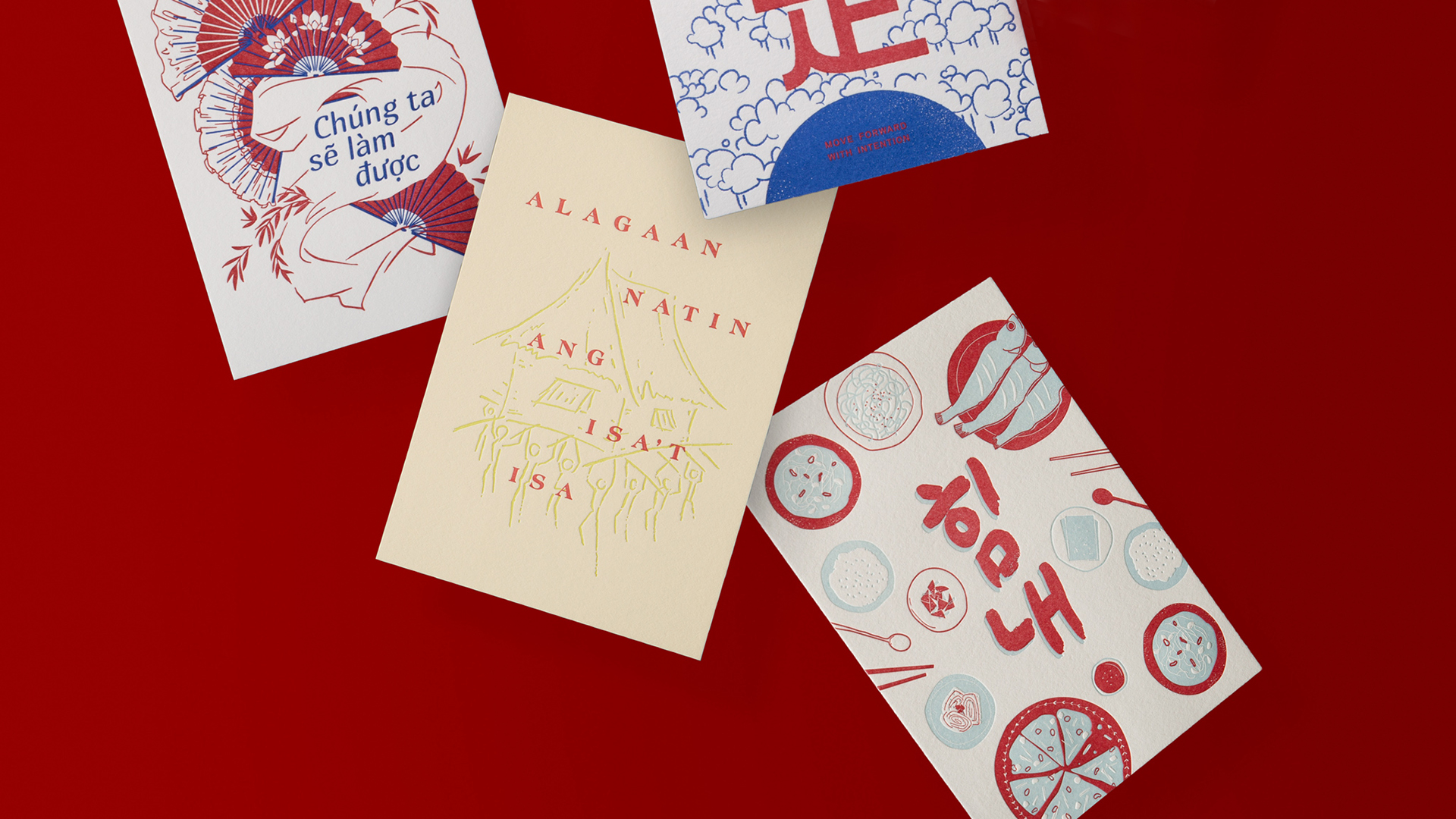
Looking at these postcards side by side, you can’t help but see both what sets them apart from each other and also what unifies them – precisely the message the studio wanted to convey about the Asian American experience. As Joshua Chen observes, “Solidarity can be found in how we are connected, as well as how we are all unique.”
(The “Let’s Take Care” postcard set can be purchased directly from Chen Design Associates here.)


