In today’s competitive real-estate market, the company that can “flip the script” on conventional marketing efforts is the one that ultimately will come out ahead. And in the case of the Teneo brochure, I mean that quite literally.
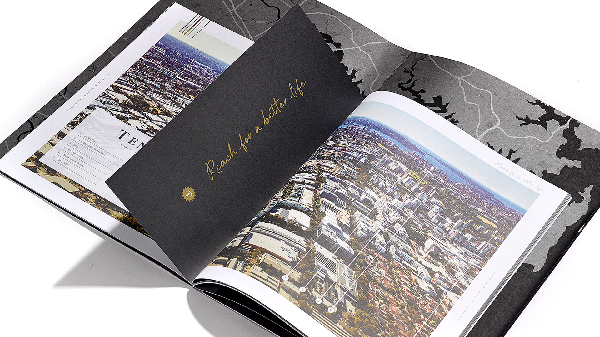
Designed by Toast Creative and nicely produced by Digitalpress to promote a “boutique collection of contemporary apartments and terraces” in the inner-city suburb of Alexandria in Sydney, the black booklet instantly grabs your attention with its large size – about 11.5-x-16 inches – and chunky feel. This latter quality is hardly surprising considering it’s actually two papers duplexed together: 135 gsm (90 lb.) Colorplan Ebony Black [Get Swatchbook!] on the outside, 270 gsm (180 lb.) Gruppo Cordenons Knight Vellum within.
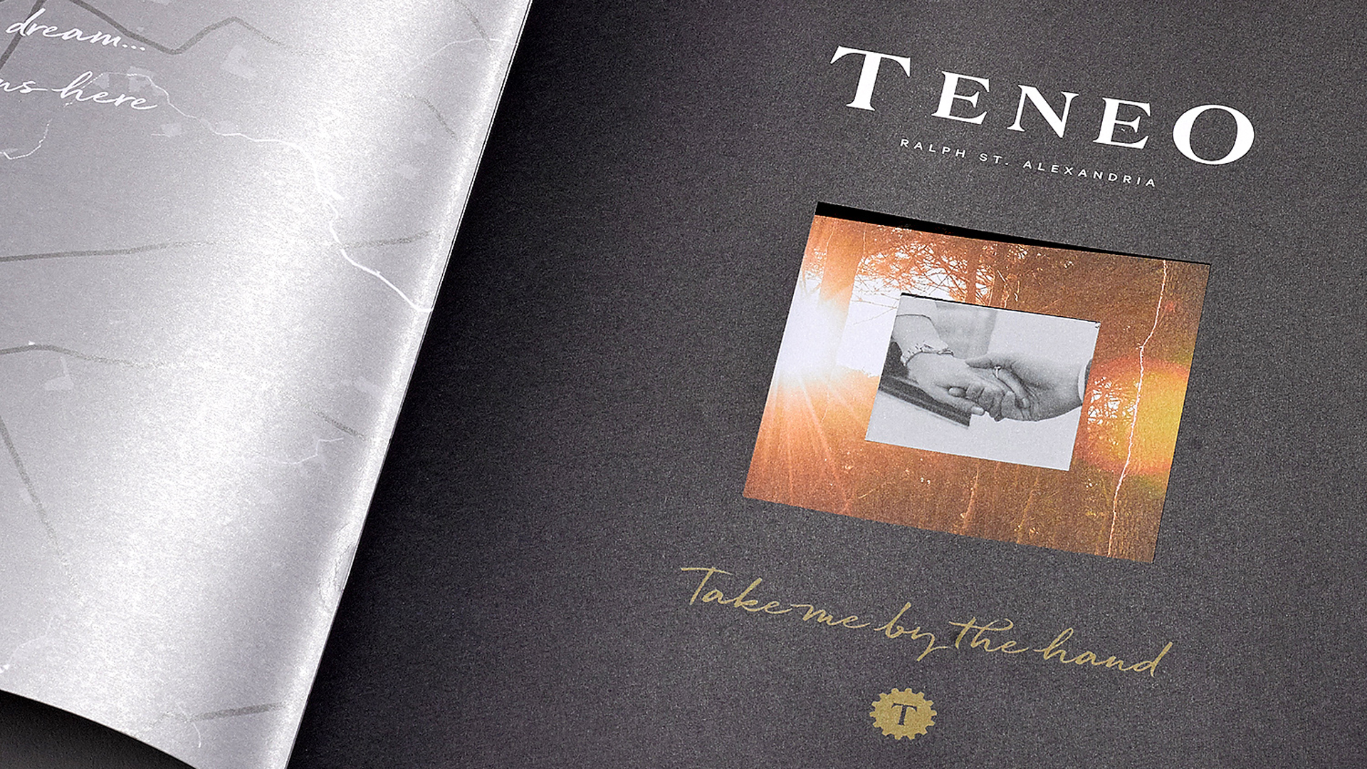
On the black cover, rendered in black foil, are the words “Teneo,” the name of the development, and its tagline: “Take me by the hand.” Intrigued, I open it…to reveal a much smaller brochure inside, bound in place between those larger covers.
This one, a 36-pager, is printed on Australian Paper’s uncoated Grange Text, and cleverly runs with the “hand” motif from the tagline by featuring not only a die cut in the cover, but Page 1 as well, to focus our attention on a pair of two gently clasped hands. The die cut in the black cover is slightly larger than the one in the second page, creating a moody frame around those hands. (I’m going to stop the description right there because in this case, a video is definitely worth a thousand words.) Turning the second page of that booklet reveals a couple exploring some of the apartments’ amenities.
So, have we gotten to the part where they “flipped the script” yet? No, but we’re going to do that right now…by flipping the entire brochure over to reveal a completely different one!
Where the first featured a black cover with black foil, this one has a white cover with white foil. Like the first “version” though, once I open the super large cover sheet, this one, too, features a smaller brochure inside.
While the first brochure focused on lifestyle, this one presents us with photos showing off the properties themselves. It’s a clever way to separate the two things that any real estate company is selling: the house and grounds on one hand, and the potentially exciting life people could have if they lived there on the other.
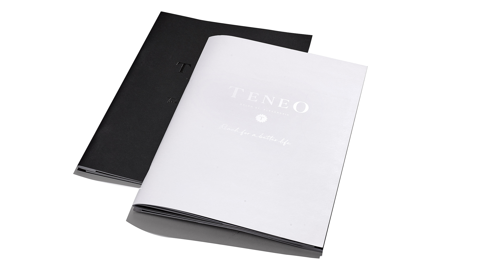
Wedding these two different brochures together was accomplished by basically having two individual saddle-stitched brochures that were then saddle stitched yet again, this time to an oversize cover. The technique is based on the concept of an accordion fold and goes by a few different names – z-binding, zigzag binding and accordion binding – and can be used by any designer IF you follow our exclusive PRO Tip. (Not a PaperSpecs PRO member? Start your PRO membership right now!)
Love this piece? Like it, share it and add your comments below.