Sure we all love parties, but ask yourself this: How would you express a party’s spontaneity and energy visually? This was the challenge faced by creative agency Bond when they created an entire brand identity for high-end London party and event planner Moriarty. The solution they came up with is both vibrant and refined.
First, it helps to understand how Moriarty has positioned itself in the party-planning market. Its team has created events ranging “from intimate occasions in grand palaces to award ceremonies for thousands,” as well as luxury weddings for the European elite. “We believe event planning is an art,” the company declares on its website, “with creativity at the heart of all that we do.” Bond took them at their word.
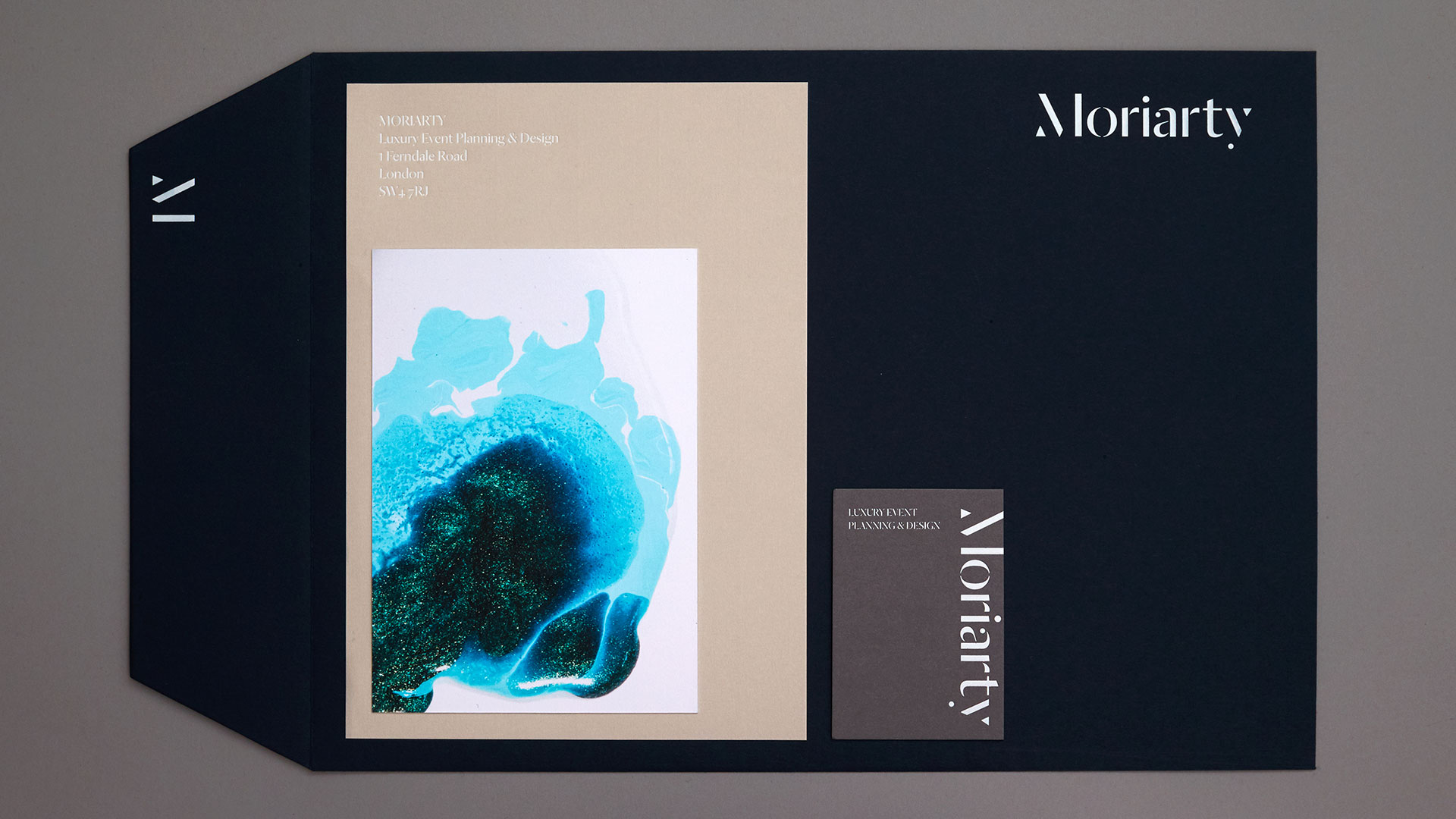
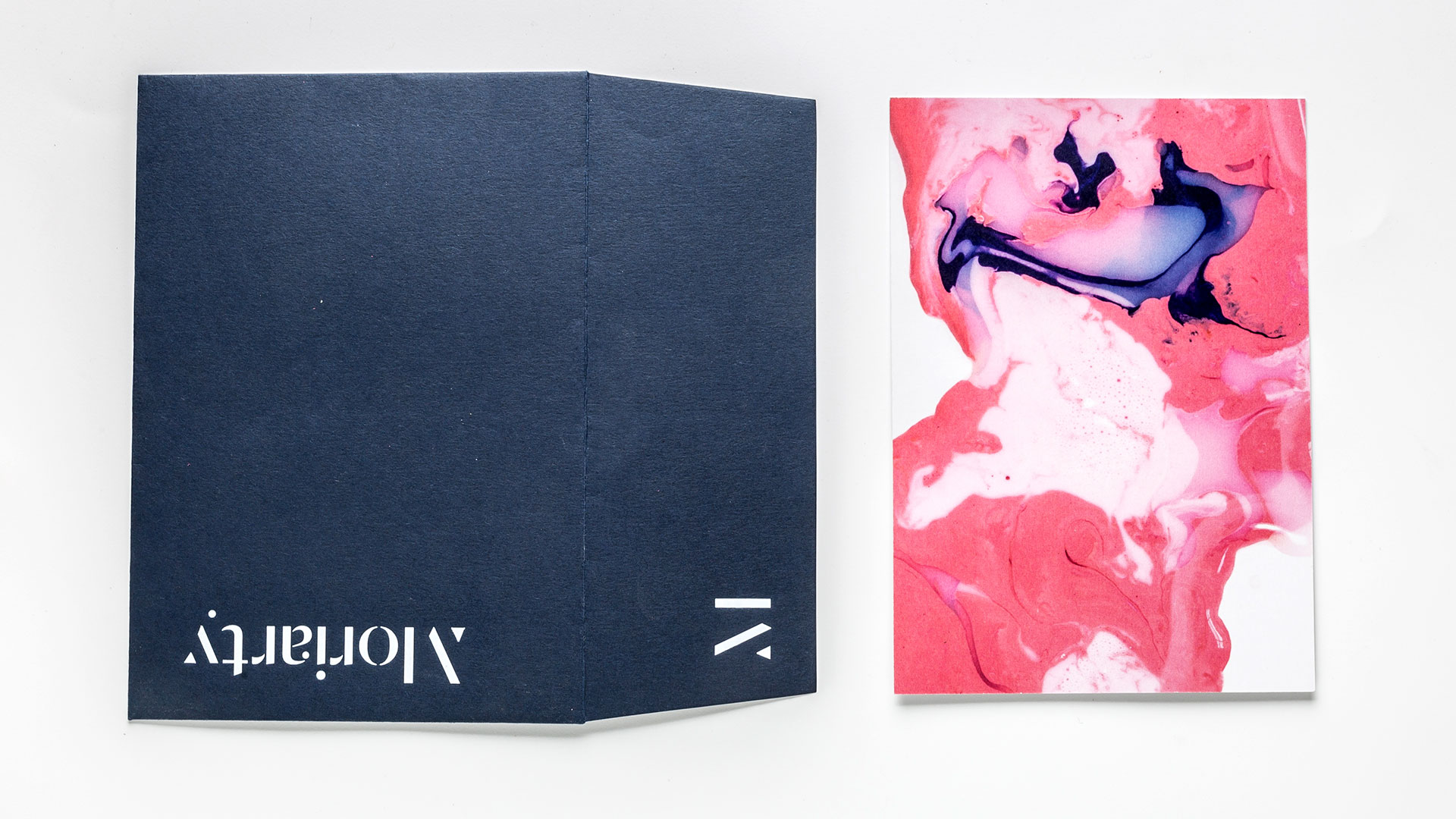
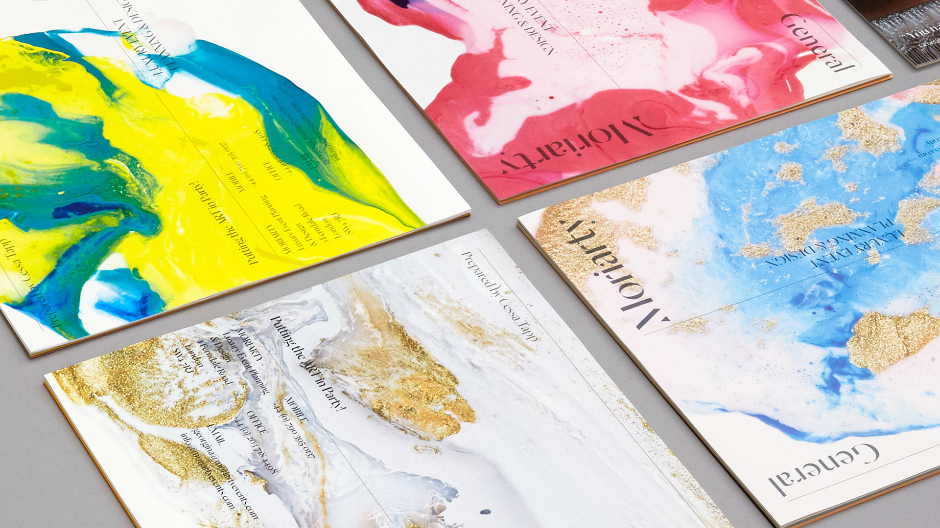
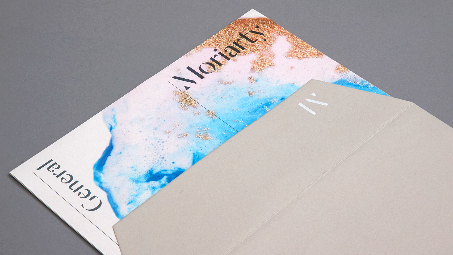
At the heart of these pieces are a series of abstract works of art featuring a mélange of colors and textures achieved through an inventive use of paints, inks, and other mixed media.
“As well as paints, we used nail varnish,” reveals Bond’s Hugh Miller. Some of that nail varnish even contained glitter. Additionally, “the mix of paints and nail varnish caused a chemical reaction which transforms the varied textures and colors into the variety of abstract designs shown” in the pieces.
Finally, paint thinner was applied with a syringe into a cup of paint, which helped give it the desired consistency when poured onto a board, he explains.
The resulting artwork was then photographed and printed CMYK on an HP Indigo Digital Press on postcards. It was also reproduced on proposal cover sheets.
“The abstract art has a kind of punk spirit which we like,” Hugh admits. “Allowing accidents to happen through mark making gives it a dynamic energy and a rebellious spirit.”
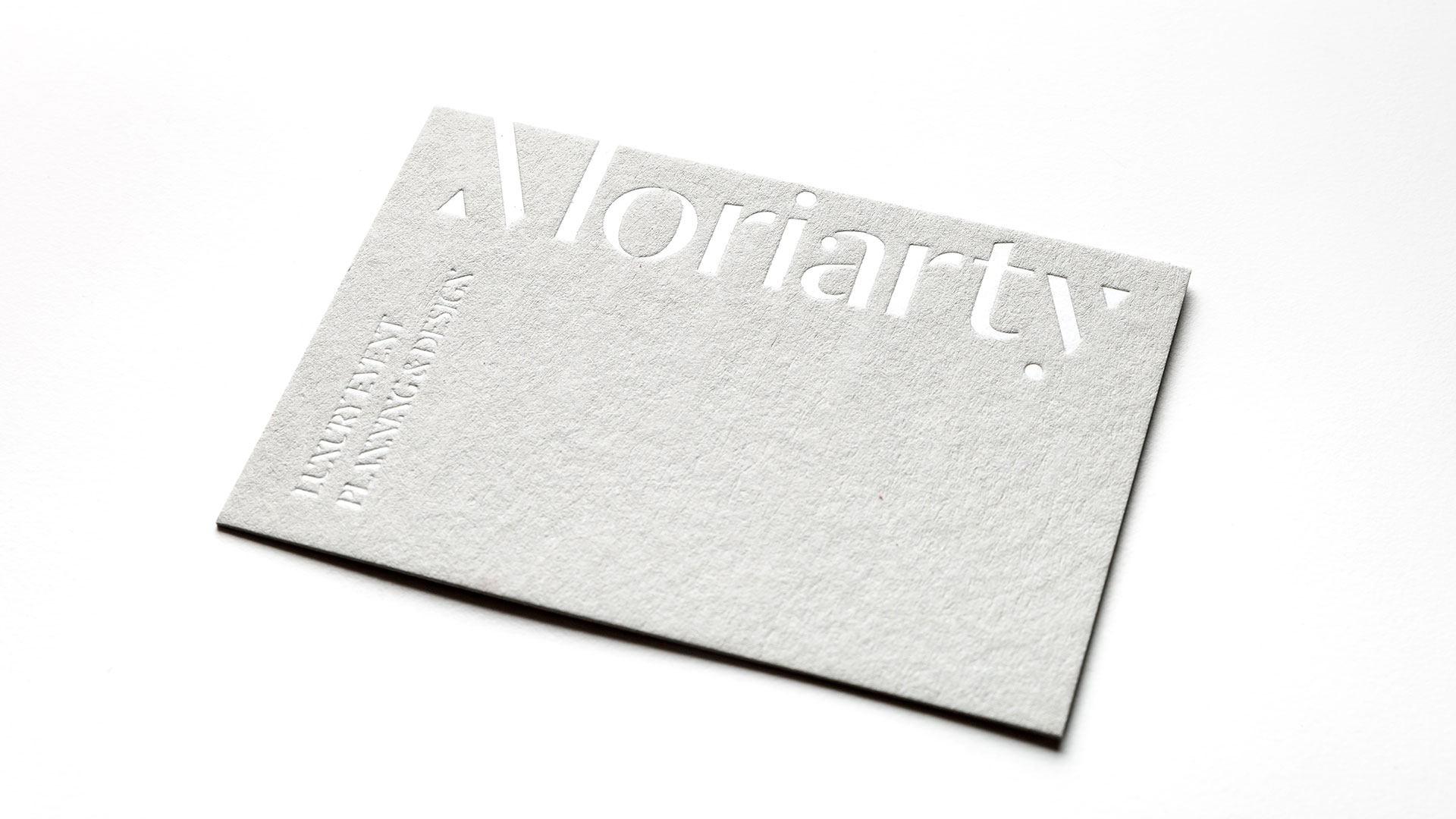
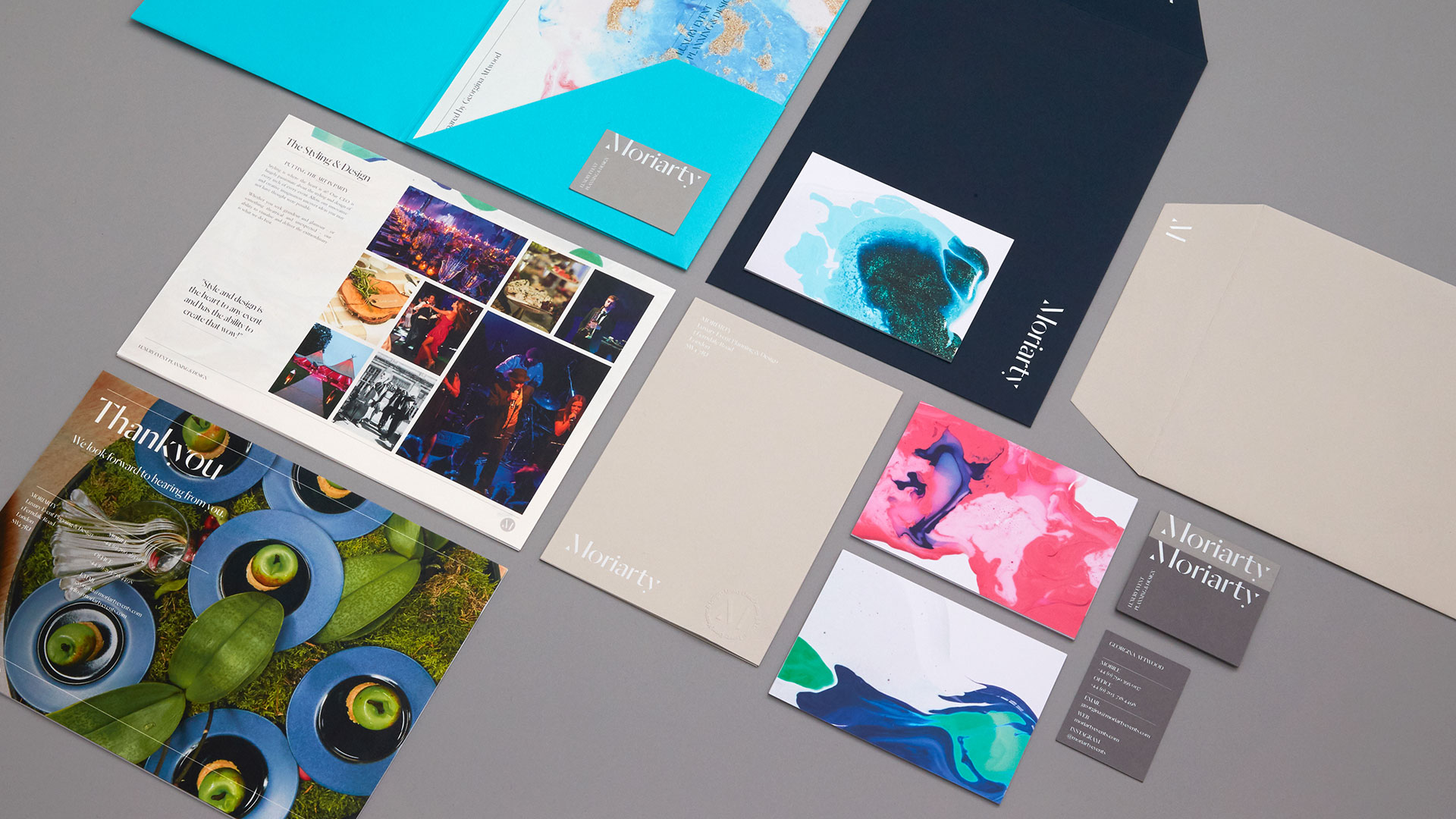
Balancing out that rebellious spirit is an unpretentious use of white foil in various spots on a host of pieces, including:
- Business cards
- “M” monogram on the back of their large envelopes
- Front and back of the small notecard envelopes
- The name “Moriarty” on their folder.
But my personal favorite in this branding suite is the presentation folder. I have always had a soft spot for a broadside reveal, and the creative people at Bond really kicked it up a notch. (A broadside is a flat sheet of paper folded from the bottom up on one side and then tri-folded, creating 2 to 3 pocket spaces.) These folders are not only foil stamped on a textured Colorplan sheet – depending on the relative sophistication of the event, Moriarty can also choose between a Pale Grey or Turquoise version to set the tone from the get-go.
The wide variety of pieces in this branding suite allows Moriarty’s event planners the utmost flexibility in presenting their suggestions to their client – all the while ensuring they stay on brand.
PRO members, don’t forget to check out your: