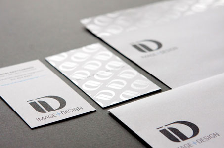
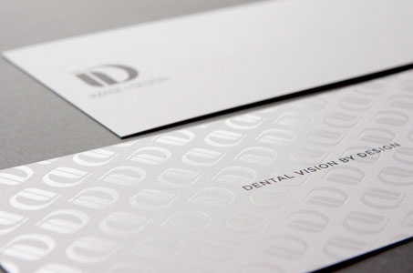
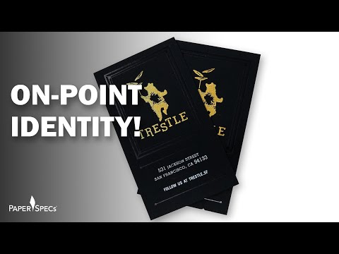
So, how would a designer drill down to the core identity for a dental design firm? Here, the use of interesting proportions and the addition of subtle shine bring a polished look to this company’s unique brand proposition.
The curvilinear letters “ID” create the logo. That logo becomes the basis for a repeating pattern, rendered in glossy clear foil stamping, which appears across the top of the letterhead and on the back of the business card and a note card.

On the letterhead, that repeating pattern across the top forces an unexpected placement of the logo a little farther down the sheet. This begs your eye to take a closer look. The company tag line and URL appear in a delicate balance at the bottom of the letterhead, off center to the right. The company address line does its own balancing act, off center to the left, on the #10 envelope.
The palette is cool and contemporary in slate gray and cyan. The stock (Classic Crest Solar White) was wisely chosen in 165 lb. Cover for the business card and note card.