What a long, crazy year of Paper Tips it’s been. Like the Roman god Janus, we seemed to be looking to old dilemmas (taming To-Do lists) and future challenges (the future of print and marketing) simultaneously. Hopefully you learned even half as much from these tips as we learn each year from our PaperSpecs readers.
Before we move on to the 10 most popular Paper Tips of 2012, please take a moment to drop us a line to let us know what you’d like to read in 2013. And if you missed any of these Top 10 Stories in 2012 – feel free to catch up now. You won’t miss anything – it’s going to be nothing but cat videos at work until the holidays are over anyway.
10. iPR: the Future of Print and Marketing
By Sabine Lenz
I had the chance to catch a glimpse into the very near future of print when I attended a Print Production Professionals webinar about intelligent print recognition (iPR), an emerging marketing technology that provides groundbreaking opportunities for print.
9. The Secret of Cold Metallic Magic
By Sabine Lenz
Whoosh! The sheets were coming off the press fast and shiny. Whoosh! Hundreds of metallic tones brought glitz and shine to our project. Whoosh! And all this with one pass through the press … Magic, pure magic.
8. QR & AR Codes – Questions Answered
That our webinar, “From Print to Web with QR & AR Codes,” generated a lot of interest (and questions) comes as no surprise. Thanks to special guest speaker Daniel Dejan, North American ETC Print and Creative Manager for Sappi Fine Paper North America, attendees were treated to great visual examples and a wealth of invaluable information from this industry expert.
7. Milton Glaser’s Success Secret? ‘Work Your Ass Off’
By Will Sherwood
Milton Glaser (b. 1929) is among the most celebrated graphic designers in the United States. He is perhaps best known as the originator of the “I (heart) NY” logo and as co-founder of New York magazine. Will Sherwood asked Glaser to share with him his wisdom on the subject of design and making it in the design world.
6. Avoiding Death by To-Do List
By Jason Womack
Do you dread it? You know … the feeling that the second you step foot in your office you’ll be hit with 20+ tasks to add to your to-do list (not to mention an inbox full of emails begging for an immediate response)? Most of your dread doesn’t come from the work itself—it comes from how you think about the work.
5. How Seven Simple Words Can Save You
When that meeting or conversation gets off to a rocky start – whether tense words are exchanged or you just don’t seem to be connecting – it’s time to push the reset button. There’s one phrase that can turn it all around.
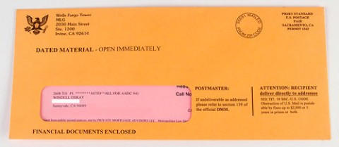
4. Rule 1: Don’t Creep Out Your Clients
By Heidi Tolliver-Walker
All personalization is good personalization, right? Using customer data in your marketing always makes customers happy and increases the chances that they will respond, right? Wrong.
3. 6 Tips to Successful Font Selection
By Ilene Strizver
Selecting a typeface (or typefaces) for a design project is one of the most important – and challenging – aspects of any job. In today’s digital world of over 100,000 fonts, this task can be a daunting, if not overwhelming, undertaking that requires time, patience and perseverance.
2. How to Decide: 4-color vs. Spot Color
By Nani Paape
How do you determine whether four-color process printing will work for your design or project? Here are some tips to help you decide.
1. 10 Tips to Avoid Typos
By Carrie Chase
Did you know dialing a toll-free 800 number could take you to a sex hotline? I know this because a few years ago, I sent a promotional email that inadvertently directed 150 of our distributors to a phone sex operator. Oops! I had transposed two digits in my company’s 800 number. Not exactly the kind of message you want to send anyone, let alone a very conservative group of customers.