Selecting a typeface (or typefaces) for a design project is one of the most important – and challenging – aspects of any job. In today’s digital world of over 100,000 fonts, this task can be a daunting, if not overwhelming undertaking that requires time, patience and perseverance.
Before you even begin searching through your font library, or those of the numerous foundries and font retailers, it is essential to know enough about the job at hand in order to narrow down the endless possibilities. If you don’t know where you are going, typographically speaking, you’ll never get there.
Begin by familiarizing yourself with the needs and goals of the project, and treat them as a roadmap to your intended typographic destination. Here are some important factors to consider before you begin your search:
Design Goals and Demographics
The first and foremost step in selecting a typeface is to understand the needs and goals of the client, as well as the intended audience. To focus your design goals and subsequently the most appropriate typefaces to use, start by identifying the age, attention span and demographics of your audience.
Different typefaces attract different audiences, both subliminally and overtly. Children are drawn to easy-to-read, childlike fonts; seniors to larger settings of typefaces with clarity and legibility; teens to edgier, more expressive designs. After you consider your audience, ask yourself how much reading you are asking them to do and what information you are expecting them to walk away with. Once you identify your design objective, your typeface choices will narrow considerably.
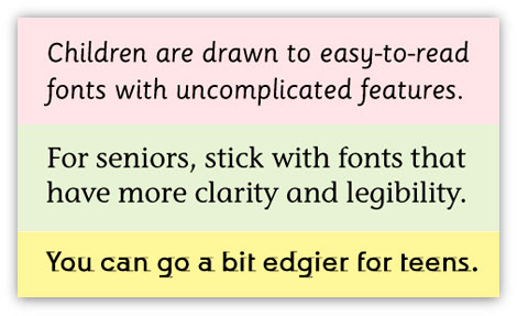
Knowing the demographics of your intended audience will help narrow down your font exploration.
Type Size
Do you need a font for running body copy, a headline, or both? Perhaps for very small text for captions, labels or credits? Or do you need it for large signage and wayfinding, trade show booths, or even a billboard? All of these usages require fonts either intended for, or useable for these sizes.
In some cases, you might want a font family to be used for both text and display. While the foundry might give you guidelines on what size range a particular typeface family is intended for, it is always wise to see for yourself how it looks from the smallest to the largest of intended size range by doing your own testing.
While some fonts can be adapted to a broad range of sizes with the help of a bit of tracking or kerning, others will either become hard to read, or loose the defining characteristics they were initially chosen for.
Font Legibility
Legibility refers to the ease with which a typeface can be read; it relates to design characteristics including its x-height, character shapes, stroke contrast, the size of its counters, serifs or lack thereof, and weight – all of which relate to the ability to distinguish one letter from another.
Not all typefaces are designed with legibility as a priority. This is more of a consideration for text designs where a high degree of legibility is necessary to holding the reader’s attention for the duration of the copy. On the other hand, display designs are generally used for fewer words in larger settings where the objective is to be instantly noticeable and to convey a mood or a feeling, so legibility might not be as important. For this reason, it is important to know at the onset of a project how important legibility is for each font and usage, and proceed accordingly.
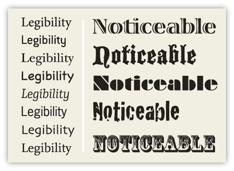
Legibility (left) is much more of a requirement for lengthy text settings; while for headings and other display settings, it can be sacrificed for a bit more punch and personality.
Type Color
You might not think the color of your type would affect the type selection, but it can, especially with text type. If the type is to be light or white and dropped out of a dark color or image, the weaker design details of the typeface might not stand up to any potential ink spread, tint or color screening, especially if you are using CMYK or RGB rather than spot color.
In that case, or in any scenario where the contrast between the type and the background is not high, choose a typeface (or weight variant) with a bit more strength or punch, as well as with heavier serifs or thin strokes for greater readability.
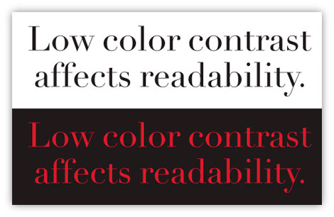
Color and contrast can affect the appearance of typeface design details. The thin strokes in the upper examples are stronger than those of that below it, which are more difficult to see, resulting in reduced readability.
Paper and Surface Considerations
When selecting a typeface for print, take into consideration the kind of paper or other surface it will be printing on. This is especially true when the desired typeface or version has extreme weight contrast with very thin strokes, is an extra light or ultra thin weight, or has small counters that might close up.
Different papers, surfaces and finishes take ink differently, and can alter the appearance of the type, making it heavier or lighter – and in some cases, start to break up entirely.
For instance, newsprint and some textured papers are very porous and might make the type appear light, while some coated papers as well as surfaces such as plastic, mylar and glass don’t absorb ink well, resulting in type that appears heavier than intended.
Using a super family that contains a broad range of subtly progressive weights allows you to select the exact weight needed to give you the desired results for the medium you are using. And if it will appear on more than one surface, customizing the weights for each can result in a more consistent appearance.
Paper: coated or uncoated, smooth or textured, try one of the super families with subtle weight
Color: consider color/texture of paper as well as, do not select from the screen
Printing Method
Last but not least, do take into consideration the printing method being used, and what effect it has on the type, especially the thin strokes and the counters, or enclosed spaces within a character.
If it will be straightforward digital or offset printing with regular ink and no special effects, you probably know from experience what to expect, with results fairly true to the actual letterforms. But if you will using letterpress, thermography, screen printing, as well as embossing or metallic inks, the integrity of the characters might be affected by either reproducing too thin with lights strokes breaking up, or too heavy with counters filling in.
So before you choose a font and weight, check with your printer or a print production expert to find out beforehand what to expect, and pay attention to any suggestions or guidelines that will help give you the results you are looking for.
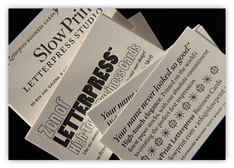
When conducting a font exploration, consider the intended printing method and what effect it might have on the appearance of the type, including the thin strokes, counters, and other design details. These letterpress pieces showcase the performance of a range of typestyles and sizes. (Printing & design by PF at SlowPrint Letterpress.)
———-
Copyright 2012 PaperSpecs.

Ilene has written and lectured extensively on type and typographic design to both students and professionals in the field. She formerly was the director of Typeface Development for International Typeface Corporation (ITC) where she developed more than 300 text and display typefaces. Her book, Type Rules! The designer’s guide to professional typography, 3rd edition, has received numerous accolades from the type and design community. She conducts her widely acclaimed Gourmet Typography Workshops internationally.


