 Casting a wide net in search of impressive business cards the world over, you’re never quite sure what you’re going to get…which is exactly how we like it.
This week it really does run the gamut from simple to sophisticated, from a fold in the right place to a flirtation with “the edge.”
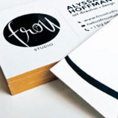
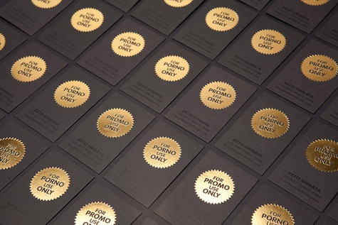
Miller Creative
“We sweat the small stuff,” boasts New Jersey branding agency Miller Creative, but it’s where they make this claim that sets them apart. Opting for 2mm-thick card stock that reflects the packaging materials they design, they have this phrase rubber stamped on the edges of their cards! And that’s just one of the messages they randomly use there. Reminds us of those magazines that get all playful with what they put on the spines of their perfect-bound issues.
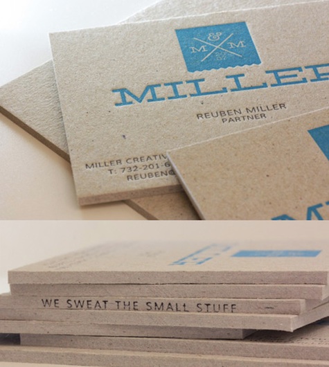
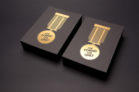
Beto Shibata
When gold foil stamping is used, you’re more than halfway to a classic, efficient business card. And if you come up with a phrase that inspires a double-take from everyone who sees it, so much the better. Brazil’s Beto Shibata separates his design work into two camps, he tells UnderConsideration:
“Promo Use Only are the projects I could put in my portfolio and For Porno Use Only are the other works I just make for the money.”
For the latter, he came up with these cards that stamp gold foil on paper – just beautiful.
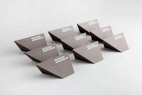
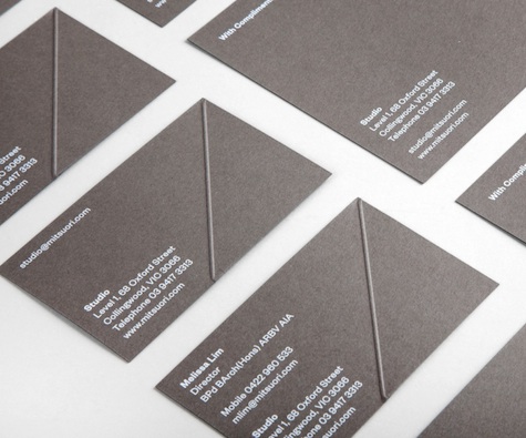
Mitsuori Architects
If you’re a boutique architecture firm, how wonderful it would be to actually work some manner of architecture into your business card itself. This is what Melbourne’s Mitsuori Architects did. We quote at length here from the card’s designers: Hunt & Co., to give you a better appreciation of what at first seems a simple feat:
“Translating to ‘three-fold’ in Japanese, Mitsuori is a boutique Melbourne-based architecture studio. The concept of the identity derives from a literal interpretation of ‘three-fold’. Through experimentation, we developed a folding system from a single A4 sheet of paper that uses only three folds. The outcome was the triangular-shaped fold that was used as the cornerstone of the identity. The 45-degree fold was then applied to the business and with-compliments cards, enabling them to stand freely and representing an architectural form. The collateral was printed on a dark-grey-coloured stock, with six passes of white ink on an HP Indigo printer. The result, a refined uncoated stock with unique matte printed finish.”
>>Business Cards of the Week 1