Neenah Paper
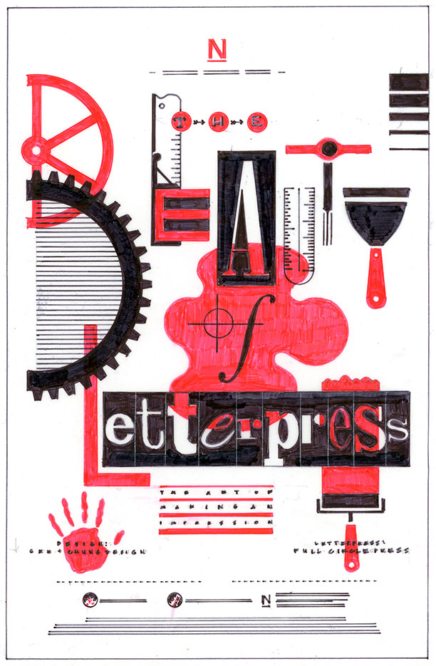
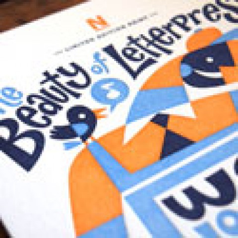
For the newly released Edition 13, otherwise known as “The Beauty of Letterpress: The Art of Making an Impression,” designer Earl Gee, partner and creative director of Gee + Chung Design, pays homage to the centuries-old letterpress process – with a modern twist and a Russian Constructivist aesthetic.
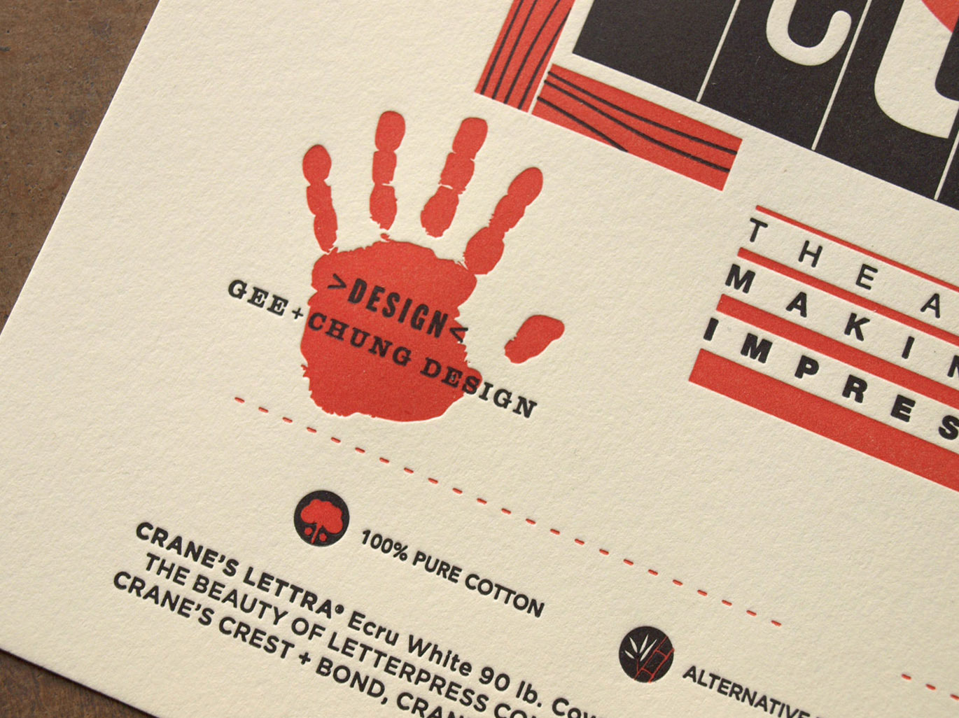
As with all prints designed and produced for The Beauty of Letterpress by Neenah, Gee’s print is available for purchase — it’s only $5! — with all proceeds going directly to the Hamilton Wood Type & Printing Museum.
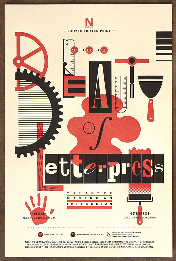
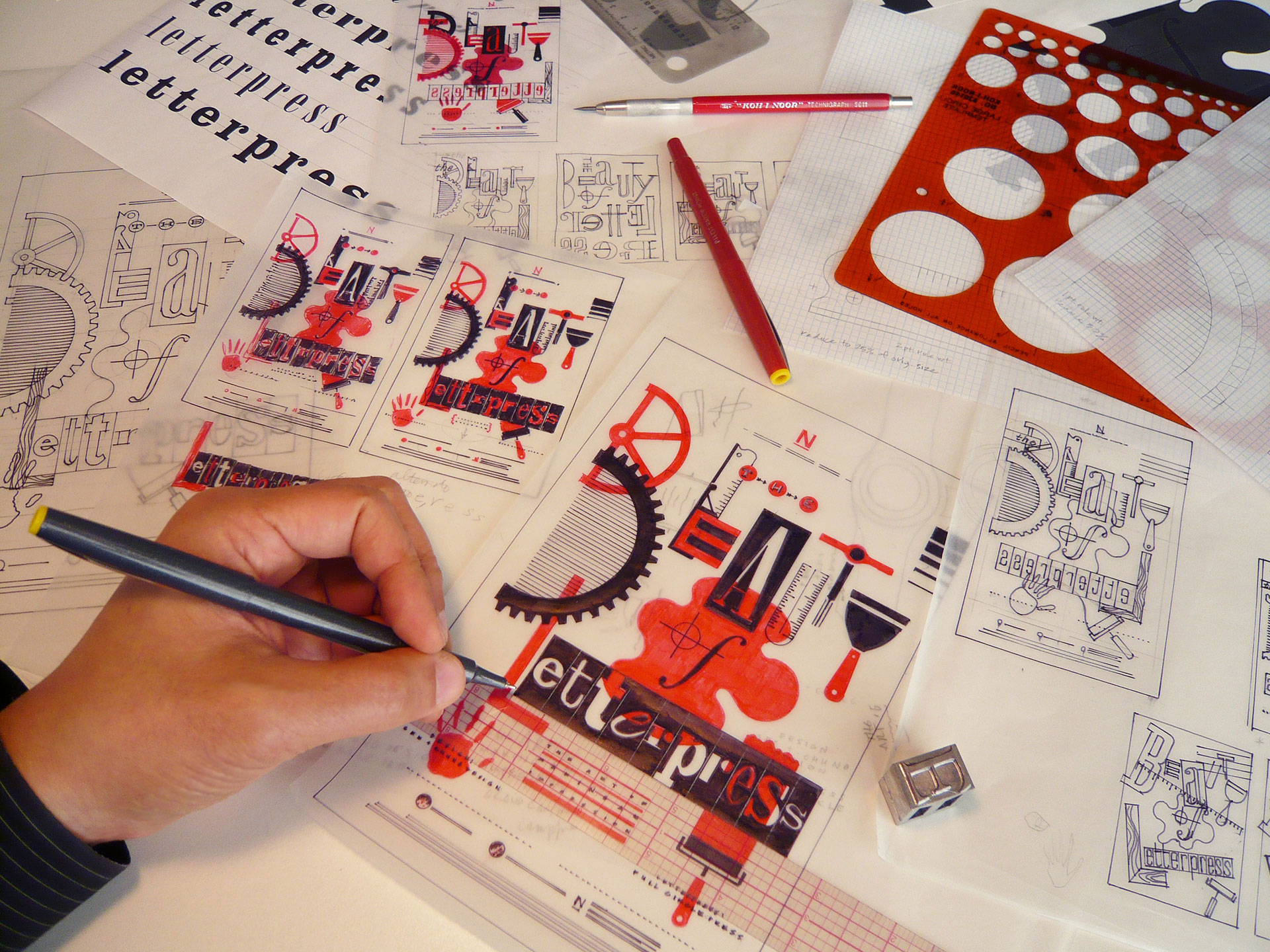
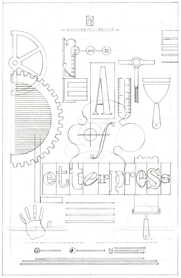
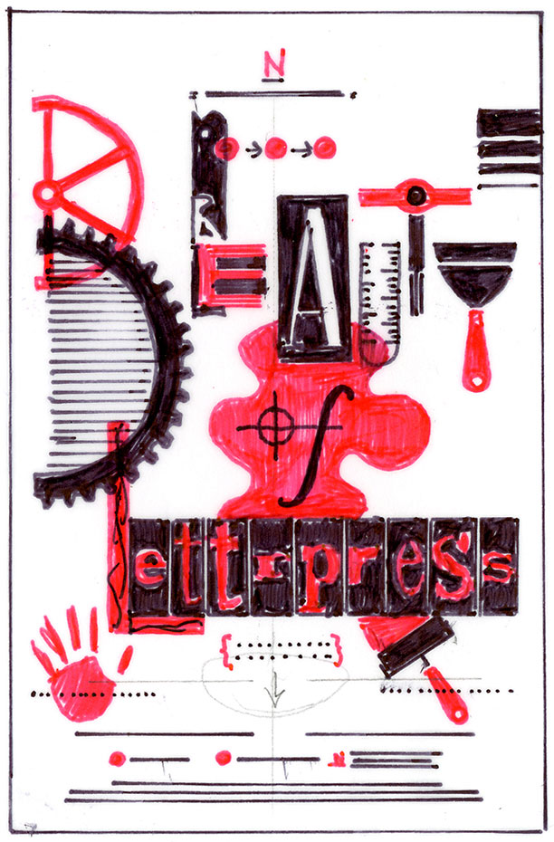
The title of Gee’s print couldn’t be any more representative of his finished piece. Inspired by the letterpress process, Gee transforms the craft’s iconic tools into typographic forms that make the viewer want to explore each letter.
“These amazing tools and techniques, which have survived for centuries, connect art and craft, designer and printer, and paper and impression,” Gee explains. “Letterpress has the extraordinary ability to make a lasting impression by enabling people to appreciate the artist’s craft in both a visual and tactile manner.”
Though Gee had other concepts for his design involving straight type, he says, “The idea of using tools as typographic forms was just too much fun to resist. I hope viewers enjoy discovering the tools within the typography.”
The platen press wheel and mechanical gear, ink blob and woodblock letters, ink brayer and ink streak illustrate overprinting, while the composing stick, line gauge, and dot screen represent letterpressʼ ability to transform fine detail into a delightfully tactile experience.
Gee’s design approach was to inspire appreciation of letterpress through its timeless forms, processes and effects; combining these elements in an unexpected, surprising, and distinctly modern way.
His decision to use red and black ink was inspired by a Russian Constructivist aesthetic. The print’s geometric structure, dynamic composition and modern abstraction also pay homage to Constructivist ideals.
“The movement’s dedication to machines and technology, functionalism and modern mediums, and artists and engineers seemed like a natural fit for letterpressʼ synthesis of art and machine,” Gee says.
He may not have been to the Hamilton Museum yet, but Gee says it’s on his bucket list. “Supporting this wonderful resource is an important way to invest in our past, present and future. The museum stimulates much needed interest, education, and inspiration for this important art form. Being a working museum and fully functional workshop enables visitors to not only learn about the art and craft of letterpress, but to participate in continuing its rich legacy”
The firm’s Silicon Valley technology client base doesn’t often afford Gee the opportunity to design for letterpress, he admits. “We’d definitely like to encourage more of our clients to make an impression with letterpress. What I appreciate most about the technique is the attention to craft that it signifies to its audience. Designing and producing a letterpress piece creates a distinctly personal, tactile, and visceral communication that allows people to take notice through the dimension of touch.”
Edition 13, “The Beauty of Letterpress: The Art of Making an Impression,” is printed on Crane’s Lettra Ecru White 90 lb. Cover. The prints are $5 and available for purchase at www.thebeautyofletterpress.com.


Great visual connections with letterpress, Neenah, and congratulations to Earl Gee!