Spotlight: Neenah
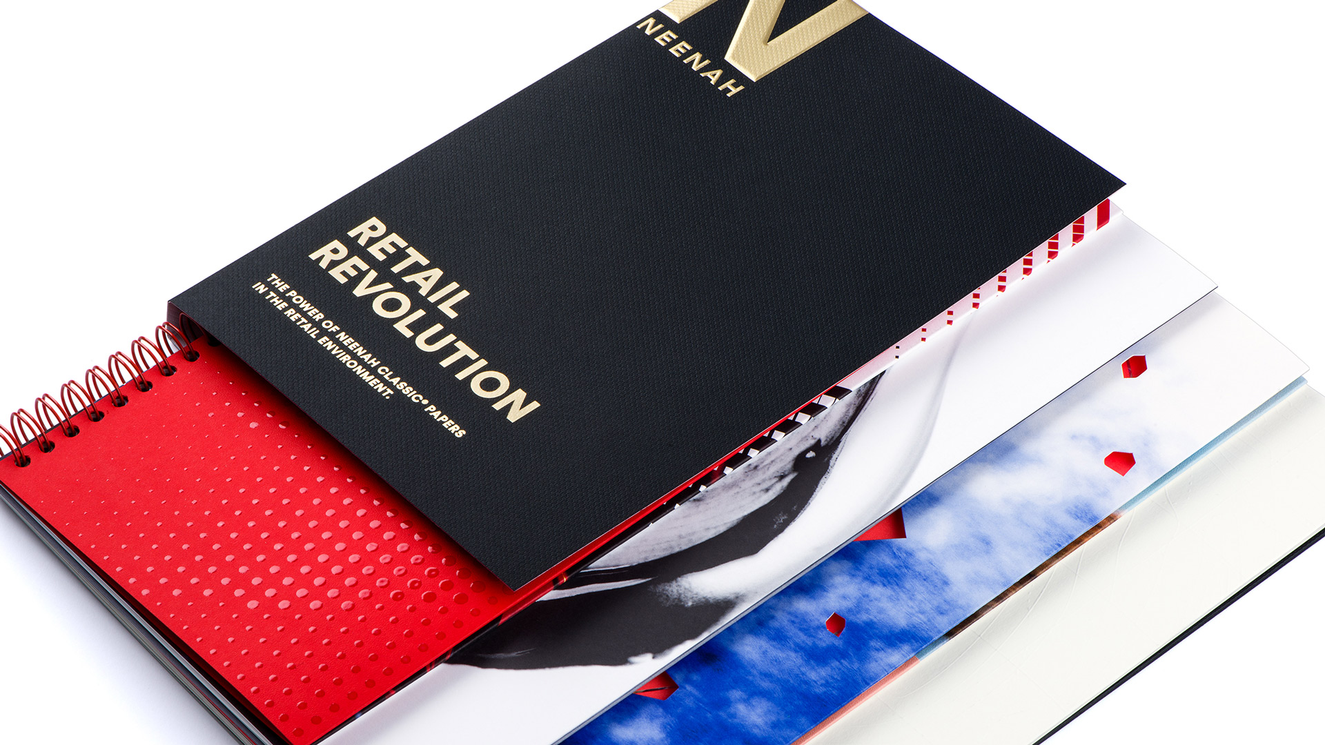
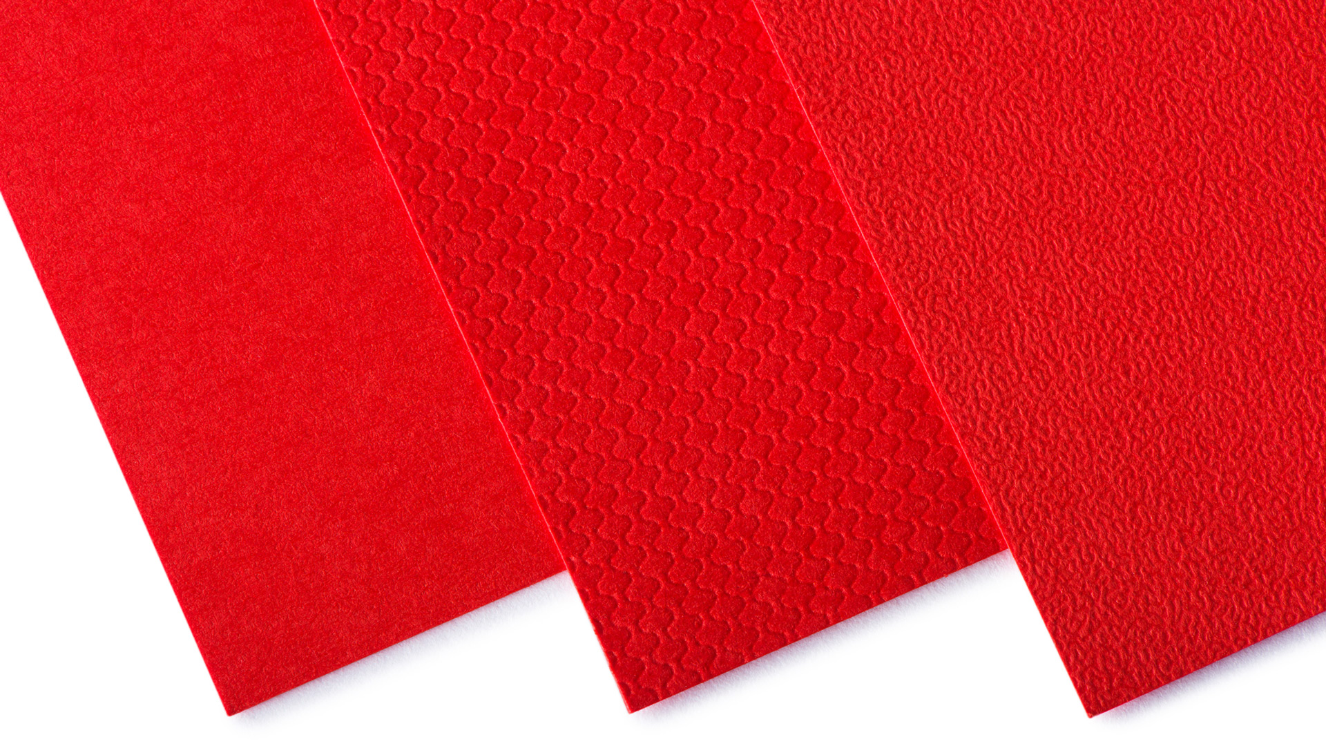
When Neenah relaunched its CLASSIC Brands last year, the color Imperial Red was one of its newest stars. And it’s shining again — in three different finishes — in the just-released promotion “CLASSIC Retail Revolution,” a resource tool designed to showcase the power of paper in the retail environment.
(Oh, by the way, we’re giving away one carton of Imperial Red in the finish of your choice! Read further to find out how to win!)
So, what is behind this pigment’s power of persuasion? Perception. From the famous Red Carpet and unmistakable soles of Christian Louboutin shoes, to the global influence of the Coca-Cola brand, the color red signifies power and importance. It’s even used to create a sense of urgency for clearance sale signs.
Here we’re going to take a look at how Imperial Red is used — in Stipple, Smooth and Techweave textures — to create the Knetics Athleisure Sportswear brand, just one of the four dynamic brands that Dallas-based Matchbox Studio imagineered for the new “CLASSIC Retail Revolution.”
[youtube=https://youtu.be/XwNFgTskDVs]
Using a colored paper rather than trying to print it will provide greater color consistency for a brand — especially for a brand that uses multiple components, or produces materials in different locations. The bright energy of Imperial Red supports the Knetics active brand lifestyle look and feel.
In the study “Impact of Color in Marketing,” researchers found that up to 90% of snap judgments made about products can be based on color alone. The color red has been shown to physically stimulate the body, raise blood pressure and heart rate, and is associated with movement, excitement and passion.
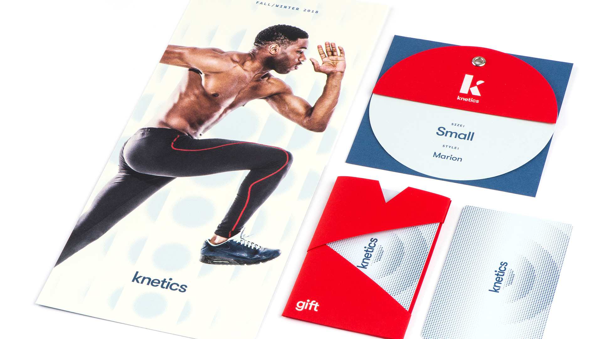
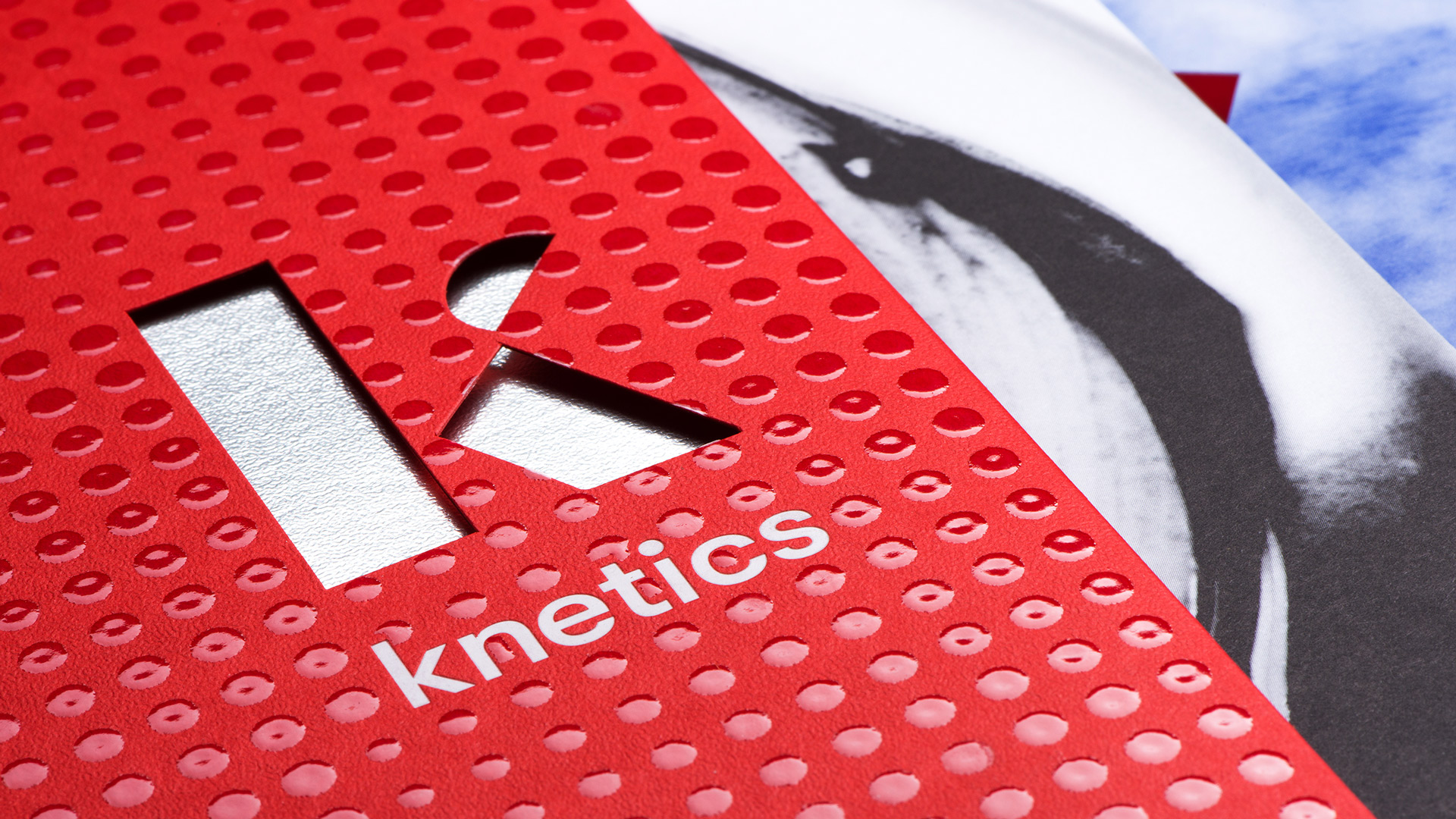
Combine those auto-responses with the high-tech touch of a spot gloss raised UV dot pattern on a Stipple finish with a silver foil accent and you have created a piece that delivers a high-energy brand message.
[youtube=https://youtu.be/Ye6sv3J6S9M]
Forty-four percent of people say a gift card has sent them into a store they otherwise wouldn’t have visited. This unique carrier wraps around the paper card through dynamic diagonals. The carrier’s Smooth finish, combined with the NEENAH IMAGEMAX Paper Card, creates a sleek and compelling impression.
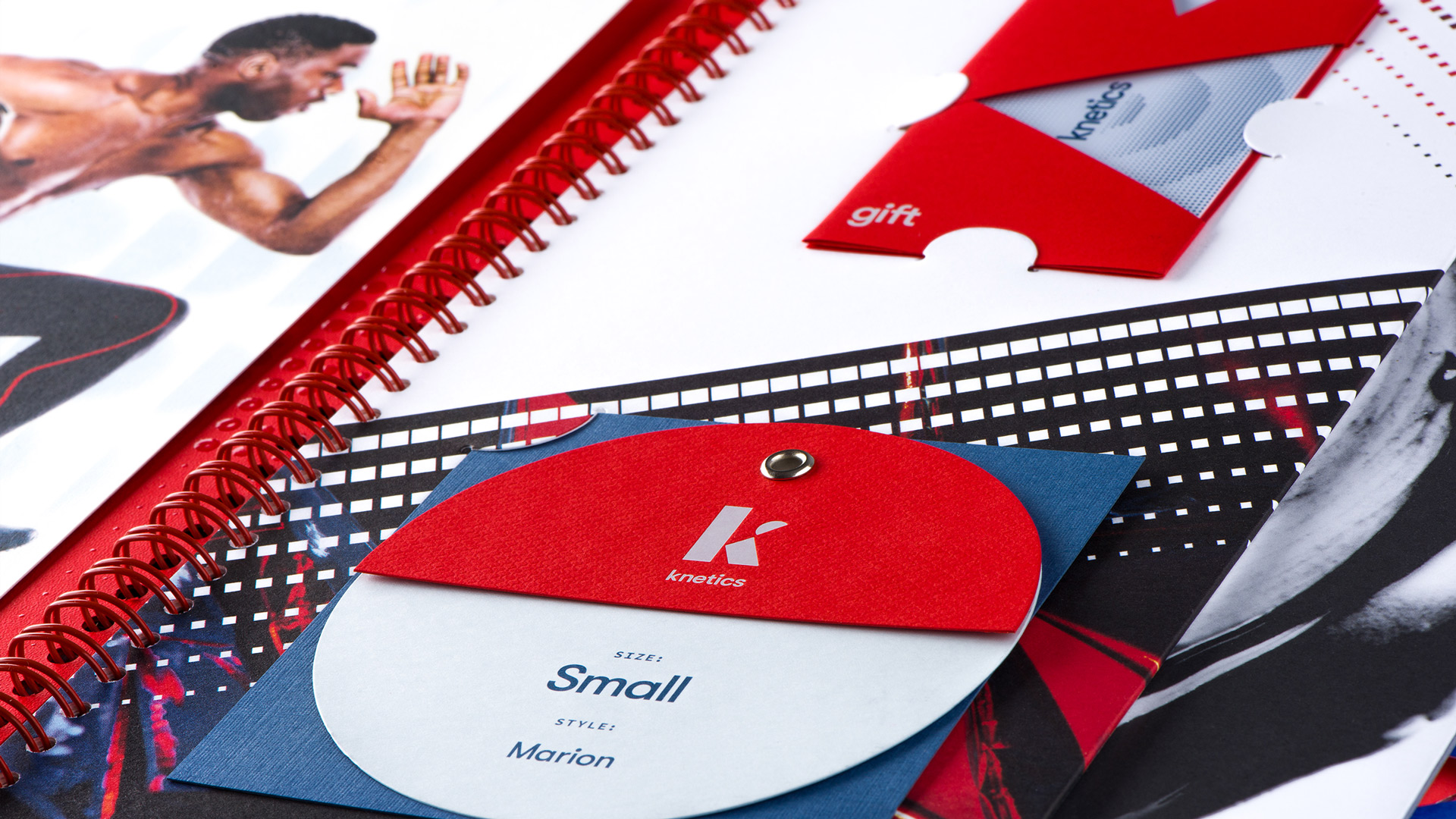
Color also influences the likability and familiarity of a brand. The Knetics hangtag is designed to be fun and interactive, again delivering the brand’s message of movement. It’s constructed from three different papers — CLASSIC Techweave Imperial Red, CLASSIC CREST Windsor Blue, and CLASSIC Linen Chambray — and grommeted together.
This is just one example of how color, texture, design and print work together to support retail brand messaging.
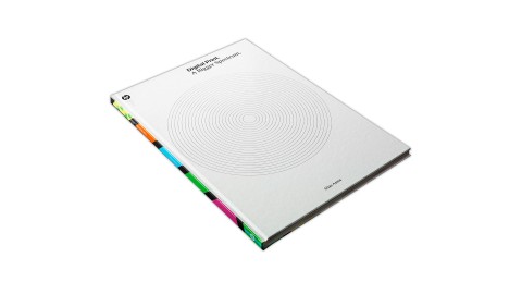
The 10”-x-12” book and its 11 pull-out samples are all produced on combinations of colors and textures from the CLASSIC Brands line of papers.
Want a book of your own? Enter to win one of 25 copies right now! And one lucky winner will also receive a free carton of Imperial Red paper, too! [THIS CONTEST IS CLOSED]
This offer has ended but PRO members can get a copy below.
(Not a member? Why not start your PRO membership today?)
CLASSIC Papers and NEENAH IMAGEMAX are registered trademarks of Neenah Inc.