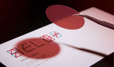
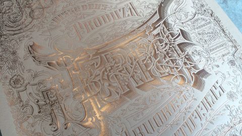
 We’re like a kid on Christmas whenever we discover someone really breaking away from the pack with their identity materials. Saatchi & Saatchi Ukraine artfully avoided the use of images when it came to creating the branding for that country’s prominent photographer, Andrey Lobov.
Instead, they went right back to photography’s roots to borrow some techniques that would make people work to decipher Lobov’s business cards and other materials – and have a bit of fun while doing so.
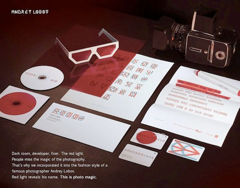
Business cards, posters and letters were printed with letters that looked like odd multicolored shapes to the naked eye. Accompanying these were a red-film disk attached to the cards; a pair of red-filmed cardboard glasses for viewing the poster; and a red highlighter to read the correspondence. Viewing these items through their respective red materials transformed the odd shapes into words.
A clever bit of self-marketing that takes us right back to the days of waiting for photos to develop in the darkroom under that red light, with all those wonderful chemicals – and it kind of makes us feel as giddy.
[youtube=http://www.youtube.com/watch?feature=player_embedded&v=pPMNQoDVIog]