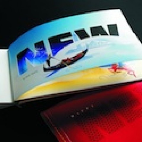
Occasionally we find ourselves regarding wine & spirits packaging giants Stranger & Stranger like a teacher does the precocious student who is forever putting up her hand to answer every question. “We know you’re amazing at what you do, S&S,” we hear ourselves say wearily. “But you really must give the other packaging companies a chance.” Well it won’t be this time, I’m afraid. One look at this design they came up with for the UK’s Compass Box Whisky Co. and we were well and truly smitten.
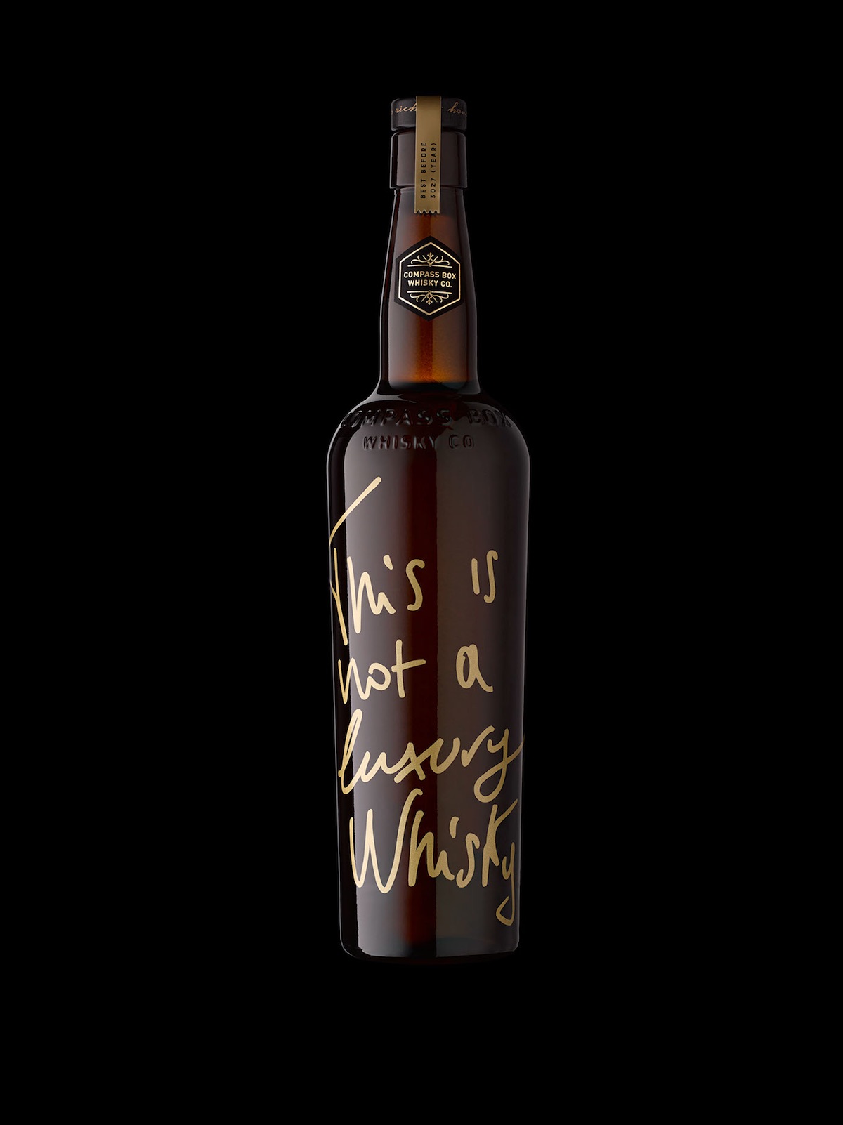
Like the show-offy student, Stranger & Stranger has crafted a look for “This is Not a Luxury Whisky” that, at first glance, looks like they scribbled it on the back of a napkin 5 minutes before the client meeting. But the more you look at the letter formation, text color, and precise placement on the bottle, the more you appreciate what an effective bit of design this actually is. And then we come to the box…
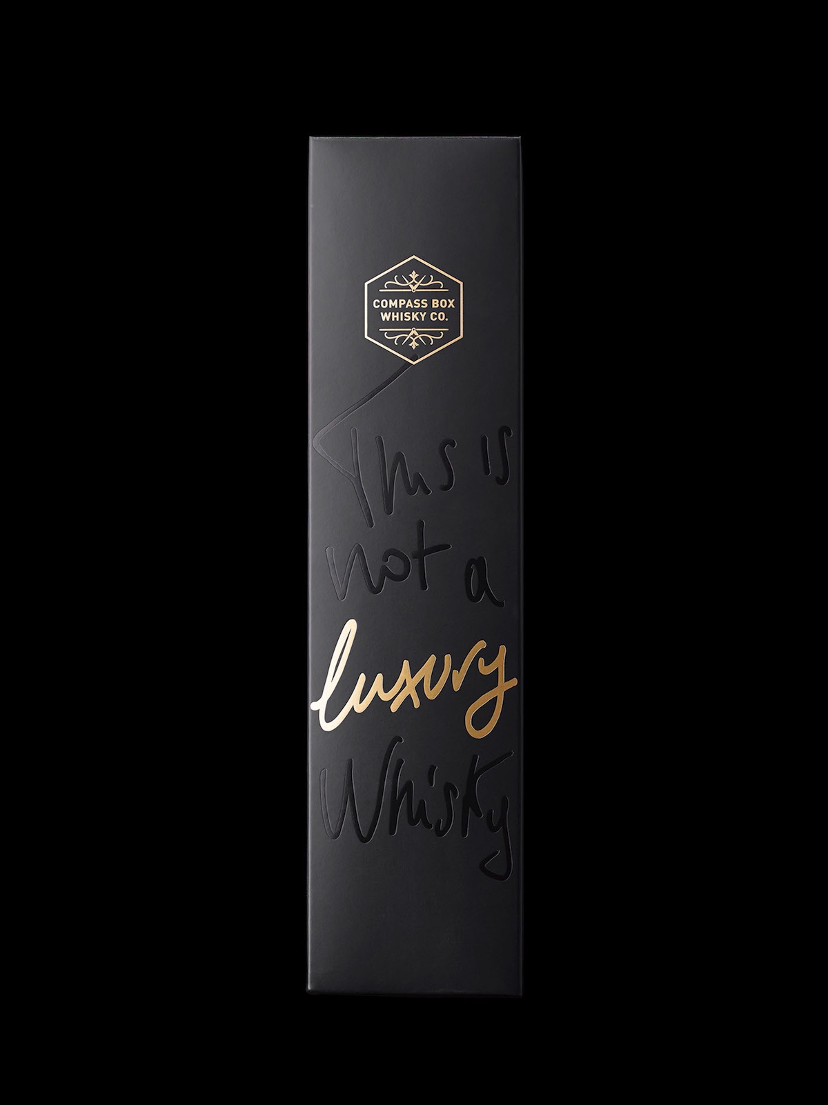
It takes the same sense of effortless superiority you get from the bottle and heightens it with a smart combination of gold foil and spot UV varnish. And when you place bottle and box side by side…
You are struck by a rarity in wine & spirit packaging: a box and bottle combination greater than the sum of their parts!
PRO members: Check out our ‘Designing Spirited Labels’ webinar with Stranger & Stranger founder Kevin Shaw!
Discover more Cool Packaging right here!