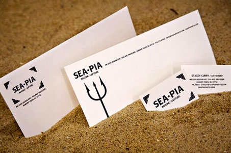
No, this is not a typo. Being a lover of the clever use of words, I’m immediately drawn to the pun of this company’s name. SEAPIA is a beachside photo studio on the boardwalk in a New Jersey.
But the fun only begins with this catchy moniker. The designers of these branding and identity pieces have done a great job appealing to the studio’s many potential clients with creative marketing pieces like these:
- temporary tattoos for the young and young-at-heart
- coasters that may be redeemed for special pricing for those that frequent the local pubs
- a hand fan for those that need a bit cooling off
- four-color splash cards/mini hand bills that be placed on the counters at other local businesses or passed out on the boardwalk
All are tied together either through the logo name or the illustrations of the old-time paper photo corners.
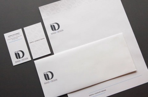
In comparison, the #10 envelope, notecard and business card seem subdued. But hey, these are your must-have, down-to-work business tools. The cream-colored French paper has a nice feel to it. The choice of the dark brown logo color gives it an old-timey feel.