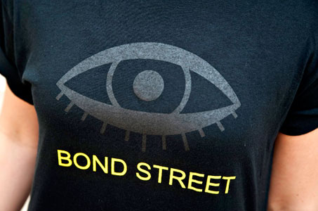
Assignment: design for the reopening of an old watering hole targeted at a locals-only crowd. Inspiration: nonsensical behavior, mysticism, the occult, punk rock and the notion of an unbranded secret spot or clubhouse.
The palette: burnt-earth brown juxtaposed to stark white. There’s something a tad irreverent and a bit brilliant about that seemingly simple choice … particularly for the re-opening of a no-nonsense, neighborhood bar.
Character for this establishment develops through the copy (Secret Spot + Secret Knock = Bond St.) and the chunky, sans-serif type used on the coasters, napkins and matchbooks.
I love that the napkins and coasters do double-duty as the menus for the no-airs, no-pretense tavern. All the materials in this identity package convey a comfortable, get-straight-to-the-point, we’re here for good drinks, easy food and down-to-earth service.
Cheers! I’d have another round of this design team.