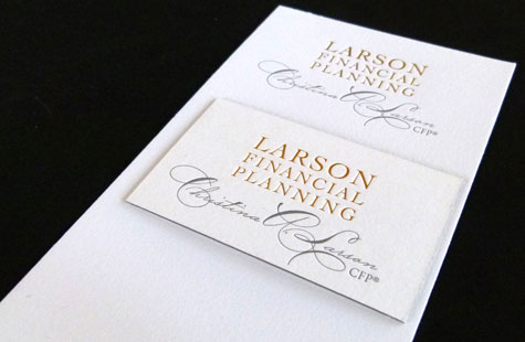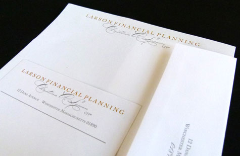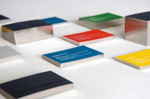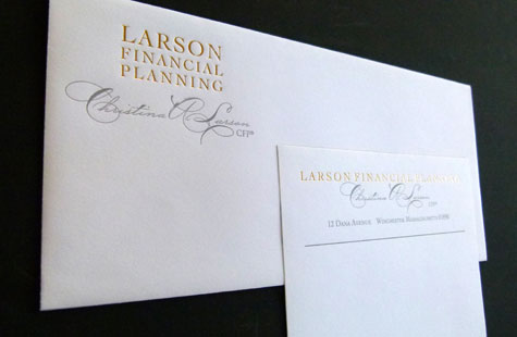
Branding for CPAs, doctors and lawyers typically results in more conservative designs, typography and palette. What we’re seeing from many of you, and what is shown in this identity suite, is a slightly different twist to the traditional, particularly for women.
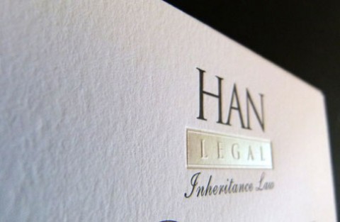
This client wanted something more creative, something that reflected her personality with a nod to her gender. The designer accomplished those requests in fine style. The letterpress printing conveys a timeless aesthetic. A quiet gray spot color combined with a tasteful gold foil looks refined and professional.
Swirling caps on the beautiful script signature hint at the feminine. All caps on the blocky company name convey a solid and trustworthy image. Long narrow notecards also update the look of the stationery package, as does using dots instead of dashes on the phone number. The wonderful tooth of the Crane’s Lettra keep it classic.