Spotlight: RICOH Graphic Communications
It seems there’s a new color trending. In fact, it’s hard to miss. It’s everywhere: popping off the shelves at the corner store and adding allure to postcards in the mailbox.
On Wednesdays, We Wear Neon Pink
Neon (or “Hot”) Pink is the bolder cousin of the delicate blush shade that dominated the design of the 2010s. It’s futuristic, vibrant, and kind of punk — it’s also more accessible to designers and buyers than ever before. The reason for its rise is twofold, having to do both with innovation in printing technology and with evolving tastes.
Trend watchers have noted that post-COVID styles, particularly in fashion and makeup, will lean toward the daring. This development seems to extend to colors, too.
Whereas “Millennial Pink” is muted, serene, and coy, the new pink is anything but. Hot Pink is in-your-face. And it’s fun, reflecting a general change in our aesthetic sensibilities as we emerge from lockdown. The new preferences speak to a yearning for excitement, to a desire to get back out into the world, and to a sense of newfound freedom after we’ve discovered how we dress when nobody’s looking.
Oh, the Design Possibilities
Hot Pink packs energy. Often paired with Black or Navy, it adds a dramatic flair on top of a dark background. Used with softer colors like Yellow and Cyan, it creates a whimsical tone. Alongside lighter Pinks and White, it can produce an effect that’s sweet but still a little spicy.
Whatever you choose to do with it, designers have a world of exciting new options thanks to recent advances in digital printing. (Enter to win 1 of 50 designers’ guides to learn how you can expand your gamut to unexpected colors.)
Digital Printing is Powerful and Affordable
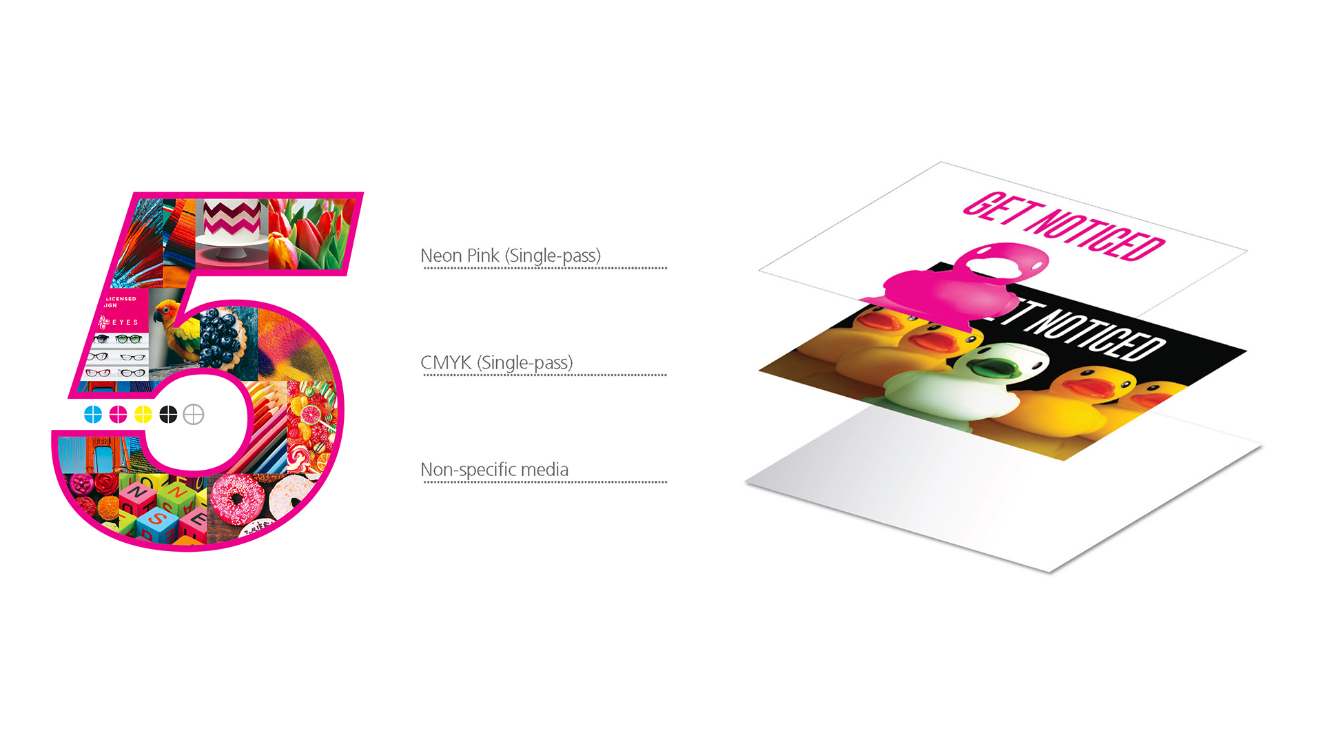
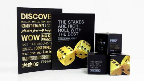
Colors like Neon Pink can go from concept to paper relatively easily today thanks to game-changing technology like Ricoh’s 5th Color Station, which features an innovation referred to as “beyond CMYK,” “CMYK+” or “5th Color.”
As the terminology suggests, such devices offer up more than the traditional 4 colors (Cyan, Magenta, Yellow and Black). Sometimes, as is the case with the versatile RICOH Pro C7200X, the expanded capabilities include clear coatings in addition to unusual colors, including Neon Yellow and Invisible Red. Also known as “enhancements,” the specialty toners are applied in-line with CMYK. In the past decade, CMYK+ enhancements have expanded to a wide range of digital devices, many of them economical, compact, and easy to use.
A Way to Differentiate
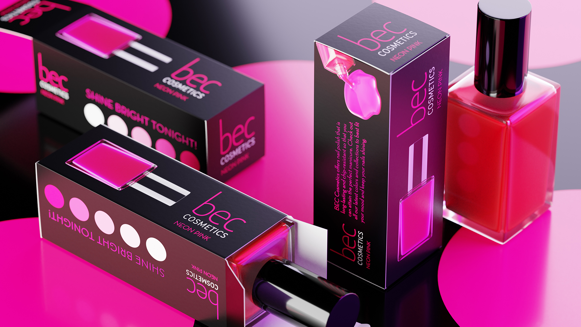
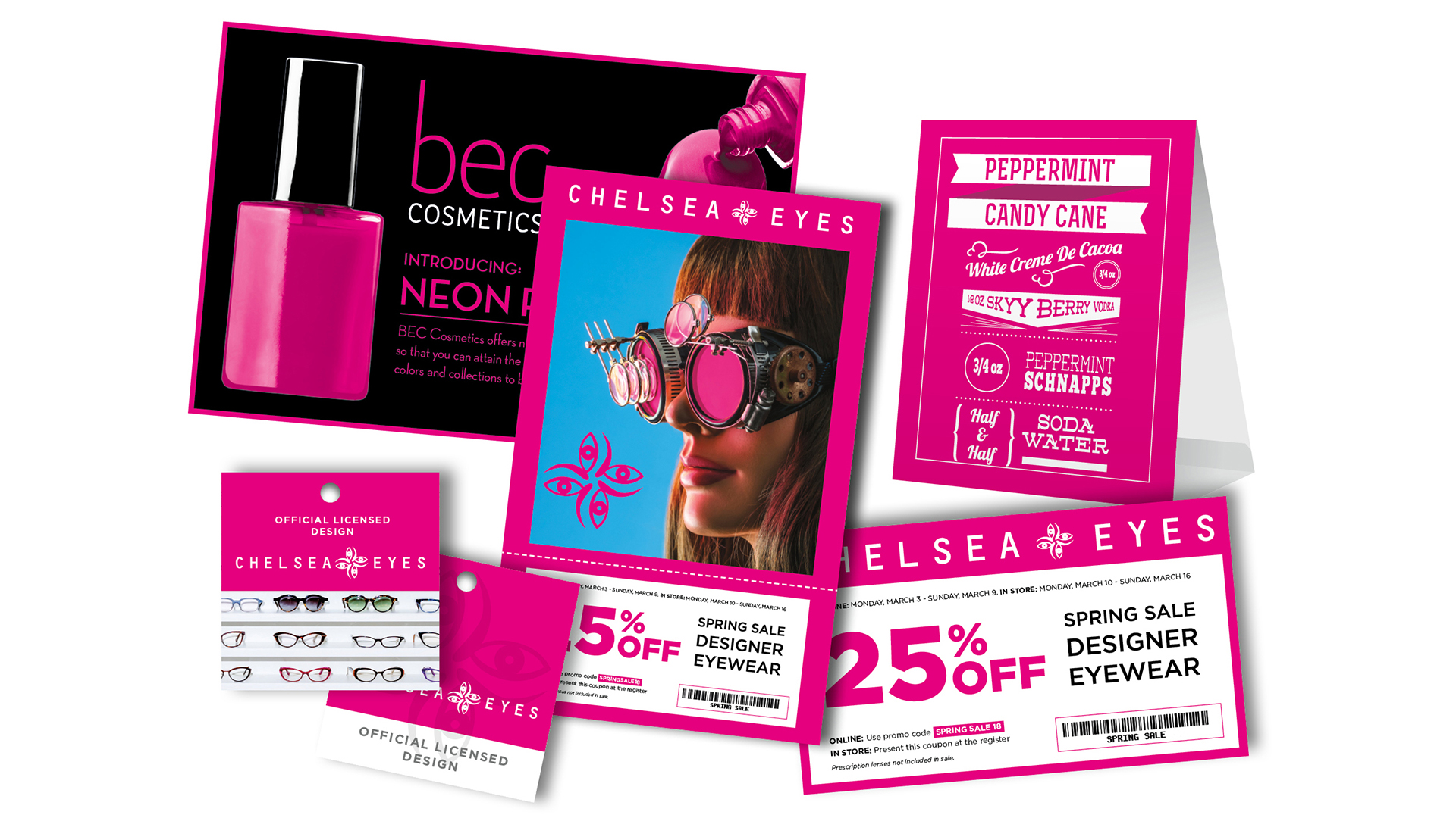
Graphic designers like the new options, and buyers do, too — choosing conspicuous colors for labels and marketing materials is a relatively simple and effective way to stand out in crowded markets like beverages and cosmetics. It’s no wonder, then, that Neon Pink is showing up everywhere from wedding stationery to logos and awareness posters.
In a study by SGIA and NAPCO, marketing professionals named these as the top 4 benefits of digital printing enhancements like neon colors:
1. “Giving the brand a premium look”
2. “Capturing the attention of recipients”
3. “Helping campaigns stand out from the competition”
4. “Enhancing the brand or corporate image.”
Blend in to Stand Out
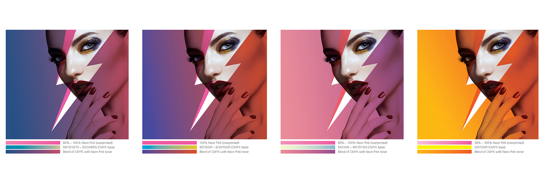
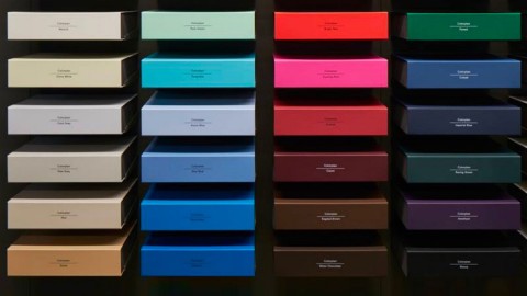
What’s more, the extended gamut of 5th Color printers makes possible a whole new set of hues aside from Neon Pink that’s sure to intrigue any color enthusiast. By blending 5th Color Enhancements with regular CMYK colors, designers can hit a range of nuanced shades that 4-color digital printers simply can’t match.
Applying Neon Pink isn’t always about being the loudest. It can also achieve more subtle, yet similarly eye-catching, results. Looking for a unique, memorable brand color? Try blending Neon Pink with Magenta and Cyan shades for atypical Reds and Purples.
Add the capabilities of digital production, including its quick turnarounds and easy personalization, and specialty colors become even more irresistible.
Here’s How Designers are Using Neon Pink
According to graphic designer Chris Siarkiewicz, “When experimenting with Neon Pink, you realize it isn’t always about being the boldest or brightest.”
The most successful packaging creates a sense of anticipation for the experience awaiting inside. Neon Pink — and its blends — serve that purpose well.
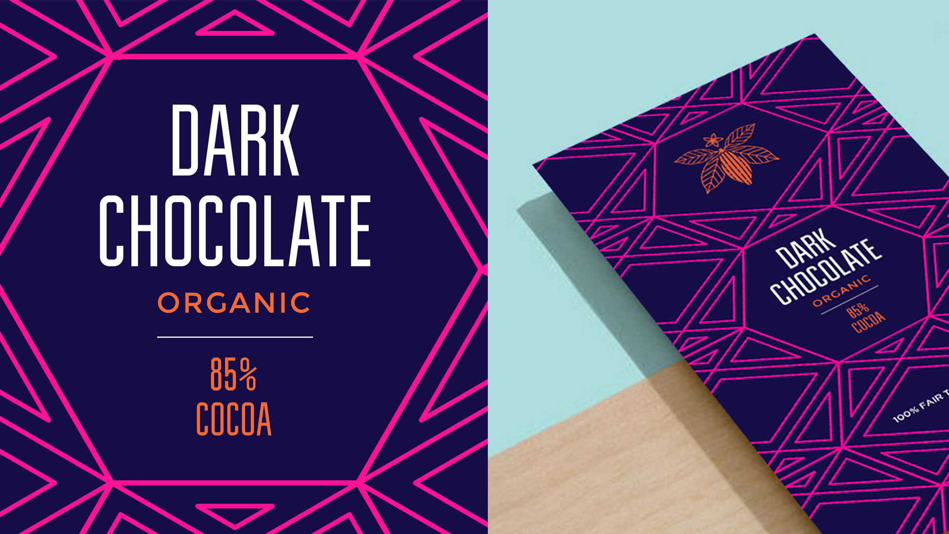
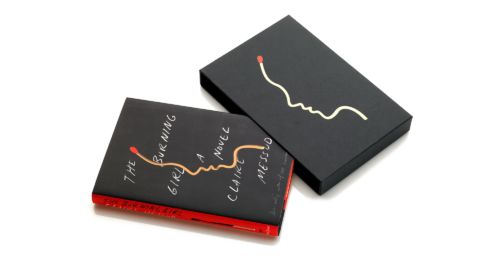
The design shown here, printed on the RICOH Pro C7200X, showcases a mix of Neon Pink two ways. It’s also an example of the way Hot Pink leaps off a dark background. The Pink lines are composed of 25% Cyan and 100% Neon Pink, while the Orange text is 87% Yellow and 97% Neon Pink.
Siarkiewicz, who creates designs like this using Adobe Illustrator and InDesign, says, “Here’s a tip — less is more when blending Neon Pink and CMYK. As you add more CMYK colors into the neon, it reduces the effect of the neon, so know your limits.”
For this chocolate brand, he used Neon Pink to create a subtle pop of color with thin veins of neon-powered Purple on a rich, dark CYMK background.
“Unique colors are a great technique for brands that compete in a saturated market,” Siarkiewicz says.
Experience the fun of Neon Pink for yourself – enter to win 1 of 50 copies of the ‘Art of the Blend’ booklet now! Hurry, this contest ends Feb. 17th. (North American entries only, please.) THIS CONTEST IS NOW CLOSED
RICOH Graphic Communications is committed to supporting the vitality of the graphic arts community. Your brilliance continues to drive them and the products they create!

