When organizers invited the best and brightest to the new British Pop Archive opening in May 2022, they had a clear message. They didn’t want their collection to be just another celebration of The Beatles or “Doctor Who.”
Instead, the items showcased at the University of Manchester’s John Rylands Research Institute and Library focus on music, television, and counter-culture publications from this industrial English city.
A Dazzling Invitation Design
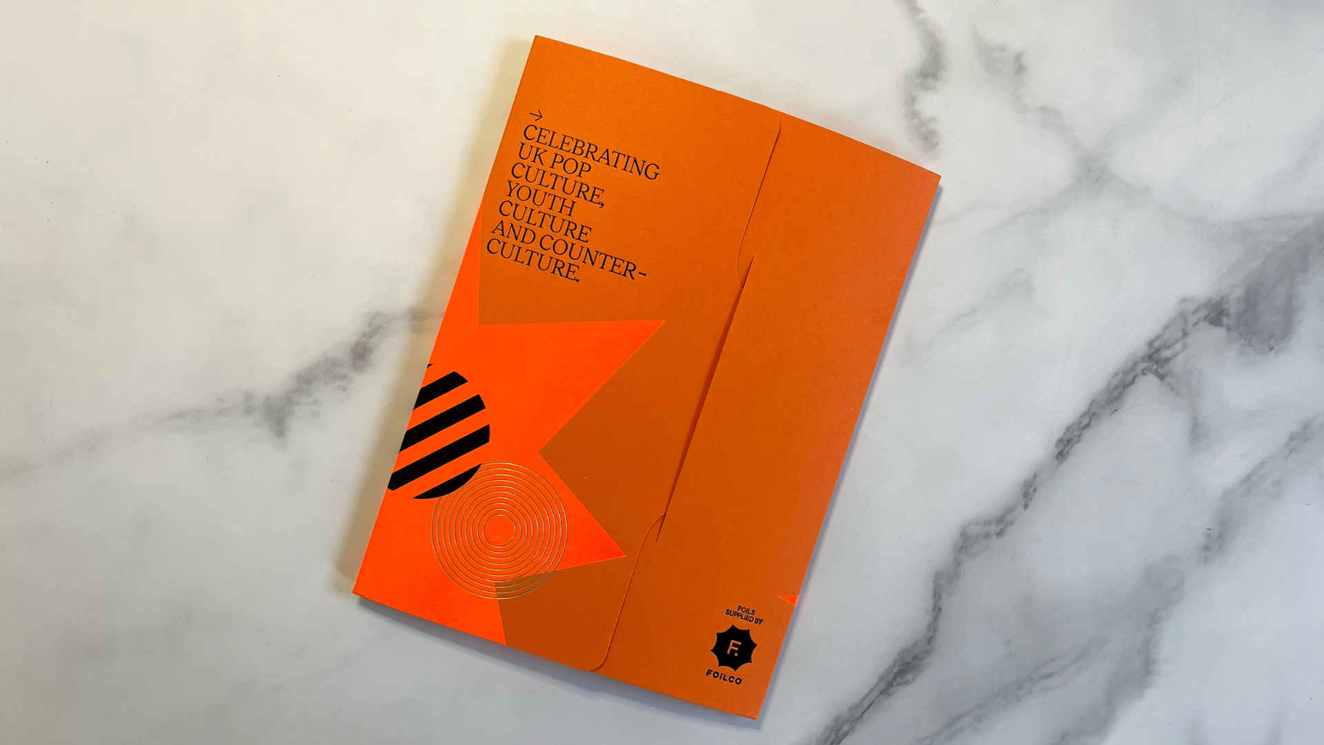
Designed by Studio DBD and produced by Lancashire Foil & Print, the invitation suite for the opening of the British Pop Archive “pops” impressively.
What’s the secret? The invitation suite captures the glamor and radicalism of the collection through vivid colors and an unexpected use of Foilco foil. This foil is as edgy as the arts it celebrates.
The tuck-sleeve folder, made from a 270 gsm GF Smith Colorplan Mandarin sheet, becomes even more vibrant with a large, Neon Orange Hot Foil star.

Not only is the design a powerful reminder of the counter-culture of the era that much of the archive covers, but the Orange foil on Orange stock also contrasts sharply with the large Silver foil asterisk, as well as the Black words and logo mark…which are also 100% Hot Foil Stamped!
Innovative Use of Foil Techniques
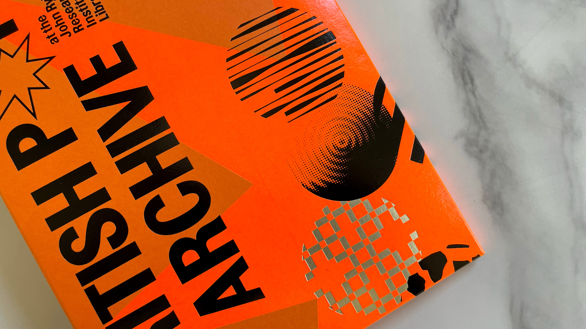
That’s right—all the Black “printing” is actually Black foil! Many of the foils are overprinted with other foils, creating a layered and textured effect.
(If you’re a PaperSpecs PRO member, you’ll know all about this cutting-edge technique, which we covered in a recent members-only Deep Dive with Foilco’s Matt Hornby.)
The registration is so tight, and the gradations between Black and Orange foils are breathtaking. Circular, album-like graphics, nodding to bands like Joy Division and Buzzcocks, further enhance the design.
A Stunning Invitation Unveiled
Opening the tab-and-slot closure on the folder’s back reveals a simple cross fold.
Lifting the panels dramatically unveils the colorful invitation inside.
The invitation consists of two sheets of Colorplan Pistachio duplex laminated together, creating a chunky, double-thick card.
This design choice not only offers a lovely Light Green shade on the front but also along the double-thick edges. Flooding a White sheet with color wouldn’t achieve this effect.
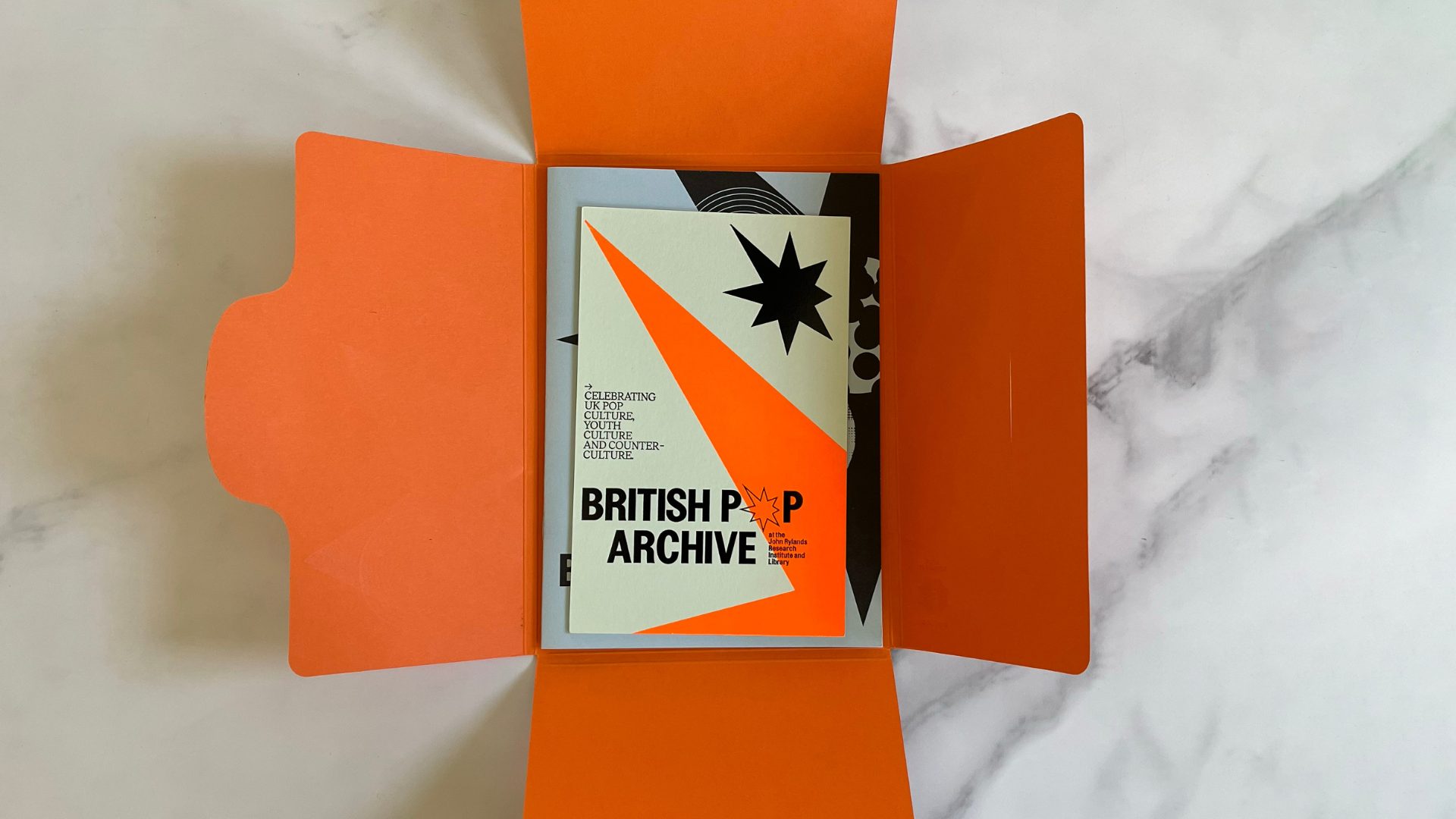
Thanks to the lighter background, the Neon Orange foil star and Black foil words stand out even more. The 8-pointed compass-star logo, seen in the “British Pop Archive” name, becomes more prominent here. (The North and West points of the star extend slightly, acknowledging the archive’s focus on Northwestern England.)
The back of the invitation features the archive opening date and RSVP information, offset printed in Black.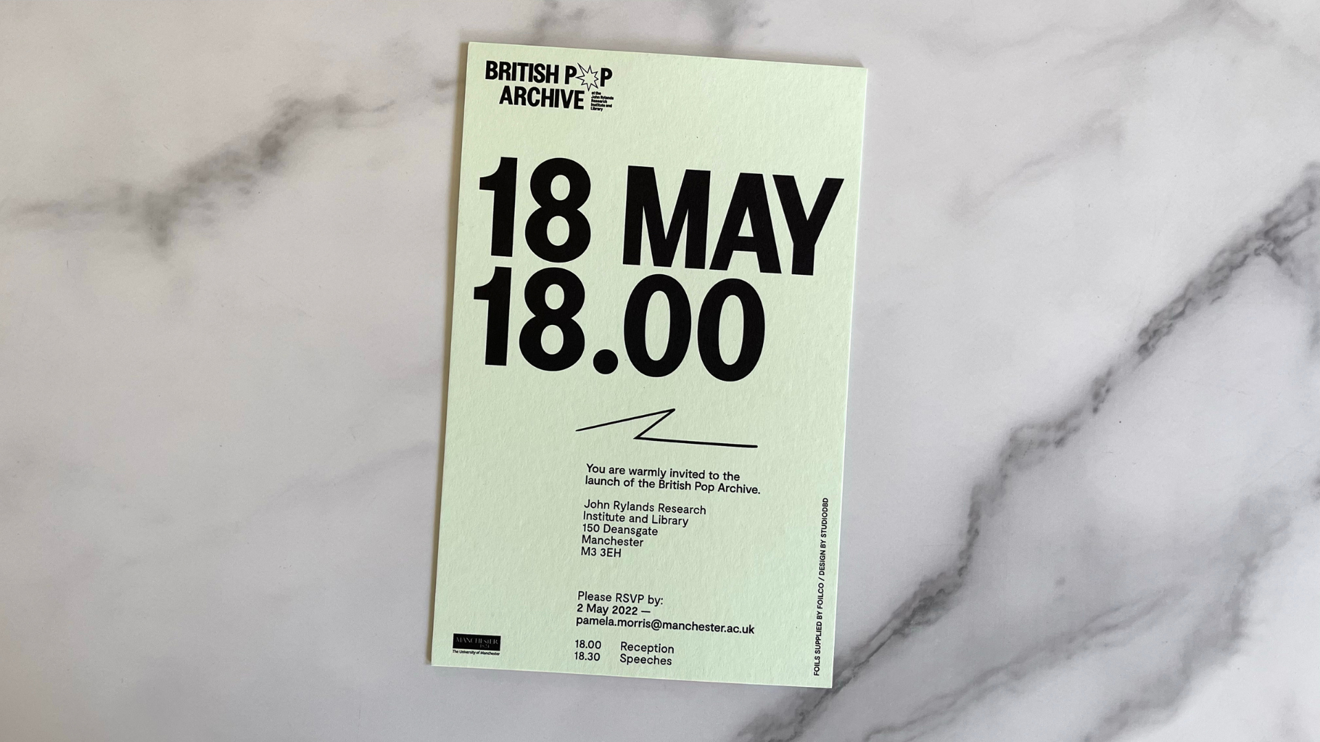 Also inside the folder is a small, Saddle-Stitched booklet offset printed on 140 gsm (94 lb.) uncoated colored stock.
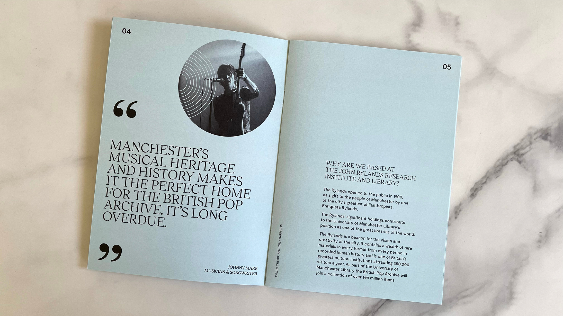 It features a brief explanation of the archive, along with pull quotes from noted Manchester pop culture luminaries such as The Smiths guitarist Johnny Marr. Circular graphic elements throughout tie it all back to the folder and invitation branding.
As you can see, the use of colored foils doesn’t just make your design “pop.” In the right hands it can make it positively explode with vibrancy. And when you want to get people’s attention, it doesn’t get much better than that.


