In a society bursting at the seams with “content,” package design is everything. And coincidentally, “packaging is everything” also happens to be the theme of this week’s Cool Designs. Join us as we rediscover the strife and strategies of shopping in the communist Poland of the ’80s, swoon over the packaging for typography-inspired clothing, and transmogrify all those family stories into a smart coffee table book. (Previous Cool Designs of the Week can be found here.)
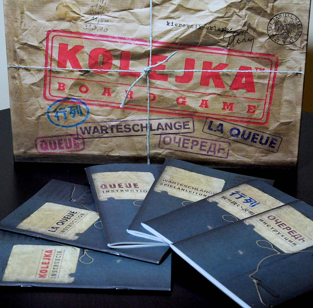
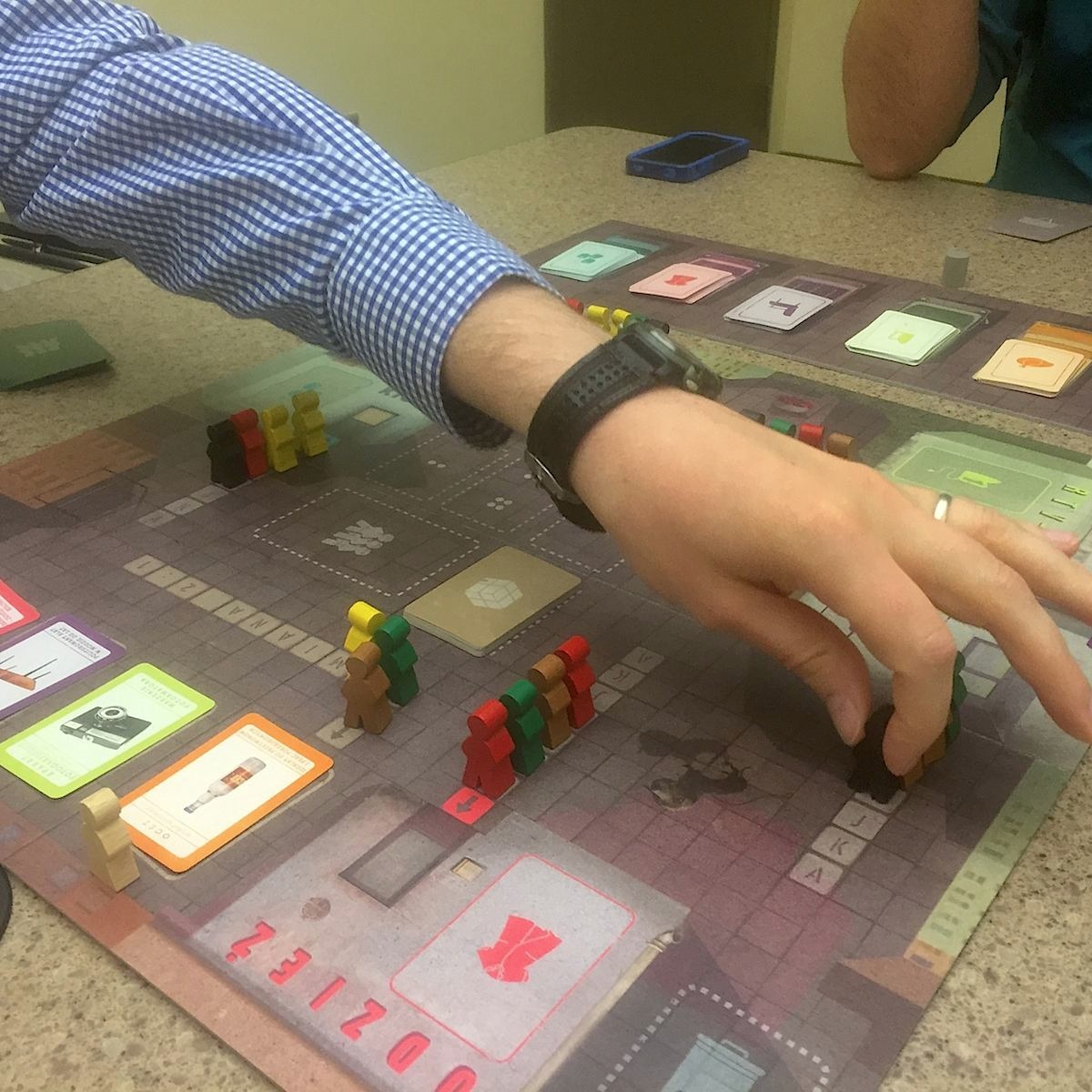
“Queue” (“Kolejka”) Board Game Design
In what sounds like one of the unlikeliest games of our time, “Queue” was “created by the Polish Institute of National Remembrance to ensure that a small portion of what it was like to live under Communist rule in the 1980s was kept alive,” according to WinkFun, and that’s precisely what it does. From 40-page manuals printed in seven languages that resemble ration books, to a game box that is simply intriguing to stare at for long periods of time, “Queue” will have board game enthusiasts queuing up for months to come.
[youtube=https:www.youtube.com/watch?v=qYcek8LS8EM]
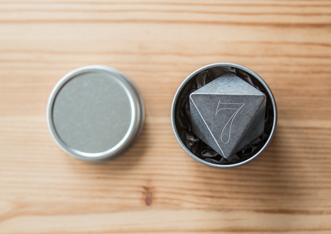
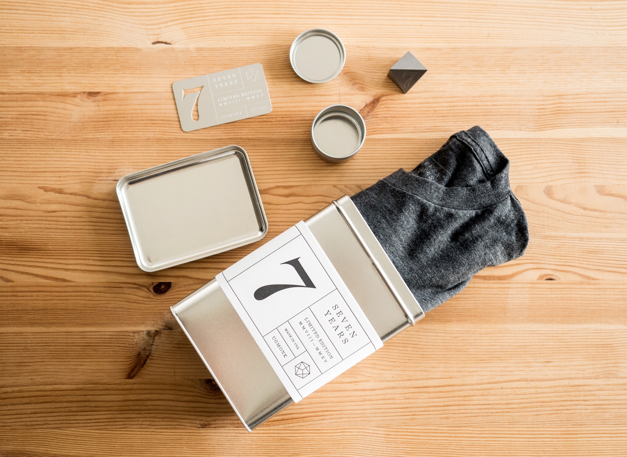
Ugmonk 7th Anniversary Set Design
A doff of the cap to PaperSpecs reader Rachel for calling our attention to a fun, design-focused company called Ugmonk, their 7th Anniversary Set in particular. To be honest, there’s not a lot of paper here – just a very snazzy letterpress label on the tin that holds the shirt, the center of it all. (You can see the making of that label below.)
Still, you have to admire the various pieces of this stylish package, including a:
- Solid steel heptahedron – a 7-sided piece that looks like a role playing die stacked firmly against the player. (It even comes with its own presentation tin.)
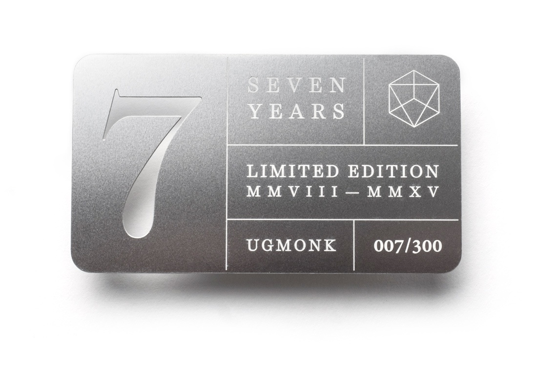
- Die-cut steel card, each individually numbered to reflect that it’s one piece in a series limited to 300
- The laid back “7” T-shirt itself.
Sure, there’s something pretty troubling about coveting packaging with no environmental conscience whatsoever (OK, the tin’s label will probably degrade…), but the designer’s heart wants what it wants, alas.
Fielding Family History Book Design
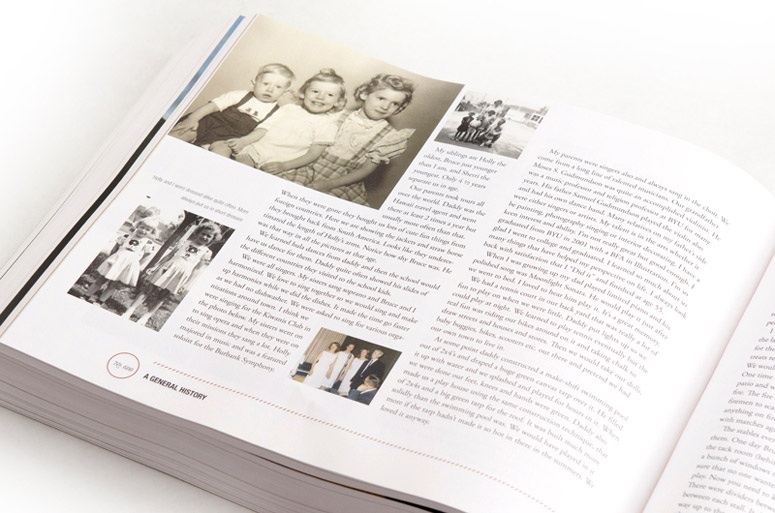
Shaking the family tree became something of a fad back in the ’90s with the rise of services such as Ancestry.com, and continues to be a passion for millions today. Though the Internet has made gathering family information easier, what is done with that data usually leaves a lot to be desired: boring printouts and dynastic charts, usually.
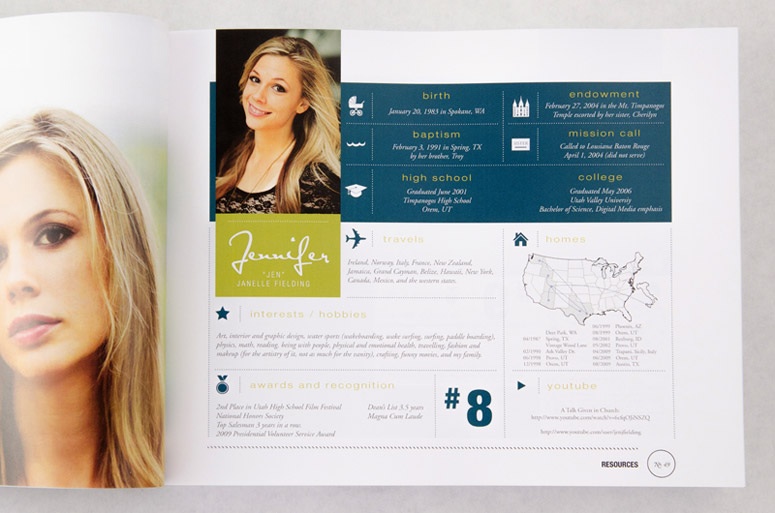
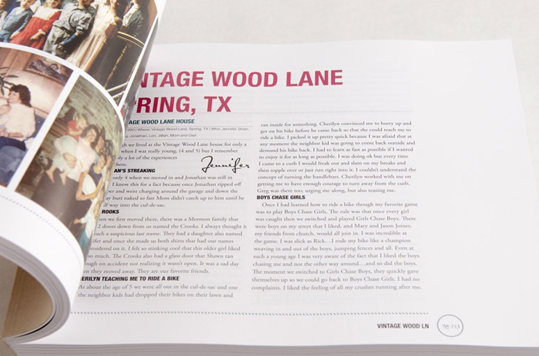
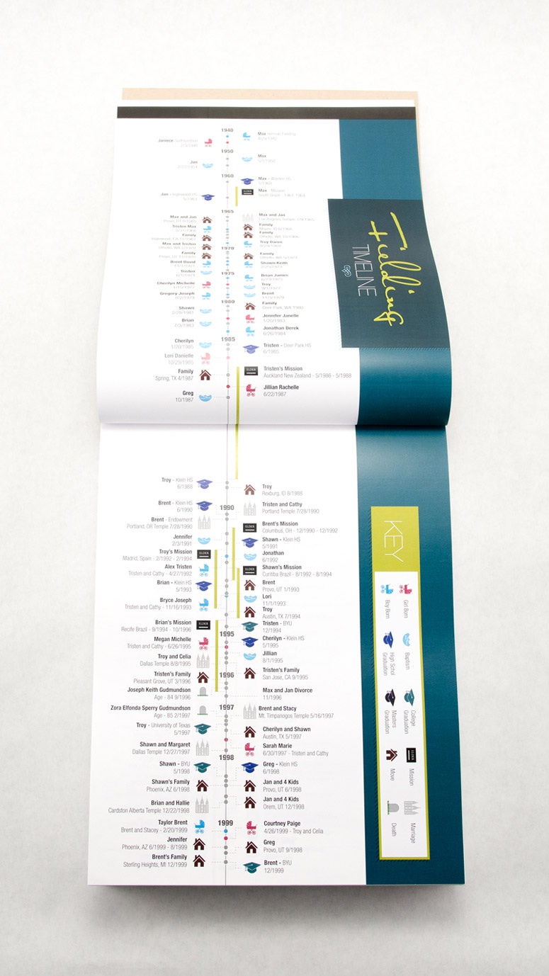
Kudos, then, to Jennifer Fielding, who gathered stories from her family – more than 500 in all – and spun them into a fun, engagingly designed book that runs to 756 pages! There is so much to love about this book, including:
- Die cut, letterpress printed covers (using two hand-carved stamps)
- A biography page for each family member with key dates, accomplishments, maps and more
- A Family tree
- A timeline that marks out key moments using different icons.
More than anything, what impresses us so is just how much the design makes this compendium of potentially dull family history something that begs to be read, whether you’re a member of the family or not. Could there be greater praise than that?