 Occasionally science takes time off from measuring cow emissions to come up with information that we can actually use in our own day-to-day work. In this case, a few tips on how to improve the efficacy of those infographics your clients will insist on putting positively everywhere.
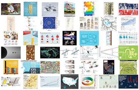
In what’s being called the “largest scale visualization study to date,” doctoral student Michelle Borkin at Harvard’s School of Engineering and Applied Sciences and her study collaborators collected more than 2,000 informative images from a range of publications and websites, according to an interesting FastCoDesign piece.
From it, we can extrapolate five tips for making your infographics more effective:
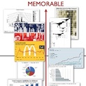
1. Use images of things people often see in everyday life. Body parts, icons, photographs–novelty is NOT your friend here.
2. The more color, the better. The greater number of colors used, the more memorable the graphic is.
3. Clutter is king. Photos with a lot of things going on in them are much more memorable than those taking a minimalist approach.
4. Curves, baby, curves. The more roundness there is, the more memorable it is. (Hey…this is a family website–knock it off over there.)
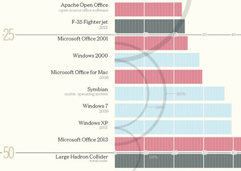
5. Time to bar bar graphs. Put simply, all bar graphs look alike, so readers think they’ve seen a particular bar graph when, in fact, they have not.
And now if you’ll excuse us, we have to go tear up an infographic we were working on last night and start over. Cheers for that, Michelle Borkin 😉