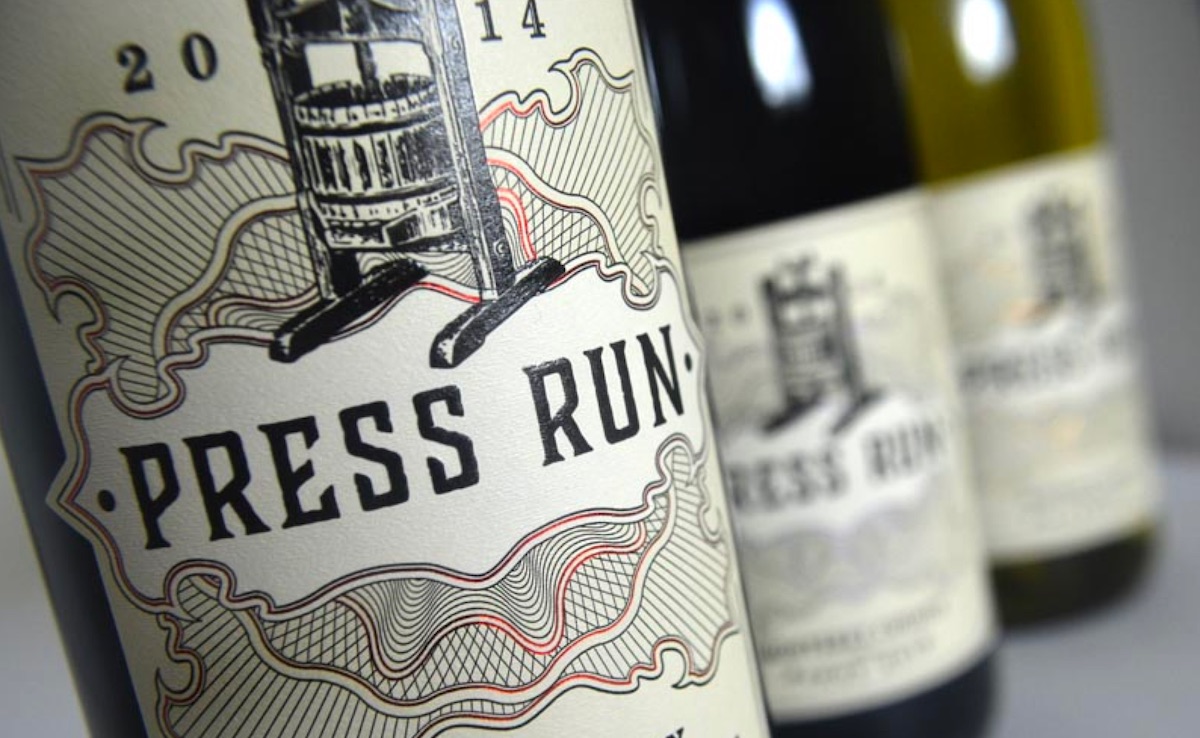
Let’s pretend for a moment that we’re not automatically predisposed to adore any wine that rejoices in the name “Press Run.” How could we not appreciate a label that features such an intoxicating cocktail of print processes?
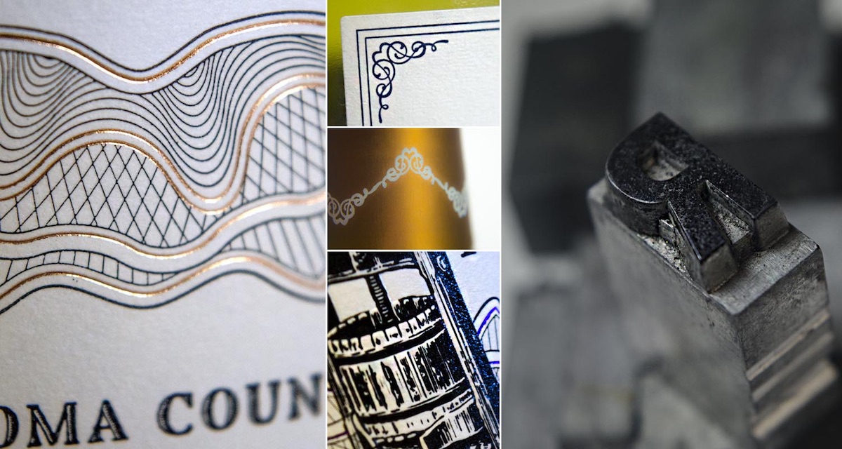
Crafted by 4 Parts Design, this piece combines foil stamping, die cutting, embossing and spot gloss to suggest that the contents of the bottle are as finely handcrafted as its label.
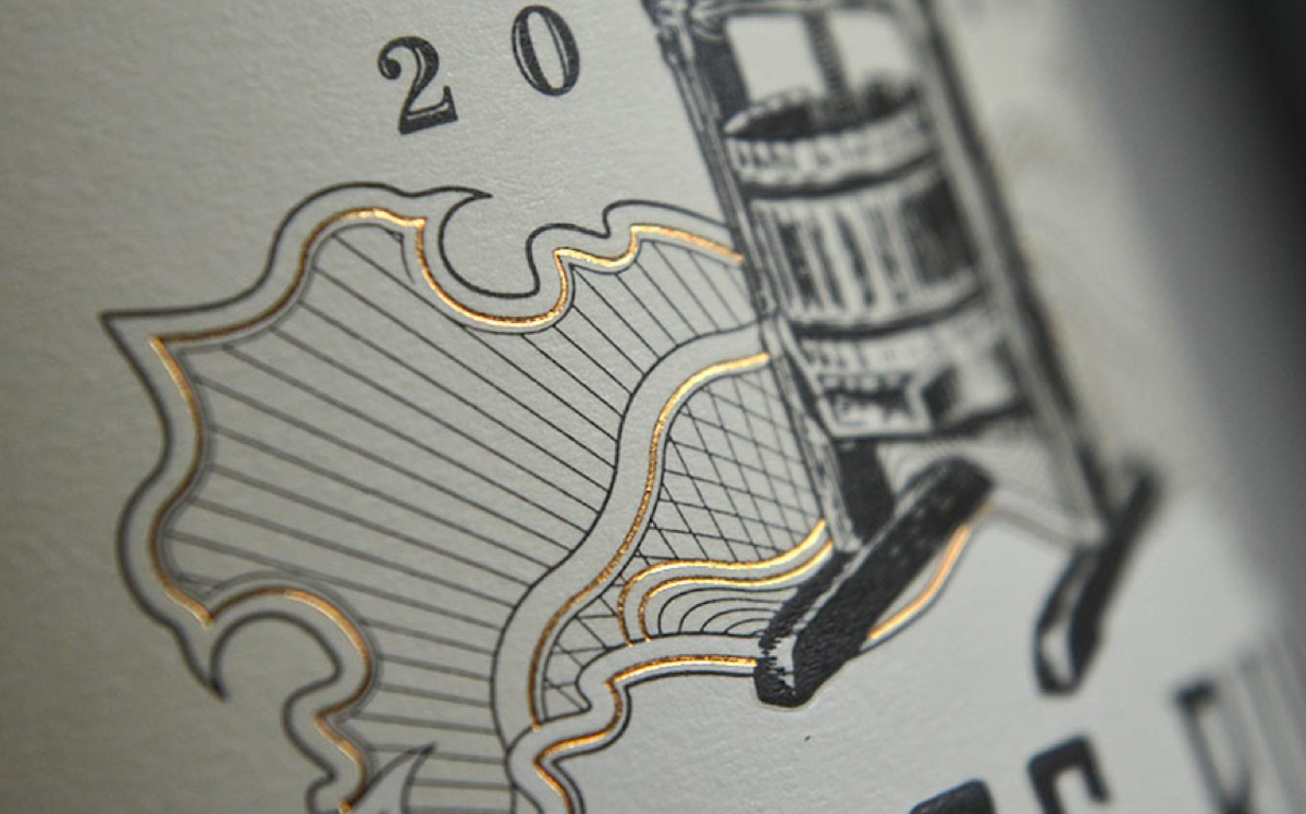
Often front and center in packaging design, foil stamping here is relegated to a supporting role – a foil, quite literally, for the delicate line work.
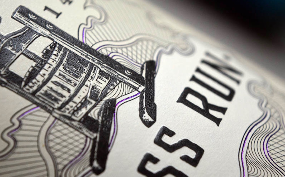
Indeed, the purple foil evokes thoughts of currency suggesting intrinsic value, and subtly pushes forward the pièce de résistance: the black-ink rendering of the grape press that gives the wine its name.
PRO members: Check out our ‘Designing Spirited Labels’ webinar with Stranger & Stranger founder Kevin Shaw.
Discover more Cool Packaging right here!