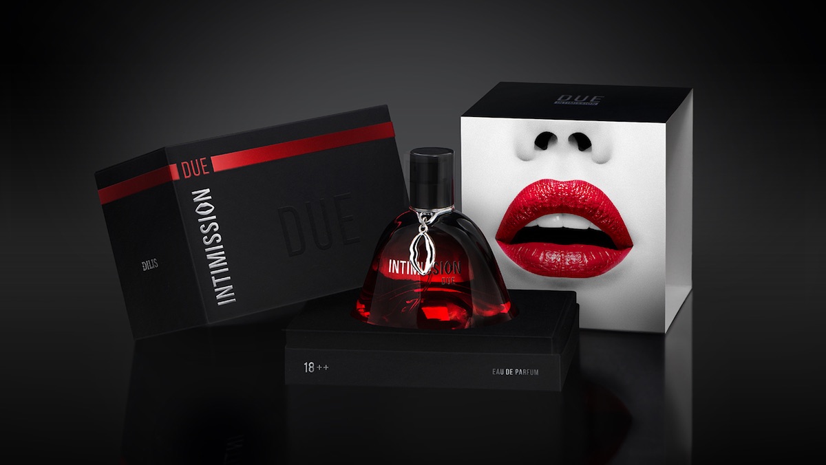
Anyone who doubts the power of a little sensuality in our oversexed, 50 Shades of Grey society should spend a little time with ARMBAND Studio‘s stunning packaging design for Dilis Perfume’s Intimission line of fragrances in Belarus.
As the studio explained to Packaging of the World:
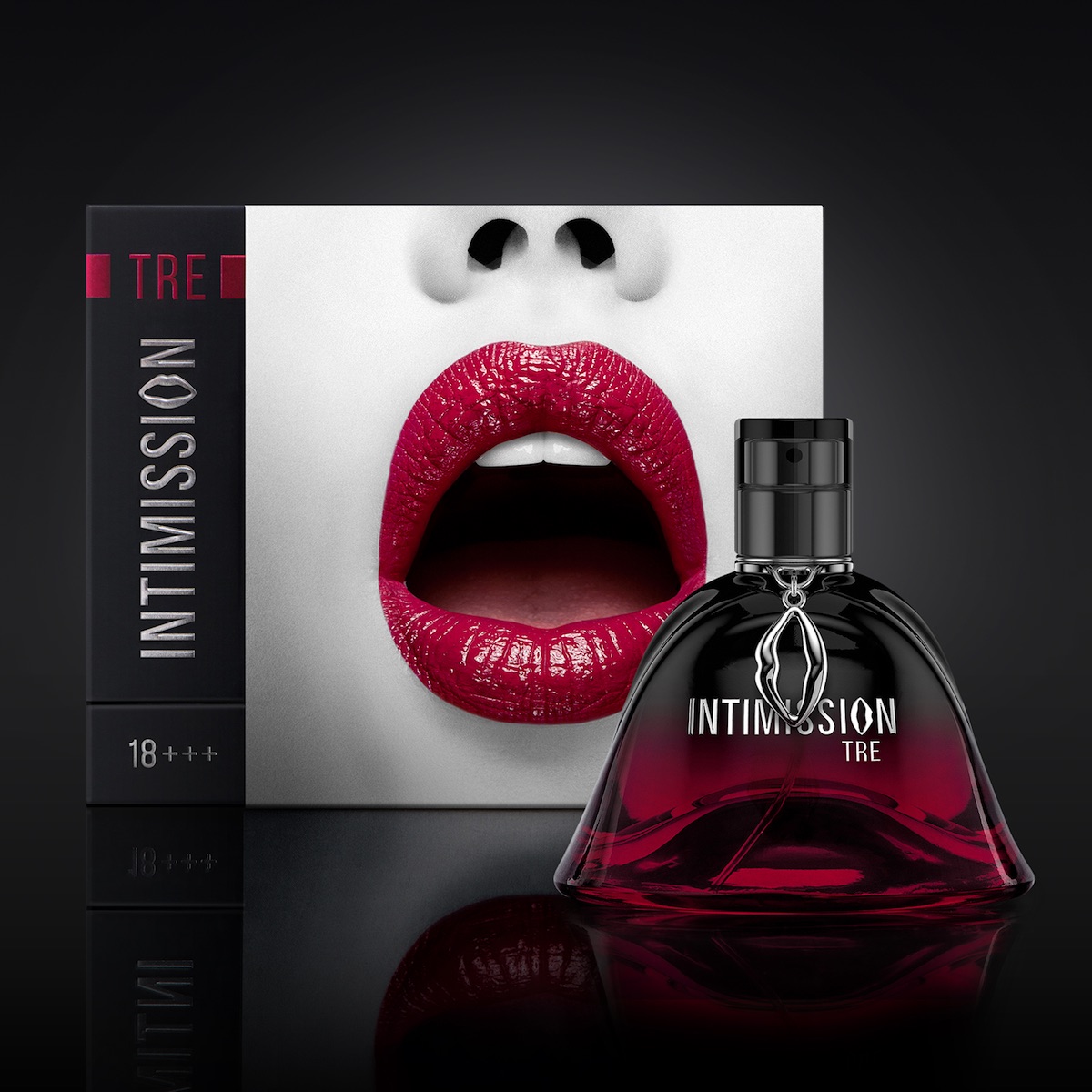
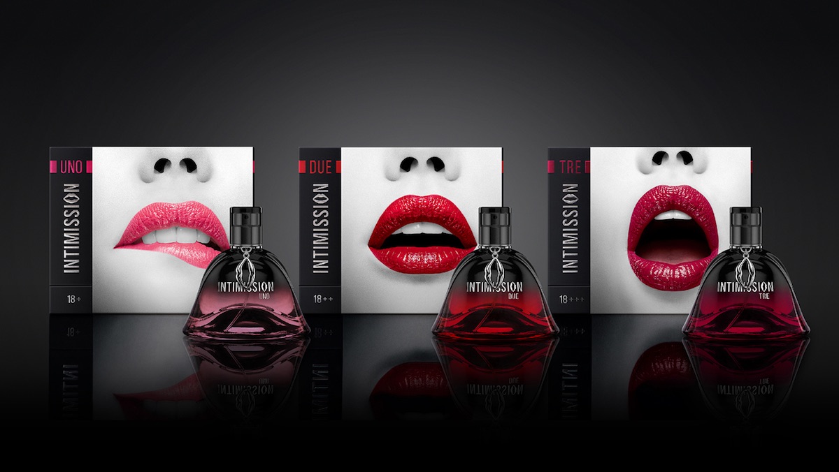
“Three packs tell quite an obvious story. In the first instance only the expressions of lips distinguished the packs within the range – by the intensity of emotions. However, to underline the difference we added different lipstick colors. Pink – for the lightest fragrance, deep red – for the deepest one.”
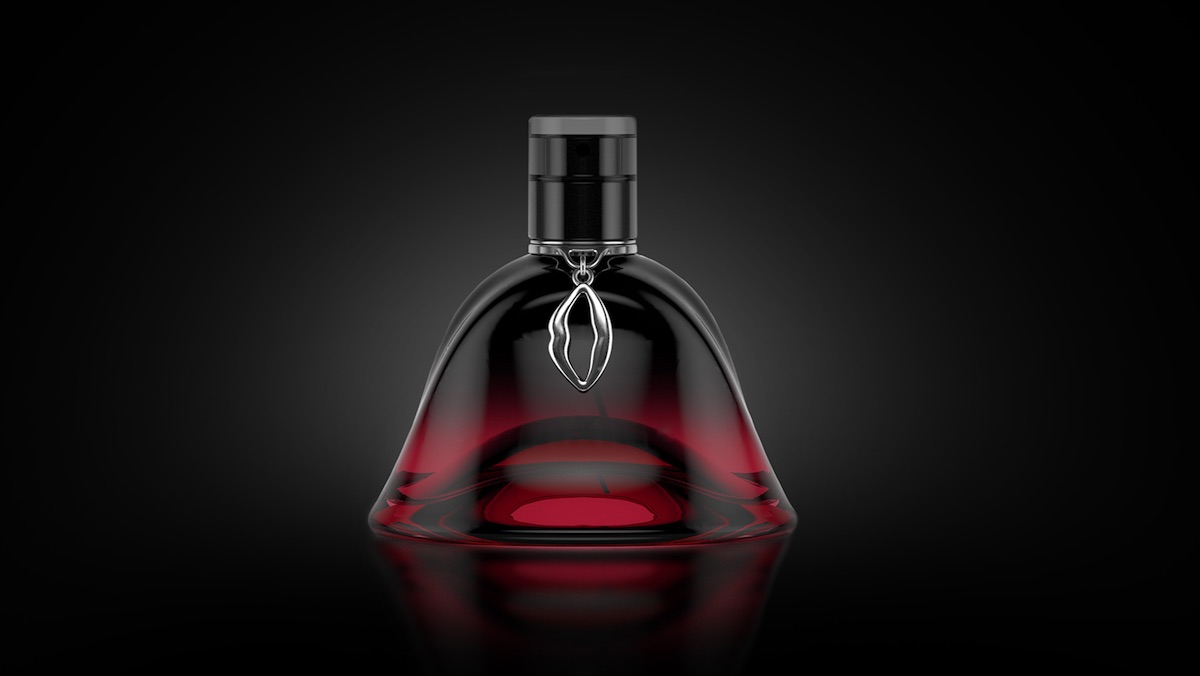
This approach was also applied to the lippy bottle, using colored glass “with gradients between black and the relevant color.”
And because you can’t sell a high-end scent today without dangling something from the neck…yep, lips again.
Finally, those smackers were applied vertically to the “o” in Intimission’s typography, which come out horizontal thanks to the vertical orientation of the name on the box.