Just when we think we’re going to hit a week where we’re going to have a hard time living up to the “Cool” part of “Cool Designs,” the design gods crank it up to 11. This week, we are awed by a Brooklyn Philharmonic invitation, witness the beautiful union of two sunglass companies that have a thing for pretty packaging, and discover an album of Beatles cover songs all but dripping with gold foil. (You can find previous Cool Designs of the Week right here.)
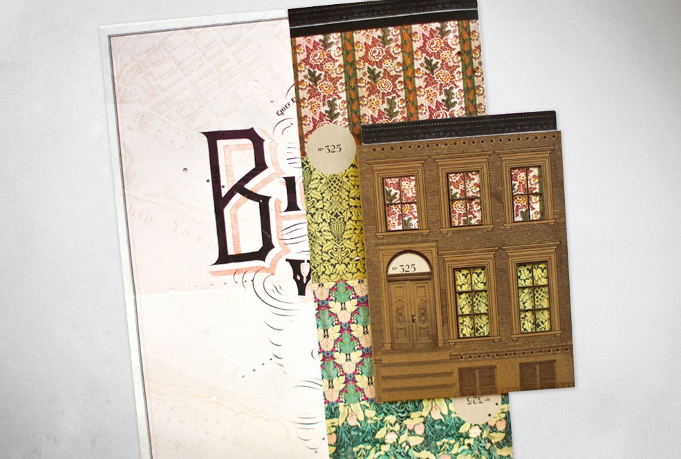
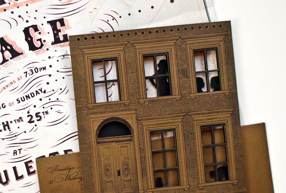
Brooklyn Philharmonic Invitation Design
If we have a concern about this stunning package crafted by Kelli Anderson, it’s that there is no way that the orchestra could possibly live up to the gorgeousness, creativity and level of detail to be found here. What can you say about an invitation suite in which a carefully researched, typographically stunning map-like invite is only the second most interesting component?
“This inner invitation sheet arrives folded-up map-style and is delivered within a sleeve shaped like the most salient of Brooklyn architectural mascots: the brownstone! The reverse side is printed with Victoria upholstery patterns, a bit of interior decor which can be reconfigured by folding the map in different ways. Removing the inner invitation entirely reveals a peek into brownstone life with its semi-anonymous silhouettes of human drama.”
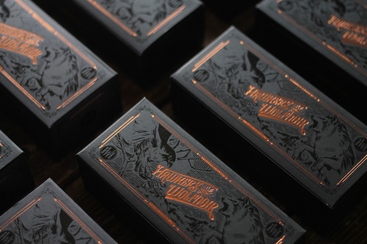
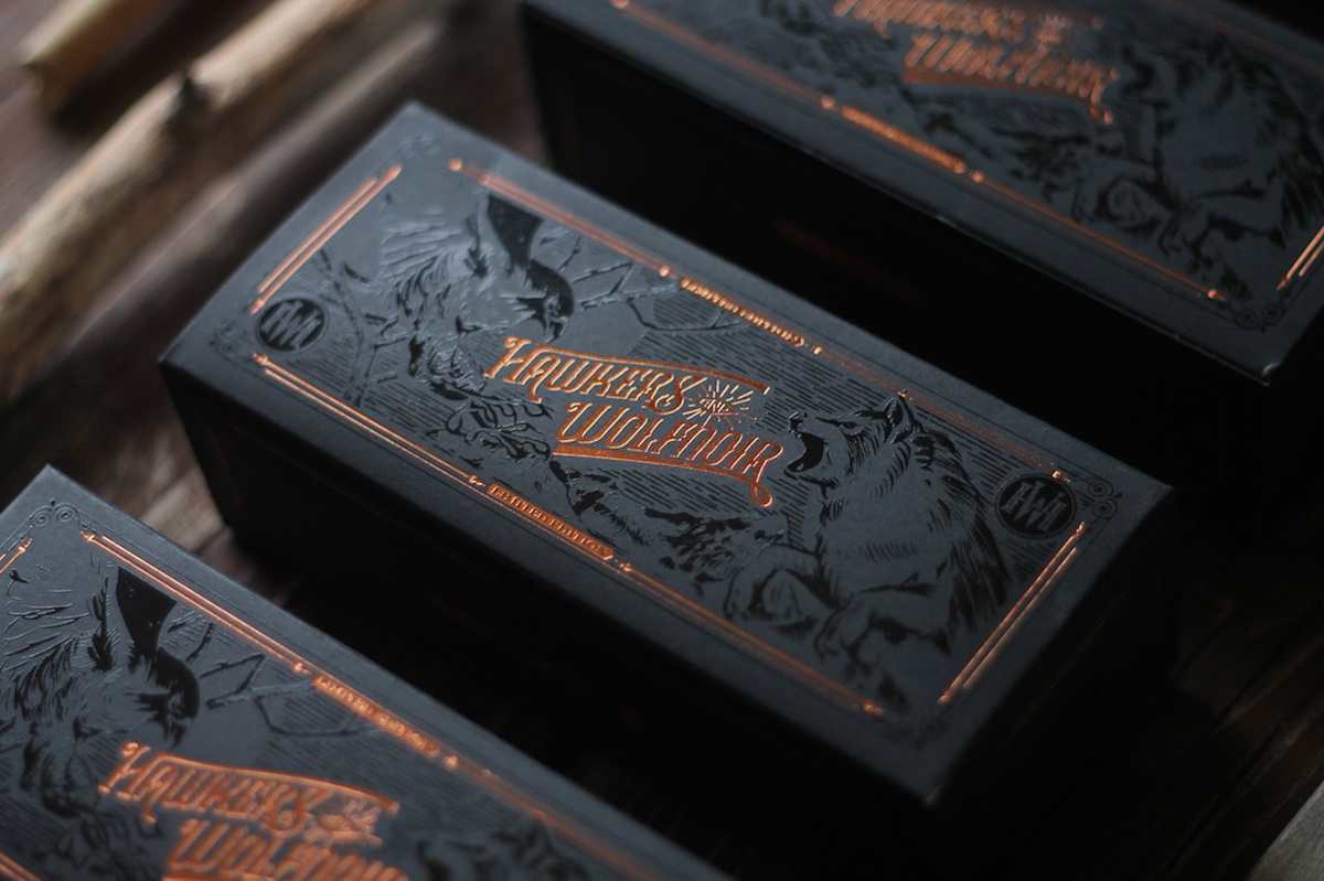
Sunglasses Packaging Design
Tasked with developing packaging snazzy enough for a limited edition product for sunglasses makers Hawkers and Wolfnoir, David Sanden came up with the lettering design, monogram and ornaments, with graffiti artist Rock Roice providing the illustrations. Once more we have to ask if the product itself can live up to its opulent packaging.
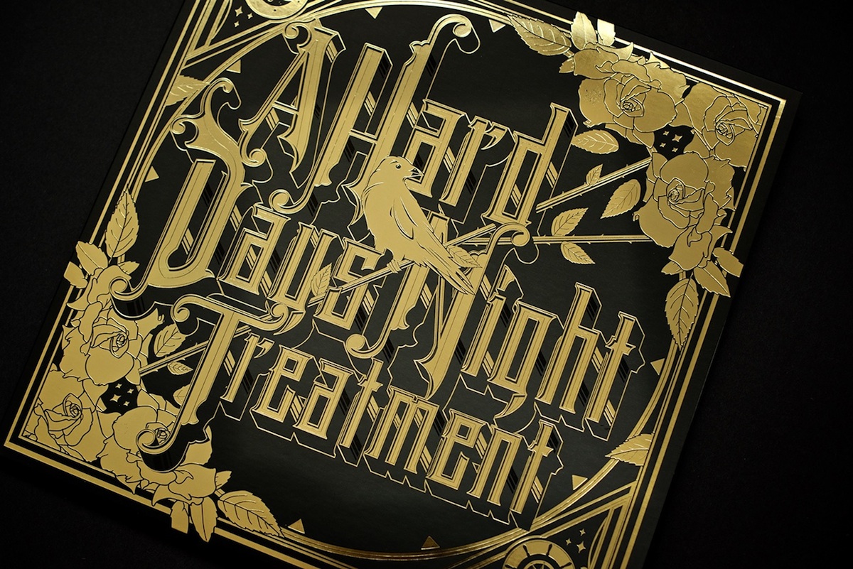
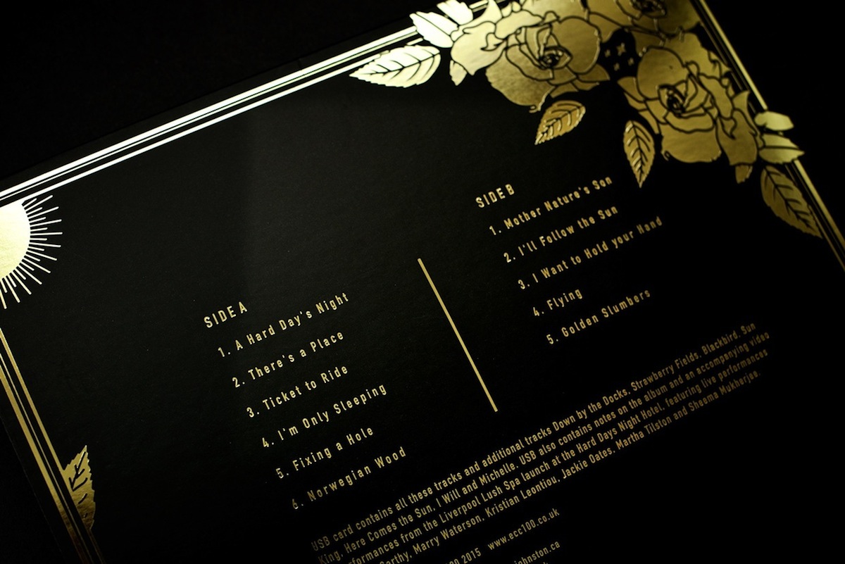
Beatles Cover Album Design
It has to be a thankless job being involved with an album of Beatles cover songs in any capacity. So if you have to design the packaging for it anyway, why not really push the boat out with gold foil, foil, foil?! Ben Johnston’s sophisticated blending of stellar typography and delicate details is a joy to behold. THIS is the real Beatles “revolution.”