 By John Prothero
No matter how much we think we know about the color proof printing process, it’s always a good idea to review the basics to fill in any gaps in our knowledge BEFORE they become a problem later on. We particularly appreciate John Prothero’s no-nonsense tackling of color-discrepancy in proofs because he gives us the printer’s-eye view of the problem – what follows is his advice to his fellow printers…about us! And after 30 years in the business, he offers a couple of solutions that more printers could provide going forward. Anybody can define a problem; what we need are more people offering ways to eliminate them. – ed.
…….
One of the most consistent issues in print is the comment “Your proofs don’t match mine – why is that?” Most of the time these comments are made by folks who are not experienced in print production or print buying. Sometimes even seasoned pros can make these kinds of comments. So let’s explore why your proofs may not match – and often WON’T match – the proofs your client has.
3 Things to Consider for Color Proof Printing
The Monitor
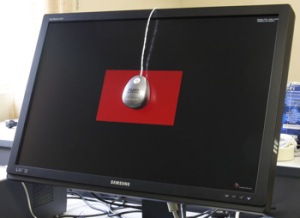
Often the first indicator that your client is not experienced in color proof printing is when they say that your proof doesn’t look like their monitor.
Designers or administrative assistants who’ve been tasked with design see the color on their monitors and like it, and then when they see the proofs, they are disappointed because what they saw on their LCD or LED monitor does not match what you’re showing them.
Most often the reason for this is that a monitor is in the RGB color gamut, and it uses transmissive light. Red Green and Blue is how monitors generate colors, and when the RGB all meet they become white. The light is then transmitted through the monitor screen to your eyes. Color is representative, not accurate.
The fix is for the designer or admin to purchase and use a monitor calibration device, which will correct the color of the monitor and make it accurate. However, this is a step that must be done regularly to ensure color accuracy of the monitor. But one must realize that this is STILL an RGB representation of a color, so even with calibration you cannot trust that the monitor is true to color.
The Laser Proof
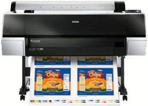
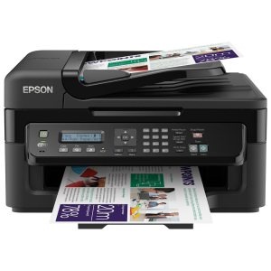
Most designers, and even administrative assistants, have access to a color laser or color inkjet printer, and most of these have their own simple internal calibration. Epson and HP make printers that can print in just CMYK, or you can add second sets of C or M toner to richen up the color.
These printers can handle up to 11” x 17″ or even 12” x 18″ sheets, and can be calibrated to a certain extent. They use ink or toner and lay it down on the surface of the substrate, which is the closest process to printing you can get. However, if the designer or admin is developing color critical content, it would be advisable to purchase a high-end proofing device, such as an Epson or Kodak large format printer, and create different profiles for the various print service providers you may use and their end RIP.
For example, one in-house marketing firm for a large pharmaceutical company has an Epson Stylus Pro 9900, which offers high-end color proofs that can be calibrated and imaged using profiles of the printers, and even papers that they use. This allows them to get the most accurate color, which they match against the print service provider’s color proofs.
 The Print Service Provider’s Proofs
Proofing for print has evolved over the decades from the old 3M Color Keys that were hand-processed with an alcohol-based solution (during the summer you could faint from the fumes), to proofing methods such as the Kodak Waterproof system, or the Epson Stylus system.
However, many printers are making sure that their proofs match their press sheets by setting up profiles that account for the idiosyncrasies of each press. Most printers are now GraCol 7 certified, meaning that they have invested the time, energy, hardware and software to footprint their presses so there is NO difference between them, and that the proofs will match the press sheet. This is imperative, since you want the client proofs to match what they’ll see on press, not what the client provided.
That is often why the statement “your proofs don’t match mine” comes up. The client has seen the visual on the monitor (calibrated or not), has generated color proofs on their printer (calibrated or not), but they do not understand that the ultimate color proof printing technique is the one provided by the print service provider that is profiled to specific presses or substrates.
What Can I Do To Help?
As a printer, the best thing we can do to help our clients is get their devices and monitors calibrated. Doesn’t it make sense? Don’t we want the client to be happy and understand why colors don’t come out the same from device to device? Take the time to send one of your prepress team members to the client’s office to help in calibration, or even set up profiles on their Macs or PCs that can get them closer to creating proofs that are accurate.
Another solution is to provide them with a calibration device, which is an expense that could pay for itself in the long run. The goal is to enable your client to create proofs that are as accurate as possible, and either eliminate – or at least mitigate – the comments about their proofs and your proofs not matching.
………..
 John Prothero is a print professional with 30 years experience in the print industry. Starting out as a driver delivering jobs, he worked in bindery, proofing, plating, traditional prepress (camera and stripping), scheduling, job planning, job management, account management and digital job production. His skills also run in the area of blog authorship, social media management, and lead generation and qualification of prospective clients. John is a Business Growth Strategist for Precision Services Group, a marketing services provider in Tustin, California. Connect with John on Google+, Twitter and LinkedIn.


Hello!
I came across the article, “Three Causes of Color Proof Discrepancy “. I am looking for clarification regarding industry standards as to how colors are identified on soft-proofs. Specifically, is there an industry standard?
I work in the prepress department for a small printer in Michigan. We had an issue with a press run where the customer required a delta on one of the Pantone colors they supplied to us (color chips). The job was run according to a visual match to the Pantone book (which is normal for us), but did not match according to the customers specifications. I was then asked by a colleague if I would change the Pantone color number (PMS418) to a different name (Straw Dark Gray) on the soft-proof, so that our production team would be alerted and special attention given to this particular color.
Is this an acceptable practice? My thought is that this information should be passed along in the job ticket and not the soft-proof. I feel it would cause the customer more confusion, should I send a proof in which colors they have clearly identified have been renamed.
Thank you for your time.
This is a tough one because you’re talking about setting a standard for your in-house workflow, which obviously differs depending on the number of people involved, and how your current workflow has evolved over time. And yes, ideally the information would be in the job ticket. But considering the number of places where information is conveyed in today’s printing process, perhaps the only workable practice is to ensure that important details are placed everywhere possible, just so that they are not missed. But enough about us – what do other people think?