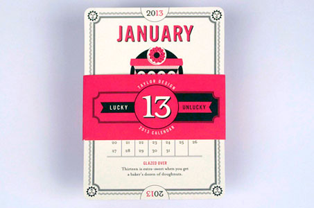
I stand firmly behind the notion that calendars can be sweet client gifts to give during the holidays. But how do you design one that people actually want to display (you know … something NOT like the national auto club or the local insurance guy)?
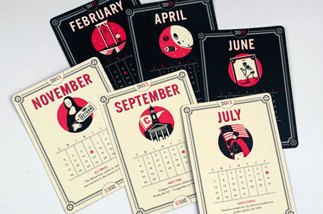
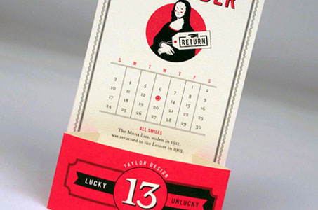
This design firm decided the motif didn’t have to be all serious and affirmy, particularly in a year that ended with the number 13. So they took two simple colors (black and red) and looked at two opposite sides of this infamous number in a shadow-and-highlight sort of way.
Six round-cornered cards (two months on each card), one DIY paper stand to put them in (that doubled as the belly band for presentation), and 12 very clever illustrations take the recipients on a glass-half-empty/glass-half-full journey through 2013.
I really like that the stock (Mohawk Via Vellum Cream White) was matching between the cards and envelopes, and I love that the whole package weighed in under an ounce so it could mail with a First Class stamp.