Understanding the meaning behind a brand’s name and ethos, then communicating that visually is an essential part of designing any great identity. When designers do that for their own businesses, the results are always interesting and inspiring; and with these business cards, it also sends a loud and clear signal.
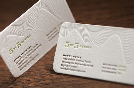
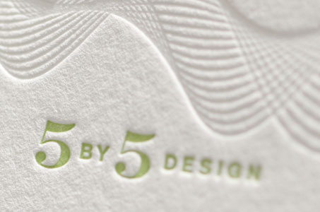
The name 5 by 5 Design comes from the way traditional communication signals were rated – a scale of 1 to 5 based on clarity and strength. The designer chose a radio wave as the visual motif of this idea. The organic and flowing shape of the wave creates an elegant counterpoint to the simple typography.
The toothy texture of Crane’s Lettra is a perennial favorite for letterpress printing and the substrate of choice here. The movement of the wave form (rendered on the letterpress without ink) across the top of the card is strong enough to balance the green and brown palette below it.
While round corners are always a refined option for any business card, their grace is an absolute must for this brand’s identity.