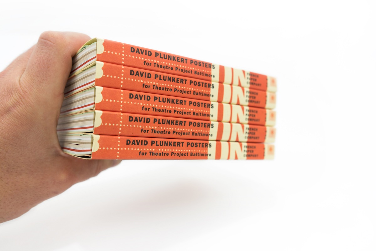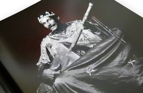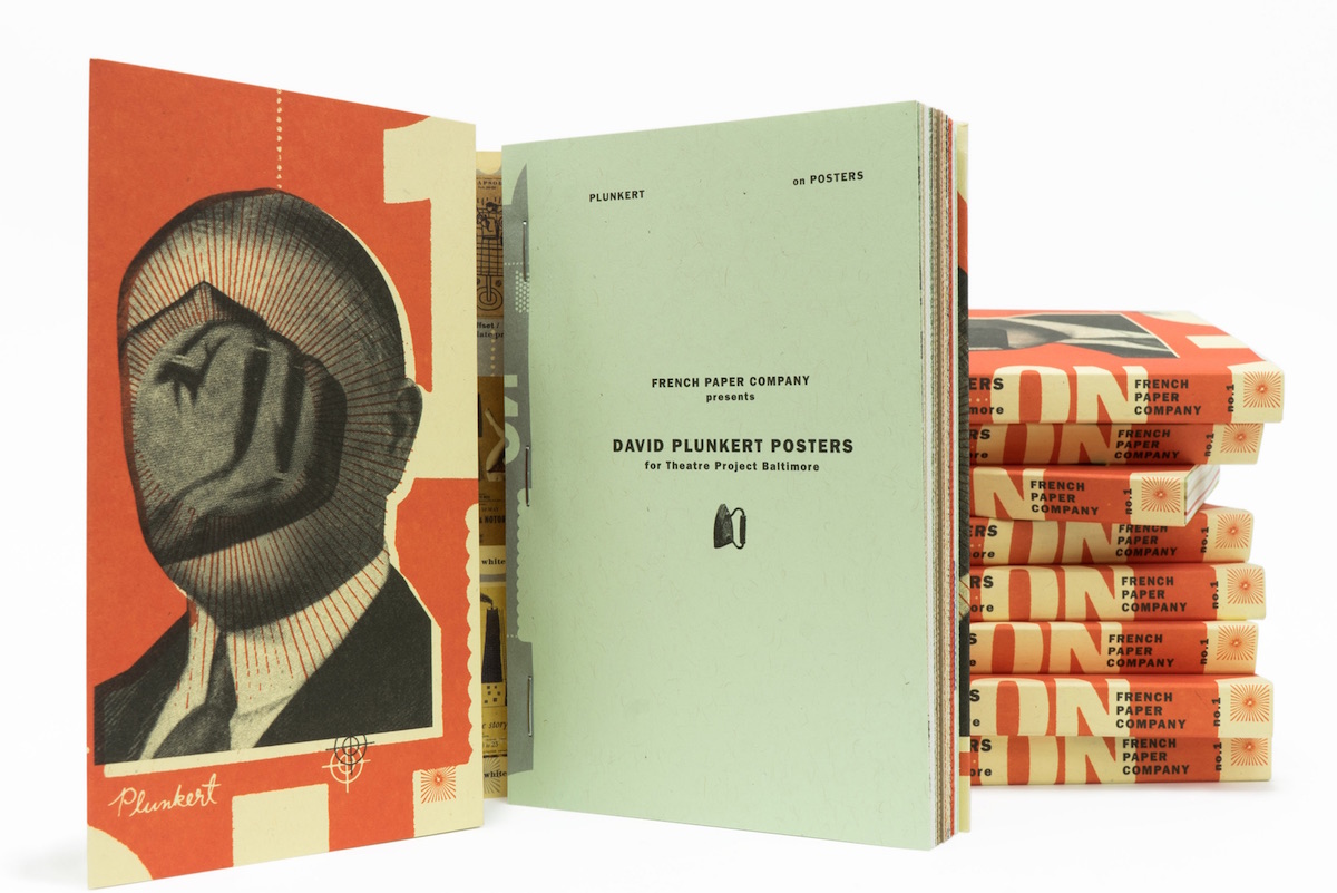
There is something very wrong with David Plunkert…and thank heaven for that. The artist’s style – think Monty Python-era Terry Gilliam and Rene Magritte keeping a common scrapbook – is creepily bonkers to begin with. But when a 15-year retrospective of his poster work is then viewed through the delightfully skewed prism of Charles S. Anderson’s CSA Design, you are in for an attention-grabbing treat: the book “David Plunkert.” The fist-in-the face cover image says it all.
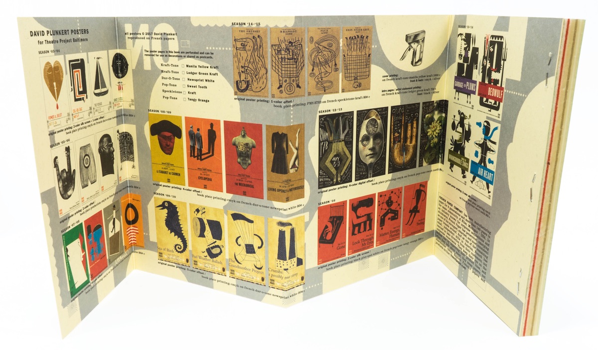
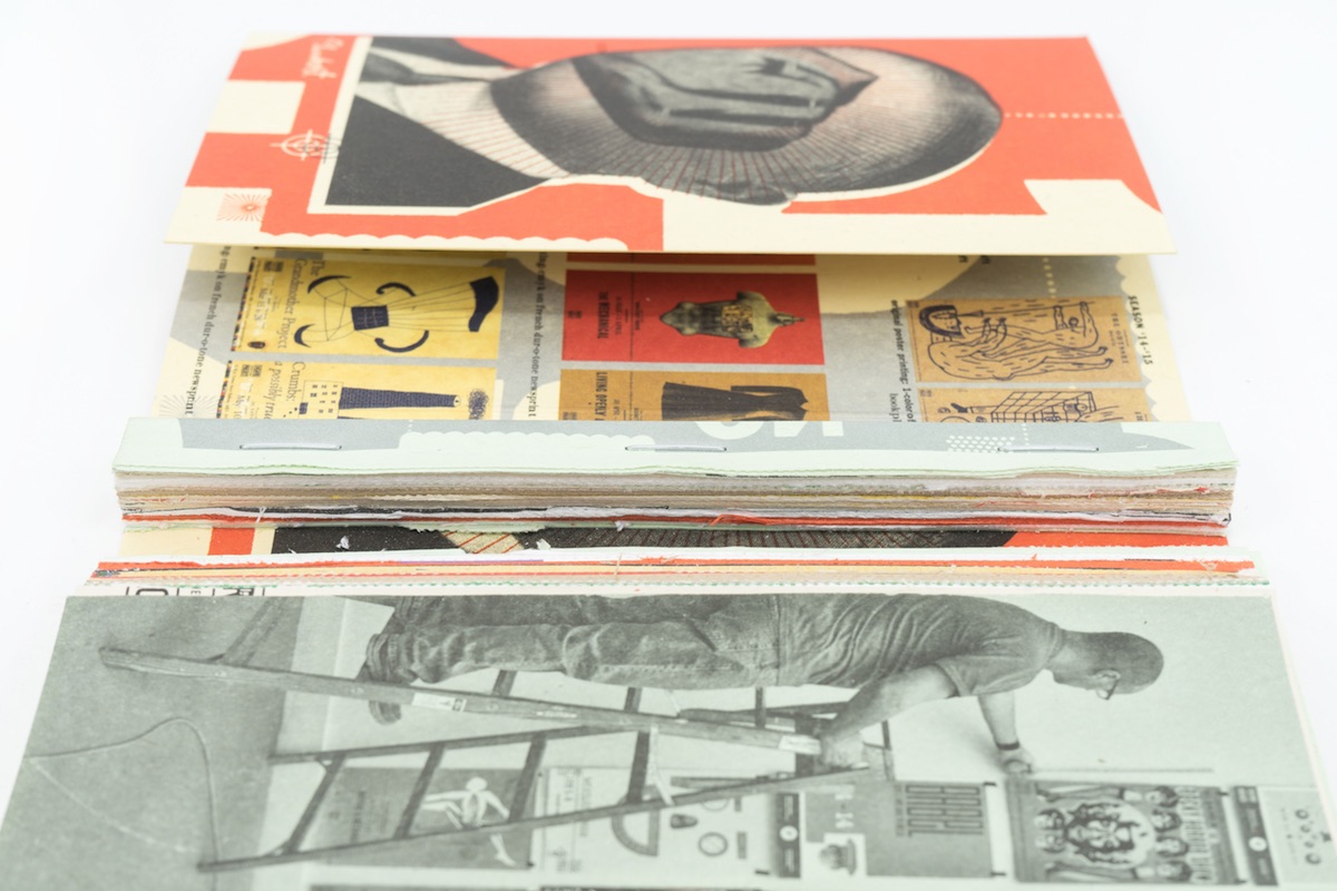
“David Plunkert is a renowned art director, designer and illustrator whose work we follow enthusiastically,” explains CSA Design’s Erik Johnson who was directly involved in the creation of this tome. “He had known Jerry French for years and reached out to share the 15 years’ worth of posters he had created for Theatre Project, hoping to create a book that could inspire poster artists of all levels. We embraced the idea of sharing this amazing artwork, and also saw it as a way to dramatically show off many French Paper colors through unusual pagination, a unique exposed binding, wraparound cover and perforated card-weight pages which could be removed as postcards.”
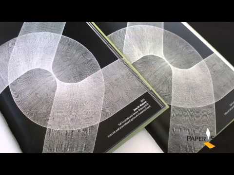
Longtime designers of French Paper promos, CSA Design really outdid themselves with layouts that somehow impose order on Plunkert’s artistic anarchy, while the foldouts seem to emphasize his work’s penchant for pushing at the edges of the page. And Franklin Press went above and beyond by producing a gritty package – complete with French folds and an exposed, perfect bound glue edge stitched binding inside a wraparound cover – that matches the posters technique for technique.
The artist “used a variety of styles and printing techniques throughout his many years of work on the original Theatre Project poster series,” Erik explains. “We could not include silkscreen and digital printing, but we asked Franklin Press to explore several offset variations to approximate the looks of the posters.”
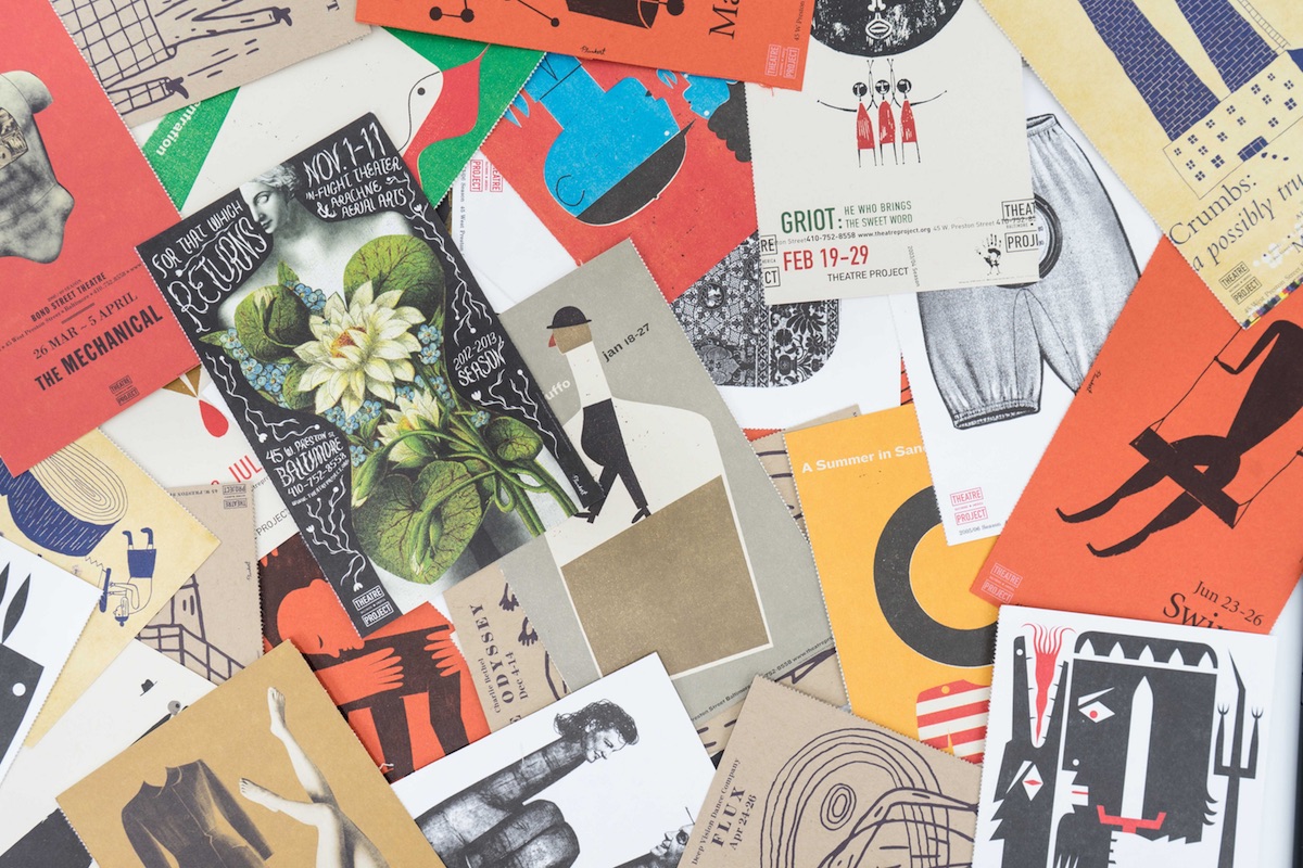
Best of all, and I sooo wish we would see more of this in other promos, the poster pages are perforated so you can easily remove and use them as postcards or hang them on your cube or office walls.
PRO members, don’t forget to check out your:
Love this piece? Like it, share it and add your comments below.