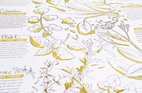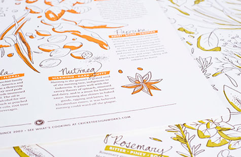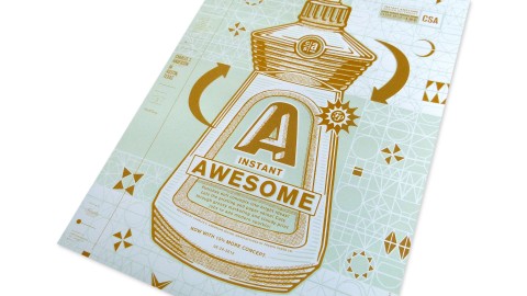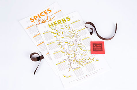
Inspired by early memories of each of their grandma’s kitchens, Cricket Design Works collaborated with vendors, clients and friends to cook up these yummy letterpress broadsides full of just the right design ingredients.
Typically, I’d be worried with so many cooks in the kitchen, but the overall composition gels well thanks to the re-inking of each individual illustration. We love the places where the finer line quality loosely interacts with broader areas of color, showcasing the beauty of letterpress on Crane’s Lettra.
Adding a splash of color in just the right spots to these freshly penned illustrations also makes great use of two-color printing. The simplicity of the block sans-serif titles on each poster pairs nicely with the handwritten look of the script on the spice and herb names.
Both posters have a vintage taste that any creative in the kitchen (or studio) would be proud to share … and as a self-promotion piece, they are a recipe definitely worth repeating.