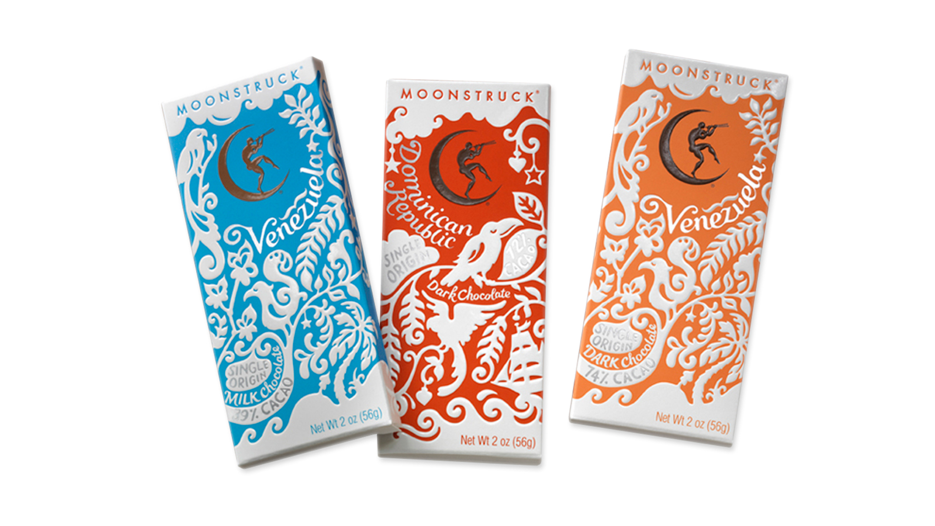
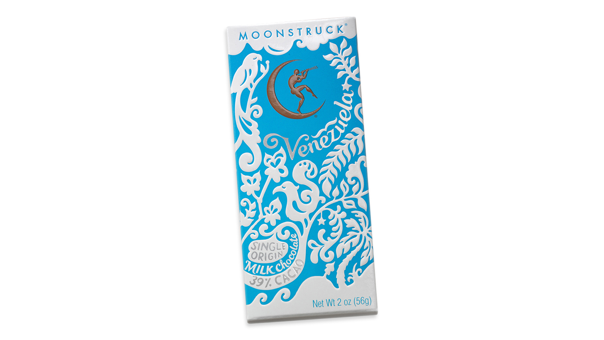
After six seasons of “Portlandia” we feel as if we know what to expect from Portland: enthusiasm for all things organic, environmentalism, and unflagging dedication to the hipster lifestyle (i.e., the Bay Area ethos before the techies got a hold of it). This trio of chocolate bars – the first “single origin” ones from Portland’s own Moonstruck Chocolate company – celebrate all of these traits through the use of a distinctive, cohesive packaging.
“Our goal was to create a chocolate bar packaging that imbues the same qualities that drive Moonstruck brand enthusiasm through its truffles: handcrafted quality, visual beauty, multi-sensory experience and imagination,” says Chris Gardiner, creative director of Sandstrom Partners. “The illustrations and typography are a hand-cut paper style inspired by the single origin chocolates’ country of origin.”
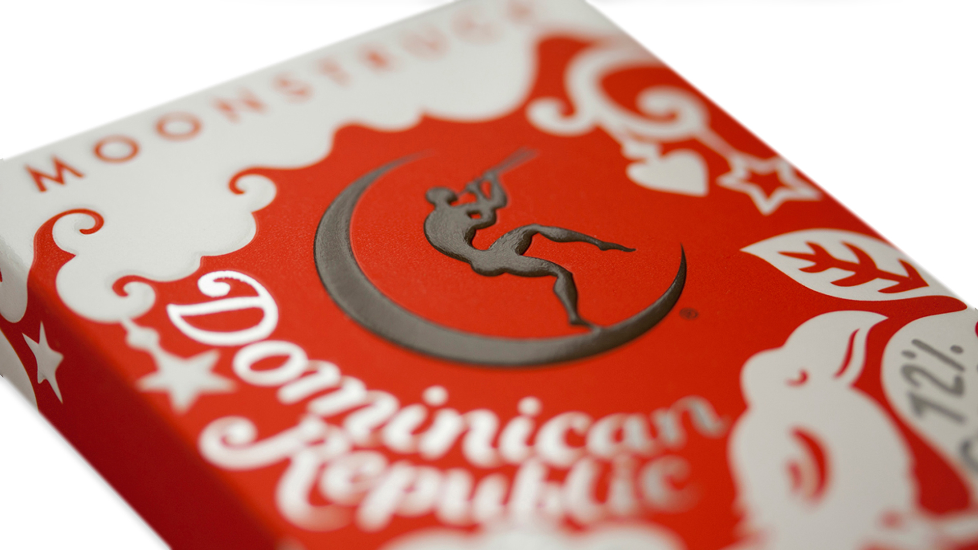
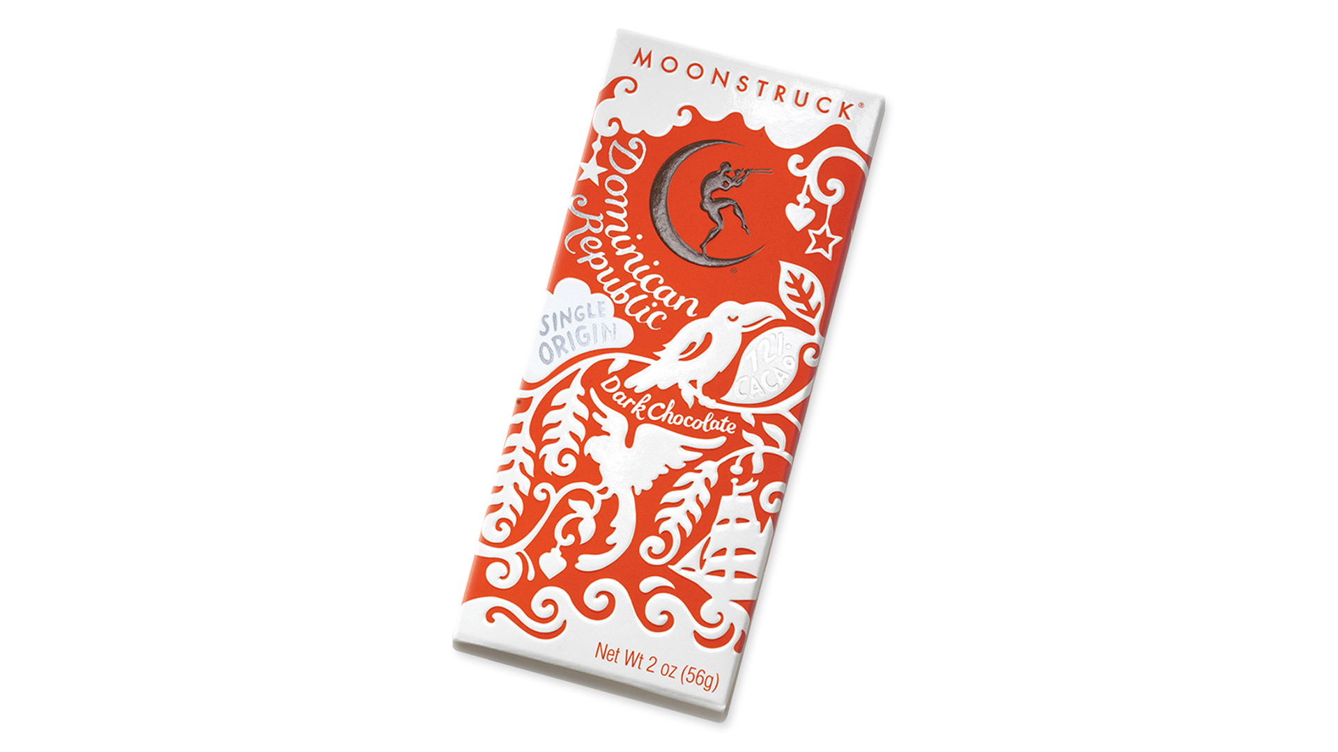
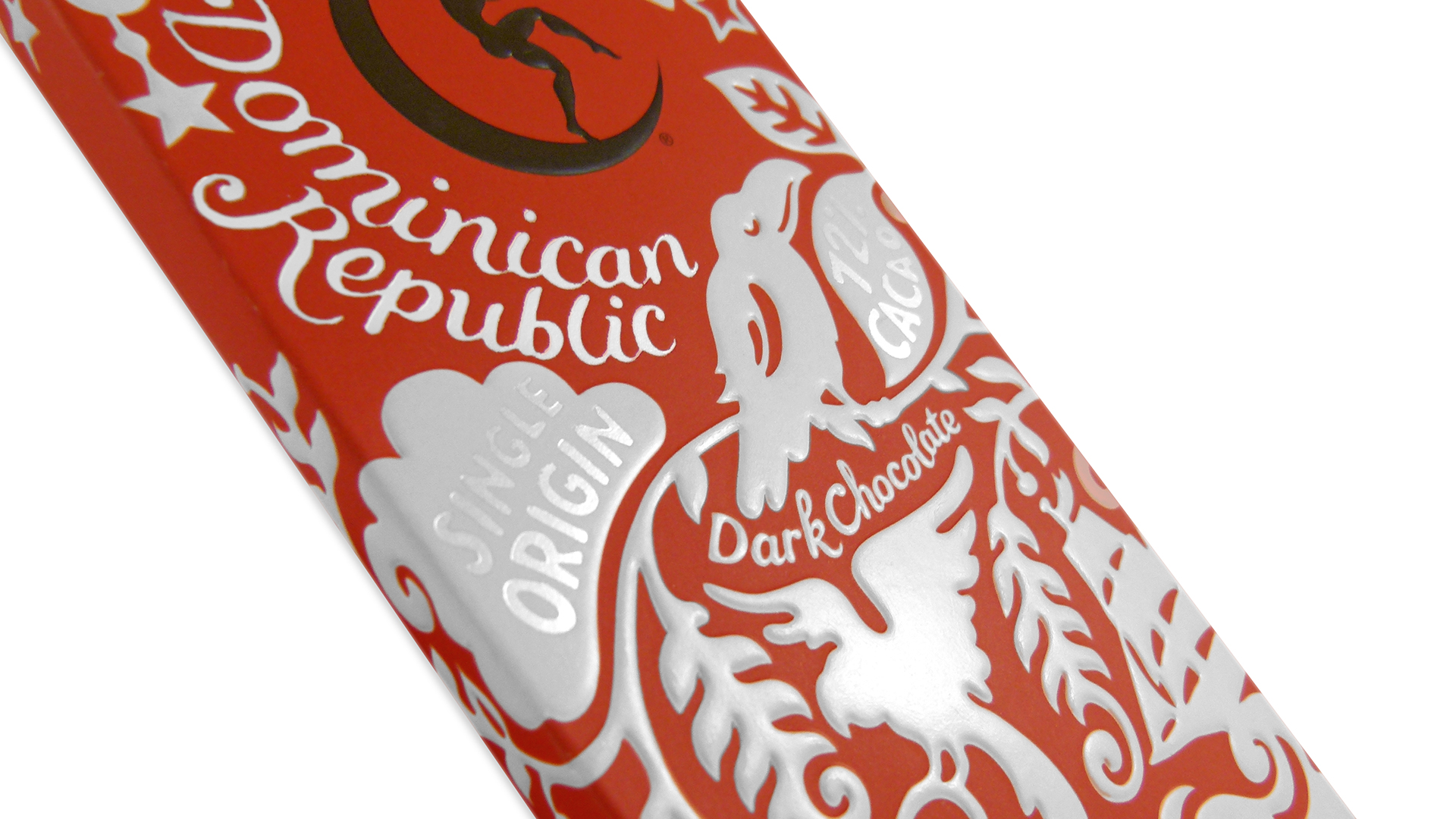
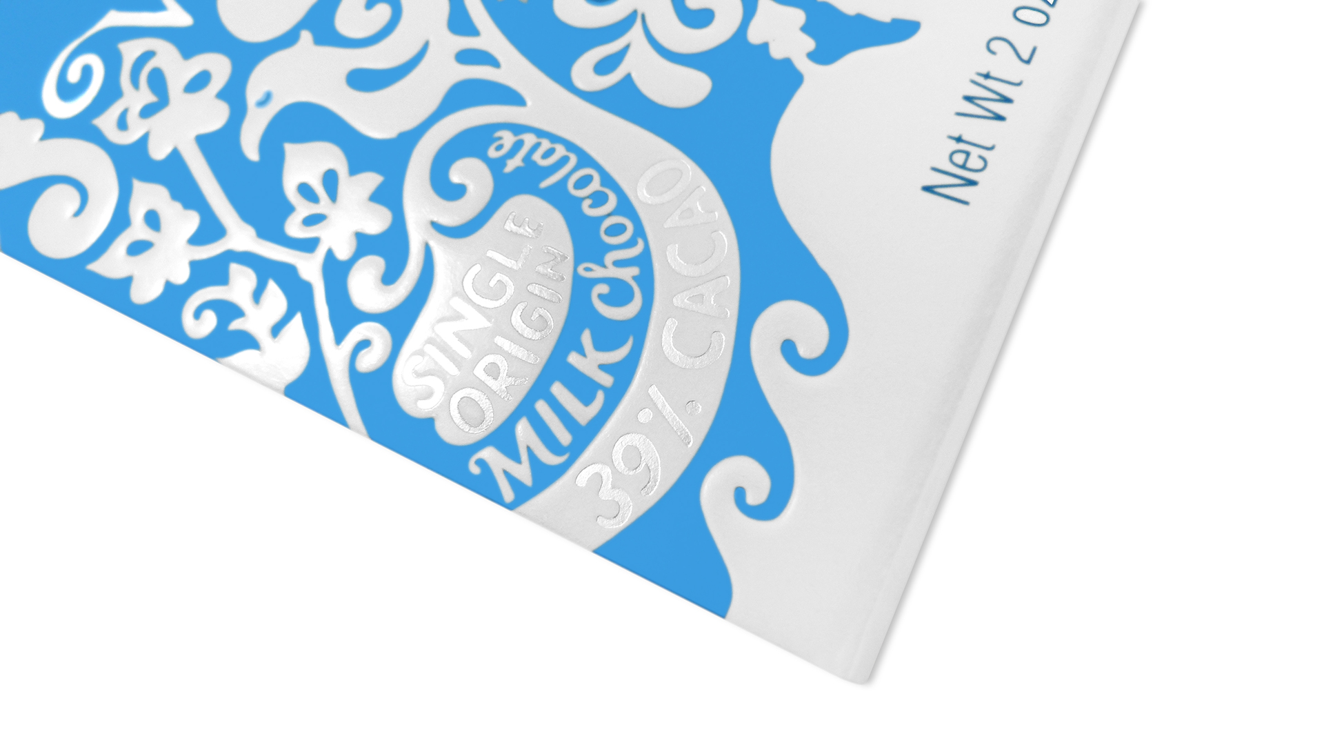
The flora and fauna (yes, they “put a bird” on them ) hailing from each of the two source countries – Venezuela and the Dominican Republic – printed in white, bring the packaging to life. Yet what makes it all stand out is the striking use of finishes and finishing techniques. These include matte in the color areas and a glossy Soya-Kote varnish with embossing in the white.
This last “is made with a bio-renewable domestic product that supports the American farmer, and it helps to reduce our dependency on foreign oil and conserve resources for future generations,” Chris helpfully explains. “These coatings produce higher gloss levels than traditional products.” (Note: Soya–Kote is a trademark of The Irwin Hodson Company, encompassing aqueous and UV curable coatings containing soybean.)
In addition, a thick UV varnish was applied to the “chocolate” logo at the top, with the name of the source country embellished by matte silver foil stamping.
This packaging might’ve cost a bit more than that of your average grocery store chocolate bar but, says Chris, “it is well worth the cost of using specialty printing, like foils and [embossing techniques] to produce a package that reflects the unique qualities and preciousness of the product inside.”


Nice use of 2 color, reminiscent of old world Europe. nicely done!