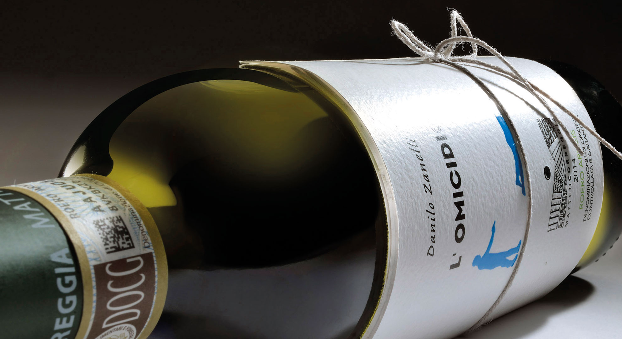
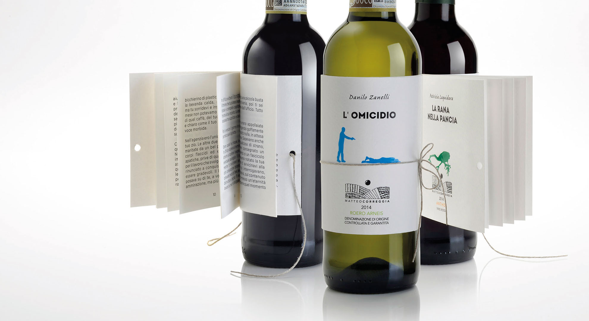
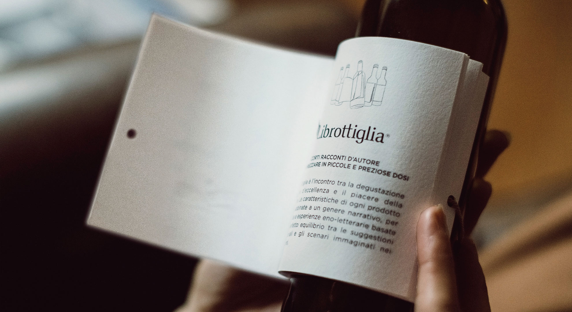
Three authors, three short stories, three small bottles of wine. Librottiglia is where great wine and literary pleasure meet. The combination of a conservative product such as wine with a beautifully crafted book is both innovative and modern.
– Mirco Onesti, Reverse Innovation
Like blades of grass poking up through the concrete, the printed word increasingly appears in places where you’d least expect it to in order to lure people, however briefly, away from their phones. Famously, Chipotle has decorated its cups with illustrations and stories by celebrated authors since 2014. The Italian winery Matteo Correggia has gone one better by affixing an entire beautifully printed short story to bottles of its Librottiglia Wine.
“Today we read books on computers, tablets and mobile phones,” observes Mirco Onesti of Reverse Innovation, the creative agency responsible for the move. “Why not on a bottle of wine?”
Writers have enjoyed a long and infamous relationship with alcohol in all its forms, so why shouldn’t bottles of same spread an author’s work around to a new audience sufficiently mellowed to receive it?
In this case, three authors collaborated closely with Reverse Innovation and the winery “in order to achieve an in-depth exploration of the nature of the wine and the mood it evokes,” Mirco explains. “From romance, to humor to murder, the short stories all strive to reflect and complement the particular personality of each of the three wines.” (see previous paragraph.)
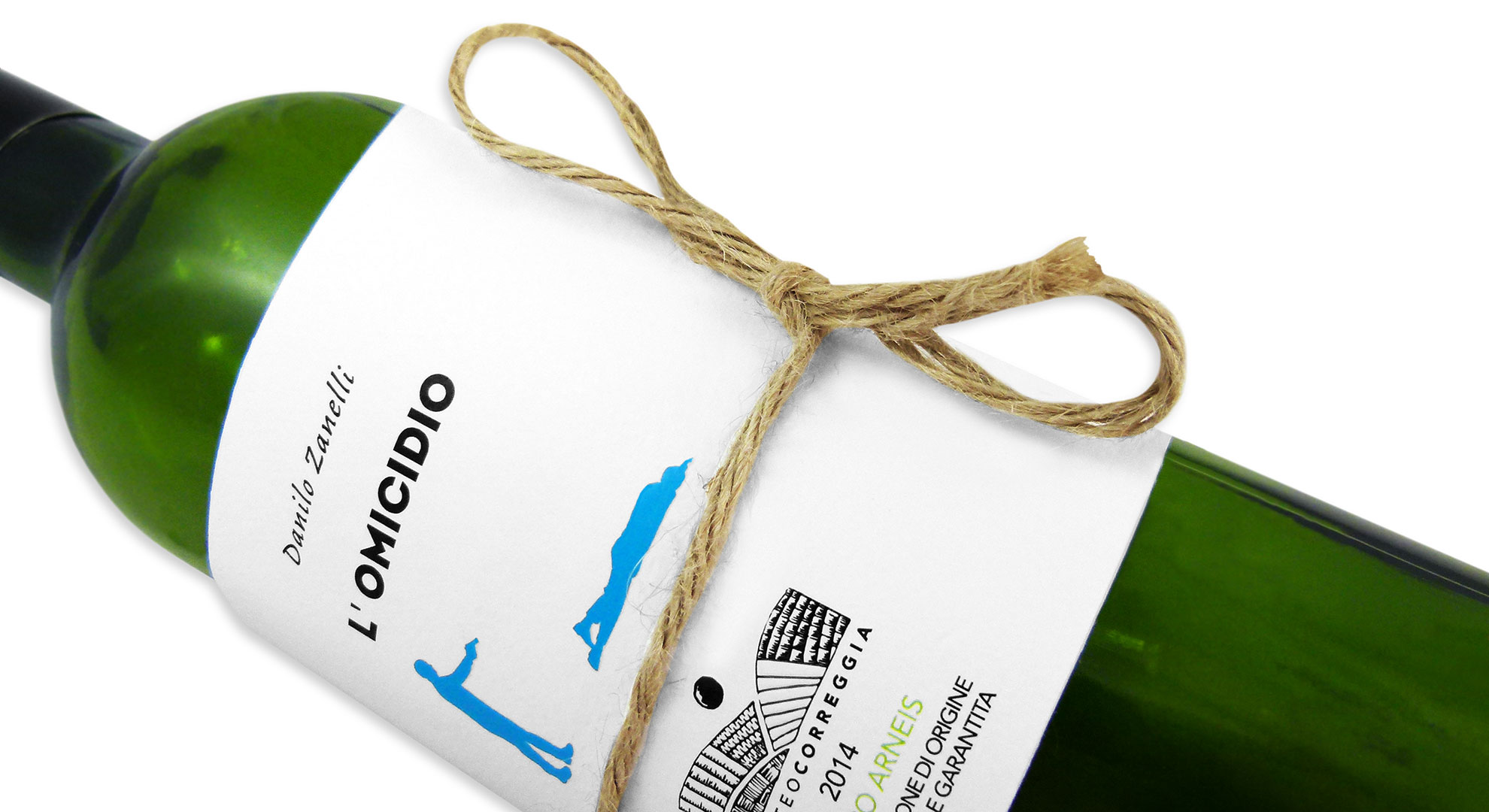
Each bottle’s Singer-sewn “label book” was digitally printed CMYK on gloriously textured Fedrigoni Tintoretto Stucco Gesso 220 gsm Cover.
Artistic details are highlighted by a spot gloss UV varnish while the company logo is embossed: check out the blue “Reservoir Dogs” like silhouettes on the cover of “L’Omicidio,” the title of which says it all in any language.
“The minimalist graphic style recalls the visual language of vintage soft-cover, short-story books,” says Mirco. “A fine cord is used to fix the book closed and establishes a visual ‘common thread’ that strengthens the identity of the coordinated product line. Once purchased, the cord converts the opening and closing of the book into a ritual.” While this last bit is a tad disingenuous – how many openings and closings are you really going to get out of a 12 oz. bottle of wine – the cord does add an unexpected degree of elegance to an already wonderfully tactile piece of packaging.
Collectively, it all comes together to, in the words of the Reverse Innovation creative team, serve as “a reminder of the value of unplugging ourselves from our personal technology and [taking] the time to recharge our own batteries and indulge the senses.”
Photography by: Francesco Zanet, Studio Effe [images 1, 2, 4, 5]