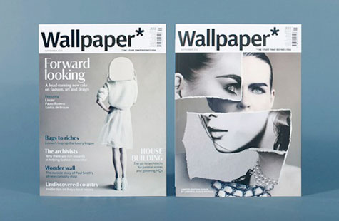
 When you think “magazine redesign,” the emphasis is usually on layout changes and the use of images. Yet with the September issue redesign of Wallpaper* magazine, the use of typefaces – and the baggage they bring with them – came to the fore.
In a chat with Creative Review, creative director Sarah Douglas shared an interesting rationale for switching to their two new fonts: Darby and Portrait.
“When Plakat (Graphik) was made for Wallpaper* by Paul [Barnes] and Christian [Schwartz] in 2007, it was perfect, and has served us very well for six years. But when the fonts are put in the public domain, they start to have lots of different personalities rather than just a Wallpaper* one.”
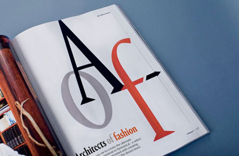
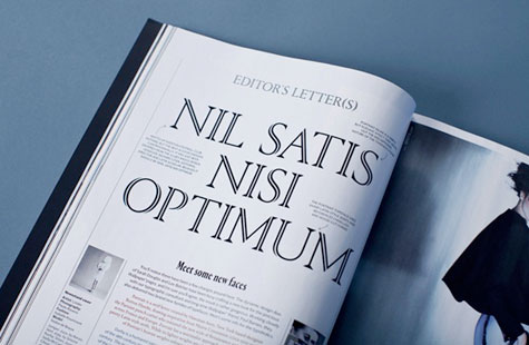
The two new typefaces were created exclusively for Wallpaper*:
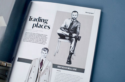
- Portrait (a serif, for features): “While its lighter weights are classical and elegant, the vibrancy of Portrait’s heavier weights references chiseled and wood-cut forms”
- Darby (a sans serif, for front-of-book content): “It is both a serif typeface without serifs as well as a sans with greater than normal contrast. The text is a low-contrast version of the same design, with differing proportions, and a slanted-style italic.”
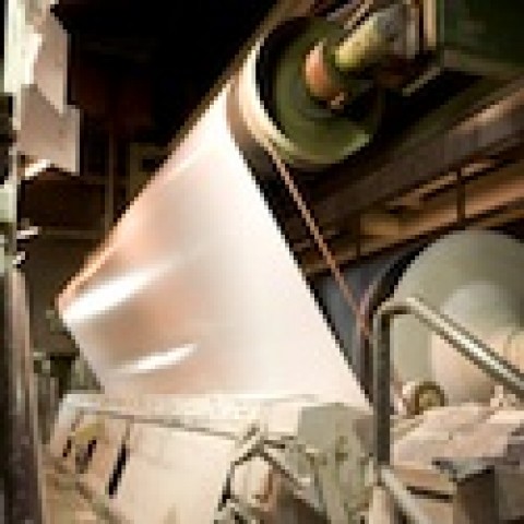
And after looking at more than 100 papers, Wallpaper* went with a heavier paper stock, too. “The new paper is 80 gsm UPM Star (previously 75 gsm UPM Ultra),” Wallpaper* Marketing Manager Caroline Sampson tells PaperSpecs. “This new stock is whiter with less show-though – beautiful!”