 It’s been a crazy old year around PaperSpecs Towers, particularly with our long-lived Paper Tips column. At some point it was renamed Paper Insights, and consequently became more insightful, or so we would like to think. We tackled cutting-edge printing techniques, advice on designer dilemmas, the collective freakout that was the launch of Creative Cloud, and experimented with…potato printing?
Through it all, we hope you learned something, snapped up a spark of inspiration, and maybe even breathed the words “pretty cool” after a quick read.
Before we bring you our choice of the top 10 Paper Insights of 2013, we hope you might take a moment to drop us a line with thoughts on some of the subjects you would like to see covered next year. Don’t worry – we’ve had a quick look around your office – we counted 5 screens with Facebook open. Trust us, this close to the holidays, you’ll be far more productive by simply emailing us.
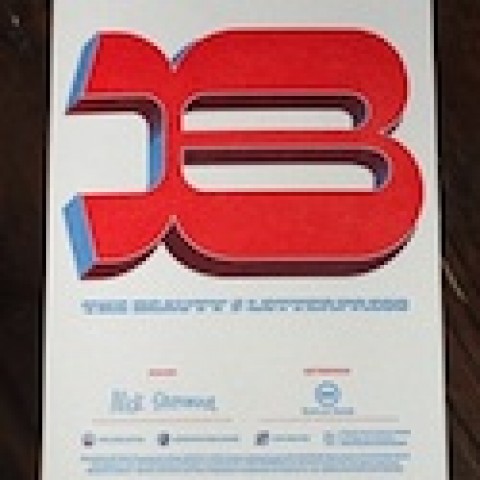
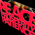
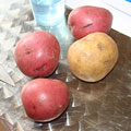 10. Logo Beauty: In the Eye of the Potato
Do you remember your first artsy projects back in kindergarten? You cut a potato in half and created stars and other shapes on the exposed surface, which you used to print something amazing (place mats in my case ;-). This is the inspiration the Isley design team used. Starting with yams, cauliflowers and other vegetables, they ultimately settled on a potato print. Not just any potato, mind you. The perfect half circle for the new Sweet Hospitality Group “S” logo was achieved with the help of a Yukon Gold potato…
 9. Keep Your Fonts from Ruining Your Life
Like magpies, creatives are attracted to, and acquire, many different fonts in our travels, and sprinkle them liberally throughout our design. Despite our best intentions, it’s not uncommon for the odd font to sneak into the finished product. It’s not the end of the world if it does, you say? Tell that to NBC Universal. The company has been successfully sued more than once for NBC’s misappropriation of typefaces…
 8. Design Files: Know When to Hold ‘em
“Are they greedy or just stupid?” Variations of this question probably echo through the mind of every designer at least a few times each year, usually triggered by the same action: a client asking for design files at the end of a job…
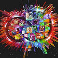 7. What Creative Cloud Means for You
Last week was hardly a slow one for news. The trial of too-glamorous-to-convict Jodi Arias ended in conviction, one of the alleged Boston Marathon bombers was laid to rest, and disturbing findings in Ohio were enough to put you off your cornflakes. And then Adobe put its head above the parapet and said “Designers, we need to have a little talk.” Guess which bit of news we’ve been discussing ever since…
 6. The Most Complex Project of 2013?
We at PaperSpecs are lifelong connoisseurs of books, and we’ve seen some humdingers. But I think it was somewhere around the third day of owning S. by JJ Abrams and Doug Dorst that I actually found myself sniffing the pages. It was then I realized that this volume wasn’t just unusual, it was messing with me. This behavior will seem a little less eccentric once you understand the conceit behind the novel, as well as the Herculean amount of thought and planning that went into its crafting…
 5. MTE: Welcome to Metallic Ink Nirvana
Over the years, there have been various ways in which press manufacturers and foil makers have tried to help us simulate metallic inks. There was Metal FX, which required special software. There are foil options that run inline with the offset press and require special equipment and extra care when spec’ing paper. Then there’s MTE – opening up a whole creative can of metallic worms … in a good way…
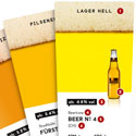 4. Art of Brewing Inspiration
Like some of those exotic beer blends you come across while perusing your local grocery shelves, there are certain design combinations that make you think: Boy howdy, now why didn’t I think of that. Here’s an example that has been a major hit with our readers since we first mentioned it nearly a year ago: Beertone, a Pantone-like swatch deck…for beer…
 3. Who Knew Digital Print Could Do THAT?!
What started out as a promotional piece for DRUPA 2012 soon became a showpiece for great design and superb digital print quality and processes. So this got me to thinking about the astonishing capabilities that digital presses have today, and how quickly it seems to be evolving…
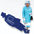
 2. How the FSC Should I Know?
“This whole FSC labeling is such a hoopla, it just is not worth it.” Francesca, a good friend of mine (and a true skeptic), was letting off some steam. “And how do I know that the paper the printer sells me is really FSC certified anyway? For all I know they could just …” I am sure Francesca is not alone in her reservations…
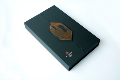
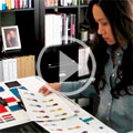 1. In the Design Studio: Intricate Parfumerie
The packaging concept was enticing. The foil stamping divine. The color story… No matter how elegant and beautifully wrought the piece, it seems that too often we’re presented with images of a finished product that leave us asking: How did they do that? That leave us wondering what went on behind the scenes. This was something we wanted to remedy with “In the Design Studio,” a new short-video series…