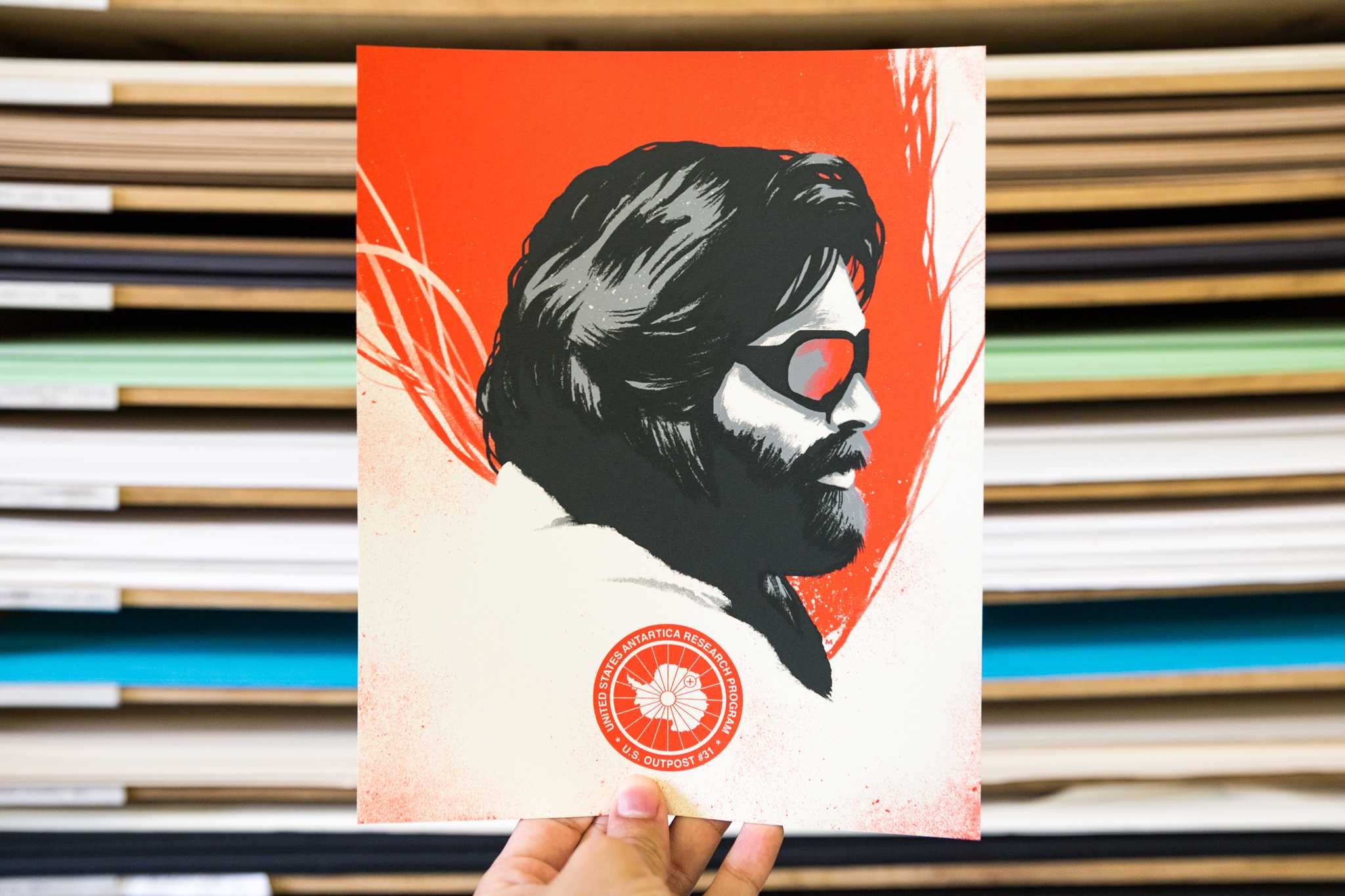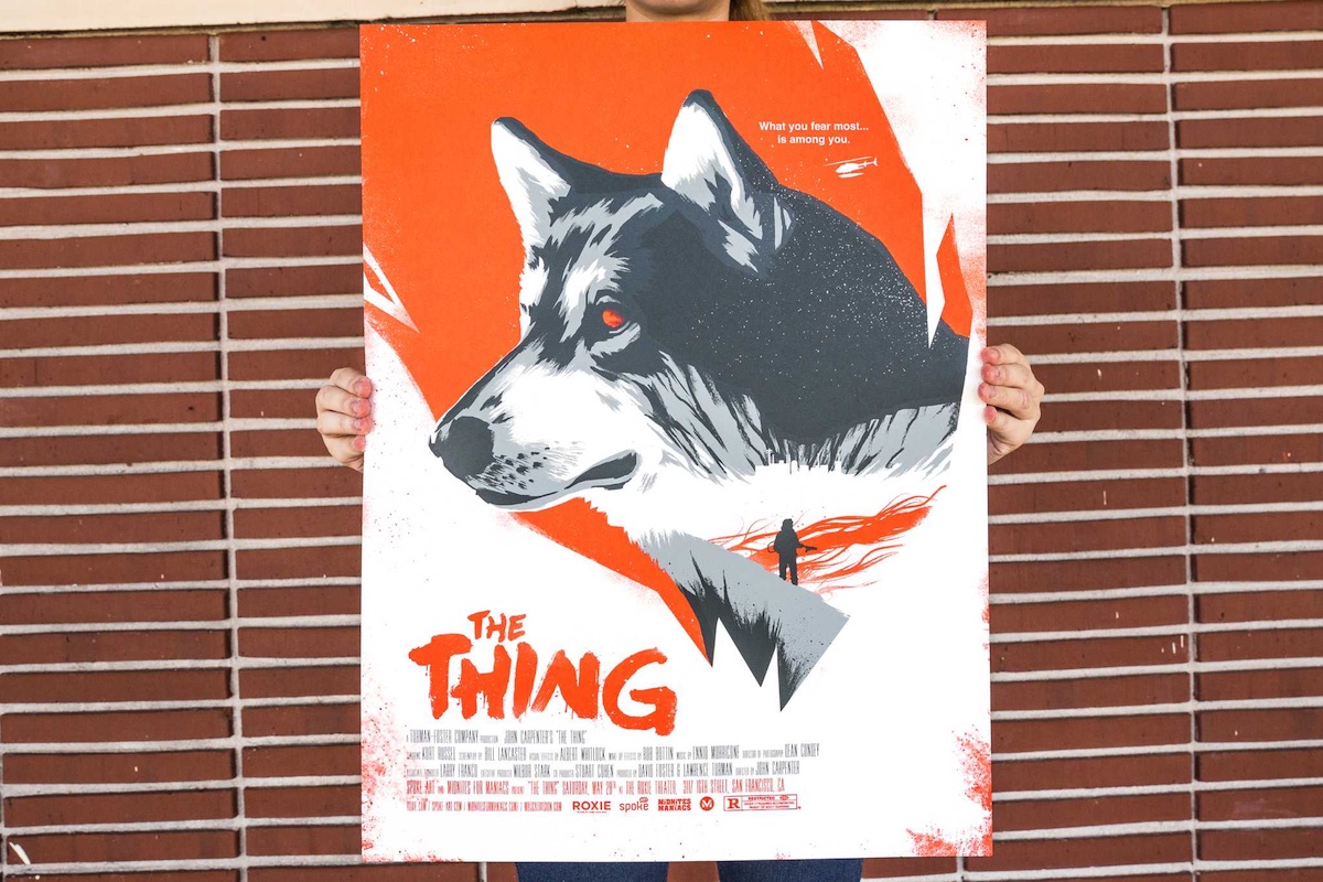
The more printing options we are showered with these days, the easier it is to forget how effective the old standbys can be in the hands of master printers and illustrators. This 3-color screen print produced by Mama’s Sauce to promote the showing of the 1982 classic horror film “The Thing” is an inspiring example of what can be done with something as simple as halftones. Here they are applied to French Paper Co.’s Construction Whitewash 100 lb. Cover to add gradients that make portions of illustrator David Moscati’s work appear as different shades.
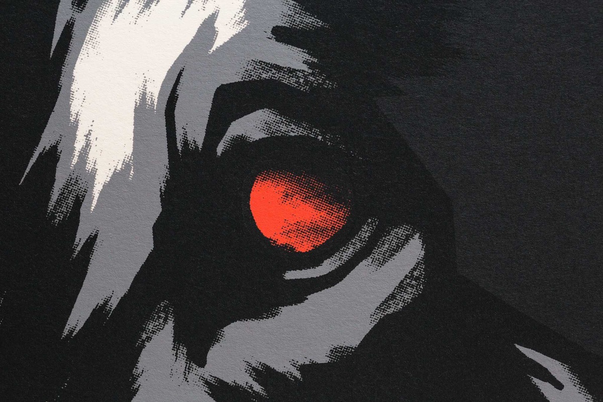
Overprinting was used to create deeper blacks, a nod to the fact that much of this film takes place in darkness.
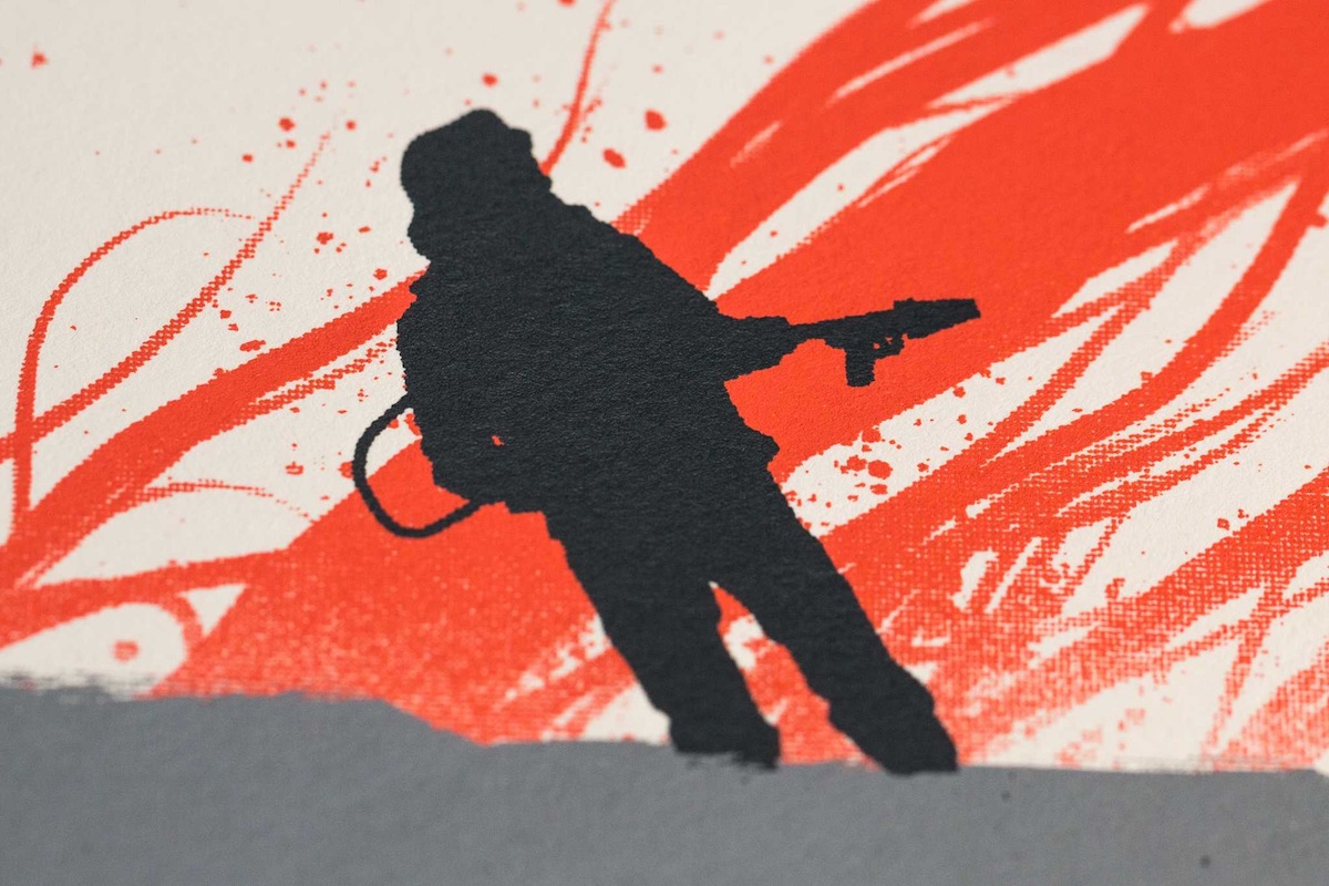
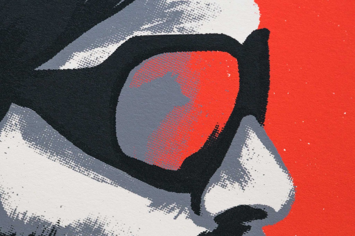
Another nice touch, and one that was carried over to a limited-edition handbill given to the first 30 customers (below), is the use of overlaying inks that are semi-transparent, providing even more shading. And thanks to the illustrator’s attention to detail, the tiny white “gaps” in printing (in Kurt Russell’s hair below and on the sled dog’s head at the top) can be taken as the snow and ice that are omnipresent in the film.
Discover more Cool Designs right here.