 It’s been a helluva few months for the folks at Livestrong. Ever since January, when founder Lance Armstrong admitted that the countless doping allegations against him were true, the cancer foundation that once bore his name has struggled to weather the resulting PR storm.
Where once the nonprofit proudly stood behind the solo “Livestrong” name that’s graced more than 55 million yellow wristbands, a recent logo change has added the word “foundation,” reflecting an official name change and distancing from its founder. The black field surrounding “foundation” is meant to emphasize the charitable work that the entity does, drawing attention away from Armstrong’s ubiquitous catchphrase.
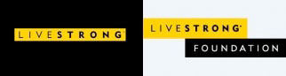
“The change is subtle but it is substantive,” said Andy Miller, executive vice-president of operations, in a statement. “Thousands of people and many critical programs are the ‘Foundation’ beneath that ethos. We believe that while changing our mark is a small act, it’s a natural step in our evolution and a step towards becoming more us, more clear and doing more work.”
We, of course, believe that logo design and presentation are extremely important, whatever your product. But when that product is so beloved by its adherents, and caters to a demographic that grows by the hour, we have to ask: Who but design wonks will even notice the difference?